For a while now I’ve used a reference blog called #pondlife to explore various tools and ideas for constructing sites. All the #pondlife implementations build the exact same blog, and trying to enforce a consistent set of user-defined requirements for the source content makes it much easier to make apples-to-apples comparisons.
Origami uses a foundational map-based tree pattern to model the construction of sites like #pondlife. I recently became interested in the question of how hard it would be to implement that pattern in a compiled, strongly-typed language with explicit memory allocation. I haven’t written C or C++ in decades, but Zig seemed interesting to me. Among other things, Zig seems highly aligned with the Web Origami philosophy of building software artifacts directly on top of a platform using explicit code.
My intention was to explore map-based trees in Zig, not become a Zig developer, so I relied heavily on an LLM as a counterpart. This turned into a week-long argument with the LLM, with me trying to express an idea and the LLM explaining why the idea could or couldn’t work. Often the LLM would generate code that worked, but which didn’t capture my intent; I’d ask to rewrite the code until the code both worked and roughly expressed what I wanted.
The result of the extended argument is a Zig implementation of the #pondlife blog. This includes a Map type to represent an associations of keys and values; maps get composed to form a Tree. A tree can be used to represent both the source content and the resulting site’s tree of resources.
Comparing the Zig implementation with other #pondlife implementations, the Zig version is by far the most verbose:
The three implementations on the left include substantial portions that are completely general in nature and could be factored out into a reusable library. If we subtract that out and focus just on the code unique to building the #pondlife blog, we get:
Verbosity aside, I think Zig might be a plausible site construction language for someone who either: a) just loves Zig, b) wants to incorporate site construction into a larger Zig project, or c) wants to use the map-based tree pattern to process other kinds of content, e.g., game assets for a game.
I’d recommend that, for a typical site, build time should generally not be your primary criteria when evaluating static site generators; most of them are already quite fast. But, as expected, the Zig implementation is the fastest one I’ve made yet:
I’m kind of surprised the JavaScript implementation comes out so well in this comparison.
This little Zig experiment was illuminating for me. In particular, it was interesting how much more complex it is to work with lazy maps in Zig. Eager maps are much more straightforward to work with, and in a few cases I used an eager map for simplicity. Lazy maps can be an important factor in constructing a site tree that can be quickly served — you only need to do the work for a requested resource — but if you’re going to always build the complete set of static files, concentrating on eager maps would make a Zig implementation simpler.
If you’re interested in exploring some of the other #pondlife implementations:
For almost 20 years I’ve maintained a journal for my family. I recently met someone interested in this practice, so I’m documenting it here for both them and anyone else that might benefit from it.
Why I journal
Our memories are not only terrible, but they’re terrible in a particularly insidious way: when something hilarious or interesting happens, the event feels certain to be something you will remember. Sadly, the strength of that conviction bears no relation to the likelihood you will actually remember that moment.
This isn’t just a supposition — I have proof!
My own family journal now extensively documents nearly two decades of our lives. I often reread portions of this family journal, and frequently rediscover stories which I had completely forgotten. Sometimes I’ll share the rediscovered story on my family chat, and everyone else in the family says that they’d forgotten it too. And for the stories I (or we) do remember, our journal generally includes details we’d forgotten.
The family memory loss is particularly acute in our kids’ early years. The early years of parenting are so packed, and yet nearly all of it is forgotten.
Preserving these moments in a durable way lets us enjoy them over and over.
Beyond using a journal as a memory prosthesis, I also share this journal content in various ways with extended family and friends. I find this provides a good way to let people know what we’re doing, and in a manner free from corporate exploitation.
Over the years I’ve learned that our journal can also be a good way to document things like the name of a restaurant we may want to return to. With that in mind, I sometimes take care to write down details that are not crucial to recalling the story, but might be useful later. Example: when my family goes car camping, I record the campsite number in case we want the same site later. Occasionally one of my kids will reach out to ask me for some detail like this.
How to start
It doesn’t matter how you start, only that you start.
Create a new note on your phone, or a text file, or a new Google Document, or anything. You could do this right now. At the beginning, it doesn’t matter what form you pick; you can change your mind later.
The next time something happens in your family, write down a few words that you think will help trigger the memory of that event. If you want to try this now, think of something funny that happened this past week.
You don’t have to push yourself to do this on a schedule (although you can certainly do that if you want), just do it whenever something interesting happens.
If you do this but fall out of the habit, it doesn’t matter if there’s a gap. Come back to this whenever you want.
If your partner is interested, pick some collaborative form in which you can both write.
If you do this for a few weeks, when you open up the note/file/doc, you are guaranteed to find something you had already forgotten.
There are plenty of purpose-built systems for journaling and sharing. If you want to use one of those, go ahead. But at the beginning it might be better to do the simplest thing that could possibly work until you can identify your real needs.
How I journal today
This is what my practice looks like today after many years of iteration. This is probably not how you should start.
When something interesting or funny happens in my family that I think would be worth remembering, I make a small note on my phone with just a few words that will trigger the memory. I make the note in my to-do list app so I’ll see it when I’m back at my desk.
If I’m traveling, I will generally record moments from the trip in a note or a Google Doc that I can edit offline. Family trips have many such moments, so I will often do this at the end of the day. Since my focus is on traveling, I’m just writing down enough words that I can recall the story after the trip. The entry for a typical travel day might include a date and 10 lines of such words.
If the event has been captured in a photo, that alone might suffice as a reminder. I periodically review my recent photos for things I want to add to the family journal.
When my time allows, I expand those few words and/or photo into a story. I want to capture sufficient detail that someone who wasn’t there will still understand why the moment was interesting. As it happens, this may also be the same amount of detail needed for us ourselves to reconstruct the event years later.
A typical story might just be a paragraph. A humorous photo might stand on its own without comment. For a full day of family travel, the story might run for many paragraphs with multiple photos.
The story text goes into a markdown file with all the stories for that month. I’ve organized those files into folders by year.
The markdown and photo files are stored in a local git repository and pushed to the network.
I turn that content into a site using Web Origami. The site has a page for each month. I share that site URL with family and friends but avoid posting it publicly.
The site includes an RSS feed. I doubt anyone else subscribes directly, but I subscribe to the feed myself so that, when I see the story later in my feed reader, I can confirm everything’s working. The feed is also used to produce the newsletter (below).
I used to go to lengths to enable editing of the full journal content directly on my phone, but I rarely did that and it added complexity. Nowadays I don’t bother.
Monthly newsletters are great
Since few people will visit our site on a regular basis, our family journal feed is also used by an email newsletter service. On the first of each month, this service sends the previous month’s stories to a set of friends and relatives. I don’t really monitor whether people read it, but it’s clear that some people really like it.
For what it’s worth, I receive a similar newsletter from a friend, and once a month turns out to be plenty often. Social media sites provide far more personal content than I generally want; I don’t need to know everything a friend, their spouse/partner, or their kids are doing on a daily basis.
I currently use MailChimp for this service, which is adequate but I don’t love it. I may switch to something like Buttondown in the future.
How to write good family holiday letters
At the end of each year I review our journal stories for the year, and collect what I think are the best into an annual family holiday letter. I copy the complete story text into a new document, then edit it down so that I can fit the letter on a single sheet of double-sided paper. I add photos to this, then send the thing for bulk printing at FedEx.
I think it’s interesting to receive some condensed digest of what happened in a family over a year. The problem is that most people can’t sit down in December and remember the funny or interesting things that happened over the concluding year.
Instead, what people can remember are: 1) destinations they traveled to, and 2) milestones like births, graduations, weddings, awards, and deaths. Such a list achieves the impressive feat of being simultaneously boastful and boring. It’s just not interesting to hear that you all went to Rome or that Blake graduated from middle school. A little bit of such news is obviously appropriate, but don’t fill the letter with it.
What is interesting in a family holiday letter:
Stories that reveal personalities, particularly of the kids who are growing up. For that to work, I take care to include at least some story for each of my children (and my wife and I as well) that reflects some aspect of the person’s nature.
Variety: a story that touches on a possibly mundane but unique family routine or tradition; a story (just one or two) about a treasured pet; a story about your physical house or neighborhood; a family story connected to a regional, national, or global news event.
Humility. The holidays are supposed to be a joyful time, but that doesn’t mean you have to limit yourself to 100% positive news. It’s okay to mention that a concert got rained out or a trip was too packed. If something truly bad happened, there may be a way to indicate or touch on that without making the entire letter depressing. If a story is mildly embarassing or sensitive, clear its inclusion with the person in question.
Progression: a story that builds on something you mentioned in a previous year.
Friends and family routinely tell us that they love receiving our letter, and I’m pretty sure they’re not all saying that just to be polite.
The family journal and the holiday letter are separate ideas; you could do one without the other. But if you want to write a good holiday letter, your task will be much easier if you’re keeping a journal.
As a very crude metric, the conciseness of legible code can roughly correlate with simplicity, so in this final post, let’s measure how large the projects are. That analysis is followed with an Appendix of other notes from this experiment.
I totaled the size of all source files in each project: configuration code, data, scripts, and templates. I did not count markdown content as source code, and in any event, both projects use the same markdown.
In a code size comparison, Eleventy has latent advantages: its folder structure implicitly encodes behavior that Origami must spell out in code, and its use of configurable plugins should in theory require less code.
Counting source code in bytes (with wc -c) for Eleventy:
The Origami version, which is doing much of the work from scratch, is smaller!
It seems Origami’s smaller size can be attributed in part to:
JavaScript template literals (3763 bytes) are significantly more concise than the equivalent Nunjucks templates (7000 bytes). Both Origami and Eleventy let you use other template engines, so templates could be factored out of this analysis.
JavaScript templates can inline JavaScript expressions directly instead of requiring separate registration as “shortcodes” or “filters” (see Appendix below)
Some Eleventy files include instructional commented-out code blocks which could be trimmed
Origami has a built-in function to create a sitemap
The Origami site definition in site.ori (which defines the top-level structure of the site) is 30% the size of eleventy.config.js (which configures the main behavior of Eleventy’s static site generator).
In the domain of site creation, code is more concise than configuration.
Static site generators presume that sites are so complex that it’s better to generate a site with an engine whose behavior you configure. But sites just aren’t that complex! If you know how to write HTML and CSS, you can put together a site using zero magic. The code to do so is smaller than the configuration code required to influence a static site generator.
Speaking of metrics, performance should probably be no more than a secondary concern for you when evaluating blogging tools. Most static site generators are quite fast, especially for personal sites.
That said, I timed builds of both approaches via time npm run build on a 2024 MacBook Air M3. I threw the first (longest) time away, then averaged the real time of the next three builds.
Both Origami and Eleventy build this tiny blog project in less than a second:
While performance shouldn’t be your primary concern, in the case of this sample blog Origami comes out ahead. It’s entirely possible that Eleventy has higher startup costs as it digs through your project looking for files, so for all I know, once those startup tasks are accomplished it could process a larger blog faster. Regardless, the performance here shows that Origami’s fundamental approach is well-suited for this task.
Conclusion
Summing up this post series, I beleive this experiment shows that an explicit, code-oriented solution like Origami is easier to follow, more coherent, more expressive, and more concise than one predicated on configuration like Eleventy. I expect the same comparison holds true for the countless other static site generators that rely on a combination of configuration, naming conventions, and folder structure.
Not every person wants to code, or has the time or energy to learn to code. But I think configuration-based site generators cover up the complexity of code with a system that is ultimately just as hard to understand. If you’re capable of configuring a tool like Eleventy, you are just as capable of coding in Web Origami.
I don’t know the Eleventy team personally, but they seem like perfectly nice people who care deeply about their users and want to create good tools for them. They also have what looks (to an outsider like me) like a dynamic, supportive user community. If you pick Eleventy for your site, it’ll probably work out fine.
If you’re interested in trying Origami for a blog, I think you’ll like it. You can start with the corresponding origami-blog-start template project. If you’re interested but want help or have questions, let me know.
Code is more concise than configuration [this post]
Appendix
The following are small points I noticed while studying the Eleventy blog; none are as important as the main points above.
Bugs
I found three very minor possible issues in the sample eleventy-base-blog project. Although the issues are small and debatable, any bugs in a template project will be endlessly copied into new blogs, so their potential impact is magnified.
I want Eleventy to continue growing and their new users to have great experiences, so I reported these to Eleventy (issue, issue, issue).
JavaScript as a template language
Template languages like Nunjucks are common, but they become another language you need to learn. If you already know JavaScript, that’s enough to be able to do anything you want in a template in Origami.
As a bonus, this means that you don’t have to do special things to invoke JavaScript from a template. When the Eleventy version wants to insert a timestamp onto a page, it registers a small JavaScript function as a shortcode:
This shortcode can then be called by name from a Nunjucks template:
built on {% currentBuildDate %}
In Origami, a template is a JavaScript template literal stored in its own file, so you can skip all that registration complexity above and just inline the desired JavaScript into the template:
built on ${ newDate().toISOString() }
If the code were longer, you could put it in its own JavaScript file and call that by file name. The Origami version uses that technique to implement the Eleventy readableDate function; Origami templates then call that function with
${ readableDate.js(post.date) }
Passing data to templates
A number of the Nunjucks templates in the Eleventy blog include lines like this:
{% set postslist = collections.posts %}
{% include "postslist.njk" %}
As I understand it, a Nunjucks include doesn’t let you pass data directly, so you have to pass data via what’s effectively a global variable. That approach is so fraught with the high potential for errors that it’s hard for me to recommend any system that requires it. (Eleventy allows the use of template engines other than Nunjucks; perhaps those are better.)
Origami templates are functions, so you can pass data to them directly:
${ postList.ori.html(posts) }
Focusing on representing pages
Blogging tools like Eleventy use a project’s folder structure to determine the resulting site structure. That approach focuses on complete file resources, such as a page for an individual post.
But blog posts in this project actually have three representations:
The post page in the blog area
A post entry in lists of posts: home page, blog/index.html, and tag pages
A post entry in the feed at feed/feed.xml
The folder structure only gives you a way to conveniently express the first representation. The Origami code doesn’t have any particular focus on pages; all post representations can be defined in a variety of ways.
Meanwhile, using folder structure to represent site structure has limits. It took me a while to realize that the single file tag-pages.njk isn’t just a template for a tag page; an embedded block of JavaScript at the top of the file appears to also generate the collection of pages like tags/second-tag/index.html.
In contrast, the Origami site.ori file includes an explicit definition of the tags area.
Inlining CSS
The Eleventy blog inlines the main CSS stylesheet into every page instead of linking to it. Origami can easily do both, but as a matter of preference, I had the Origami version link to the main stylesheet. Among other things, that keeps each built page smaller and easier to read.
Navigation links
The Eleventy version uses an Eleventy navigation plugin. I’m probably missing something, but in this project it looks like the plugin is used to add an aria-current attribute to three links.
Perhaps in other contexts the plugin saves time, but here it seems like overkill. I implemented this in the Origami version by adding conditions to the three links in question:
This does the job, and is a lot easier for me (someone familiar with JavaScript) to understand. This could be scaled up into a helper function if necessary.
HTML rewrites
I was baffled by this template fragment in the Eleventy version:
Go <a href="index.njk">home</a>.
I just couldn’t figure out what this was doing — what would it even mean to navigate to a Nunjucks template? Looking at the running site, I could see that the link was magically being rewritten. But even closely reading the project’s source code couldn’t help me see how or why this was happening.
The original Eleventy project defined a sitemap.xml file so I implemented one for the Origami version. That said, a sitemap seems unnecessary for this blog; all the content is trivially discoverable by a search engine. The code to generate the sitemap ends up being both a distraction and a possible maintenance burden.
Plugins are general features bound to specific projects
The original Eleventy blog uses a number of plugins to:
Rewrite URLs to inject a path prefix
Generate ID attributes for heading elements
Transform input file paths to output URLs
Optimize images
Help construct navigation elements
Define an RSS feed
Apply syntax highlighting to blocks of code in posts
All these tasks performed by the Eleventy plugins have one thing in common: the tasks have nothing to do with Eleventy. Every one of them is something you might want to do on any static site, regardless of which tool you’re using to make it.
It’s in the nature of tools with proprietary interior workings to require tool-specific plugins. The lost opportunity is that, instead of sharing general-purpose code that can work with many tools, we collectively waste time rewriting the same ideas over and over for different tools.
Extensibility in Origami is provided by calling functions that can be written as generally as possible. There are no internal data structures that require proprietary plugins to manipulate. As the creator, your own code generates the requisite objects; you can pass those directly to third-party functions.
This post looks at another advantage of code over configuration: the degree to which you can easily express your ideas without limits.
As one example, let’s look at the code required to give this blog a feed. The Eleventy version uses the Eleventy RSS plugin, which in this project is configured this way:
In contrast, the Origami project uses a function that generates an RSS feed from a data object created this way:
// The posts in JSON Feed format
(posts) => {
version: "https://jsonfeed.org/version/1.1"title: metadata.yaml/title
description: metadata.yaml/description
feed_url: `${ metadata.yaml/url }/feed.json`home_page_url: metadata.yaml/url
// Map the post data to JSON Feed itemsitems: Tree.values(Tree.map(posts, (post, slug) => {
// Patch image URLs to be absolutecontent_html: post._body.replaceAll('src=".\/', `src="${ metadata.yaml/url }/blog/${ slug }/`)
date_published: post.dateid: url
title: post.titleurl: `${ metadata.yaml/url }/blog/${ slug }`
}))
}
In both projects, you build the feed with code — but in completely different ways:
In Eleventy you write code to configure parameters for a feed-generation plugin whose internal workings are opaque to you that will create the feed. Your ability to customize that feed is limited to the extent the plugin’s developers have correctly anticipated your needs.
In Origami you write code to create the feed. The Origami code above is slightly denser but it’s doing nearly all the work the Eleventy plugin itself does. Your ability to customize that feed is limited to the extent you can describe what you want in code. (The code generates the feed in the JSON Feed schema, which is then directly translatable to RSS with a built-in function.)
The expressiveness of code gives you the freedom to tackle things the way you want to — and the code required to make the change is proportional to the complexity of the change. If you want to change what the Origami feed uses as an item id, you change that part of the code.
A long-term benefit of coding things is that you learn transferrable knowledge. Your potential mastery of the Eleventy RSS plugin data schema won’t help you in a different blog tool, or even using a different Eleventy plugin. In contrast, learning an interchange format like RSS or (here) JSON Feed is knowledge you can apply elsewhere, as are the data manipulation techniques employed in the code above.
[As I was finishing this post series, I discovered that the Eleventy RSS plugin allows you to specify a feed template, giving you the same degree of expressiveness as Origami for a feed specifically although not as concisely. That only makes me wonder why the plugin has to exist at all — the feed template itself isn’t that much longer than the plugin configuration code. In any event, there’s no guarantee that other plugins will give you the same kind of escape hatch through code.]
The expressiveness of code comes into play at every level of the Origami site. At the site’s highest level, I could readily use Origami to support the Eleventy sample blog’s preferred folder layout:
Posts are stored in a top-level content folder, like content/firstpost.md.
Posts with images are stored in a subfolder holding both the post (content/fourthpost/fourthpost.md) and associated images (content/fourthpost/possum.png).
I’ve never used that particular layout for a project before, but it was straightforward to express in code.
I point this out because folder-based, configuration-focused tools impose very particular expectations about how you should organize your content and source files. I have no idea whether it would be possible to configure, say, Astro to work with the content layout of this Eleventy project, or for Eleventy to work with the content layout of Astro’s starter blog.
You might not care about that, or you may care about that a lot. In an Origami project, there’s nothing special about the source file names or organization; structure them however makes sense to you.
To be clear, both approaches require too much code! I hope someday you can make a great blog for yourself with much less coding — or none at all. So you can design whatever you want and retain complete control and avoid paying a monthly ransom on your own writings via a subscription.
But we have to start somewhere. You’re either writing code to 1) configure an engine or 2) do the actual work. Think about what kind of code you want to learn, and whether it will let you create what you want without limits.
Today let’s look at how both projects define the overall structure of the site and consider whether they can present a coherent picture of what you’re building.
Like most static site generators, Eleventy leverages the tree-like structure of a folder hierarchy to approximate the tree-like structure of a site. The good news is that the file system itself gives you the best picture you’re going to get of the resulting site. That’s also the bad news.
Here’s the folder structure of this Eleventy project, including the relevant source files:
The above organization alone may not mean much to the uninitiated, and sadly folders on their own can’t have comments. Nevertheless, experienced Eleventy developers can probably envision the resulting site, especially if they also scan the lengthy configuration file.
There are also many little files that configure different parts of the site’s construction, like content/content.11tydata.js:
exportdefault {
layout: "layouts/home.njk",
};
Most of these configuration files have no explanatory comments, by which I only conclude that we’re not expected to look at them. But if the average user isn’t expected to look at these files, why not have comments for those users that do look at them?
The above file sets a path to a Nunjucks layout, but I couldn’t see how it was used. As discussed last time, configuration-oriented tools tend toward “action at a distance” behavior that is hard to intuit. It’s also the case that there’s just not much to go on here when searching for answers.
I eventually learned that a file called content.11tydata.js is a directory-specific data file that implicitly associates its exported data with the containing folder. In this case, it defines a default layout property that will be applied as the base template for other templates in the content folder, like content/index.njk.
Most of the Eleventy configuration code feels like this. The site builds a blog as advertised, but it feels like substantial work to piece together the site’s construction to the point where you could change it.
In contrast, the premise of a coding-focused approach like Origami is that you describe what you want in code. Given that freedom, most Origami users elect to define their site’s top-level tree of resources in a single file, providing a coherent map of the project. Here’s the whole site.ori file for the sample blog:
// This file defines the structure of the entire blog site
{
about: {
// About page
index.html: templates/base.ori.html(Origami.mdHtml(about.md))
}
// Static assets like stylesheets
assets/
// Blog areablog: {
// Blog index page
index.html = templates/blogIndex.ori.html(posts.ori)
// Create a folder for each post
...Tree.map(posts.ori, {
key: (post, key) =>`${ key }/`value: (post, key, tree) => {
// Index page for post folder
index.html: templates/post.ori.html(post, key, tree)
// Any associated images
...post.images
}
})
}
feed: {
// Blog feed in RSS format
feed.xml = Origami.rss(feed.ori(posts.ori))
}
// Home page
index.html = templates/index.ori.html(posts.ori)
// Tags areatags: {
// Tag index page
index.html: templates/tagIndex.ori.html(tags.ori)
// Create a folder for each tag
...Tree.map(tags.ori, {
key: (group, tag) =>`${ Origami.slug(tag) }/`,
value: (group, tag) => {
index.html: templates/tag.ori.html(group, tag)
}
})
}
// Not Found page404.html = templates/base.ori.html(Origami.mdHtml(404.md))
}
// Add a sitemap for all of that
→ (site) => {
...site
sitemap.xml = Origami.sitemap(site, { base: metadata.yaml/url })
}
Even if you don’t know Origami or JavaScript, you can probably squint and perceive the structure of the final site. All references here are explicit and by name.
For example, at the top you can see that the about area contains a page called index.html. The formula for that page may be unclear to you, but it contains references to the files templates/base.ori.html and about.md, so you can look at those. Even if you don’t know what something does, you at least have a name to search for. Searching the Web Origami documentation for the remaining term in that formula finds the built-in function, Origami.mdHtml.
This single site.ori file pulls together the bulk of the logic behind the site. I think such a coherent, text-based map of the site is enormously helpful in understanding and remembering how the parts fit together. You can also ask Origami to draw a visual diagram of the running site to confirm your understanding.
This post series is for people who want to build or rebuild a site.
You may have heard of Eleventy, a popular static site generator, and maybe heard it’s simple to use. To evaluate that simplicity, I’ll compare a sample blog in Eleventy to the same blog in Web Origami. This will be similar to my comparison last year of Astro and Origami.
If you’re shopping for a site-building tool, I hope this series can help inform your decision. If you already use Eleventy, I’m happy you’ve found something that works for you. As I said last year, anything that makes people more likely to create a site is fantastic.
A difference in strategy
Eleventy works like most static site generators: you run the tool, it searches inside your project for certain folders and files, then processes them to create an output directory with your site’s HTML pages and other resources. You influence this process through configuration, setting various parameters to adjust what Eleventy does. You generally set those parameters through JavaScript files, although the emphasis in those files is on defining parameterized objects or enabling plugins.
In Web Origami you focus on defining the site you want with code. You do this in standard JavaScript or the smaller Origami dialect of JavaScript, which is essentially JavaScript expressions with embedded file paths. The code does whatever you tell it to do. In this case, it defines a blog site’s tree of resources, transforming the markdown posts into browsable HTML and a feed.
This difference between configuration and coding is similar to the difference between working with numbers in Intuit QuickBooks and Microsoft Excel. The former is configured; the latter lets you calculate whatever you want.
Configuration is generally sold as simpler than coding, and most people intuitively feel that should be the case. But I believe that, for making sites, coding is superior in four specific ways:
Code is easier to follow than configuration.
Code is more coherent than configuration.
Code is more expressive than configuration.
Code is more concise than configuration.
Configuration can certainly let you achieve impressive results in complicated domains that you probably couldn’t code yourself, but sites just aren’t that complicated. It’s actually easier to code your own site from scratch than to create one by configuring a tool.
Experiment setup
I copied Eleventy’s recommended starting point for new blogs, the eleventy-base-blog template project, studied that until I felt I understood its construction, then ported it to Web Origami. This gave me two versions of the same blog:
Both demos are about as close as I can easily make them. For a cleaner comparison, I made a few modifications to the original Eleventy project:
The original project had an introductory message with instructions to remove it, so I removed it.
The original used a plugin for image optimization, but reproducing the effects of that would complicate this analysis, so I removed it.
I removed the original’s XSLT stylesheet for the blog feed, as XSLT is being deprecated by Chrome; WebKit and Gecko will likely follow. (I’m not saying the deprecation is warranted, but given the state of things I felt the stylesheet was a distraction.)
Beyond that I tried to port all observable behavior; some minor differences remain. For example, the Eleventy project uses PrismJS for syntax highlighting while the Origami solution uses the slightly different HighlightJS. With more work, the sites could be made even more identical, but I don’t think that would change the overall results of this experiment.
Code is easier to follow than configuration
With two versions of the same project in hand, let’s start evaluating them by considering which version is easier to follow. If you’re coming fresh to the project, can you answer the question: How does it work?
That can be a hard question, so let’s start with a simpler one: What is calling what?
For template projects like eleventy-base-blog, the README typically instructs you to build the site with a command like npm run build. That’s the main entry point to the build process. I tried to search forward from there and follow links to related files.
I got stuck.
The build command for eleventy-base-blog is npx @11ty/eleventy. That invokes Eleventy, but beyond that point it’s not obvious how Eleventy does what it does.
A promising eleventy.config.js file makes specific references to a folder called content and a file called filters.js, but there I hit a dead end.
I ended up searching through the entire project looking for source files, then looking in those for references to other source files.
I constructed a partial map of what calls what:
The files floating in space aren’t directly referenced by any other files. Some of the file names suggest what roles those files play, but it was still mysterious to me how they actually played those roles.
I eventually found an Eleventy documentation page called Order of Operations providing an “advanced” description of most (but not all) of what was going on. I then had Claude Code guess/explain how the remaining files worked. This clarified that, e.g., Eleventy lets you register JavaScript functions as “filters” you can call from templates. I hadn’t been able to work out for myself that many of the .njk files were invoking code in filters.js.
I was then able to flesh out the above dependency diagram, adding what I understand to be the implicit connections as dashed lines:
Many of the connections in this project are dashed lines representing “action at a distance” — if you don’t already know how the system works, such connections are hard to discover or intuit. This may be acceptable for something you will use all the time, but it certainly does make learning the system (or coming back to it) more difficult.
Let’s now try to answer the “What is calling what?” question for the Web Origami blog, again starting from the build command:
ori copy src/site.ori, clear files:build
Even if the meaning of that command is unclear, you can still see an explicit reference to the file site.ori. If you open that file, you’ll see it contains references to all the files it calls.
You can repeat that process, following links from one file to another, to recover the entire graph of source file calls:
The Origami project has no hidden associations, so all the lines are solid. Everything happens because an explicit line of code makes it happen.
This property of an Origami project makes it much easier to follow what the project does. When I read someone else’s Origami project, it doesn’t matter how they’ve written it. I can always start at the build command and work forward to find all the code. The project’s author also benefits from this same guarantee when they read their own project after some time away from it.
Other posts in this series:
Code is easier to follow than configuration [this post]
I’m interested in helping to create a shared JavaScript library for letting Electron apps authenticate with Netlify (and potentially GitHub/GitLab pages) via OAuth for the purpose of creating new projects and uploading files to existing projects.
The users in the web publishing ecosystem are benefiting from Electron becoming a de facto standard for user-facing tools. As Niki relates, Electron is winning because “native has nothing to offer”. Many developers are voting for Electron these days; I’m one of them.
One task I want my Electron app to perform for end users is helping them select or create a site on a static site host and later deploy locally-built files to that site. Netlify is an attractive target because it supports OAuth; GitHub Pages and GitLab Pages are others.
As it stands today, many tools that want to perform this task on the user’s behalf msut guide the user through creating an account with a host, obtaining a developer credential such as an access token, then copying the token and various other details into the tool. This is complex enough for a developer — and ridiculously complex for a non-developer. I think Publii’s walkthrough of this process is as clear as possible and it’s probably still daunting to many people that might want to create a site.
Netlify offers developers the possibility of an OAuth-based UI flow, but that’s a non-trivial thing to create from scratch:
Create a window or dialog in the Electron renderer
Define an HTML-based wizard that walks the user through the process, asking the absolute minimum number of questions
Negotiate the OAuth exchange (as I understand it, this requires a server)
Figure out what files need to be uploaded for a Manual Deploy, or bundle files for a ZIP deploy
Upload the files
Display progress feedback to the user
Communicate success and errors in a meaningful way
Even with the help of AI, creating and maintaining this would be some work. But much of this work would be generic — so it could be implemented in a library shared by multiple tools.
A conceptual, back-of-the-envelope API sketch for a hypothetical NetlifyPublish library:
// Select the site or create a new oneconst siteDetails = awaitNetlifyPublish.selectSite({ name: "My blog" });
if (siteDetails) {
// Successful, deploy build to siteconst files = awaitdoTheBuild(); // However the tool wants to do thatconst success = awaitNetlifyPublish.deploySite(siteDetails, files);
}
There are many details to hammer out — how is work split across the main Electron process and the renderer? To what extent can the server component be generalized and shared as a community service? On the renderer side, how is the UI made modal: a <dialog> or a separate BrowserWindow? How are the built files represented? How is the UI themed? etc.
If you work on a tool that would might benefit from such a shared library, or are interested in participating in its design and/or implementation, please get in touch!
To increase awareness of cool features in Web Origami, I kicked off a weekly comic series with a Mastodon post:
Each 4-panel comic will deliver a short, standalone story. I thought a 4-panel comic would be a perfect format for Twitter-like sites that allow 4 images per post. The images should add visual interest to a user’s feed, and the user can read the comic right there. Each comic will also be available as regular HTML on the Origami site.
It takes a couple of hours to rough out a little story, come up with code examples, ensure they work, and revise as necessary. I write the comic script in YAML, indicating who is talking, what they’re saying, and what should appear in the panel.
The rest of the process is automated:
It’s easy to compile that YAML script to HTML using Origami itself.
Origami can easily runs the code samples and inlines the results directly into the comic so that the terminal session and browser panels are 100% accurate.
To confirm code continues to work as Origami evolves, I use Origami’s Dev.changes builtin to test the site and flag any changes in code output.
😐 Nurture a small, healthy, respectful user community. I’m happy that the small circle of existing Origami users seem happy with the system and continue using it. A number of new people tried Origami as well, although most of them fell into the “lurker” category; I have no idea whether they are still using it or, if not, why it didn’t meet their needs. So pragmatically speaking, I didn’t do as well on this goal as I’d hoped. One new Origami site, the documentation for the open-source WESL project, was interesting to me because it uses a GitHub wiki as the content management system.
😃 Make it easier for users to make sites they’re happy with through docs, bug fixes, and features. Most of the work I did this year was driven by user feedback. Some existing users moved additional projects of theirs from other systems to Origami, a good indication of user satisfaction.
The big feature investments I aimed to make in 2025 were:
😃 Language Server Protocol implementation. I wanted to implement an LSP server so that development tools like Microsoft VS Code (and others) could provide code completion and inline error feedback. An LSP is a complex beast, and tackling this goal was a significant undertaking. The LSP is now part of the Origami VS Code extension and published in the VS Code marketplace.
😃 Screencast engine. I wanted a way of introducing new users to Origami through a media somewhere between a video and traditional documentation. A video is insanely time-consuming to produce and can’t be kept up to date; traditional docs are easier to maintain but less interesting to newcomers. I developed a system for creating comics and published an initial introductory comic. I’ve always loved comics and am delighted with how this turned out. I have more plans for the comics system in 2026.
😐 Feature complete for JavaScript expressions. I mostly accomplished what I wanted, which was feature parity with JavaScript expressions, but during the year I moved the goal posts. I ended up investing far more in this area than I’d expected; see below. There are still a few remaining unsupported JavaScript features in Origami that I’m looking forward to implementing.
☹️ Inspector/debugger. My plan was to create a browser-hosted tool that lets a user interactively inspect the call tree of an Origami file so they can more easily diagnose errors and better understand how their code works. I spent a month on this, but it proved to be a bigger job than I’d expected and I ultimately set it aside to pursue other priorities. I plan on trying this again in 2026.
JavaScript with paths
The Origami language has evolved in stages, growing closer and closer to JavaScript, but at the beginning of 2025 there were still distinct differences.
Chief among them was that Origami required the / slash operator as a way of extracting a property from an object. Instead of writing post.title like in JavaScript, you had to write post/title. Origami used a slash to preserve the use of the . period as a valid character in file names like data.json.
Feedback from Origami users indicated that this difference in syntax presented a persistent stumbling block, and I eventually developed a file name heuristic that lets the Origami parser determine whether a . period represents part of a file name or a property access. The parser can handle expressions like data.yaml[0].name and generally do what users expect.
This change was a small but important step forward towards turning Origami into a dialect of JavaScript: “JavaScript with paths”. To that end, other important changes included:
Redefining all builtins as global objects, just like JavaScript, so the old syntax tree:map became the JS-style call Tree.map().
Supporting JavaScript keywords like new. Old syntax: new:@js/Date("2025-12-31") is now new Date("2025-12-31"), just like JavaScript.
Map-based trees
Another significant foundational change this year was in the way Origami represents hierarchical tree-like structures. The higher levels of the Web Origami project rest on a foundational notion of a tree of nodes that may require asynchronous calls to traverse. For the past few years, these trees have been defined by a small proprietary interface, essentially a stripped-down version of the standard JavaScript Map class. Origami didn’t use the Map class itself because it was some quirks.
However, experiments suggested ways to work around those quirks, so I rewrote the foundations of Origami to use Mapas a general interface.
Now most of the tree structures you work with in Origami, including those based on in-memory objects, the file system, and local data like JSON/YAML files, are represented with standard Map instances. Because Map doesn’t support async calls, Origami uses an async variation called AsyncMap to represent network resources.
These architectural changes also necessitated extensive revision of Origami’s documentation, including a completely rewritten pattern walkthrough discussing the use of Map-based trees to represent a wide variety of data sources and operations.
Other additions
Along the way there were many other additions to Origami:
Tree.filter builtin for filtering a tree based on a condition
Tree.mask builtin for filtering a tree based on conditions defined in a second tree
Tree.globKeys builtin to support filtering based on Unix-style glob patterns like *.jpeg
Tree.regExpKeys builtin to support filtering based on JavaScript regular expressions
Origami.mdOutline builtin to extract the tree structure of markdown content, e.g., to generate navigation elements
JavaScript has a Map class for holding key/value pairs, but it’s underused and underappreciated. If you fix the class’ limitations, you can use Map as a building block to create really interesting things.
Photo: Cun Mo, Unsplash
A quick review of Map
The Map class lets you associate keys with values:
The Map class has a number of advantages over plain objects for storing data, but JavaScript syntax makes it easier to create and work with objects so Map doesn’t get used as often as it should.
Extending Map
Map also has one key advantage over a plain object: Map is a class you can extend, so you can expose any key/value data store as a Map.
For example, we can write a FileMap class that makes the contents of a file system folder available as a Map. This ignores the map’s built-in storage, and instead gets the keys and values from the file system:
Most of the time you work with files in code, you’re just reading a list of files and getting their contents, so something like this is much easier to work with than the full file system API.
Better yet, you can immediately pass this kind of file system Map to any code that understands a Map. That provides a desired separation between data storage and code that works on data.
Limitations to work around
Sadly, the Map class is cumbersome to extend: its standard methods like clear(), entries(), and values() will ignore your get() and keys() methods.
markdown.entries(); // empty array ☹️
For comparison, the Python language provides a Mapping abstract base class that is much more helpful than JavaScript’s Map. When you inherit from Mapping, you only need to define a small set of core methods, and the base class uses your definitions to provide the remaining methods.
To compensate for this and other issues with Map, we can create our own base class that inherits from Map but provides all the expected methods:
exportdefaultclassBetterMapBaseextendsMap {
// Override entries() method to call overridden get() and keys()
*entries() {
for (const key ofthis.keys()) {
const value = this.get(key);
yield [key, value];
}
}
…
}
If we derive our FileMap class from this improved base class, the full set of Map methods work as expected:
Once your data is in Map form, you can manipulate it in interesting ways without having to worry about how the original data is defined. For example, you can transform a map of markdown to a map of HTML.
const html = newHtmlMap(markdown);
html.keys(); // ["post1.html", "post2.html", …]
html.get("post1.html"); // "<p>This is <strong>post 1</strong>.</p>\n"
Transforming the values of data often implies a transformation of the keys, so maps are ideal representations of such operations.
Creating a build system with maps
This Map approach is a pattern you can explore in more detail. Because it’s a pattern, you can use it without taking on any new dependencies.
But you can take advantage of the Web Origami project’s async-tree library, which includes:
A better Map base class along these lines, called SyncMap
An asynchronous variant called AsyncMap that can represent network data sources
A more complete FileMap class that supports write operations
You can use this library to construct things like a build system for generating the static files for a site. A sample blog project uses the library to represent the various stages of the build process as Map-based trees:
1. Content tree → 2. Site tree → 3. Build tree
The source content in the file system is represented as a tree of Map objects.
These are transformed with map-based operations and composed into the desired tree of site resources.
The site tree is copied directly into a Map-based representation of the folder that will hold the build output.
The entire build.js build process is very concise and boils down to a copy operation:
import { FileMap, Tree } from"@weborigami/async-tree";
import site from"./site.js";
// Build process writes the site resources to the build folderconst buildTree = newFileMap(newURL("../build", import.meta.url).pathname);
awaitTree.clear(buildTree); // Erase any existing filesawaitTree.assign(buildTree, site); // Copy site to build folder
By using Map as the fundamental building block, this sample project generates the site’s static files using only two dependencies, the async-tree library and a markdown processor.
The AsyncMap variant lets you represent a network data source as an object that has the same methods as a Map but the methods are asynchronous. This lets you pull content from sources like Dropbox or Google Drive using a much simpler API, so you can incorporate content directly from the network into your build process.


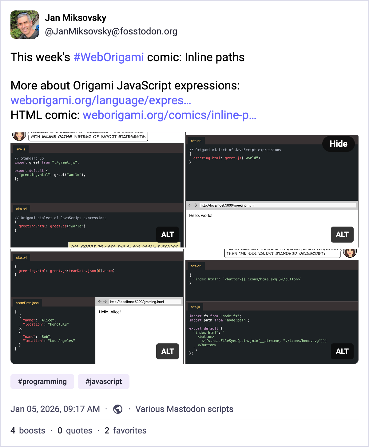
 Photo: Cun Mo, Unsplash