Building a Storybook-like demo browser with web components — a much simpler way to get most of the benefits
I recently tried Storybook, a popular tool for browsing the demos and documentation for a UI component library. I think Storybook offers a good user experience, but its developer experience entails complexity out of proportion to its benefits. I tried creating a simpler web component library browser using web components, and am happy with the result.
Storybook: The good parts
Storybook is a good idea. It’s helpful to be able to quickly browse a component library and see the range of what each component can do.
Storybook offers useful features like:
- Top-level UI for browsing stories.
- Automated construction of an index of stories: given a project that contains story definition files, Storybook will generate a hierarchical outline of the stories defined in those files.
- Router that updates the page URL to deep-link to the currently-selected story, making it easy to share links to specific demos.
- Search facility that filters the index to those stories whose titles contain the desired text.
- Miscellaneous tools: zoom in/out, change background color, change viewport width to preview mobile device results, maximize the demo viewport, open demo in a new window, copy the current URL for sharing.
- Inline view of the source code used to create the adjacent demo.
- Property inspector panel (“Controls”) that lets the user dynamically change the properties of a demo component.
- API documentation generation.
- An add-on ecosystem.
How to define a demo written in HTML? Hmm…
My own experiments with Storybook did not pan out, and I found it too heavy for the relatively simple problem I was trying to solve. (You can find my notes from that experience in an appendix following this post.)
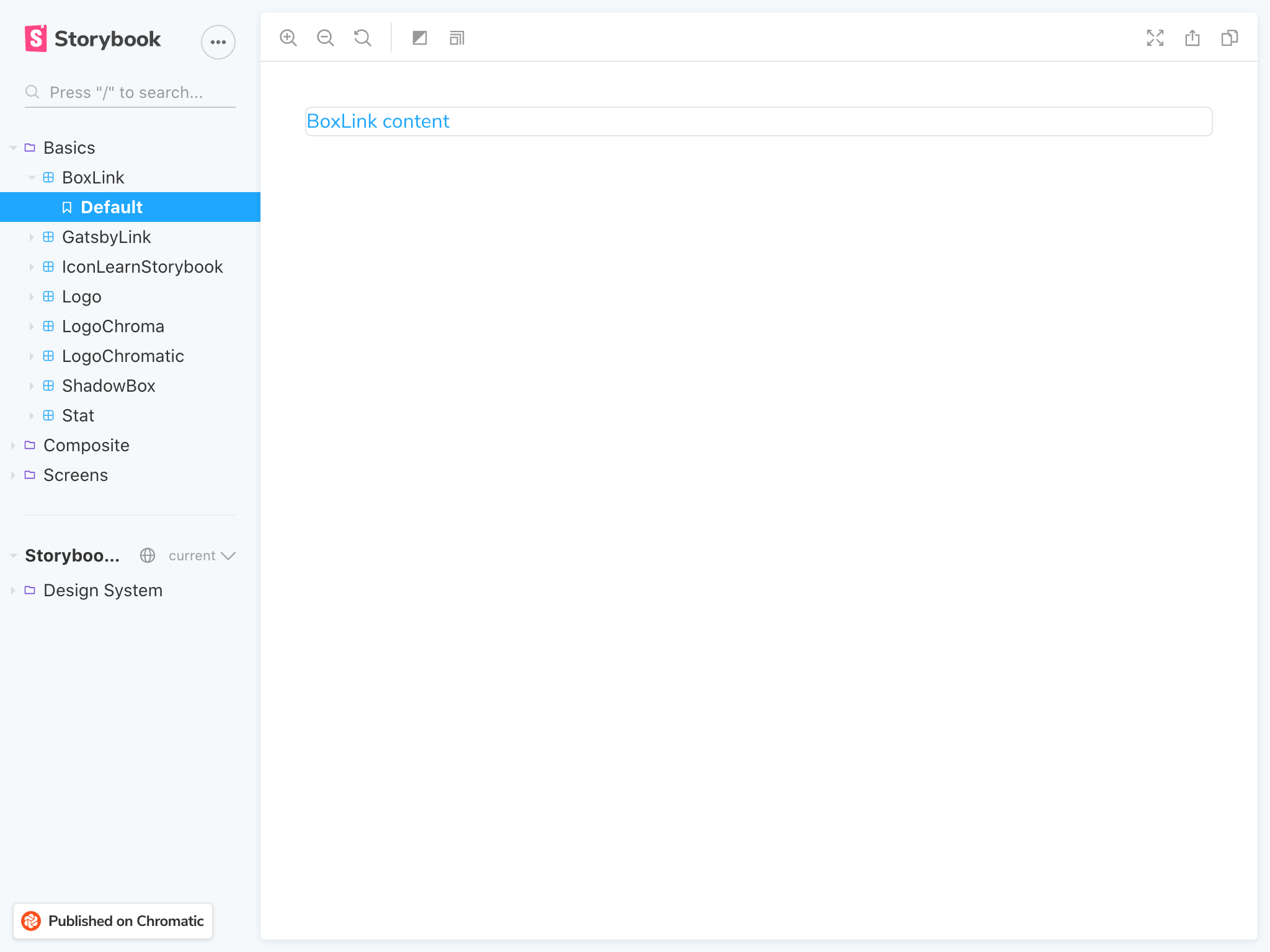
For me, the crucial turning point came when I was trying to define my first story demo in Storybook. Since my project is creating plain web components, I just had a bit of regular HTML I wanted to use for a story.
But to define my HTML demo in a common Storybook configuration, I had to create a markdown document of some flavor I’d never seen before (“.mdx”), and then put something like this in it:
```js
export function MyElement() {
  return html`<my-element>Hello, world.</my-element>`;
}
```
Here we’ve got HTML inside of a lit-html JavaScript template literal inside of a JavaScript function inside of a JavaScript code block inside of a markdown document.
Whew! All that to display some HTML.
Huh. If only web browsers gave us some native way to write HTML…
Oh, right — they do! It’s called HTML.
What I want to write is an .html file that includes the demo as plain HTML:
<my-element>Hello, world.</my-element>
A web component library browser made of web components
Stepping back, the Storybook application runtime UI is actually not that complex. There are certain useful UI elements that appear on Storybook pages, like the story index and the “View code” buttons. The web already provides an easy, standard way to implement reusable UI elements: web components.
I built a simple component library browser that achieves perhaps 60% of what I want out of Storybook, but in a more straightforward fashion using web components. It’s meant for local development, but I’ve quickly posted an unbundled version of that if you want to see the Elix web component library demos.
The first iteration closely followed the Storybook UI:
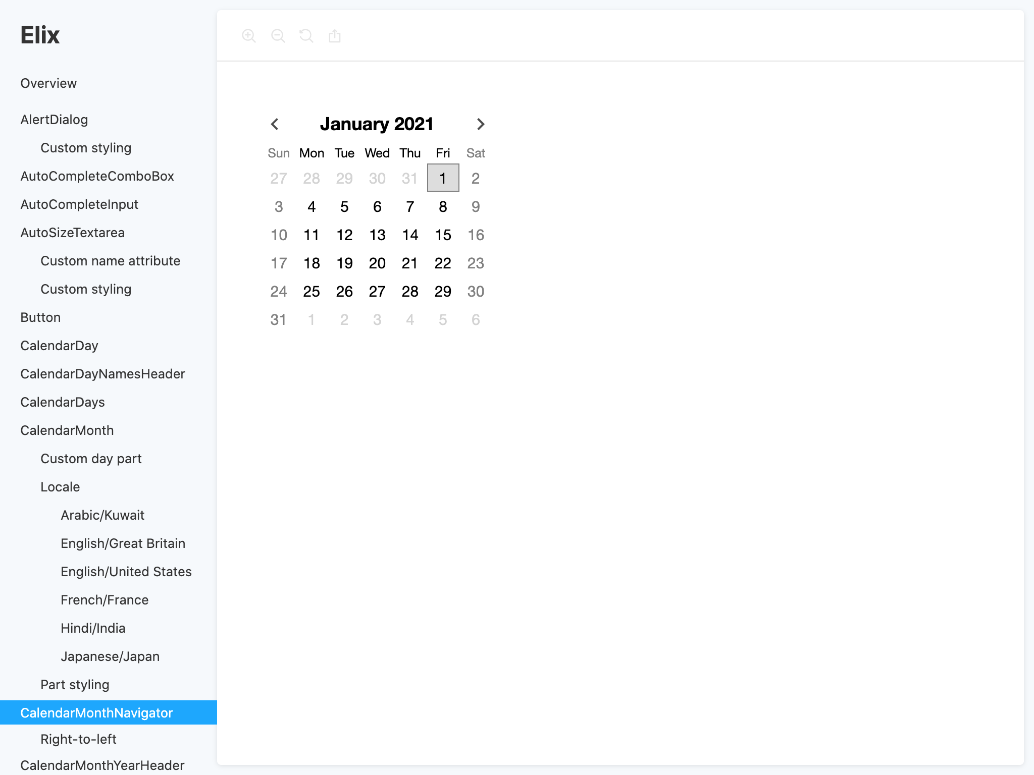
Building this with web components, and generally using the web platform more directly, makes it possible to do much (not all) of what Storybook does much more simply and flexibly.
- Demo/documentation pages are plain .html files. You can write these however you want, and serve them with any web server you want.
- A
<story-browser>component on the index page handles the top-level UI pattern: navigation is shown on the left, and the demo page is shown on the right in an<iframe>. - You define the set of demos by placing a handwritten list of plain
<a>links as children inside the<story-browser>component. Since HTML is the composition medium, you can write whatever HTML you want there; you’re not limited to links. - The
<story-browser>component includes a tiny router that picks off the path from the URL and hands that to the iframe. - Once a demo is loaded, the story browser component extracts the demo page title and shows that as the document title in the browser’s title bar. This extracts maximum value out of existing HTML metadata.
- The component also highlights the current demo in the navigation index by applying a CSS class you can style however you want.
- Like the Elix components, the story browser component itself contains no aesthetic styling. Instead, you can style the interior shadow parts of that component using standard CSS
::partsyntax. (See a different styling example below.) - Because you define the demos in plain .html files, you can always load the demo pages directly to cut out the story-browsing UI. That minimizes the code that might confound your debugging of the component itself. As a shortcut, I added a little close box on the navigation pane that navigates you to the current demo as a top-level page.
- Because this is just HTML, all the native HTML features work. You can Command-click on links to open them in a new window, the links are fully accessible, etc.
- The existing Elix documentation site already has a way of inlining the HTML demos into component documentation, and I could leave all that infrastructure intact. The same demos can be used in both places.
- For another web component library, I created a simple
<story-demo>web component that can be used to wrap an individual demo. This<story-demo>component shows the demo, and also extracts the demo markup (i.e., its own light DOM content) and renders that markup as viewable code. This addresses Storybook’s “Show Code” feature, without any need for build-time tooling. (I’m not using that<story-demo>component in the Elix demos yet.) - These web components for browsing stories are written in plain JavaScript that requires no tooling and no build step.
- I happened to write the story components in Elix, which has no dependencies of its own.
- Out of curiosity, I rewrote the
<story-browser>component in vanilla JavaScript with zero dependencies. Minified (but not gzipped), this component was 2050 bytes in size. This is contrast to the hundreds of megs of dependencies pulled in by a straightforward Storybook installation. The web component is just not doing very much, which is exactly the point.
Since there’s not much going on here, there’s very little new that someone has to learn to use it. If someone needs to be taught how to do something in HTML — then they’re learning something useful for the rest of their career! The HTML pages they create with this approach are as future-proof tech as one can ask for, and are simple enough to work until the heat death of the universe.
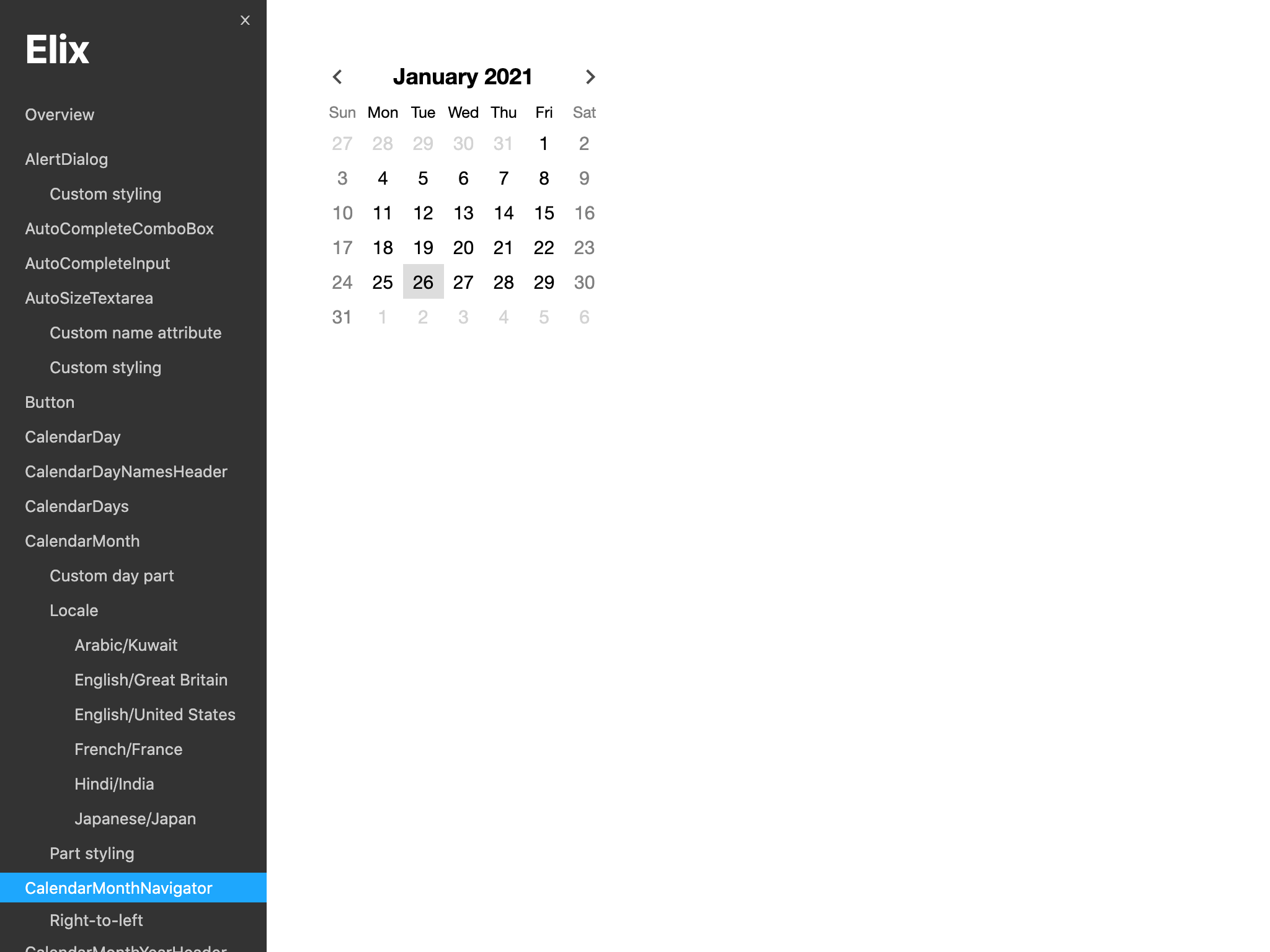
I eventually changed the page styles to get a plainer look which I felt put more attention on the demos:
What I left out
Here are some of the Storybook features I did not implement:
- Built-in browser features. Every browser already has tools like Zoom In/Out and Share Link.
- Generating a hierarchical index of demos. Even for the large collection of components in the Elix project, it’s just not that hard to keep a handwritten list of links up to date. Handwritten HTML preserves a huge range of freedom. On the rare happy occasion where someone is adding a new demo, their brain can insert the link into its proper position in the alphabetical hierarchy. If the Elix project ever decides to programmatically generate the demo index, that could be done in a minimally-invasive fashion via a simple build script that generated the links in some static form that could be referenced by the
<story-browser>component. - Search. This would be nice to have at some point, and wouldn’t be particularly hard. That would be a nice web component on its own!
- Story files. The Storybook server can be viewed as a kind of templating language for translating stories into HTML files. This can help avoid the boilerplate that is a necessary part of working with loose HTML files. That said, boilerplate is not necessarily a terrible thing. Each of the loose HTML demo pages in Elix’s demos folder contains some identical boilerplate which, very occasionally, must be tweaked. Doing so at design time is easy enough via a find-and-replace operation in any modern code editor. That feels much, much simpler than introducing a templating system.
- Run-time UI controls to let a user manipulate component property values in the browser. This might be the nicest Storybook feature to add, but I’d prefer to wait until there’s a standard way for having a component project describe a component’s API. In the meantime, if you’re already the kind of developer who can create a web component, then it’s probably not challenging for you to manually create demos with controls that adjust component properties. And any run-time component-editing UIs could be nicely packaged up as web components.
- Generating API documentation. The Elix project already has a way of generating documentation for its external developer site, so the project didn’t need that.
Defining the key story browsing UI in web components lets you maintain complete control of the top-level pages and project infrastructure. The separate aspects of this approach are simple, small, loosely-coupled pieces that can easily be replaced as needs change.
It’d be pretty interesting to see this approach built out into an ecosystem of web components and other simple parts which work well together. That could ultimately comprise a compelling, web-oriented alternative to Storybook.
Conclusion
A component library browser like Storybook is a useful tool. After developing the initial story browsing components for the Elix library, I discovered small UI regressions in a couple of demos, simply because it was easier for me to quickly experience all the demos in action.
But I think the benefits of a component library browser can be achieved in ways that work with the grain of the web, squeezing every advantage out of solid technology you already know well.
Appendix: Notes on trying Storybook
My goal in writing the above post was not to focus on Storybook, but on addressing what it does in a simpler way. From what I can see online, many people love Storybook. If that’s you, that’s great! I’m glad you’ve found a tool that meets your needs.
If you’re considering adopting Storybook, and are interested in knowing ahead of time what its downsides might be, I’m including my notes from my experiments with it here. Your Mileage May Vary.
- Storybook appears to have been originally designed to browse React component libraries. It shares with React an approach that covers up much of the browser platform with proprietary JavaScript abstractions in the name of developer ergonomics. I am personally skeptical of that approach.
- Storybook is a full-blown application server in its own right that must be accommodated inside the host project.
- Installing and configuring the Storybook application in an existing project is a non-trivial task.
- Various project generators exist that can pre-populate a project with the required files. These all assume that you don’t want to understand how the resulting application actually works. They create a lot of files, tell you how to start the application, and then you’re on your own.
- The results of running one of these project generators are, in my experience, rigid and brittle. Attempting to diverge from the generated project is likely to break the Storybook application in ways which are difficult to diagnose or resolve.
- Storybook is still focused primarily on React development. There are project generators aimed at web component developers, but these don’t yet feel like first-class citizens of the Storybook ecosystem.
- To the extent Storybook does support web component development, it focuses on frameworks like Polymer/lit-element rather than plainer JavaScript web component development.
- The extensive toolchain imposed by Storybook, and the run-time environment of the Storybook UI, can complicate debugging. When you’re trying to debug a UI element, any other UI code on the page can make it harder to isolate the problem. So while Storybook may make it easier for designers and other developers to browse your component, it can get in the way of letting you actually create those components in the first place.
- Storybook forces use of a build process, even if the underlying web components don’t need a build process. Even for a minimal web component project, Storybook builds are slow.
- Storybook adds a set of huge set of files. Depending on which starting point you use, the configuration can be massive.
- Storybook has an extensive set of configuration options, add-ons, etc. It’s probably possible to get whatever UI you want in a Storybook application. However, the way you configure UI in Storybook will be substantially different than how you would create the exact same UI in an application of your own.
- In other words, learning how to do UI inside of a Storybook app isn’t teaching you anything about building app UI outside of Storybook. When the day comes that you decide to present your component library in any other way — or work on literally anything else — your Storybook knowledge will not help you.
- Storybook appears aimed first at local developer use, and only secondarily at the task of making documentation for internal or external consumers of component libraries. Many organizations creating UI components need both.
Stepping back, Storybook is essentially a complete CMS (Content Management System). It’s reinventing CMS infrastructure with the presumption that browsing web component libraries is a special task that deserves its own ecosystem. I question that premise.
Even if the premise were true, companies that provide web component libraries already have a CMS for everything else they do. Storybook isn’t large enough to encompass an entire corporate site, and it’s doubtful that companies would want to switch their developer site CMS just to be able to offer a prebuilt web component library browsing UI.
So if your company is using Storybook and ever decides to make its components available to external developers, you will have to reconcile your internal and external documentation platforms. You will need to either: a) shoehorn Storybook into your developer site, b) reimplement the Storybook functionality in the context of your existing developer site so people can browse the same demos there, or c) rewrite all your demos and documentation in whatever form your existing site needs, and then try to keep those in sync going forward. None of those options is attractive.
Perhaps the most puzzling thing to me is that, for a project designed to showcase UI component libraries, Storybook itself is not presented as a collection of UI components. It’s built internally from components, presumably React components, and it looks like the project is beginning to make that UI componentry available to developers. But components are still not the dominant paradigm for working with Storybook.
I spent half a day trying to get Storybook working in the context of an existing web component project, with an eye towards someday using it to document the general-purpose components in the Elix web component library.
- I tried several different Storybook application generators, none of which worked out of the box in the context of my existing project.
- The web component project I had in mind uses TypeScript, which complicates Storybook configuration.
- That project uses rollup for bundling, which also complicates configuration. Most Storybook projects and documentation document the use of webpack.
- I was eventually able to find an example of a Storybook configuration using TypeScript and rollup, but it was still very hard to configure Storybook inside the context of an existing application. Wrangling a tool like Storybook into a complex, existing project is next to impossible unless you understand a great deal about the tool. From the documentation, I could not easily form an accurate model of how Storybook performs its core functions.
- I ultimately had to create a new project from scratch so just to get something I could play with.
- The node_modules folder of the new project was 240MB in size. The size of node_modules isn’t the main metric to use in evaluating tools, but I think its order of magnitude can be a useful proxy for complexity. However you slice it, 100s of megabytes of dependencies suggests that this is a complex answer to what seems like a simple problem. The web component approach above is smaller in size by 5 orders of magnitude.
- I was forced to use much, much more technology than I wanted. Among other things, the particular Storybook configuration I could get to work wanted me to create story demos using lit-html. I don’t use lit-html, and I had no intention of adopting it just to be able to get my web components rendering in Storybook. I could not easily find documentation on how to create demos in plain JavaScript or HTML.
- A colleague who loves Storybook and is much cleverer than I am eventually pointed me at their own Storybook project, which was better suited to plain web component development. It is wonderful to see that such a thing is possible. But I remain wary of a tool where my primary use case requires sacred knowledge instead of being the tool’s primary use case.