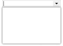
Combo boxes are hard to implement well. At the most abstract level, a combo box combines a text input with a button that can invoke a popup. The popup contains a list or other data-entry element:
But even this simple visual arrangement hides many complexities. A while ago we shared the challenges building a great menu component, so we thought we’d offer a similar look at the many issues faced as we added a new family of ComboBox components to the Elix web components library.
Keyboard focus challenges
Keyboard focus proves to be one of the most challenging aspects of writing good general-purpose web components:
The browser primitives for working with focus predate Shadow DOM, and there are still odd edge cases. In our work on ComboBox, we hit an issue that turned out to be a bug in both Chrome and Safari.
Keyboard focus and keyboard input are generally difficult to test in an automated way. Synthetic keyboard events rarely work in a manner that’s identical to real keyboard events triggered by user activity.
The imperative nature of the focus() method to set focus doesn’t mesh well with a contemporary functional-reactive approach to rendering UI. You have to apply focus after rendering (in componentDidUpdate or something like it), which can lead to timing issues.
Mobile focus behavior can differ from desktop focus behavior.
Beyond these points, very similar UI patterns may call for focus to be handled quite differently, making it tricky to establish reusable baseline behavior.
Where should the focus go in a combo box?
Handling keyboard focus for a combo box is particularly hard, because there are multiple potentially focusable elements. For a combo box containing a list, we want to keep the keyboard focus on the text input element, but the user may also want keys to navigate selection in the list.
If the user presses the Left or Right arrow, they most likely want to move the insertion point to the left or right. However, if they press the Up or Down arrow, it’s reasonable to assume they want to move to the previous or next selection in the list.
Moreover, the user wants to seamlessly move back and forth between typing and navigating.
If they type a few letters, then see the desired item appear in the list, they want to immediately press the Down arrow key to get there, without first having to tab to the list.
Likewise, if the user’s navigating the list, that populates the input field. When the input field holds a value the user wants to edit, they should be able to start typing immediately, without having to Shift+Tab to move the focus back to the input.
Given these constraints, it seems best to always keep the keyboard focus on the input element. That means we need to listen for keystrokes that seem meant for the list (like Up, Down, Page Up, and Page Down) and tell the the list what to do via method calls. If the user clicks on the popup, we’ll let that click do whatever it would normally do (like select the clicked item), then ensure the focus is still on the input.
Controlling the input and popup with the keyboard
Keeping the focus on the input makes managing the popup harder. We usually want a popup to implicitly close if it loses focus, but in this case we won’t give the popup the focus at all.
We also face some odd challenges on mobile:
In native apps, lightweight popups like combo boxes usually go away when the user resizes the window. But in Chrome for Android, moving the focus to the combo box will invoke the on-screen keyboard — which resizes the viewport, which closes our popup. We had to allow our underlying PopupModalityMixin to optionally allow window resizing while a popup is open.
When Safari displays its on-screen keyboard, it doesn’t give the app any way of knowing that the keyboard’s open; the app still thinks the page hasn’t changed size. That means a combo box on Safari can’t automatically confine itself to the available real estate. A dropdown combo box on a mobile device isn’t a particularly common pattern, but it’s still disappointing that Safari can’t support it better.
If you tap the page background when a combo box is open, you probably want the combo box to close. That’s the natural analogue to clicking the page background to dismiss a combo box on a desktop browser. Chrome for Android does this correctly, but Safari appears to only put the keyboard away if you explicitly tap the keyboard’s Done button or tap some other focusable page element.
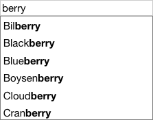
Auto-complete
Auto-complete is a common feature in combo boxes with lists. That feature is useful in other contexts, too, so we’ve implemented auto-complete in an AutoCompleteInput that we can use elsewhere.
Auto-complete presents its own challenges:
Auto-complete should happen on keydown for the best response. But when the user types a key, we get an input’s keydown event before the input’s default behavior actually adds the key to the text. That makes it hard to know what text to use for auto-complete. We could try to speculatively construct the text, based on the current text, the current key being pressed, and the state of the insertion point and selection. But that’s not trivial, and forces us to reproduce native behavior.
A particularly weird issue we encountered was Chrome for Android, which mysteriously sends keydown events with keyCode equal to the magic value 229, regardless of what key was actually pressed. That’s really annoying, and effectively rules out doing anything useful on keydown.
Instead, we listen to the input event. That’s a safer option — the event is only generated after the new key has been reflected in the input’s value property.
However, the input event also behaves weirdly on mobile browsers. For example, the default Gboard keyboard on Android will send more than one input event for a single keypress! It’s hard to interpret what’s going on, but it seems related to Gboard’s own AutoComplete behavior. Maybe we can turn off Gboard’s AutoComplete behavior by setting the autocomplete attribute to off? “Hahaha, nope!” says Gboard. Other Android keyboards have their own quirks.
The bottom line is that mobile keyboards generally presume that the text in an input isn’t going to change underneath them as the user’s typing. When we try to append auto-completed text to the input during a keystroke, the on-screen keyboard gets really confused.
We eventually worked around these issues by debouncing input events and giving the input a chance to settle down before looking at the latest value. That creates timing problems, but seems the best we can do.
We also need to take pains to only try to auto-complete text if the user’s typing at the end of the input box.
If we do manage to match the user’s input against a known list of text choices, we auto-complete the input text, and then leave the auto-completed portion of the text selected. If the user wants to enter something else, they can just keep typing, and that’ll automatically overwrite the selected (i.e., auto-completed) text.
Accessibility
We try as hard as we can to do an exemplary job supporting universal access in the Elix web components, including ARIA recommendations for combo boxes. A combo box, unfortunately, appears to hit the limits of what’s currently possible in web component accessibility.
As with other kinds of wrapped input elements, it’s hard to have an aria-label on a complex component like our combo box. The app developer can only set aria-label on the outer combo box, because that’s all that’s visible to them. We can forward this value to the inner input element. But that means the DOM tree ends up with a aria-label on both the outer combo box and the inner input element. The screen reader sees that label twice in the accessibility tree, and so will confusingly read the label twice.
Many ARIA attributes take an ID reference, but ID references don’t work across the Shadow DOM boundary. If you try to set aria-labelledby on the outer ComboBox, and that gets delegated to the input hiding inside the ComboBox’s shadow, that input can’t find the corresponding label sitting outside in the light DOM.
A more complex example of the above issue is that, in theory, both the wrapping combo box and the inner input need a way to reference the list of choices: the ComboBox should set aria-owns and the input should set aria-controls and aria-activedescendant. But again, it’s impossible for elements in shadow to reference IDs in light DOM, or vice versa.
For the time being, we do the best we can, and hope that the W3C Accessibility Object Model will open up the possibility of better accessibility.
Making ComboBox as general-purpose as possible
Our goal with ComboBox is to provide a solid general-purpose combo box class that can be used for any combination of a text input with a popup. The element featured in the combo box’s popup could be a list, or a calendar, or anything else.
To accommodate this level of flexibility, we’ve defined roles for our ComboBox family. Each role is filled by another component. For example, the base ComboBox class defines an input role that you can fill with any input-like element that should be shown in the combo box. By default, this role is filled with a standard <input> element, but you use other input elements in that role. Our AutoCompleteComboBox uses the aforementioned AutoCompleteInput, letting a combo box easily pick up auto-complete support.
So a ComboBox is being defined as quite an abstract thing: it has an input-like element, a button to toggle the popup, and the popup itself. Everything else — auto-complete behavior, the use of a list in the popup, and so on — is defined in more specialized component classes.
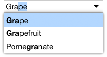
That flexibility lets us quickly adapt the combo box pattern to new contexts. For example, we created a FilterListBox that filters its items to: a) show only those items that match a text query string, and b) highlights the matching portion of the item text. We can then drop that FilterListBox into the list role of a ListComboBox and, voilà, we get a combo box that can filter items as the user types:
Factoring UI this way lets each component do a great job at its appointed task. In this case, we can take address all the complexity of keyboard support in the generic ComboBox component. You can then use that foundation for great keyboard support in more specialized combo box components.
Recombining components to implement new patterns
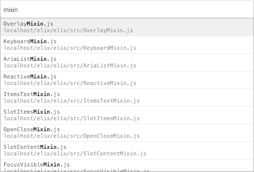
One other benefit of factoring UI this way is that components can be readily recombined to create new variations. A UI pattern that’s become common in development tools is a “list with search”. This pattern lets you quickly open a file or select a command by typing the first few letters, then selecting the best match from a list. Here’s an example from Chrome dev tools:
As you type into the input field, the list of files below is filtered to show only those whose names contain the text string. Moreover, the matching portion of the file name is highlighted.
We can quickly reproduce this general UI pattern as a web component by taking the AutoCompleteInput and FilterListBox described above, and wiring them together to create ListWithSearch:
This is an in-place variation of the FilterComboBox we saw earlier. ListWithSearch is useful in cases where the user is completely focused on selecting an item from a large set. That task focus permits us to place the input and list in situ, instead of needing to save space by hiding the list behind the popup. The user can apprehend the purpose of the UI elements more quickly, and can complete their task in fewer steps.
DropdownList for a MenuButton variation that’s effectively a completely customizable <select> element.
We want all these menu components to feel as polished and natural as native OS menus. Native menus have a number of subtle details, and getting the UI details right turns out to be outrageously complex. Menus are a good example of the fractal nature of UI design.
Menu positioning
Just to get started, we need to be able to position a menu with respect to a source button.
On desktop, a menu should open on mouse down, not mouse up. This feels faster. It also, as described in more detail below, allows the user to possibly select a menu item in a single drag operation.
Only primary mousedown events should be considered. The menu should not appear on a right-click, since we want the user to still have access to the browser’s own context menu.
The menu should appear in the desired direction if there’s room in that direction. If there isn’t and there’s room in the opposite direction, it should appear in that opposite direction. But if there isn’t room in that direction either, it’s preferable to show the menu in the original direction and constrain its height. (This can force scrolling.) Note that OS menus can extend outside a source window’s boundaries but web components, like all HTML elements, are not allowed to extend outside the document viewport.
The calculation of whether the menu will fit can’t happen until the menu has actually rendered (many factors can influence the layout of the menu), but we don’t want to let the menu be visible until we know which direction we want to use. So we layout the menu once while its invisible, see if it fits, move it to the desired position, then render it again to make it visible.
Calculations of whether the menu fits in a particular direction are affected by the scroll position of the document.
To complicate things, we’ll want to put the keyboard focus in the menu — but moving the keyboard focus can cause scrolling as a side effect. (This is especially true in Safari, whose focus method doesn’t yet support the focusOptions parameter.) So we’ll have to complete all our menu layout and rendering before we try to move the focus into the menu.
Because these positioning rules generally apply to all popups invoked from buttons — not just menus, but also things like combo boxes — we’ve enshrined responsibility for position popups relative to a source button in a general-purpose PopupSource class.
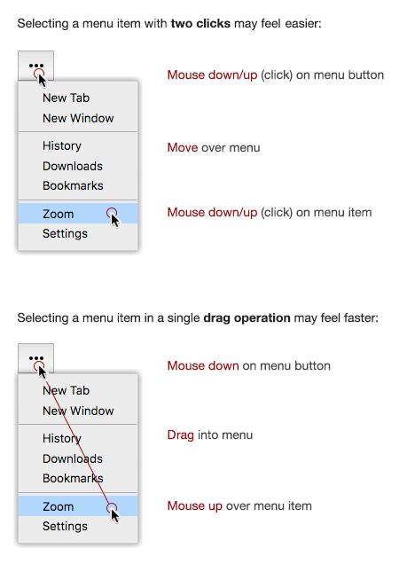
Two ways of selecting a menu command with a mouse
Most people have probably never noticed there are two different ways of using a mouse to select an item from an OS menu:
Nearly every web menu handles only the first method: selecting a menu item in two clicks. But both macOS and Windows support selecting menu items in a drag operation, which can feel faster and more responsive. If you’re reading this on a laptop, try using your mouse/trackpad now to select a browser menu command using both approaches. Observe the different feel of the two approaches. Which do you normally use?
(I seem to recall that the original Mac OS supported only menu selection with a drag, while Windows supported both methods. Windows generally had better keyboard support for menu navigation, and once Windows engineers allowed the user to pop up a menu with the keyboard and keep it open, it was probably easy for them to support the two-click method.)
The two-click method is trivial to implement, but if we want to achieve the same usability of an OS menu, we’ll want to also support the drag method. That’s hard to do, which is probably why most web apps don’t support it. (The various Google Suite apps are a notable exception.) A few of the more interesting problems:
If the user mouses down, then moves the mouse away from the menu button and its associated menu, and then releases the mouse over the page background, the menu should be dismissed.
Once the user drags into the menu with the mouse down, we want to automatically select the menu item underneath the mouse. However, those item can’t get mouse events yet — the user still has the mouse down, so all mouse events are still targeted at the button that invoked the menu. We’ll need to listen to mousemove on the menu button and do our own hit-testing to figure out whether the user is currently dragging the mouse over a menu item — and, if so, select that item.
If the user mouses down and then moves the mouse completely off the page, our menu button component will never receive a mouseup event. So we’ll need to listen to mouseup events on the document too.
If the user mouses down, then releases the mouse over interior menu padding or a disabled item like a menu separator, the menu should also be dismissed.
However, if the user opens the menu with a click (in the two-click approach), a subsequent click on interior menu padding or a menu separator should be absorbed and not close the menu.
This is all hard, but still doable, so we’re giving it our best shot. If you’re on a laptop, try opening our MenuButton demo and confirming that the menu component feels like an OS menu.
For completeness, I should point out that many web menus also handle an additional means of selecting a menu item with a mouse: the menu opens on hover, after which the user only needs to click once on the desired menu item. I hesitate to mention that approach, however. It’s my personal belief that hover menus are a usability disaster: they invariably appear when they’re not wanted, and disappear when they are wanted. The hover approach does have a distinct advantage, in that it lets the top-level menu heading itself serve as a clickable link. But I think that advantage comes at a steep usability cost.
Menus on mobile
Our two-click approach for menus should generally work on mobile devices, with some minor changes. Generally speaking, mobile menus appear when a tap ends and force use of the two-click method described above. To ensure the menu responds instantaneously, we must enable fast-tap behavior by applying the CSS touch-action: manipulation to the relevant elements.
If reading this on your phone, try opening our MenuButton demo and tap around. The menu should both appear and disappear as soon as you complete a tap.
Keyboard support and accessibility
As with all Elix components, we strive for excellent keyboard support. This benefits all users that want to use a keyboard and improves universal accessibility.
We allow users to invoke a menu button by pressing Space. The user can navigate the items in the resulting Menu with the full set of keyboard navigation keys supported by KeyboardDirectionMixin, KeyboardPagedSelectionMixin, and KeyboardPrefixSelectionMixin. Without writing any new code, those mixins give Menu support for Up/Down keys, Page Up/Page Down keys, Home/End keys, and prefix selection (e.g., type “Z” to select “Zoom”).
In making our menu components accessible via ARIA, we were helped by this excellent Inclusive Components article on Menus & Menu Buttons. The whole Inclusive Components series is worth a read.
While our Menu component generally behaves like our ListBox, the accessibility rules for menus are different than lists. The role attributes involved are different, for one thing. Another way in which menu accessibility is different than that for lists is that the overall list element can take the keyboard focus, whereas the browser expects a menu to put the keyboard focus on an individual menu item.
Happily, our mixin-based approach to components was hugely helpful in letting us create a Menu component that worked mostly like our ListBox component, but with some differences. Rather than subclassing ListBox or creating a common base class (as we might have in a traditional class hierarchy), we simply copied over the set of mixins ListBox was using, dropped the ones we didn’t need, and then created an AriaMenuMixin for menus to replace the AriaListMixin which ListBox needs. We end up with a Menu that cleanly shares 90% of the code from ListBox without any class hierarchy entanglements.
Customizability
For styling and general customizability, all these menus components have replaceable parts. So you can use a MenuButton, but swap out the elements it uses by default with our own custom elements. You could:
Have your menus show a semi-opaque backdrop over the page that’s themed with your brand color.
Change the popup (menu) portion so that the menu animates in with a sliding effect.
Replace the Menu that contains the menu items with an element that lays out items as pie slices instead of the usual vertical orientation.
Bonus: a customizable select element
With our MenuButton component in hand, it was easy to create a DropdownList variation that shows the selected value as the menu button’s label. When the user makes a selection from the menu, the button label updates to match.
This effectively lets you use DropdownList as a customizable version of the built-in HTML <select> element. The native <select> can only cope with text choices, but DropdownList can handle arbitrary content — including custom elements, of course — as content in both the menu button and the menu items. See this customized dropdown list demo for an example.
Interestingly, the native <select> is a place where some users may use the drag-to-select method to make a selection — even if they’re the type of user that normally selects from an app’s menu bar using the two-click method. In other words, all the work we did to build a menu button with great mouse support also makes it possible for us to deliver a dropdown list (<select>) with great mouse support.
These details are a pain!
Getting all these details correct takes far too much time. Which is precisely why no app team should try to build a menu component from scratch! The only sane way to achieve OS-quality menu components for web apps is to share code — to pour the attention of an open component library community into menu components that everyone can use. That is why Elix exists.
We’re getting much closer to a world where we can create sophisticated applications from widely reusable, general-purpose user interface components. We’re still not there — it might be another 5–10 years before that world comes to pass. But we can imagine what software development will be like once that’s happened.
Here in the year 2028, we’re lucky to share enormous public collections of reusable components implementing every user interface pattern under the sun. Every old-school UI technique you can think of — menus, carousels, shopping carts, Pull to Refresh, plus all the cool stuff that was invented in the 2020s — everything you need is already coded for you!
Just think of how good we have it now:
Designers and devs readily adopt common UI patterns without hesitation. They never wonder how hard it will be for the team to implement a pre-existing UI, because they can always find a rock-solid implementation of it in the comprehensive component libraries.
We see constant experimentation. Because switching to a different pattern is trivial, designers play with and test multiple ideas before settling on a solution.
Visual design tools let us work with palettes of UI patterns. These days, it goes without saying that designers and developers collaborate directly on the same artifacts that define an app. But it wasn’t that long ago that designers would create static design images or limited prototypes, and developers would laboriously translate those to running code. (Honest, they really had to do that!) These days, our design tools can edit the front end definition directly. Not only that, they provide integrated access to catalogs of UI patterns as components. Adding or modifying complex interactions can now be accomplished through drag-and-drop. That shift dramatically accelerated development, further encouraged experimentation, and generally made designing a blast.
You see a lot more variation in common patterns than one saw in the 2010s. It used to that variation came about almost accidentally because people had to implement patterns from scratch. Now designers and devs create variations when they want to. They can extensively customize generic components or build new variations that reuse substantial behavior from existing generic components. Even complex patterns can be adapted to new contexts and still retain much of their reusable value.
We’ve seen a burst of domain-specific innovation. Because teams no longer waste time reinventing wheels, they now focus primarily on their business domain’s specific challenges and their app’s unique value. We’ve also seen the introduction of large domain-specific pattern libraries for specific industries. The apps we use now are far, far better as a result.
Fewer people are required to design and implement basic UI.
You probably create UIs alongside many people with deep expertise in fields other than UI design. Once working with UI building blocks became easy enough, more people could do it, which opened up the field to a huge number of new participants.
If you’re young, you may not even remember a time when companies had to build their product UI multiple times for different OS platforms. What a colossal waste of time and money that was!
Good ideas now spread faster. When the Thought Crystals user interface pattern first appeared in beta in April 2025, the creator contributed a solid reusable implementation, and it spread like wildfire. By May, the new pattern had completed displaced VR hamburger menus.
Common patterns have been extensively studied and documented. For any given pattern, you can access a wealth of academic and industrial research about it: the precise circumstances where it is most useful, metrics showing where how and why it goes wrong, comprehensive galleries showing the pattern in actual use, and suggestions for best practices in specific contexts.
Coded patterns gave us all a consistent vocabulary that reflected both user experience and developer implementation. Once we had real implementations of all the common patterns, everyone building apps could talk about UI the same way.
We rarely come across apps with terrible UI fundamentals. Back in the day, one could hardly shop online without constantly tripping over aggravating menus, intrusive dialogs, and flaky carousels. Ignorant companies today still produce bad apps with bad designs, of course, but at least the fundamental interactions in those apps still meet a decent quality bar.
People with permanent or temporary disabilities have better experiences across the board. At minimum, an app’s fundamental UI provides a higher baseline of reasonable interaction than one typically found in 2018.
Branded user experiences have become far more immersive. Corporations customize UI in a deep way, far beyond theming fonts or colors. They adapt all aspects of interaction: the types and speeds of animated effects and sounds, the quality of voice dialogs, the tightly-focused microbrands for specific markets, and the general personality of a UI’s construction. Even boring apps today in 2028 exhibit the same degree of pizzazz as games did back in 2018.
You now design some aspects of your apps at a meta-level. For certain UI problem domains, you can just specify the general parameters of the problem, and let the system make limited decisions about the best UI pattern for the situation. Sophisticated apps now use AI to track user behavior and adapt which patterns are used in real time.
While the component implementations in our universal pattern library have been rewritten several times over, the patterns themselves have proved quite durable. While we now use much better frameworks that were available in 2018, the patterns themselves are timeless. When we saw major shifts in programming languages and techniques in the early 2020s and again in 2025, it was relatively easy to upgrade the patterns and the apps which depended on them.
Isn’t user experience design in 2028 great? It’s interesting to realize that all the benefits above were already possible 10 years ago — we just didn’t realize it. All it took was for us to recognize the value of implementing common UI patterns as reusable components and start really sharing them.
While updating our Component Kitchen site to incorporate the Elix web component documentation, we replaced our server-side use of Preact with template literals for JSX. The result works well and could be applied in many situations, so we describe the solution here in case others are interested in trying it.
Some pros and cons of JSX on the server
Back in 2016, we decided to use plain JavaScript functions to render page content. We really liked that straightforward approach, but we eventually shifted to using JSX because the code was easier to read. The use of components as tags in JSX makes it easier to see how the page is being constructed, and code editors that apply syntax highlighting to HTML/JSX make it easier to spot simple mistakes (missing end quotes, etc.).
But using Preact on the server felt like more architecture than we needed. We’d construct a component, render it immediately to a string, then throw it away. So Preact’s support for lifecycle methods and incremental rendering were all extraneous. And using JSX in our Node code base added a compile step we wouldn’t have otherwise needed. Finally, we had to go through some gyrations to asynchronously collect the data a page needed before we could tell Preact to render the content.
Using template literals
With the advent of template literal languages like hyperHTML and lit-html, we wanted to get back to the stripped-down simplicity of plain strings while incorporating the benefits of JSX legibility.
The result is a small template literal library we call litJSX. It lets us concisely use JSX-like syntax in template literals that combine static content and dynamic content to create strings. All parsing is done at runtime; there’s no build step. Parsing is fast, and because we’re using template literals, parsing of the static content is only done once per unique template string.
Our components are all just JavaScript functions that take a properties object and return a string.
With any system along these lines, it’s necessary to tell the template literal function what JavaScript class names it should expect to find in the strings we give it. Some JSX template literal libraries like t7 handle this by setting configuration options on the parser.
In our case, we designed litJSX as a generator of custom template literal functions. You feed it a set of classes, and it hands back a custom template literal that recognizes those classes.
The second line above creates a custom template literal called html. We tell it that if it sees the strings “Bold” or “Greet” in a tag, then it should invoke the JavaScript functions Bold and Greet, respectively.
Simply naming our template literal function “html” lets code editor extensions for syntax highlighting know they should parse and decorate the template contents as either HTML or JSX. So we get the design-time legibility and error-checking we were after.
Server-side rendering
On the server, we write our top-level page components as functions that accept an HTTP request object and use litJSX template literals to return a string result.
Server-side pages often need to perform asynchronous work before they can return a response, so we designed litJSX to handle components which are async functions. If any component in the JSX is async (returns a Promise), the tagged template literal itself returns a Promise for the final, complete result. This lets you create async component functions and await the final template result.
asyncfunctionGreetUser(props) {
const user = awaitgetUser(props.id); // Some async function to get datareturn html`Hello, ${user.name}.`;
}
const html = jsxToTextWith({ GreetUser });
const userId = 1001; // Jane's user idconst text = await html`<GreetUserid="${userId}" />`; // Hello, Jane.
Such async components allow us to cleanly encapsulate the async work performed by specific pages on our site.
Results
We’re now using litJSX to render our entire site. The words you’re reading here have passed through a litJSX template literal! Our server code has gotten more concise and more clearly expresses our intentions, with very minimal library overhead and no build step. So far it’s holding up well.
Two months after releasing version 1.0 of Elix, we’re happy to announce version 2.0.
The main focus of this release is a new paradigm for customizing components in which complex component can expose internal elements as configurable properties. You can control the appearance and behavior of such a complex component by handing it other components it will use internally to fill various roles.
This paradigm lets us unify components that had previously been distinct, implementing them with reusable, shared code. For example, by default the Elix Carousel shows little dots along the bottom:
(Tap/click for live demo)
We can override those dots and tell the carousel component to use thumbnails for that role instead, producing a new CarouselWithThumbnails component:
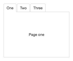
As another example, the Elix Tabs supplies a default style with a classic rounded tab look:
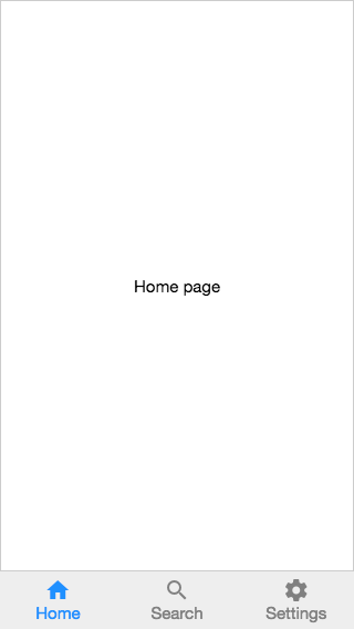
It’s easy enough to supply a custom button to fill that same tab button role, as in this Tabs instance used as the organizing navigation element in a mobile app:
If you click the image through to the live demo, you’ll see that the main “stage” element for this navigation UI has also been changed. Tabs has a main stage that shows a single tab panel at a time. By default, Tabs uses a simple Modes component as its stage. But this stage can be replaced with another element like SlidingStage, which not only adds a sliding transition, but also support for touch/trackpad gestures to move between tabs.
That’s a level of customization far beyond what’s feasible in CSS. By using one custom element as a parameter to another, we can efficiently create different expressions of fundamental UI patterns.
But as we built Elix 2.0, we realized we could take this idea of customization through custom elements as parameters a lot further.
The mind-blowing part
When viewed at the right level of abstraction, all of the component examples shown above are the same component. These carousels and tabbed UIs don’t look alike, but at a logical level, these UI patterns both share core behavior:
Both present a main stage showing a single item (an image or tab panel) at a time.
Both present a list of smaller proxies for those items (dots/thumbnails or tab buttons) that can be clicked to select the corresponding item on the main stage.
Both can be implemented so that they can generate a default set of such proxy elements for each corresponding item (i.e., a default dot/thumbnail for each image/panel).
All of those parts — the stage, the list of proxy elements, the proxy elements themselves — are configurable via properties.
By separating logical roles and relationships from particular DOM representations, we can find new opportunties to efficiently reuse code. Elix 2.0 delivers the shared behavior for the UI patterns above in a new component called Explorer. That can be configured on a per-element basis, or subclassed to bake the customizations in, as with the component classes showcased above.
We’ve applied the same configuration paradigm to the Elix set of overlay elements, so that Dialog, Drawer, and Popup are all built around a configurable Overlay core. We expect we’ll find opportunities to use this same pattern in many other places.
Building components around extensively configurable components like this means we can handle subtleties like accessibility and keyboard support in a consistent way, allowing us to deliver a higher-quality and more usable result. It also means that you can readily adapt Elix components for the unique needs of your application, including extensive possibilities for branding.
We’ve recently been trying a new way to let devs customize complex web components: let a component accept parameters for the custom elements that should be used inside the component’s template.
A while back we indicated that we noted that it’s hard to style web components, and that we’ve been using subclassing as a partial solution. Using custom elements themselves as parameters to more complex components opens up new possibilities for styling, as well as interesting new possibilities for customizing behavior.
Example
Suppose we have a simple spin box:
This component has two <button> elements inside its shadow. Suppose we construct this shadow from a template defined by a string:
How do we let a developer customize those buttons? As noted in the first post linked above, the whole point of Shadow DOM is to encapsulate styles, so we can’t directly style those buttons from the outside. And while there eventually be a standard way to style across a Shadow DOM boundary, that won’t be available any time soon.
But if we’re constructing the shadow from a string, we can simply let a dev insert whatever element they’d like as the “button” element in the above template.
Exposing a component parameter to accept another custom element
That’s easy to arrange. We define a buttonTag property that can be set on a spin box at any point before the component’s connectedCallback runs:
const buttonTagKey = Symbol();

class SpinBox extends HTMLElement {

  constructor() {
    super();
    this.defaultButtonTag = 'button';
  }

  get buttonTag() {
    return this[buttonTagKey] || this.defaultButtonTag;
  }
  set buttonTag(buttonTag) {
    this[buttonTagKey] = buttonTag;
  }

  /* Plus rendering code, etc... */
}
The spin box component can then use this property as a parameter in its template, instead of hard-coding <button>:
So by default the template looks like the original one above, and shows button elements for the arrows. But now you can pass a custom element tag to a spin box instance and ask that it be used instead.
A developer who wants to use custom buttons in this spin box starts by creating a standalone custom button by any means:
They register this as a custom element, then supply the name of the custom element to a spin box instance:
<spin-box button-tag="custom-button"></spin-box>
and the spin box will use that to construct a template that includes custom-button:
Advantages of making components customizable this way
A developer who customizes a spin box component this way doesn’t need to know everything about the internals of the spin box; they just make a button. (To create a good button, they can use the Elix WrappedStandardElement utility class.) Because the spin box will use the button in the right place, the button will get the right positioning and have all the right event handlers to ensure interaction with the rest of the spin box.
This kind of indirection is roughly analogous to a function that accepts another function as a parameter. In this case, we’re creating a custom element that accepts another custom element as a parameter. Complex components can expose as many element parameters as necessary.
This approach works with any web component system that can cope with a tag name that’s specified at runtime. Elix components generally use string templates (as shown above), in which case parameterizing the template is a simple matter. While React components are not (generally) web components, React has long supported similar dynamic construction of a component tree, since a JSX tag name can be a JavaScript class, and that class can be supplied as a component parameter.
Because the core unit of customization is an element, it can do anything! For example, we can create a custom button element that generates mousedown events repeatedly when the user holds down the button. This lets someone customize the spin box in ways that go far beyond what the spin box’s creator can anticipate. (See the demo page for an example.)
Summary:
A dev doesn’t have to learn a new styling/theming system. They create their custom elements however they want: in plain JS, using Elix, Stencil, Polymer, whatever.
All the styling they want gets baked into their custom element, and will show up at the right point in the Shadow DOM. So this slips past all the challenges of styling components from the outside. At the same time, just as the Shadow DOM boundary prevents accidental style interference between the outer page and a component, it can likewise prevent accidental style interference between a complex component and any custom elements passed into it as parameters.
We don’t have to invent a new way of naming or registering these customizations: they’re just custom elements registered with customElements.define().
Customization can go far beyond what’s possible with CSS Custom Properties, and even beyond what would be possible with the proposed ::part and ::theme syntax for CSS.
Customization can be done on a per-instance basis or by creating new classes.
All of this works in Shadow DOM v1 and Custom Elements v1. You can do this right now.
We’re excited to announce that the Elix project we lead has reached its v1.0.0 milestone.
This represents the culmination of over a year of work to create a great set of high-quality, general-purpose web components for common user interface patterns. These include:
SlidingCarousel: a full-featured carousel for images and other elements that includes navigation with touch, a mouse, a keyboard, or a trackpad, as well as accessibility support.
Drawer: a panel that slides in to temporarily present navigation or other UI elements. Includes touch support to swipe the drawer away.
Tabs: useful for classic tabbed UIs or configurable for such patterns as tabbed navigation toolbars.
Beyond the project’s technology, we’re also proud to be managing the project with an open governance model that includes regular core team discussions and an open Request for Comments process.
The project is already hard at work on its 2.0 release. A big focus for that release will be a system for thoroughly customizing the appearance and behavior of the key parts inside a component.