Building a great combo box component is so much trickier than you'd think
Combo boxes are hard to implement well. At the most abstract level, a combo box combines a text input with a button that can invoke a popup. The popup contains a list or other data-entry element:
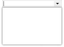
But even this simple visual arrangement hides many complexities. A while ago we shared the challenges building a great menu component, so we thought we’d offer a similar look at the many issues faced as we added a new family of ComboBox components to the Elix web components library.
Keyboard focus challenges
Keyboard focus proves to be one of the most challenging aspects of writing good general-purpose web components:
- The browser primitives for working with focus predate Shadow DOM, and there are still odd edge cases. In our work on ComboBox, we hit an issue that turned out to be a bug in both Chrome and Safari.
- Keyboard focus and keyboard input are generally difficult to test in an automated way. Synthetic keyboard events rarely work in a manner that’s identical to real keyboard events triggered by user activity.
- The imperative nature of the
focus()method to set focus doesn’t mesh well with a contemporary functional-reactive approach to rendering UI. You have to apply focus after rendering (incomponentDidUpdateor something like it), which can lead to timing issues. - Mobile focus behavior can differ from desktop focus behavior.
Beyond these points, very similar UI patterns may call for focus to be handled quite differently, making it tricky to establish reusable baseline behavior.
Where should the focus go in a combo box?
Handling keyboard focus for a combo box is particularly hard, because there are multiple potentially focusable elements. For a combo box containing a list, we want to keep the keyboard focus on the text input element, but the user may also want keys to navigate selection in the list.
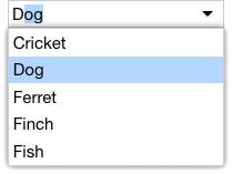
If the user presses the Left or Right arrow, they most likely want to move the insertion point to the left or right. However, if they press the Up or Down arrow, it’s reasonable to assume they want to move to the previous or next selection in the list.
Moreover, the user wants to seamlessly move back and forth between typing and navigating.
- If they type a few letters, then see the desired item appear in the list, they want to immediately press the Down arrow key to get there, without first having to tab to the list.
- Likewise, if the user’s navigating the list, that populates the input field. When the input field holds a value the user wants to edit, they should be able to start typing immediately, without having to Shift+Tab to move the focus back to the input.
Given these constraints, it seems best to always keep the keyboard focus on the input element. That means we need to listen for keystrokes that seem meant for the list (like Up, Down, Page Up, and Page Down) and tell the the list what to do via method calls. If the user clicks on the popup, we’ll let that click do whatever it would normally do (like select the clicked item), then ensure the focus is still on the input.
Controlling the input and popup with the keyboard
Keeping the focus on the input makes managing the popup harder. We usually want a popup to implicitly close if it loses focus, but in this case we won’t give the popup the focus at all.
We also face some odd challenges on mobile:
- In native apps, lightweight popups like combo boxes usually go away when the user resizes the window. But in Chrome for Android, moving the focus to the combo box will invoke the on-screen keyboard — which resizes the viewport, which closes our popup. We had to allow our underlying PopupModalityMixin to optionally allow window resizing while a popup is open.
- When Safari displays its on-screen keyboard, it doesn’t give the app any way of knowing that the keyboard’s open; the app still thinks the page hasn’t changed size. That means a combo box on Safari can’t automatically confine itself to the available real estate. A dropdown combo box on a mobile device isn’t a particularly common pattern, but it’s still disappointing that Safari can’t support it better.
- If you tap the page background when a combo box is open, you probably want the combo box to close. That’s the natural analogue to clicking the page background to dismiss a combo box on a desktop browser. Chrome for Android does this correctly, but Safari appears to only put the keyboard away if you explicitly tap the keyboard’s Done button or tap some other focusable page element.
Auto-complete
Auto-complete is a common feature in combo boxes with lists. That feature is useful in other contexts, too, so we’ve implemented auto-complete in an AutoCompleteInput that we can use elsewhere.
Auto-complete presents its own challenges:
- Auto-complete should happen on keydown for the best response. But when the user types a key, we get an input’s
keydownevent before the input’s default behavior actually adds the key to the text. That makes it hard to know what text to use for auto-complete. We could try to speculatively construct the text, based on the current text, the current key being pressed, and the state of the insertion point and selection. But that’s not trivial, and forces us to reproduce native behavior. - A particularly weird issue we encountered was Chrome for Android, which mysteriously sends
keydownevents withkeyCodeequal to the magic value 229, regardless of what key was actually pressed. That’s really annoying, and effectively rules out doing anything useful onkeydown. - Instead, we listen to the
inputevent. That’s a safer option — the event is only generated after the new key has been reflected in the input’svalueproperty. - However, the
inputevent also behaves weirdly on mobile browsers. For example, the default Gboard keyboard on Android will send more than one input event for a single keypress! It’s hard to interpret what’s going on, but it seems related to Gboard’s own AutoComplete behavior. Maybe we can turn off Gboard’s AutoComplete behavior by setting theautocompleteattribute tooff? “Hahaha, nope!” says Gboard. Other Android keyboards have their own quirks. - The bottom line is that mobile keyboards generally presume that the text in an input isn’t going to change underneath them as the user’s typing. When we try to append auto-completed text to the input during a keystroke, the on-screen keyboard gets really confused.
- We eventually worked around these issues by debouncing
inputevents and giving the input a chance to settle down before looking at the latest value. That creates timing problems, but seems the best we can do. - We also need to take pains to only try to auto-complete text if the user’s typing at the end of the input box.
If we do manage to match the user’s input against a known list of text choices, we auto-complete the input text, and then leave the auto-completed portion of the text selected. If the user wants to enter something else, they can just keep typing, and that’ll automatically overwrite the selected (i.e., auto-completed) text.
Accessibility
We try as hard as we can to do an exemplary job supporting universal access in the Elix web components, including ARIA recommendations for combo boxes. A combo box, unfortunately, appears to hit the limits of what’s currently possible in web component accessibility.
- As with other kinds of wrapped input elements, it’s hard to have an
aria-labelon a complex component like our combo box. The app developer can only setaria-labelon the outer combo box, because that’s all that’s visible to them. We can forward this value to the inner input element. But that means the DOM tree ends up with aaria-labelon both the outer combo box and the inner input element. The screen reader sees that label twice in the accessibility tree, and so will confusingly read the label twice. - Many ARIA attributes take an ID reference, but ID references don’t work across the Shadow DOM boundary. If you try to set
aria-labelledbyon the outer ComboBox, and that gets delegated to the input hiding inside the ComboBox’s shadow, that input can’t find the corresponding label sitting outside in the light DOM. - A more complex example of the above issue is that, in theory, both the wrapping combo box and the inner input need a way to reference the list of choices: the ComboBox should set
aria-ownsand the input should setaria-controlsandaria-activedescendant. But again, it’s impossible for elements in shadow to reference IDs in light DOM, or vice versa.
For the time being, we do the best we can, and hope that the W3C Accessibility Object Model will open up the possibility of better accessibility.
Making ComboBox as general-purpose as possible
Our goal with ComboBox is to provide a solid general-purpose combo box class that can be used for any combination of a text input with a popup. The element featured in the combo box’s popup could be a list, or a calendar, or anything else.
To accommodate this level of flexibility, we’ve defined roles for our ComboBox family. Each role is filled by another component. For example, the base ComboBox class defines an input role that you can fill with any input-like element that should be shown in the combo box. By default, this role is filled with a standard <input> element, but you use other input elements in that role. Our AutoCompleteComboBox uses the aforementioned AutoCompleteInput, letting a combo box easily pick up auto-complete support.
So a ComboBox is being defined as quite an abstract thing: it has an input-like element, a button to toggle the popup, and the popup itself. Everything else — auto-complete behavior, the use of a list in the popup, and so on — is defined in more specialized component classes.
That flexibility lets us quickly adapt the combo box pattern to new contexts. For example, we created a FilterListBox that filters its items to: a) show only those items that match a text query string, and b) highlights the matching portion of the item text. We can then drop that FilterListBox into the list role of a ListComboBox and, voilà, we get a combo box that can filter items as the user types:
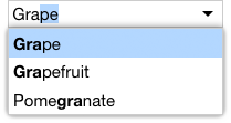
Factoring UI this way lets each component do a great job at its appointed task. In this case, we can take address all the complexity of keyboard support in the generic ComboBox component. You can then use that foundation for great keyboard support in more specialized combo box components.
Recombining components to implement new patterns
One other benefit of factoring UI this way is that components can be readily recombined to create new variations. A UI pattern that’s become common in development tools is a “list with search”. This pattern lets you quickly open a file or select a command by typing the first few letters, then selecting the best match from a list. Here’s an example from Chrome dev tools:
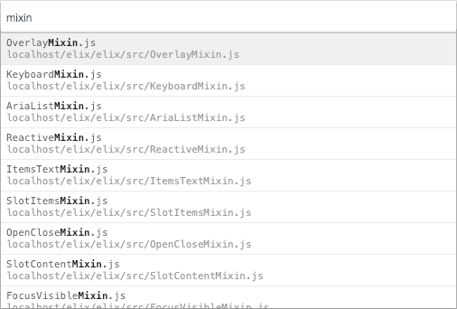
As you type into the input field, the list of files below is filtered to show only those whose names contain the text string. Moreover, the matching portion of the file name is highlighted.
We can quickly reproduce this general UI pattern as a web component by taking the AutoCompleteInput and FilterListBox described above, and wiring them together to create ListWithSearch:
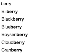
This is an in-place variation of the FilterComboBox we saw earlier. ListWithSearch is useful in cases where the user is completely focused on selecting an item from a large set. That task focus permits us to place the input and list in situ, instead of needing to save space by hiding the list behind the popup. The user can apprehend the purpose of the UI elements more quickly, and can complete their task in fewer steps.