Outlook's clever modeless delivery of useful info
Microsoft Outlook, a dyed-in-the-wool client app, makes very effective use of a certain UI technique that comes up more often on web sites: whenever Outlook has additional information to communicate to the user, it does so in a modeless way by making room for the information in the window the user is working in.
For example, if you’re scheduling an appointment over a time interval that contains other appointments, Outlook lets you know in a status area near the top of the main appointment window:
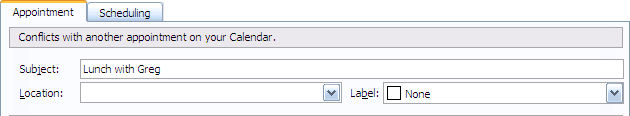
The "Conflicts with another appointment" message works so well because the information, which is clearly salient to the current situation, is delivered in a modeless way. A less thoughtfully designed client app would pop up a modal dialog to communicate the same information, getting in the way of the user and forcing them to dismiss the dialog before they could fix the problem.
That web sites handle feedback modelessly is taken for granted. Virtually all feedback regarding field validation in a web form is dealt with this way, typically as red text adjacent to the fields that require re-entry. A Win32 application like Outlook has to do more work than a web site to achieve the same effect, because Win32’s facilities for layout are so primitive that the designers and developers have to handle all the layout themselves. Nevertheless, this isn’t rocket science, and the technique is so useful that more app designers should consider adopting it.