Apps often need to ask users questions during long operations like
installation or file copying. Whenever possible, it’s good to front-load these
questions whenever possible. It’s irritating to walk away from a process that
the app says will take an hour, then come back an hour to discover the app’s
only 5% done because it’s waiting for you to answer a simple Yes or No
question.
I was reminded of this again during a hunt for a better file synchronization
utility for Windows. For years I’ve used
Second Copy by Centered Systems, which
has been as a straightforward workhorse, but I thought I’d see what else is
out there now.
As a rule, file synchronization tools have atrocious user interfaces. The
people who really care about the fine points of synchronization or backup tend
to focus on the technical challenges and ignore the greater challenge of
presenting a simple user experience. These products typically have tabbed
dialogs or wizards chock full of options that cover an enormous range of
scenarios. Figuring out how to configure these options to get the product to
do something basic often requires far more time than I’m willing to spend.
I’ve recently tried out a number of products, including
ViceVersa by
TGRMN Software. The UI in ViceVersa is only about average in terms of
simplicity (in other words, not very simple), but they do offer an obvious and
helpful mode that compares the contents of two file systems locations that are
about to be synchronized. This lets you make sure you’ll get the results you
want. I thought the comparison mode was a nice touch, and after reviewing the
results of such a comparison, went ahead and initiated a sync.
The sync ran for many hours, and
restarted so many progress bars
that I lost count. Each phase of the sync process provided an estimate of how
long that phase would take, but as far as I could determine, that estimate was
meaningless because I had no idea how many other phases were yet to come or
long those phases would take. Because the file sync was tying up two machines,
I effectively had no idea when I would regain use of either of them.
This is all par for the course in utility program UIs, but what was
particularly irritating was coming back to the PC the next morning to find a
dialog asking me to confirm that a given file should be overridden. This was
quite disappointing. The application had earlier performed an exhaustive
comparison of the files to be synchronized—for the very purpose of letting me confirm that I wanted to copy or delete
the files as indicated.
If the application wanted to draw my attention to some particularly
questionable operations, it already had essentially all the information it
would need to ask me all of those questions up front. As far as I could tell,
there was virtually nothing that the product would find out later during the
file sync process that it didn’t already know before the sync began. There
could perhaps exist some cases where this wouldn’t be the case (e.g., arising
from files that changed while the operation is in place), but even then the
product should have been able to take some reasonable default course of
action—confirmed in advance if necessary.
The general point here is: when designing UI to support a long operation,
consider whether any questions could potentially arise during the operation,
and strive to move those questions to the point before the operation begins in
earnest. Specifically, let the user know when they should be able to walk away
and come back to find the process complete.
I recall one UI like this that came up a long time ago in Microsoft’s first
email product, Microsoft Mail. (Microsoft Mail, interestingly, was written for
Macintosh computers and ran on AppleTalk networks.) During a certain
operation, the product needed to have the user insert and remove a sequence of
floppy disks. To its credit, the team took incredible pains to: a) order the
disk insertions so as to minimize the number of times during the process that
the user needed to remove one disk and insert another, and b) ensure that the
longest disk operation took place last.
It’s likely that no user ever perceived these refinements to the process, but
I’m sure that some significant number of users were nevertheless saved the
irritation of returning to their desk to discover that their computer was
stuck halfway through, awaiting their return.
One of the most time-consuming tasks in creating a post for this blog is
capturing small images of UI examples. For certain jobs, Cropper lets me
perform this task more quickly than other tools I’ve used. (SnagIt, for example, has grown somewhat ponderous for my needs.) Cropper’s
alpha-blended overlay technique for marking the crop boundaries is elegant,
and its keyboard support allows you to tweak the position and size of the
captured image.
Sites adopting AJAX and other interactive techniques are increasingly giving
users the ability to express preferences or change settings in situ,
without having to navigate to a separate page just to change the way things
work. This direction seems promising, but until standards emerge it’s also
fraught with the potential to confuse users or simply get in the way.
The wiki vendor JotSpot, for example, allows a user to rename a page by
hovering over the page title:
An earlier generation of web sites required the user to travel to another page
to make such an edit in the text box of a web form, then submit their changes.
Here the interactivity is lightweight and allows for quicker changes.
In a similar vein, various web portals let the user personalize the look and
content of their home page by directly interacting with page content. The
customziable Google home page puts
links in the corner of each blurb to customize the blurb’s size or remove the
blurb entirely:
To my recollection, MSN was one of the first portals (if not the first) to
offer lightweight editing on its own
customizable home page. This interactivity is
still there today, albeit with some heavy visuals and advertising:
The main issue with all such lightweight editing facilities is the possibility
of interfering with the average user’s use of the product. If the user is just
trying to read something, the editing controls can be distracting. At worse,
they can throw the user into a mode that they didn’t want to be in—or into a
mode they’re not even aware they’re in. The situation will improve as more
conventions emerge for lightweight editing of page content, but until then
it’s worth incorporating such interactivity cautiously.
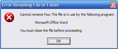
It’s odd that virtually all document editors still prevent the user from
changing the name of the file they’re working on. This is a shame, because
it’s a common user task.
A user may start writing a new document, save it under one name, and then as
the document evolves come to realize that another name would be more
appropriate. There’s usually no good way to do this inside the application, so
they struggle through workarounds like saving the file under a new name and
then digging around in the file system to delete the file with the old name.
The operating system usually doesn’t offer much help either:
The main reason most applications don’t support this is because most platforms
don’t make it easy—and the main reason platforms don’t make this easy is
because most applications don’t think they need to support the feature. Alan
Cooper vented about this problem in
About Face, and it’s still a widespread problem today.
There are a few applications enlightened enough to let you rename an open
file. Microsoft Visual Studio, for example, handles this without complaint.
Interestingly, Microsoft Word used to support this—but only in the Macintosh
version years ago, before its user interface was realigned for consistency
with the Windows version.
It’s almost impossible to get problems like this fixed in an application, let
alone the operating system. Unless customers complain about this, no one wants
to tackle the problem—and by now most people have grown too used to working
around the problem.
The new Google Local for Mobile is a
compelling little demonstration of what a Java cell phone applet can do. It’s
carefully tuned to the constraints of cell phone hardware, uses the network
well, and makes good use of the graphic display and local caching.
Google Local for Mobile
The installation process was much easier than I’d expected. Google’s site does
a good job helping you figure out whether your phone will actually run their
applet, which is nice and presumably reduces customer disappointment. The site
directs you to a web page to open on your phone, and offers to SMS you the URL
to save you the trouble of typing it in. The resulting web page sniffs your
browser to determine which download you need, so you only have to make a few
clicks to download and install the applet.
In my case, I had to put up with some very clunky Java applet management UI
produced by the local cell phone OS (controlled by my phone manufacturer, not
Google). For example, the phone asked me to confirm that I wanted to install a
“MIDlet”, whatever the heck that is. I expect most cell phone manufacturers
outsource the utility UI like this to the cheapest bidder, with predictably
poor results.
The Google Local applet itself is simple but quite polished for a phone app.
It feels a lot like Google Maps. The keyboard UI for zooming in and out took
some getting used to. You can read a complete description in the
Google Local tour. The UI
suffers from the fact that the key to zoom in (the OK button, or the center of
the directional pad) is otherwise unrelated to the key you press to zoom out
(a mappable button that labeled here as "Zoom -"). This is a
reasonable trade-off given the small keyset available on a phone, but
nonetheless the lack of conceptual connection between the buttons makes it
hard to learn their relationship. It’s also confusing to see the zoom out
command clearly labeled, when what every user will need to do first is zoom
in. The applet does offer a quick tip on how to zoom.
The zoom UI also has the unusual behavior that setting the zoom level doesn’t
take effect immediately—you can zoom in or out multiple levels, then wait a
second for the new zoom level to kick in. Again, this is a reasonable
trade-off given the bandwidth on a phone, but again this is confusing for the
new user. Now that I know how zooming works, I think it’s elegant, but I
expect a significant number of users will be completely confused and give up
on the applet after a few minutes of failing to successfully zoom around.
Other small points: I was disappointed that Google’s address lookup couldn’t
find my house. I was also disappointed that Google Local couldn’t show me my
approximate location on the map based on info from the cell towers. Finally,
at one point when I switched away from Google Local and then launched it
again, Google Local lost track of the previous map view. It reset the map back
to a high-level country view, forcing me to laboriously re-zoom down to my
local area.
The weakest part of the whole experience in my opinion is that it’s hard to
get back into to the Google Local applet once you’ve left it. This isn’t
really Google’s fault. On my phone (and probably most other phones), Java
applets don’t get their own top-level entry point in the main menu, nor is
there an option to create such an entry point. I have to navigate to a special
Java area first, then launch the Google Local app from there. For me, the
entire navigation sequence in six clicks long, and requires two clicks that
are essentially random (i.e., the UI element doesn’t suggest that clicking it
will lead you closer to a mapping application). The top-level Java area
eventually did show up as a shortcut on a top-level MRU (Most Recently Used)
list, which cut out a few clicks, but that shortcut will age off the MRU list
if I don’t keep using it.
I’ll bet that a big chunk of people who download Google Local won’t be able to
find the applet after the first time they run it, so this single issue of
finding the app’s entry point could be a critical weakness. Convincing cell
phone OS designers to make it easier to launch Java applets is a
chicken-and-egg problem: OS designers won’t do this until there are more
interesting applets like Google Local for Mobile, and app ISVs won’t create a
significant body of interesting cell phone applets unless they can be sure
users can quickly and easily run them.
Nevertheless, my overall reaction to this applet is quite positive. Google
Local for Mobile may become a bellwether entry in the mobile app space, in
much the same way Google Maps broke ground for highly interactive AJAX apps.
This is the first non-game Java app I’ve seen that’s worth downloading. If you
have a Java-capable phone, it’s worth checking out.
I recently came across an elegant demonstration for getting the user to
specify a preference by offering examples to choose from. This technique is
often done with visual settings (e.g., letting a user select a template for a
document by clicking on sample template thumbnails), but in this case, the
technique was applied in letting a user specify a simple textual setting for a
date format.
I’ve been looking at some web sites that help manage To Do lists, including
tadalists.com,
rememberthemilk.com, and
mypimp.com. (Where do they get these names?
The latter could adopt the slogan, "We think having a borderline
offensive name is so funny it’s worth giving up market share!") All these
sites strive to be as interactive as possible, and to some extent they each
struggle with the absence of conventions for entering data on highly
interactive web pages. This has produced some interesting and creative UI
experiments, some of which succeed.
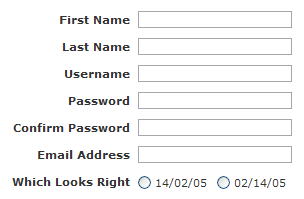
One bit of creativity (albeit in a non-interactive area) shows up in the
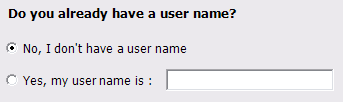
account setup page for rememberthemilk.com:
It’s the last line that caught my attention. The label for the radio buttons
doesn’t even say what you’re picking (preferred date format), but it’s obvious
what you’re supposed to do: pick the sample that shows the date the way you
like it. What’s particularly interesting is that this trick capitalizes on a
person’s ability to recognize patterns at a subconscious level. I live in a
country where the month comes before the date, so the first option
("14/02/05") looks like a jumble of numbers to me, while the second
option ("02/14/05") leaps off the page as a valid date. Presumably
people who live in date-first countries have the opposite reaction.
It may turn out that this trick only works in narrowly constrained
circumstances; perhaps it would stop working, for example, if they needed to
support a broader range of date formats. Nevertheless, it’s impressive that
rememberthemilk is able to ask for something as mundane as a date format in a
manner consistent with the site’s overall casual visual and textual tone.
A European acquaintance once remarked that when they go to an American
restaurant, they feel like they’re "under assault" by the waitstaff:
placing an order requires answering a long series of questions—"Soup or
salad? Italian dressing or Ranch? Lite Italian or Regular Italian?"—and
the waitstaff continues to interrupt them every ten minutes to ask yet more
questions. Some user interfaces can feel like this.
In particular, some applications have commands with UIs that ask too many
questions before the application will actually carry out the command. If you
try to insert a new page into a Microsoft Visio document, you get a form to
fill out:
What you really wanted was a new page, not a form to fill out. The difference
between ordering a salad and inserting a new page is that the restaurant has
to get things right the first time. Once you get the salad, you can’t change
your mind and have them turn the salad into a soup (or, at least, not a very
good soup).
An application, in contrast, can adjust its output after the fact. Good UIs
often eliminate unnecessary up-front questions by doing something in
response to a command and letting you tweak the results if they’re not what
you wanted.
A common example: when you create a new folder in virtually all modern
operating systems, you get a new folder right away. The new folder is called
something like "New Folder". You don’t get a question asking you
what kind of folder you want, what sort of name you’d like to give it, etc.
For this UI to be effective, the OS simply needs to make it easy for you to
rename the new folder once it’s been created.
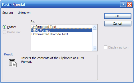
Another example comes from Microsoft Office. In old versions of Office, if you
wanted to paste something from the clipboard that could be pasted in multiple
ways, you had to use an ugly and confusing Paste Special dialog:
Recent releases of Microsoft Office have deprecated this dialog in favor of a
contextual pop-up menu that appears after commands like Paste. If you don’t
like the result of the command, you simply select another result from the
pop-up menu:
Advances like these obviate the need for an application to bug the user with
lots of questions. Other suggestions for streamlining command UI:
If a single command is really providing two features that are only loosely
related, refactor the command UI into two proper commands with their own
entry points.
If you have to ask a question, at least propose a default response and/or
give examples of typical responses.
If you have to present a dialog or wizard, consider employing some form of
elision (an "Advanced…" button, an expando that reveals advanced
options, etc.) to hide the unusual stuff.
Instead of presenting a long sequence of questions, consider presenting a
quick summary of what’s going to happen, and let the user edit just those
parts they want to change.
If you really, really need to display a dialog (e.g., for legal reasons) but
are confident most users won’t actually need to see it each time, offer an
option to skip past the dialog in the future.
Have the basic form of the command do the thing that 95% of your users want,
then let the remaining 5% tune the behavior of that command through an
application option.
If only a tiny number of users would ever answer a question a particular
way, have guts and cut the question altogether. In general, you’re better
off addressing the common needs of a broad set of users than building
special-purpose UI that only ever be used by a few people (especially if
those few people work down the hall from you).
There’s nothing quite like the frustration of trying to keep an application
from helping you. I spent a good chunk of the past weekend trying to figure
out why a UI package was displaying controls at random sizes.
I’m working a Windows client application that’s built on the .NET platform,
with the UI built in Windows Forms. We recently moved from .NET 1.1 to .NET
2.0, and I’ve generally been impressed by the wealth of new UI facilities. In
particular, most controls can now auto-size to a reasonable size (finally!),
and the new TableLayoutPanel and FlowLayoutPanel go a long way towards
building scalable UI in a structured way through the visual designer without
having to hand-code a bunch of layout logic.
The new platform is not without its faults, however, as I discovered when some
custom controls mysteriously changed sizes. I’d create a control with a bunch
of auto-sized elements and nested layout panels, and in the designer
everything would look perfect. I’d build the project, drop the control on to a
form, and the control would look almost right—but the size would be
off by some small, random amount. No amount of inspection could determine why
this was happening, nor could any amount of groveling through the docs.
It turns out that Microsoft Visual Studio 2005 offers yet another attempt to
help ISVs build UIs that scale with respect to the user’s preferred system
font. Scaling UI to assist users who, for example, prefer large fonts is in
principle a great thing. Changing the development paradigm for coping with
this problem in a new product release is not so great.
VS 2005 does so through a new form property called
AutoScaleMode,
although perhaps a more appropriate name for this property might be
AutoMessWithYourHead. Its default value is true. The true value means that
Windows Forms will try to scale your UI with regard to the system
font—although it won’t tell you it’s doing this.
Now that I know what the $#*@% is going on, I can understand why Microsoft
changed this behavior, and it’s at least nice to see them trying to fix this.
The underlying problem is that a modern, complex UI layout package is
essentially a pretty face on top of a recalc engine. As the Microsoft Excel
team learned years ago, in a complex spreadsheet it can be near impossible to
track down why a particular cell value is ending up with the value it does. To
address this very problem, Excel offers a tool that let you visually trace the
origins of any calc.
In the same light, it would be enormously valuable for WYSIWYG HTML editors or
a client UI designers to offer some way to point to a visible element and ask,
"Why is this thing ending up with the position and size that it
has?"
Modern software includes a large and growing class of UIs that in my opinion
has received insufficient formal recognition. UIs in this class share many
traits and are distinctly different from the WIMP UIs of the 1980s and 90s.
The WIMP acronym summarizes the hallmarks of that UI paradigm: WIndows, Icons,
Menus, and a Pointer (usually a mouse pointer). I’ve noticed that I now spend
more and more of my time on UIs that have neither windows, nor icons, nor a
menu bar, nor a pointer. These clearly aren’t WIMP interfaces, so what are
they?
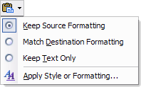
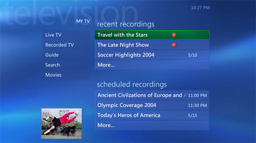
These UIs cross a diverse range of devices and environments. The first UI is
for a media hub that is designed to be displayed on a widescreen TV, viewed
from across a room, and navigated with an IR remote control. The second is for
a kiosk for checking in at airports. Here the display is of average size, but
the UI is negotiated with a touch screen. The third screen comes from a cell
phone. This UI is optimized for a small display size, and is navigated with a
directional pad.
Despite their different origins and contexts, such UIs nevertheless share many
traits. Instead of multiple overlapping windows, the UIs show a single page at
a time that consumes the entire display surface. The user navigates between
pages in the style of a web browser, and can usually navigate backwards via a
Back button. A page almost always presents a single task at a time for the
user to focus on. Often (but not always) the task is stated directly on the
page. Text, not icons, is generally used to guide the user. (If they’re
present at all, the icons play mostly a decorative role.) There are menus, but
not the dropdown sort of menu found in a WIMP UI. Instead, these menus are
lists of buttons that sit directly on the page at all times. In fact, buttons
are by far the most common control found in such UIs.
Finally, there is no free-form pointer, or at least no dependency on one. You
could argue that your fingertip is the pointer in a touch screen UI, but in
practice a well-done touch UI feels completely different to me than a
mouse-driven one. (E.g., in a touch UI, your finger clicks big fat buttons,
with none of the dragging, double-clicking, or right-clicking that pervade
WIMP UIs.) Many of these UIs dispense with a free-form pointer entirely.
Instead, the user drives a keyboard focus around the screen (usually with a
directional pad of arrow buttons) and presses a commit button like OK to
invoke the targeted action.
The commonalities between such UIs are driven by a higher-level fact: they are
meant to help users accomplish very specific tasks immediately, without any
training or up-front learning whatsoever. People generally use them in a
transient way—they get in, do what they need to do (pick a TV show, check in
for a flight, make a call), then get out. Users generally don’t spend more
than a few minutes at a time interacting with the UI proper. Even an SMS-crazy
teen doesn’t live all day inside the phone’s UI the way some people live
inside WIMP environments like Microsoft Excel or Adobe After Effects.
UIs like the ones above form an important class of UI, yet this class seems to
have received little or no formal recognition. I don’t think there’s even a
commonly-accepted term for this paradigm. To facilitate discussions with my
colleagues, I coined the acronym BBOP ("bebop") to refer to such
user interfaces. In the spirit of WIMP, the term BBOP summarizes the
paradigm’s hallmarks:
Buttons (as the predominant control type) Back stack (as a organizing principle for navigation) One Task (one task at a time, often explicitly stated) Page-based (a single page consumes the entire visible screen area)
Once we had a term for this, we began recognizing BBOP UIs in more and more
places: DVD players, in-car navigation systems, iPods, and so on. I’m
personally hoping to see more discussion and analysis of BBOP UIs (or whatever
they end up being called) in the future. Even more, I’m hoping to see better
support in UI platforms for creating them.
Getting UI right requires obsessive attention to detail, particularly if
you’re building on a platform that doesn’t provide substantial help for common
UI patterns. I’ve recently been designing and implementing a minor feature in
a Windows client application, and can’t believe how long it’s taking to get
this feature right. The feature? Remembering the position of an application
window across sessions.
Users like applications that remember the state and position of windows across
application sessions. They can pick a window arrangement they like, close the
app whenever they want, and next time have everything just the way they like
it. In the case of the Microsoft Windows APIs (both Win32 and .NET), the
platform doesn’t provide any built-in support for remembering window position.
The platform documentation blithely tells you to do this work yourself, and
sort of implies it won’t be very hard. Hah.
Here’s what the learning curve looks like during a sequence of
design/implement/test iterations:
Designer: This feature is easy to deliver: when the user closes the window,
we’ll save the window’s current state (on Windows, this is either maximized,
minimized, or normal) and the window’s current position.
User: Huh. This kind of works, but if I close the application while the
window is minimized (sometimes this happens if I log off while I’ve got a
bunch of apps minimized), the next time I start the application, the app
comes up minimized. That’s dumb.
Designer: Okay, we’ll only save the window state and position if the
window’s maximized or normal.
User: That’s better, but sometimes it still doesn’t do the right thing.
If I position the window, then minimize it, then close it, the app doesn’t
remember my window position.
Designer: That’s easy to fix: we’ll always save the window position, but
we’ll only save the window state if the window is normal or maximized.
User: This doesn’t work.
Designer: Ugh. It appears that, if a window is minimized, it’s "window
position" data is essentially junk, and not the window’s last
meaningful position like we’d expected. To fix this, whenever the user
positions the window in its normal state, we’ll remember that position as
the user’s preferred position for the window. Then, when the user closes the
window, we save this preferred position (not the current position, which
could be junk). Additionally, if the window is maximized or normal, we save
the window state too.
User: Not bad! This seems to work most of the time. How about this,
though: I position the window where I want it, then maximize it, then
minimize it, then close it. The next time I open the app, the window is in
the normal state—not the maximized state the I last saw it in. That’s
odd.
Designer: You are one tough customer. Fine: whenever the user puts the
window into the normal or maximized state, we’ll remember this as the
preferred state. Then, when the user closes the window, we save this
preferred state (regardless of what state the window is currently in).
Satisifed?
User: Not by a long shot. You see, I have a laptop. I’ve also got this
external monitor on my desk—a monitor whose dimensions are different than
those of the laptop’s built-in screen. If I close the application when the
laptop is docked, then reopen the application when the laptop is undocked,
the application tries to come up in a position that no longer makes sense.
Sometimes I can’t even get to the window with the mouse because the window
comes up off-screen.
Designer: Crap. Okay, whenever we’re recording the user’s preferred position
for the window, we’ll also save the current dimensions of the monitor
itself. Then, if the app is opening and the monitor’s dimensions have
changed, we’ll do our best to interpolate a meaningful position for the
window in the new monitor dimensions.
User: This helps a bit, but it’s not perfect. Each time I move between
the docked and undocked state, the window position shifts a bit. I really
want the window to be one size when I’m undocked, and a different size
when I’m docked.
Designer: Urg. To do this right, we’ll have to save a window’s position in a
list that stores a monitor’s size and the user’s preferred size for the
window whenever the window is opened on a monitor of that size. Over time,
this list will grow to encompass all monitor sizes the user likes to use,
and their preferred window size for each of these monitor sizes. Satisfied
now?
User: Mostly. Did I mention I recently bought a high DPI monitor? I was
thinking that your window size interpolation routine should take into
account physical screen inches instead of assuming a fixed pixel
size…
Designer: Please, please go away.
And so it goes. Since the OS doesn’t provide any help, every ISV rolls
their own solution for this, with the unsurprising result that they all
stumble in different ways at some point along this path. Most seem get to step
three or so. (Internet Explorer 7.x, for example, has the bug described by the
user after step four.) If someone were willing to bake support for saving
window state into Windows, the work would be leveraged across enough apps that
it’d be worth the time to implement a deep solution. Even then, there’d still
be room for improvement.
There is no magical point where perfection is reached. Good design is a
fractally hard problem: the more closely you focus on any given feature, the
more rough edges you find to polish. The only sane approach is to iterate in
an area until you’ve produced a solid user experience for a substantial
portion of the cases you care about, then move on.
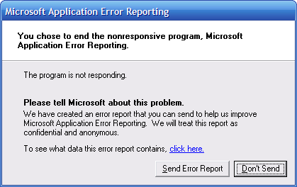
Ironic, isn’t it? Microsoft Outlook hung this morning, and when Microsoft
Application Error Reporting tried to report the error, that hung too. I
suppose I should be grateful that the above dialog didn’t hang as well.
As LCD prices comes down, we can look forward to seeing small LCDs appear on
every device or appliance we own. During this transition, manufacturers are
likely to replace physical device controls with an on-screen UI that exactly
duplicates the old physical controls, sparing them the real labor of thinking.
Consider the LCDs showing up in cars. My Toyota Prius is a great little car,
but its LCD is the weak point of the car’s design. Most of the time, the LCD
displays a power transmission diagram that lets you know when you’re using the
battery in some way. During a test drive, this diagram serves the useful
function of giving the salesperson something to point at, because otherwise
it’s hard for them to prove to you that you’re in a hybrid car. After the
first week of actually owning the car, the power transmission diagram is
mostly pointless.
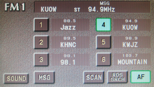
The Prius designers did come up with some other uses for this LCD, using it to
replace a random subset of controls that used to take the form of physical
hardware buttons and knobs. For example, the LCD controls most—but not all!—of
the radio functions. The Prius designers have carefully preserved many of the
limitations of the old controls, particularly the hardware radio preset
buttons (the original "radio buttons" in user interfaces):
You can only see six radio preset buttons on the screen at a time, most likely
because earlier Toyota cars had six hardware preset buttons. These preset
buttons are tiny compared to the overall screen size. I can only assume that
the designers were influenced by the physical dimensions of the old hardware
buttons, and mirrored those old sizes on the new screen—even if the new screen
isn’t subject to any of the physical constraints that governed the old
buttons. The designers also seemed to believe it was important that all
buttons be about the same size, even if some buttons could benefit from
longer, self-explanatory labels.
The tiny buttons on screen are actually less easy to use that the old
physical buttons that you could feel with one hand while keeping your eyes on
the road. The tiny on-screen button size does add a spark of excitement to the
driving experience, seeing as how each time you have to look down at the
screen to stab at the buttons, you risk smashing into the car in front of you.
What could the designers have done instead? They could have made the radio
present buttons bigger, but that would all be small potatoes. They really
should have thrown out the old model completely and started over by
considering their users’ basic radio listening needs and the physical nature
of an LCD screen.
Years ago I saw a demonstration of a bank ATM UI that had been completely
redesigned from the ground up to meet the needs of the bank’s blind customers.
(If I recall, it was designed by Chase in New York City.) The bank’s design
team recognized that the easiest regions to find by feel alone are the four
corners of the screen. They created a UI in which every page had four huge
buttons that each took up a full quadrant of the screen. The buttons ran all
the way to the edge, because that made it easier for the user to be sure they
were pressing something. (The Prius designers studiously keep all their
buttons away from the edge of the screen. It probably looks better that way in
a graphics editor on a computer screen in the design team’s office.)
Perhaps this bank ATM UI could inspire better on-screen UI for car LCDs,
making it easier to change stations without risking death. There are surely
many other factors at play here (I’m no car designer), but the point remains
that there are many ways to take better advantage of a graphical interface
than simply duplicating the old way things were done before in hardware.
As LCD prices drop to the point where they approach the cost of physical
hardware buttons, LCDs will crop up absolutely everywhere. Some manufacturers
will get this transition right, but most probably won’t, at least the first
time. It’s a virtual certainty someone will end up making a toaster with a
tiny touch screen showing a picture of knob from "Light" to
"Dark".
As part of Microsoft’s Professional Developers Conference 2005, the company
has released more information on how to design user experiences for Windows
Vista. I was the UX architect on Vista for a number of years, so it’s good to
see this information finally starting to coming into the light of day.
(As it turns out, Microsoft has created a remarkably poor user experience for
reading their guidelines on user experience. You have to go to a section on
Microsoft’s MSDN developers site for the
Windows Vista UX Guidelines. You need to go through some Windows verification foolishness, although I’m
baffled why it matters what platform you’re using to read the guidelines. You
then need to download a ZIP file. This ZIP file turns out to
contain… wait for it… a copy of a web site that describes how to
design good user experiences. Oh, the irony. The byzantine reasons behind
Microsoft’s web site production process are not worth delving into. Let’s just
say I’m glad I now work at a tiny startup.)
Some of the Vista work I’m most excited to see deals with an effort to bring
clarity to muddled dialog boxes and wizard pages. Vista offers OS support for
a new "task dialog" style. This style—and the accompanying
guidelines—call out a dialog’s main question or instruction as a single
sentence in clear, natural language. (The blurry example JPEG images below
come straight from the guidelines; too bad they didn’t offer lossless PNGs.)
This same task style is reflected in the new standard wizard template:
This wizard style is, in fact, an operating system feature designed
specifically to
make every piece of text count. Gone are the big pointless graphics that took up a third of the page, and a
single piece of instruction text replaces the old stack of redundant headings.
Hallelujah. It’s gratifying to see the evolution of direct OS support for the
inductive UI style
I developed way back in the late 90s for Microsoft Money.
Some Vista UX guidelines are specific to Vista development, but many of them
make just as much sense for products that ship on Windows XP, OS/X, or Linux.
Worth a look.
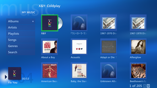
Microsoft Windows Media Center Edition contains a UI nugget worth a close
look: the My Music area’s list of albums includes any CD that happens to be in
the drive:
This sort of thing looks obvious after the fact, but consider the fact that
the list is blending data from two completely different sources: 1) Media
Player’s local music database, and 2) whatever CD happens to be inserted in
the drive. All actions in the UI work essentially the same regardless of what
kind of item is selected (with the difference that a CD can be ripped).
Faced with this design problem, most teams would have created a UI that
directly reflected the underlying data model. This would force the user to
deal with two distinct UI elements: one area for the the albums already in the
database, and a separate area for the local CD drives. (This is, in fact, what
Windows Media Player does.)
The Media Center team did a bunch of work to let the user work at the right
level of abstraction: everything in the list is an album, regardless of
whether it’s ripped yet or not. This sort of thing doesn’t come up every day,
but it’s worth thinking about whether your own application could benefit by
adopting this nice trick.
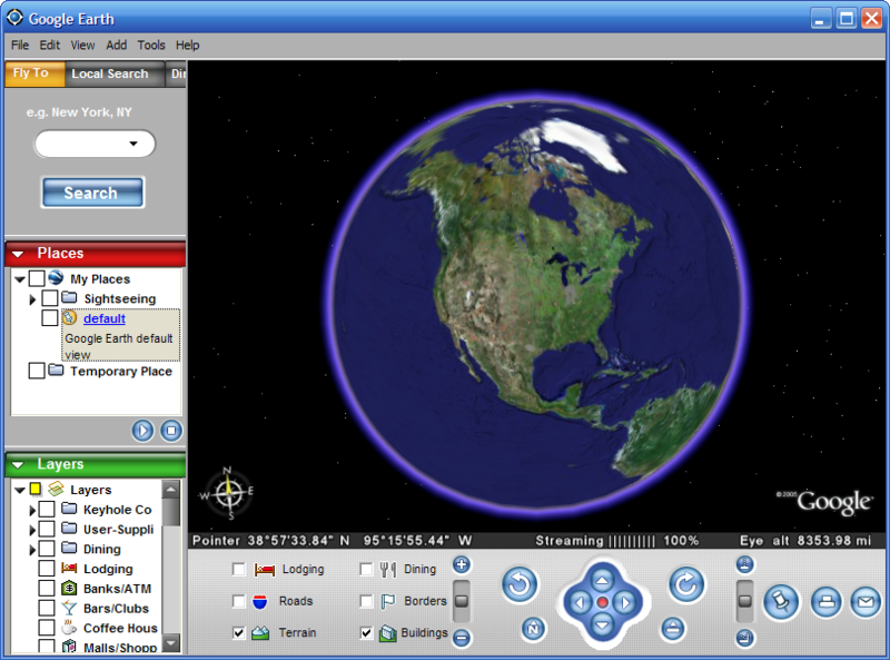
My favorite app of the past year has been the satellite imaging client
Google Earth. Much of this product’s
design is absolutely state of the art, but the fact that they’ve done such a
good job in the core UI makes some really clunky parts stand out.
If you haven’t tried Google Earth yet, you owe it to yourself to stop what
you’re doing and download their free version. While you’re downloading, here’s
the summary: they give you a 3D model of the Earth that you can spin and tilt
freely, zooming in to incredibly detailed images of your own city—and (if you
live in a big city) your own house. The main window looks like this:
I first tried Google Earth when it was an independent product called Keyhole.
The core user experience remains the same: a set of navigation controls let
you manipulate the virtual globe and camera. Given the complexity of doing
anything in 3D, I think they’ve done a reasonable job. Most of the magic in
the user experience comes from what happens under the covers: the high
performance incremental downloading and caching of huge images that all
happens in the background, with exactly the right degree of progress feedback
in the UI.
Since Google acquired Keyhole and rebranded it as Google Earth, they’ve
tweaked the UI a bit. Most noticeable is an attempt to give the product some
Google branding. Google’s visual branding strategy appears to consist of
randomly selecting user interface elements and coloring them pure red, blue,
yellow, or green. You can be the judge of whether the above screen shot really
says "Google" to you. In my mind, this UI is dominated by the
rendered globe, and the arbitrary splashes of bright color elsewhere in the UI
offer little more than distraction.
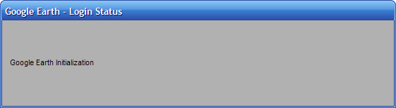
What’s really striking are the parts of the UI that have remained completely
untouched. Just before the product shows you a magnificent, full-motion, high
resolution magic 3D globe of the whole darn planet, you see… a gray dialog
box:
I’m a believer in trying to establish
positive emotion from the point of first contact, and dialogs like this don’t help. This would be a lame dialog in any
product, but it’s particularly odd to see something like this—something that
clearly no one has spent any time on since the day the dev first coded
it—followed immediately by one of the coolest visual experiences available in
any product on any platform. What’s even odder is that the above status dialog
appears in the startup sequence after a rather attractive splash
screen. To cap it off, the dialog is pointless: the status text doesn’t
communicate any information that’s meaningful to the user beyond the fact that
the app is starting up—precisely the fact communicated by the splash screen
that precedes this dialog.
Anyway, the fact remains that Google Earth is such a draw-droppingly cool
product that the clunky parts don’t spoil an amazing user experience. Now that
Google Earth has finished downloading, go take the next two hours off from
work looking at every place you’ve ever lived.
I’ve noticed that a previously answered question has recently become open
again: where does a typical user place their threshold for a download that’s
too big?
Companies that distribute client software via a web download used to agonize
over how to reduce their download size in order to encourage adoption. Browser
developers in particular used to crow about how their download was smaller
than their competitors. This was a big deal in the days of dialup. If I
recall, a rule of thumb in the mid 90s held that each 1MB of download would
take 10 minutes over a typical dialup connection of that period. Worse, dialup
connections could easily fail, forcing the user to sit through the long
download again. A user who had to devote an hour of their life to babysit your
6MB download was quite cautious about clicking the "Download Now"
button. The user was also concerned about how much disk space your product
would ultimately eat up was everything was installed.
The relevant factors have changed significantly: many users have broadband
connections, download managers exist to cope with flaky connections, and hard
drive space is easy enough to come by. Many companies now seem to pay scant
attention to their download size, so I can only assume many users don’t care
either. Download Adobe’s Reader product (a business requirement these days)
and you’ll see a lightning quick 500K download… of Adobe’s Download Manager,
which then brings down another 80MB or so of software—including some other
Adobe products slipped in for good measure.
One reason this question is interesting to client software designers is that
there are some pretty interesting client runtimes coming down the pike that
open up some great UI possibilities at the expense of download and install
size. The forthcoming .NET Framework version 2.0 package is 22MB. The Windows
Presentation Foundation ("Avalon") or Windows Communcation
Foundation ("Indigo") add more on top of that. If you’re building a
product that itself already depends on broadband use, does the download size
of your client even matter at all? If anyone has actual, recent data (not
anecdotal experiences) on how todays user’s react to download size, I’m
interested in hearing it.
UIs support working with one thing at a time, or with a potentially infinite
list of N things, but rarely for dealing with a small fixed number of things.
This is too bad—there are some cases where supporting a small fixed set leads
to a simpler user experience.
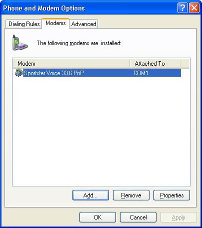
Consider the typical example of a list in this Windows XP Control Panel:
Let’s see… How many modems do you think the typical PC has? I have no idea,
but I’m guessing the numbers are something like: 70% of PCs have no modem, 29%
have 1 modem, and 1% have a number of modems between 2 and 4.
You couldn’t guess this from the UI above, though. The UI makes it look like
it’s common for a PC to have dozens of modems. The list box alone is tall
enough to show about 13 modems comfortably before it needs to scroll. Who has
13 modems?
The product development process that produces a UI like the one usually goes
like this. A designer builds a UI to edit settings for one modem, since that’s
the common case. This UI includes a collection of edit controls like dropdown
lists for things like modem speed, duplex handing, etc. A tester on the team
complains because they’ve got a machine that has two modems, so the designer
is told they need to support two modems. The designer discusses this with the
developer, who says that they don’t want to have duplicate the whole set of
edit controls to support settings for two modems: copying the controls is a
pain, and besides, the code gets ugly. To a developer, the only numbers that
make sense for UIs are 1 and N. If you don’t want a UI to edit one thing, then
put in a list box that lets you edit an essentially infinite number of things.
You’ve not only solved the problem of the person with two modems, you’ve
covered every conceivable configuration ever. Problem solved.
This is weak thinking. The team may discover a significant new problem on
their hands: the vast majority of users who come to this UI to set up their
one and only modem must now first go through an extra, non-obvious step. The
user comes into the dialog to find a big empty white rectangle, with most of
the controls disabled, and it’s not clear at all that the thing they need to
do is click the "Add…" button.
It takes guts to hardcode a UI to deal with a fixed number of things that
covers 99% of your scenarios. One group of designers who consistently do this
right are people who design cellphones. List management on a cellphone is a
pain, so whenever they can, the designers give you a fixed list of things. My
cellphone lets me switch between different "profiles" by selecting
from a fixed list of exactly eight items: normal, silent, meeting, outdoor,
automatic, headset, car, speakerphone. I can’t add another profile, but that’s
fine—I can’t imagine what else I’d need to create another profile for, and in
any event I could always repurpose an existing profiles that I don’t use.
There are certainly many cases when a list box is appropriate, but if
virtually all of your users will only need to work with a small handful of
things, consider optimizing the UI for a small fixed set.
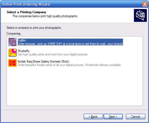
Avoid the trap of letting a design template make you write redundant text.
Consider the instructions in this wizard page from Windows XP:
Wow! Depending on how you count, this page tells the user the same thing at
least twice, maybe even three or four times. (If you just had the label
"Companies" above a list box, the user could probably guess that
they were supposed to select a company from the list.)
Why does a UI end up with so much redundant text? Part of the problem can lie
with the template used to create the UI. The Windows wizard template used for
the above dialog includes the ability to easily add a subheading below the
main heading. The person writing text for the page ends up feeling compelled
to fill this out, even if the subheading adds no information of value to the
user. (The user could probably assume that the photo companies print
high-quality photos – although that didn’t stop Shutterfly from adding its
own redundant text on that point.)
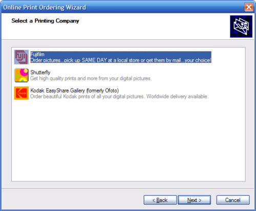
One problem with this template is that it puts the headings on a separate
visual surface than the main page content (the list box). Suppose we decided
to drop all the unnecessary text and stick with a single instruction. The
template forces a result like this:
The top of the dialog now feels somewhat unbalanced. Worse, the instruction
feels separated from the list box that the instructions refer to. Looking at
this, you might see why someone felt compelled to add a subheading for
balance, and then some more text to the main content area where it could sit
directly next to the list box.
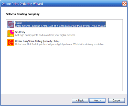
Fixing this requires jettisoning the template altogether. If we put the
instruction on the same visual surface as the list box (and lose the rather
unhelpful icon in the upper right), we end up with:
There’s more visual design work that could be done here, but this is a big
step in the right direction.
We see so much redundant text in UIs that we can become inured to the clutter.
Pare back your text to what is essential. If you find yourself writing text
that adds no value, step back and consider whether your template is part of
the problem.
Sometimes an application treats a situation as an error when the situation is,
in fact, completely normal.
For a good example of a poor user experience, consider Microsoft Outlook’s
support for the IMAP mail protocol. The vast majority of consumers use the POP
protocol to get email at home, which generally forces them to keep all their
mail on one machine at home. IMAP, in contrast, lets you keep all your email
on the server, where you can get to it from work, home and on the road. Most
email clients – including those found on cell phones – support IMAP. Upon
hearing of these wonders, most people will ask why IMAP isn’t used more often.
While large portions of Microsoft Outlook are very well designed, there’s no
escaping the fact that the Office team cares first and foremost about the
enterprise market. Large enterprises have more money than you do. They use
Exchange, and Outlook’s support for Exchange is fantastic.
People who use Outlook outside of an enterprise struggle along with support
for POP mail that hasn’t improved appreciably in years. While POP isn’t great,
at least Outlook’s POP driver is reasonably solid. Outlook’s IMAP driver, on
the other hand, appears to have been left for dead in the jungle, where it was
raised by apes.
Among its many deficiencies, the driver can’t properly cope if you use two
different machines (say, at home and at the office) to check your email. This
scenario is one of the reasons for IMAP’s existence, and most IMAP clients
handle this situation gracefully: if they see another client is checking the
mailbox, they wait for a while then try again. If you try to use Outlook this
way, however, the IMAP driver throws up the following error:
Your IMAP server has closed the connection. This may occur if you have left
the connection idle for too long.
Not only is this message a poor indication of what’s actually going on,
Outlook displays this message every few minutes until you shut down
one of the two Outlook clients trying to reach the mailbox. Outlook even
displays this dialog even if Outlook is already displaying
another instance of the same dialog. This is insane. I can come home
from a day of work and see, literally, a hundred of such errors sitting on the
screen.
Somewhere, deep down in the IMAP driver, there’s probably a core function that
checks for new mail. It’s a sure bet that if this function is unable to check
for new mail – if, say, another email client is already checking the same
mailbox – this function returns an error. The function does this not because
there’s anything really wrong, but because the function doesn’t have any other
way of communicating what’s going on. The developer who wrote the calling
function assumed that any error result is a real error, so they wrote the
calling function to punt things off to a general purpose error handler that
displays a generic error message. The limited forms of expression in code have
completely warped the top-level user experience.
That explains why the error dialog got into the product, but why did it stay?
Clearly the simplest reason is that none of Outlook’s developers use the
product’s IMAP driver themselves. The above error is exactly the kind of thing
a developer will kill in five minutes if it’s in the way of them doing their
own work. It’s reasonable to assume that the reason no Outlook developers use
IMAP is because they rely primarily on Microsoft-supplied Exchange accounts
for email at work. The rest of the world suffers at home because of this.
I use so many of Outlook’s PIM features that I could never go back to a pure
email client, but if all you need is mail, I’d encourage you to try
Mozilla Thunderbird, which has excellent IMAP support.
Microsoft Outlook, a dyed-in-the-wool client app, makes very effective use of
a certain UI technique that comes up more often on web sites: whenever Outlook
has additional information to communicate to the user, it does so in a
modeless way by making room for the information in the window the user is
working in.
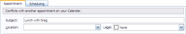
For example, if you’re scheduling an appointment over a time interval that
contains other appointments, Outlook lets you know in a status area near the
top of the main appointment window:
The "Conflicts with another appointment" message works so well
because the information, which is clearly salient to the current situation, is
delivered in a modeless way. A less thoughtfully designed client app would pop
up a modal dialog to communicate the same information, getting in the way of
the user and forcing them to dismiss the dialog before they could fix the
problem.
That web sites handle feedback modelessly is taken for granted. Virtually all
feedback regarding field validation in a web form is dealt with this way,
typically as red text adjacent to the fields that require re-entry. A Win32
application like Outlook has to do more work than a web site to achieve the
same effect, because Win32’s facilities for layout are so primitive that the
designers and developers have to handle all the layout themselves.
Nevertheless, this isn’t rocket science, and the technique is so useful that
more app designers should consider adopting it.
An application can engender positive or negative emotions in its users at the
very earliest point of contact. When interacting with an operating system, the
earliest point of contact is often the logon UI. The way an OS treats logon UI
can easily establish a good or bad impression in the user’s mind.
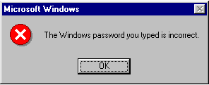
A long time ago, if you typed an incorrect password into a Windows logon
dialog, you’d get something like this:
Windows is clearly treating the situation as an error and, moreover, it
clearly thinks the error is the user’s fault. Later iterations of the
OS soften this message somewhat. By Windows 2000, the message changes to:
The system could not log you on. Make sure your User name and pasword are
correct, then type your password again. Letters in passwords must be typed
using the correct case.
This is a big improvement (not sure why User is capitalized, though), but the
tone is still stiff and a tad patronizing. By Windows XP’s Home edition,
things become much more conversational:
Did you forget your password? Please type your
password again. Be sure to use the right uppercase and lowercase
letters.
This is pretty good, and it’s hard to think of how to make this message much
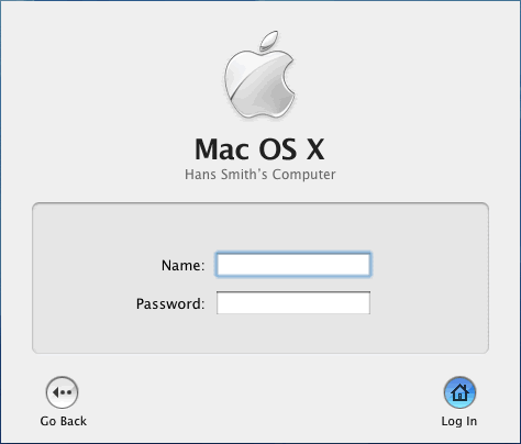
friendlier. Apple manages to, though, in its OS/X logon dialog. Apple’s
solution deftly finesses the situation by
avoiding the error message altogether.
If you don’t enter the right password, the dialog literally
shakes back and forth and the password field is cleared. A couple of
years ago when a colleague showed this to me, I laughed out loud. The dialog
is clearly shaking its head to say, "Nope!", and just as clearly
letting the user know they have to try again. It does this all in a humorous
way that engenders a positive emotion in the user and without having to play
verbal games to avoid assigning blame.
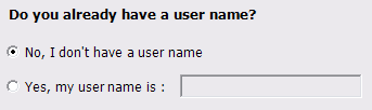
I’ve been using del.icio.us for a while to
search for things, and finally got around to registering so I could tag things
myself. I tried to create an account with an "@" sign in the user
name, and the site produced the following message:
I just got a new Mac for the first time in ages. I was a complete Mac fanatic
at the dawn of the Macintosh age, but eventually moved over to Windows since
that’s where the action was. I’ve taken a look at OS/X numerous times, but
playing around with a product for a short while isn’t the same thing as
sitting down and really trying to use it to get something done.
I’m constantly struck by how little effort OS/X Tiger expends in bothering to
explain the purpose of controls. Most of the bundled apps include their own
collection of beautifully rendered little widgets whose purpose is often
difficult to discern. My favorite example is the little glass bead found in
the upper right corner of numerous windows for expanding and collapsing the
toolbar and sidebar:
The glass bead in the upper right corner surely represents some sort of high
water mark for obscurity. No text or icon to detract from the purity of the
lovingly rendered glass! Maybe hovering the mouse over it produces a little
tip window? Nope. (Why the heck not?) The search box, at least, uses a
magnifying glass icon to suggest its purpose, even if the icon is highly
abstract in both visual representation and concept. It’s hard to think of a
control that communicates less about its purpose than this little glass bead.
(But not impossible – perhaps we should be grateful the bead is at least
adjacent to the region of the window it affects.)
The new user looks at the control and wonders, "What the hell do
you do?" The control gives its stony reply: "If you
must ask, you are unworthy."
In certain types of UI such as wizards and forms, it’s common to see UI like
this:
Here the text box is said to be a "dependent control", because its
enabled state depends upon the current selected state of the radio buttons.
In situations like the one above, I personally prefer a design that leaves the
text box enabled at all times. Instead of using the state of the radio buttons
to drive the state of the text box, the design goes the other way: the state
of the text box drives the state of the radio buttons.
The text box is always enabled but is empty by default.
If the user clicks in the text box and enters any text, the second radio
button becomes selected to let the user know that they have now implicitly
chosen the second option.
Clearing the text box implicitly selects the first radio button (but leaves
the focus in the text box so the user can enter something new).
If the user types something in the text box and then changes their mind to
explictly select the first radio button, the (non-empty) contents of the
text box are left as is. If the user goes back and changes the contents of
the text box, the second radio button is again implicitly selected (as long
as the text box is non-empty).
This lets the user who wants to enter something in the text box do so
directly, without having to first select the second radio button. In my
experience, this technique makes the UI feel faster, avoids frustration
("Why can’t I type in the box?"), and doesn’t suffer any practical
downside.
I recently played with two photo slideshow sharing products:
Picasa Hello and MSN Photo Swap (part of
MSN Messenger version 7). These two
products both give people a way to show someone else photos over the net, but
their UIs reveal subtle distinctions between their user models for this task.
The most interesting distinction for me comes up in the UI for determining
who’s showing photos and who’s watching photos. Hello’s model allows for
free-form interaction between the participants. If you want to look at a
specific photo, you can. If you want to let your buddy drive the action, you
click a command called "Follow Friend":
You can see which photo your friend is looking at and – if they want to
follow your lead – they can elect to follow along with you. In practice, this
model and the resulting UI feels natural.
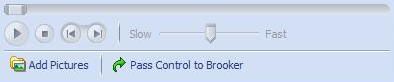
MSN Photo Swap, meanwhile, feels like what you’d get if you shared photos
according to Robert’s Rules of Order. One user has the floor, so to speak, and
gets to hold on to it for as long as they want. When they see fit to cede
control to someone else, they click a "Pass Control" command:
In practice, this model makes what should be a pleasant experience between
friends feel dull. If I don’t want to look at the photo my buddy is showing,
I’m stuck. (Where is the "Filibuster" command?)
The rest of Picasa Hello’s UI is likewise friendlier than that in MSN Photo
Swap – but the UI is moot. Hello is probably doomed as a standalone
application.
Photo slideshow sharing is a feature, not a product. It only makes sense in
the context of a larger framework for interaction over the net such as an IM
client like MSN Messenger. I can’t imagine telling someone that I want to show
them some photos I took, but first they should download and install a client
app that they’ll never use for any other purpose.
Here’s hoping Picasa Hello gets incorporated into something bigger, or that
Photo Swap loosens up.
Software product teams working on large products need to give names to
individual application components just so they can communicate effectively –
but that’s not a good reason to force a user to learn names for different
parts of something that, to them, is a single entity.
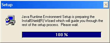
A common example: a Setup app is a little application that helps install a
bigger application. The software team needs to keep straight which application
they’re talking about (in specs, bug reports, etc.), so they give the Setup
app its own name. The user ends up having to bear the burden of figuring out
who does what. The following is a particularly egregious (and unfortunately
very common) example:
So here we’ve got one named thing (Java Runtime Environment Setup) that’s
preparing another named thing (an InstallShield Wizard) that will help the
user install a third named thing (Java). The user could care less about these
other pieces that are involved, so there’s no reason to confuse them by
introducing these other components by name at all. All the user cares about
here is getting Java onto their machine (and they may not really care about
that either – maybe what they’re really trying to do is get a Java
app to run).
The dialog could easily have said, "Please wait while Java is
installed", or even just, "Please wait."
If you’re ever shown a UI design for a new top-level application window, be
sure to notice whether the controls on the window happen to perfectly fill up
on the available space. This is often a sign of trouble.
Many application windows are resizable. (If a top-level modeless window isn’t
resizable, it’s a reasonable question to ask: why not?) A common mistake when
designing resizable windows is to focus too much on some perfect window size
that happens to show off the window’s controls to best advantage – a window
size that few people other than the designer is ever likely to see. It’s
important to question how the window is going to respond when the user resizes
it. For example, many users commonly maximize the application window they’re
working in. A surprising number of applications actually look awful when
they’re maximized on a typical large display: the additional space the
designer didn’t design for is either wasted or allocated to some control
(often a text box or list box) that didn’t really need it.
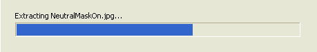
An app should never show the user a progress bar, fill it up, only to reset it
and make them watch it fill up again.
Two-thirds done — or is it?
An app with a progress bar that resets will fail to deliver on the promise it
has made. The app is saying, "Almost done! Almost done! Just a second
more!", then saying, "Just kidding! There’s still more." The
user loses faith the process is anywhere near completion. For all they know,
the progress bar is going to reset again, and again, and again. If a progress
bar can start all over, there’s practically no value in having a progress bar
in the first place. It’s more honest in such a case to use a progress
animation instead of a progress bar; at least that doesn’t make any promises
about when an operation will finish.
When an app has back-to-back operations that can take a long time, incorporate
the progress for those operations into a combined progress bar. This can be
done, for example, by assigning arbitrary percentages based on expected
results. If the first operation usually takes about three times as long as the
second, then the first operation can be defined to fill up 75% of the progress
bar and the second operation to fill up the remaining 25%. This can result in
a change in progress bar speed, but this still allows the user to derive more
value from the progress bar, and maintains a sense a progress.
… so I think I’ll get around to starting that UI design blog I’ve been
meaning to start. I’d prefer to just read someone else’s insightful commentary
on user interface design, but haven’t found much yet on the topic. There are
sites like Jakob Nielsen’s useit.com, but
that’s primarily about usability and user research, not user interface design.
There are a few other sites on web UI design, but they generally ignore the
design of client software UI. To me that’s odd, since today the UI of the
average client application is still far richer and interactive than the UI of
the average web site. Focusing on web design exclusively is like studying
architecture and only looking at the design of houses. There should be more
discussion of the craft of UI, and that discussion should include traditional
PC client UI as well as web UI, cell phones, etc.