Google Earth: Drop-dead gorgeous satellite photo rendering with clunky visuals
My favorite app of the past year has been the satellite imaging client Google Earth. Much of this product’s design is absolutely state of the art, but the fact that they’ve done such a good job in the core UI makes some really clunky parts stand out.
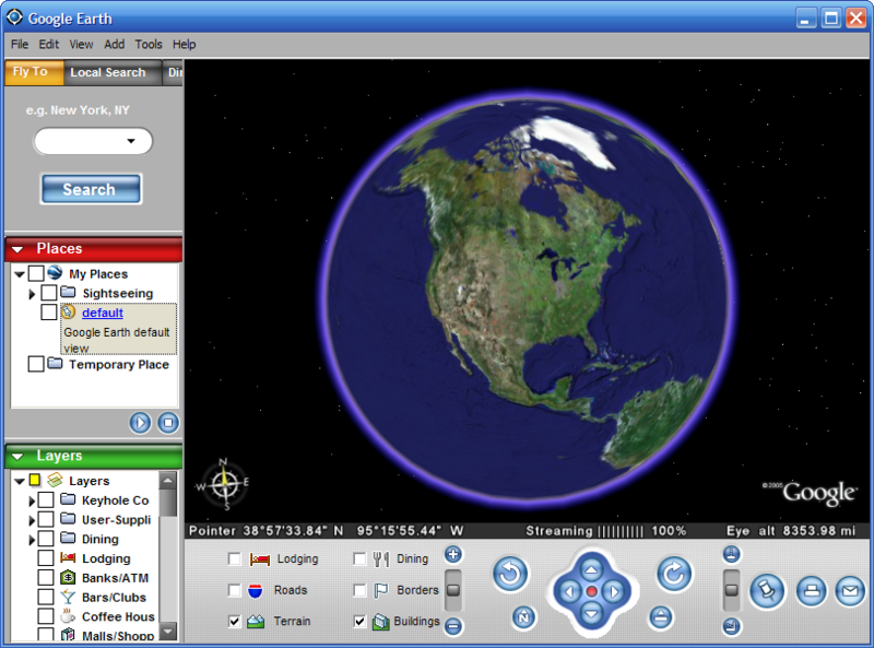
If you haven’t tried Google Earth yet, you owe it to yourself to stop what you’re doing and download their free version. While you’re downloading, here’s the summary: they give you a 3D model of the Earth that you can spin and tilt freely, zooming in to incredibly detailed images of your own city—and (if you live in a big city) your own house. The main window looks like this:

I first tried Google Earth when it was an independent product called Keyhole. The core user experience remains the same: a set of navigation controls let you manipulate the virtual globe and camera. Given the complexity of doing anything in 3D, I think they’ve done a reasonable job. Most of the magic in the user experience comes from what happens under the covers: the high performance incremental downloading and caching of huge images that all happens in the background, with exactly the right degree of progress feedback in the UI.
Since Google acquired Keyhole and rebranded it as Google Earth, they’ve tweaked the UI a bit. Most noticeable is an attempt to give the product some Google branding. Google’s visual branding strategy appears to consist of randomly selecting user interface elements and coloring them pure red, blue, yellow, or green. You can be the judge of whether the above screen shot really says "Google" to you. In my mind, this UI is dominated by the rendered globe, and the arbitrary splashes of bright color elsewhere in the UI offer little more than distraction.
What’s really striking are the parts of the UI that have remained completely untouched. Just before the product shows you a magnificent, full-motion, high resolution magic 3D globe of the whole darn planet, you see… a gray dialog box:

I’m a believer in trying to establish positive emotion from the point of first contact, and dialogs like this don’t help. This would be a lame dialog in any product, but it’s particularly odd to see something like this—something that clearly no one has spent any time on since the day the dev first coded it—followed immediately by one of the coolest visual experiences available in any product on any platform. What’s even odder is that the above status dialog appears in the startup sequence after a rather attractive splash screen. To cap it off, the dialog is pointless: the status text doesn’t communicate any information that’s meaningful to the user beyond the fact that the app is starting up—precisely the fact communicated by the splash screen that precedes this dialog.
Anyway, the fact remains that Google Earth is such a draw-droppingly cool product that the clunky parts don’t spoil an amazing user experience. Now that Google Earth has finished downloading, go take the next two hours off from work looking at every place you’ve ever lived.