BBOP: the ubiquitous yet under-examined UI model
Modern software includes a large and growing class of UIs that in my opinion has received insufficient formal recognition. UIs in this class share many traits and are distinctly different from the WIMP UIs of the 1980s and 90s. The WIMP acronym summarizes the hallmarks of that UI paradigm: WIndows, Icons, Menus, and a Pointer (usually a mouse pointer). I’ve noticed that I now spend more and more of my time on UIs that have neither windows, nor icons, nor a menu bar, nor a pointer. These clearly aren’t WIMP interfaces, so what are they?
Consider the following:

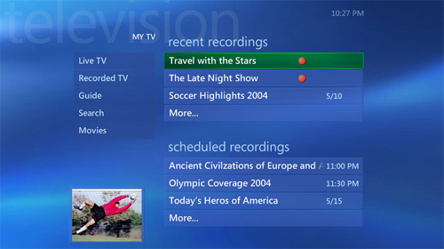
Microsoft Windows Media Center Edition

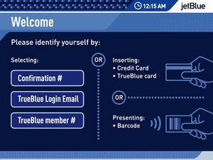
JetBlue check-in
kiosk (designed by
Antenna Design)

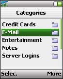
Typical cell phone
screen
These UIs cross a diverse range of devices and environments. The first UI is for a media hub that is designed to be displayed on a widescreen TV, viewed from across a room, and navigated with an IR remote control. The second is for a kiosk for checking in at airports. Here the display is of average size, but the UI is negotiated with a touch screen. The third screen comes from a cell phone. This UI is optimized for a small display size, and is navigated with a directional pad.
Despite their different origins and contexts, such UIs nevertheless share many traits. Instead of multiple overlapping windows, the UIs show a single page at a time that consumes the entire display surface. The user navigates between pages in the style of a web browser, and can usually navigate backwards via a Back button. A page almost always presents a single task at a time for the user to focus on. Often (but not always) the task is stated directly on the page. Text, not icons, is generally used to guide the user. (If they’re present at all, the icons play mostly a decorative role.) There are menus, but not the dropdown sort of menu found in a WIMP UI. Instead, these menus are lists of buttons that sit directly on the page at all times. In fact, buttons are by far the most common control found in such UIs.
Finally, there is no free-form pointer, or at least no dependency on one. You could argue that your fingertip is the pointer in a touch screen UI, but in practice a well-done touch UI feels completely different to me than a mouse-driven one. (E.g., in a touch UI, your finger clicks big fat buttons, with none of the dragging, double-clicking, or right-clicking that pervade WIMP UIs.) Many of these UIs dispense with a free-form pointer entirely. Instead, the user drives a keyboard focus around the screen (usually with a directional pad of arrow buttons) and presses a commit button like OK to invoke the targeted action.
The commonalities between such UIs are driven by a higher-level fact: they are meant to help users accomplish very specific tasks immediately, without any training or up-front learning whatsoever. People generally use them in a transient way—they get in, do what they need to do (pick a TV show, check in for a flight, make a call), then get out. Users generally don’t spend more than a few minutes at a time interacting with the UI proper. Even an SMS-crazy teen doesn’t live all day inside the phone’s UI the way some people live inside WIMP environments like Microsoft Excel or Adobe After Effects.
UIs like the ones above form an important class of UI, yet this class seems to have received little or no formal recognition. I don’t think there’s even a commonly-accepted term for this paradigm. To facilitate discussions with my colleagues, I coined the acronym BBOP ("bebop") to refer to such user interfaces. In the spirit of WIMP, the term BBOP summarizes the paradigm’s hallmarks:
Buttons (as the predominant control type)
Back stack (as a organizing principle for navigation)
One Task (one task at a time, often explicitly stated)
Page-based (a single page consumes the entire visible screen area)
Once we had a term for this, we began recognizing BBOP UIs in more and more
places: DVD players, in-car navigation systems, iPods, and so on. I’m
personally hoping to see more discussion and analysis of BBOP UIs (or whatever
they end up being called) in the future. Even more, I’m hoping to see better
support in UI platforms for creating them.