Avoiding unnecessary questions in command UI
A European acquaintance once remarked that when they go to an American restaurant, they feel like they’re "under assault" by the waitstaff: placing an order requires answering a long series of questions—"Soup or salad? Italian dressing or Ranch? Lite Italian or Regular Italian?"—and the waitstaff continues to interrupt them every ten minutes to ask yet more questions. Some user interfaces can feel like this.
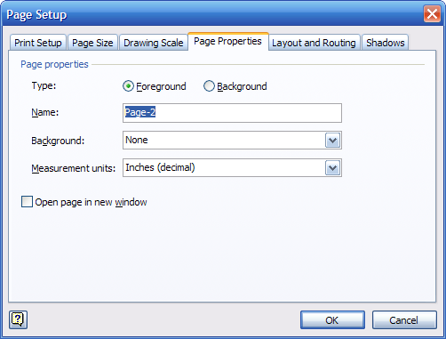
In particular, some applications have commands with UIs that ask too many questions before the application will actually carry out the command. If you try to insert a new page into a Microsoft Visio document, you get a form to fill out:

What you really wanted was a new page, not a form to fill out. The difference between ordering a salad and inserting a new page is that the restaurant has to get things right the first time. Once you get the salad, you can’t change your mind and have them turn the salad into a soup (or, at least, not a very good soup).
An application, in contrast, can adjust its output after the fact. Good UIs often eliminate unnecessary up-front questions by doing something in response to a command and letting you tweak the results if they’re not what you wanted.
A common example: when you create a new folder in virtually all modern operating systems, you get a new folder right away. The new folder is called something like "New Folder". You don’t get a question asking you what kind of folder you want, what sort of name you’d like to give it, etc. For this UI to be effective, the OS simply needs to make it easy for you to rename the new folder once it’s been created.
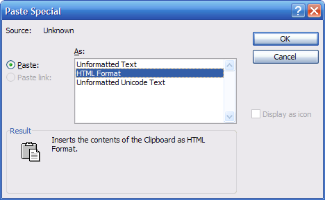
Another example comes from Microsoft Office. In old versions of Office, if you wanted to paste something from the clipboard that could be pasted in multiple ways, you had to use an ugly and confusing Paste Special dialog:

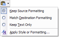
Recent releases of Microsoft Office have deprecated this dialog in favor of a contextual pop-up menu that appears after commands like Paste. If you don’t like the result of the command, you simply select another result from the pop-up menu:

Advances like these obviate the need for an application to bug the user with lots of questions. Other suggestions for streamlining command UI:
- If a single command is really providing two features that are only loosely related, refactor the command UI into two proper commands with their own entry points.
- If you have to ask a question, at least propose a default response and/or give examples of typical responses.
- If you have to present a dialog or wizard, consider employing some form of elision (an "Advanced…" button, an expando that reveals advanced options, etc.) to hide the unusual stuff.
- Instead of presenting a long sequence of questions, consider presenting a quick summary of what’s going to happen, and let the user edit just those parts they want to change.
- If you really, really need to display a dialog (e.g., for legal reasons) but are confident most users won’t actually need to see it each time, offer an option to skip past the dialog in the future.
- Have the basic form of the command do the thing that 95% of your users want, then let the remaining 5% tune the behavior of that command through an application option.
- If only a tiny number of users would ever answer a question a particular way, have guts and cut the question altogether. In general, you’re better off addressing the common needs of a broad set of users than building special-purpose UI that only ever be used by a few people (especially if those few people work down the hall from you).