The tyranny of 1 or N
UIs support working with one thing at a time, or with a potentially infinite list of N things, but rarely for dealing with a small fixed number of things. This is too bad—there are some cases where supporting a small fixed set leads to a simpler user experience.
Consider the typical example of a list in this Windows XP Control Panel:
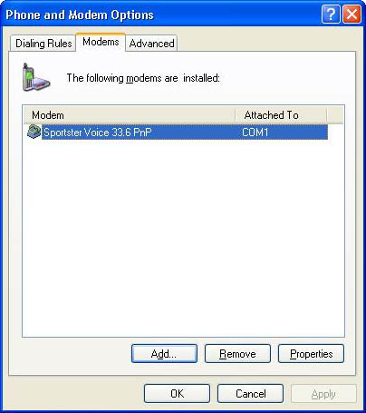
Let’s see… How many modems do you think the typical PC has? I have no idea, but I’m guessing the numbers are something like: 70% of PCs have no modem, 29% have 1 modem, and 1% have a number of modems between 2 and 4.
You couldn’t guess this from the UI above, though. The UI makes it look like it’s common for a PC to have dozens of modems. The list box alone is tall enough to show about 13 modems comfortably before it needs to scroll. Who has 13 modems?
The product development process that produces a UI like the one usually goes like this. A designer builds a UI to edit settings for one modem, since that’s the common case. This UI includes a collection of edit controls like dropdown lists for things like modem speed, duplex handing, etc. A tester on the team complains because they’ve got a machine that has two modems, so the designer is told they need to support two modems. The designer discusses this with the developer, who says that they don’t want to have duplicate the whole set of edit controls to support settings for two modems: copying the controls is a pain, and besides, the code gets ugly. To a developer, the only numbers that make sense for UIs are 1 and N. If you don’t want a UI to edit one thing, then put in a list box that lets you edit an essentially infinite number of things. You’ve not only solved the problem of the person with two modems, you’ve covered every conceivable configuration ever. Problem solved.
This is weak thinking. The team may discover a significant new problem on their hands: the vast majority of users who come to this UI to set up their one and only modem must now first go through an extra, non-obvious step. The user comes into the dialog to find a big empty white rectangle, with most of the controls disabled, and it’s not clear at all that the thing they need to do is click the "Add…" button.
It takes guts to hardcode a UI to deal with a fixed number of things that covers 99% of your scenarios. One group of designers who consistently do this right are people who design cellphones. List management on a cellphone is a pain, so whenever they can, the designers give you a fixed list of things. My cellphone lets me switch between different "profiles" by selecting from a fixed list of exactly eight items: normal, silent, meeting, outdoor, automatic, headset, car, speakerphone. I can’t add another profile, but that’s fine—I can’t imagine what else I’d need to create another profile for, and in any event I could always repurpose an existing profiles that I don’t use.
There are certainly many cases when a list box is appropriate, but if virtually all of your users will only need to work with a small handful of things, consider optimizing the UI for a small fixed set.