LCDs recreating old physical controls (whether or not that makes sense)
September 22, 2005
As LCD prices comes down, we can look forward to seeing small LCDs appear on every device or appliance we own. During this transition, manufacturers are likely to replace physical device controls with an on-screen UI that exactly duplicates the old physical controls, sparing them the real labor of thinking.
Consider the LCDs showing up in cars. My Toyota Prius is a great little car, but its LCD is the weak point of the car’s design. Most of the time, the LCD displays a power transmission diagram that lets you know when you’re using the battery in some way. During a test drive, this diagram serves the useful function of giving the salesperson something to point at, because otherwise it’s hard for them to prove to you that you’re in a hybrid car. After the first week of actually owning the car, the power transmission diagram is mostly pointless.
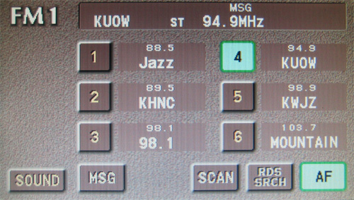
The Prius designers did come up with some other uses for this LCD, using it to replace a random subset of controls that used to take the form of physical hardware buttons and knobs. For example, the LCD controls most—but not all!—of the radio functions. The Prius designers have carefully preserved many of the limitations of the old controls, particularly the hardware radio preset buttons (the original "radio buttons" in user interfaces):

You can only see six radio preset buttons on the screen at a time, most likely because earlier Toyota cars had six hardware preset buttons. These preset buttons are tiny compared to the overall screen size. I can only assume that the designers were influenced by the physical dimensions of the old hardware buttons, and mirrored those old sizes on the new screen—even if the new screen isn’t subject to any of the physical constraints that governed the old buttons. The designers also seemed to believe it was important that all buttons be about the same size, even if some buttons could benefit from longer, self-explanatory labels.
The tiny buttons on screen are actually less easy to use that the old physical buttons that you could feel with one hand while keeping your eyes on the road. The tiny on-screen button size does add a spark of excitement to the driving experience, seeing as how each time you have to look down at the screen to stab at the buttons, you risk smashing into the car in front of you.
What could the designers have done instead? They could have made the radio present buttons bigger, but that would all be small potatoes. They really should have thrown out the old model completely and started over by considering their users’ basic radio listening needs and the physical nature of an LCD screen.
Years ago I saw a demonstration of a bank ATM UI that had been completely redesigned from the ground up to meet the needs of the bank’s blind customers. (If I recall, it was designed by Chase in New York City.) The bank’s design team recognized that the easiest regions to find by feel alone are the four corners of the screen. They created a UI in which every page had four huge buttons that each took up a full quadrant of the screen. The buttons ran all the way to the edge, because that made it easier for the user to be sure they were pressing something. (The Prius designers studiously keep all their buttons away from the edge of the screen. It probably looks better that way in a graphics editor on a computer screen in the design team’s office.)
Perhaps this bank ATM UI could inspire better on-screen UI for car LCDs, making it easier to change stations without risking death. There are surely many other factors at play here (I’m no car designer), but the point remains that there are many ways to take better advantage of a graphical interface than simply duplicating the old way things were done before in hardware.
As LCD prices drop to the point where they approach the cost of physical
hardware buttons, LCDs will crop up absolutely everywhere. Some manufacturers
will get this transition right, but most probably won’t, at least the first
time. It’s a virtual certainty someone will end up making a toaster with a
tiny touch screen showing a picture of knob from "Light" to
"Dark".