Streamline dialog tasks with careful setting of the default button
Most UI platforms allow a designer to indicate which button in a dialog should
be the default button: the button that will be pressed if the user
types the Enter key. The default button is generally the button the user is
most likely to press next, often a button like OK that closes the dialog. In
very high-traffic dialogs, you may want to consider dynamically changing the
default button to save keystrokes and help speed the user’s task.
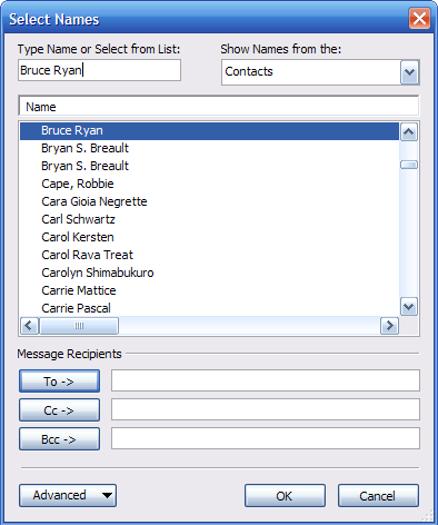
The best example I can think of is the "Select Names" dialog in Microsoft Outlook for picking recipients for an email message. When the dialog opens, the focus starts out the "Type Name" field, and the default button is the "To ->" button:

The user can start typing a name immediately, and when they’ve finished typing the name (or have selected a name in the list), they can press Enter to do the most likely thing: add the name to the message’s To line.
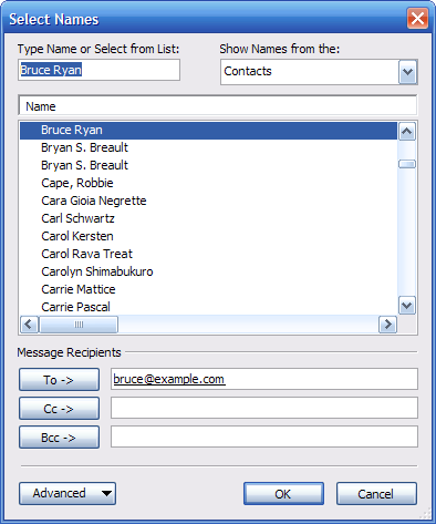
Here’s where things get interesting. Watch what happens after the user presses Enter:

The OK button is now the default button! Having added someone to the To line, the user’s most likely next action has changed: they’re now most likely to want to click the OK button and close the dialog. So, the OK button becomes the default button. (Leaving the To button as the default would be a bit of a waste here, because there’s essentially no chance that the user wants to add the same recipient to the message twice.)
The keyboard focus stays in the "Type Name" field. (The previous name is left selected in case the user wants to edit it, but typing will replace the selection.) The user can type any key but Enter (or Escape, etc.) to start entering a new name, in which case the "To ->" button becomes the default button again. That is, the user is returned to the state shown in the first image.
The overall result is that a user can open the dialog, type a name, then press Enter twice to add the name and close the dialog. This behavior is natural enough that most users zip through the dialog without even noticing what’s going on.
Since this technique is somewhat unusual, it should be used judiciously. The above dialog was arrived at after many, many iterations, and capitalizes on a very predictable sequence of user actions to shave time off a very common task. Without careful attention to detail, it would be easy to end up moving the default button to the wrong place and cause users to accidentally press the wrong button. The larger point here is that it’s worth exploring the limits of standard user interface behavior to streamline a UI that will receive a high volume of traffic.