When you ask people for feedback on a design that has not yet been
implemented, take care how much polish you put on the design’s representation.
A counter-intuitive principle of soliciting early design feedback is that
people reviewing a highly polished design may concentrate on superficial details and overlook fundamental issues. In the early stages of the process, you
may be able to elicit deeper feedback by striving for an unfinished look in
your design representations.
Even novice designers can employ production tools like Adobe Photoshop or
Flash to quickly work up beautiful conceptual screen shots or prototypes. They
can lavish attention on the presentation of early design concepts, even those
that might be thrown away. However, when such a design is shown for review,
reviewers may fixate on such details as the color on a button—and fail to
question why the button, or indeed the entire screen, needs to exist at all.
One obvious force at work here is the visually engaging nature of beautiful
imagery. I believe another, subtler issue is that people unintentionally
calibrate their criticism according to their impression of where you are in
the development process. A highly polished image may look like a screen shot
of an implemented UI, or at least the result of many weeks’ work, leading
someone to assume that only small details can be changed at this point. Even
if you repeatedly remind them that the design is just an early sketch, they
may still demur from suggesting anything so bold as starting over. People may
also have difficulty criticizing a design if the representation seems far
beyond what they could have created themselves.
As an antidote to this phenomenon, in my own design process I usually keep
early designs looking rough, and try to refrain from jumping straight to a
polished result. I often draw early sketches by hand with paper and ink. Why
ink and not pencil? I don’t want to give myself too much opportunity to polish
up even a hand-drawn sketch. To avoid the tedium of recreating design elements
like navigation bars, I sometimes draw a sketch of just the global design
elements, then photocopy that to create a template for sketches of individual
screens. I take care to leave even the template sketch looking pretty rough.
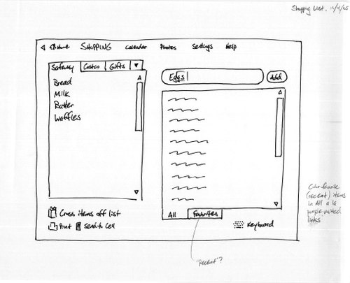
Here’s a scan of an early sketch for Cozi Central’s Shopping Lists area:
No one has any trouble giving feedback at this stage, any may indeed call for
something completely different. Reviewers figure, "How hard could it have
been to crank that out? I could have done that!"
After I’ve had a chance to iterate at this hand-drawn level, I may create a
prototype in Microsoft PowerPoint to explore some interactive elements. Again,
I resist the temptation to apply visual polish. It’s still too early.
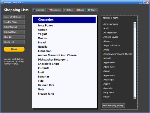
I’ll eventually create a skeleton UI directly in a development environment’s
visual designer, leading to a design like this:
At this stage, things are being to feel more solid and less mutable. Design
feedback may begin to focus on smaller details, but people still recognize
substantial room for change. Following further iteration, the design
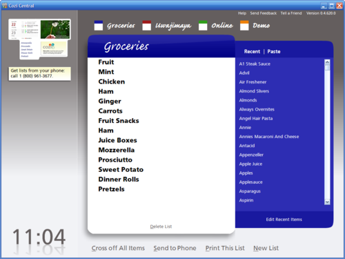
stabilizes enough to warrant a full treatment from visual design specialist:
The design is now polished to the point that many people may find it difficult
to look past the surface. Luckily, by now significant portions of the design
are often functional enough that people can interact directly with the user
interface. This opportunity can counteract the tendency to notice only
superficial issues. People who have a chance to actually use a design will
generally notice when it suddenly does something they didn’t want. A
thoughtful user will step back and realize the problem lies with the software
(and not with them), and deliver this feedback to you.
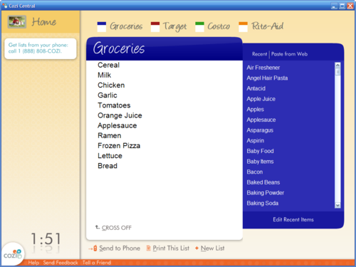
In this particular interface, feedback that came late in the game on the
surface appearance turned out to be quite important too. People who looked at
the above design said that it was "cool", in both senses of the
word: interesting, but also cold. Since we were aiming the product at families
for use at home, we iterated on the design to produce a warmer feeling. The
feature finally shipped like so:
If you’re intrigued by the idea of presenting rough sketches early in the
development cycle, but appalled by the idea of manually drafting paper
sketches, you might consider modifications to your own design process. This
past week I conducted design reviews of a PowerPoint prototype that used a
free handwriting font (at a suitably legible point size) for the UI text. The
feedback collected during the reviews was at the right level for this stage of
the process, and it was easy to refine the design between reviews, so I’m
likely to use this approach again in the future.
To keep things friendly and approachable, applications often ask a new user to
supply their first name. In designing the sign up procedure for Cozi Central,
I applied my favorite trick for asking for first names: provide an example of
what kind of name you want.
To ask a user their first name, you’d think you could just create a text box
labeled "First name:". The problem is that many people don’t
want to use their first name. A user might prefer to go by a
nickname, for example. However, at sign up time, the user has no idea how your
product is going to use the name they enter, so they may hesitate to enter a
nickname instead of their real first name. Your application may end up
addressing the user by a name they dislike.
You could just ask the user for "Name:", and figure that they can
enter whatever they want. Now you’ve got a new problem: tons and tons of
people will enter their full name, or their last name, or something else. Your
program might then address them cheerfully but stiffly: "Good morning,
John Anthony Smith!"
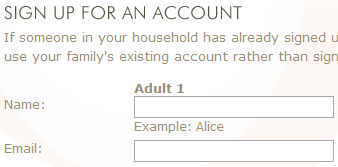
To elicit a first name but leave the door open for something else, ask the
user for "Name:",
but provide an example that shows a first name:
This seems to work quite well in practice. (I give credit for this trick to
software designer and all-around nice guy David Sloo.)
Caution: There’s a limit to how far you can push this idea, as Cozi learned
this past week. Since our sign up page used an example for Name, we went ahead
and put examples next to most of the fields, including the email address
fields. The sample email addresses were at cozi.com, so that we could avoid
collisions with a real domain name. Bad idea: many users thought we were
giving them a new email address, so they entered their own name @cozi.com
instead of entering their existing email address. We promptly cut the email
address examples from the sign up page. By now, most people should know what
an email address looks like.
This week my company Cozi launched
Cozi Central, a
product that lets busy families communicate with each other and juggle the
many elements of their lives at home. Among other things, our public launch
means I can now cover my own user interface designs in this blog. I thought a
good place to start this coverage was a quick look at what it means to design
software for families.
Most software products and services for the home market oddly do not, in fact,
recognize the family dynamics that dominate home life. Consider any service
with which the entire household has a single account, then see how many family
members are allowed to administer that account. In most consumer products, the
single person who signs up for a household account becomes the account’s sole
administrator. They can add other family members to the account, but those
other users are invariably treated as second class participants in the
account.
Many households have not one, but two people running the
household. In these cases, the user model doesn’t match the household’s actual
organization. If Mom ends up as the family’s account administrator, how does
Dad feel asking her to reset his password? Or if Dad ends up as the account
administrator, how does Mom feel asking him to give her access to a new
feature? A poor design decision in the virtual world provokes awkward
interactions between family members.
Products like this are presumably made by organizations that unintentionally
mirror their business paradigm in a home product—since groups in the business
world tend to be organized with a single leader, they fail to question whether
a similar hierarchy will actually work in the home. As it turns out, a strict
hierarchical approach is also easier for a developer to code: if you’re going
to have two classes of users, the data schema and accompanying UI is easier to
manage if you can simply designate exactly one of the users as an
administrator than if you can designate one or at most two. If a company does
decide to support more than one administrator, the design usually makes
administrative privileges an option that can be enabled for any account. So
instead of letting two people run the account, they allow N people to run the
account, which often needlessly complicates the product’s interface. (A good
example of
The Tyranny of 1 or N.)
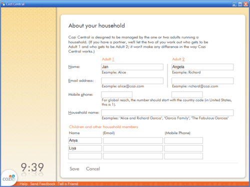
We designed Cozi Central from the ground up for the dynamics of families, not
small businesses. Either one OR two people can be identified as the adults
running the household.
There are, of course, numerous households with multiple adults, but in most of
them, one or two people can be identified as running the household. For our
v1.0, those edge cases weren’t worth pursuing if they would cause the 90% case
to suffer.
Designing things this way does require a bit more design and development work.
On the whole, however, the product’s model of family organization now more
closely represents that of actual households, so it enables unique features
that capitalize on family dynamics.
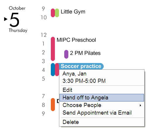
A good example is the “Hand Off” feature in Cozi Central’s family calendar.
Couples, especially parents in homes with children, are constantly trading
errands and other responsibilities. It might be the case that Dad usually
drives his daughter to soccer practice, but if he suddenly needs to take his
son to the doctor, he may hand the driving duty off to Mom. This happens so
often that Cozi Central has an explicit “Hand Off” menu command on
appointments just for this purpose:
This user interface shortcut would be far more cumbersome to offer in a
product that assumes families are organized in a hierarchy with a single
person at the top. (By the way, Cozi Central’s appointment menu comes up on
left click as well as right click, a trick I think could be useful in other
UIs.)
You can see more examples of family-ready design in Cozi Central itself. The
product, which includes features to track family calendars, messages, and
shopping lists, is available for free at
http://www.cozi.com.
Publicly available software applications and web sites contain myriad end user
license agreements, terms of use, and other legalese, but the user experience
of actually reviewing and accepting these legal agreements is universally
poor. Software users click through license agreements almost every time they
install or upgrade software, but even vendors that care deeply about user
interfaces leave untouched the fundamentally bad user experience of their
legally binding dialogs and pages. I’ve been looking for a way to improve this
experience in the products I work on.
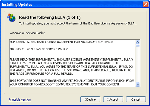
The canonical End User License Agreement (EULA) dialog looks like this:
The dialog is a smallish window that contains a very long scrolling text box.
Below the text box sit controls with which the user must accept or decline the
agreement. This may take the form of an "I agree" check box, or a
set of push buttons (shown above).
The user experience of reviewing a EULA in such a dialog is, of course,
terrible. The text of the EULA itself is dense legal language fully of text
INEXPLICABLY IN CAPITALS warning you that you hereby AGREE to ALL SORTS OF
STUFF YOU DON"T UNDERSTAND. The text is not generally organized in any
interesting way (e.g., important stuff first). The text is usually plain text
or simply formatted and—profligate use of capitals to the contrary—does not
actually highlight the most interesting bits in the text. The text goes on for
pages and pages.
In most cases, the application does not offer a default option. If it does,
the default is nearly always to decline the agreement. Since the user is
almost always going to accept the agreement anyway, the default option (if
there is one) is essentially never the option the user wants.
It’s commonly held wisdom that most users blow through such dialogs as quickly
as they can. Having paid for software, or at least having gone through the
trouble to download it, are they really going to read the agreement carefully
and Decline it?
The effect of this is that users often end up agreeing to all sorts of things
they’d probably not be comfortable with if they were aware of them. Here’s the
complete text of the EULA
above, with highlighting around some ominous clause related to digital rights
management. This EULA is even more daunting than it first appears: it’s a
supplemental EULA, amending another, probably equally lengthy EULA.
In some cases, glossing over concerning details is exactly what the vendor had
in mind. Still, there are many cases when the vendor probably would prefer
that you really did know a fact that’s unfortunately buried in the EULA. The
EULA for many software products indicate that the license entitles the user to
install the software on one computer. While there are many users who willingly
ignore (or do their best to circumvent) such a restriction, there are surely
others who would abide by this restriction—if only they were aware of it.
Despite the obvious shortcomings with such a user interface, there are many,
many very good reasons why vendors offer an interface just like this. One very
good reason is that few vendors even give the UI a second thought. It’s a
standard part of most application Setup frameworks, so it’s essentially free
to use a framework-supplied EULA UI and it’s not free to write something
better. The company lawyers fill it in once and the dialog is forgotten
forever.
Another very good reason for using this interface is that everyone else uses
it. Even if you tried to do something differently, your lawyers would probably
tell you to cut it out. If a lawyer didn’t stop you, there’s always the small
but nagging chance you could goof something up, and someone will have a good
opportunity to successfully sue you. Most people don’t think this is worth the
trouble.
I sat in on a number of early design reviews of the Microsoft Windows Vista
Setup user experience, and asked whether we could do better than the dialog
above. The Setup team loudly shouted, "NO!", for essentially the
reasons given above. A company like Microsoft is sued on a daily basis, and
has probably paid for every word of its EULAs with bloody court battles they
don’t care to repeat. They would prefer not to expose themselves to new legal
risk. Accordingly, the
Windows Vista EULA experience can dress up the dialog with glassy effects, but the experience
remains essentially unchanged.
I’ve spent the last few months at my startup,
Cozi, preparing for the not-too-distant
launch of our first product. I wanted to make another go at coming up with a
better EULA user experience. We’re fortunate enough to work with some
forward-thinking lawyers who would at least entertain the idea of trying
something new.
Our final user interface is, for now, that of the canonical EULA dialog above.
We rely on a third-party Setup framework, and ultimately decided we didn’t
have time to rewrite the framework’s EULA dialog. However, we were able to
introduce what I hope will prove to be an improvement in the user experience
of trying to actually understand what the agreement says.
The idea is to summarize the key points of the EULA (or privacy policy, or
whatever) in 2-4 bullets at the top of the document. I call this practice the
Bullet Summary. The bullets are introduced with the leader, "Here are
some key points to know about <the topic covered by the
agreement>:" The bullets are followed by a line that says,
"Please read the complete agreement that follows:" The goal is to
get these bullets and the accompanying lines above the fold; the user should
be able to read the Bullet Summary without having to scroll.
You’ll also be able to see a Bullet Summary in the EULA of Cozi’s first
product when we announce it someday soon. In the meantime, you can see two
examples of Bullet Summaries on the Cozi web site in our
Terms of Use and our
Privacy Policy. Offering
a summary of a legal document is not new, but perhaps this particular
convention is, and in any event I haven’t seen something like this in
software.
NOTE: Those simple lines above and below the bullets are absolutely critical.
The Bullet Summary is meant to summarize, not replace, the
text of the agreement. I’m not a lawyer, but it’s my understanding that
offering the user a summary of a legal agreement can be acceptable as long as
the summary is not misleading, is consistent with the complete agreement that
follows, and does not imply that the summary is a complete account of what the
user is agreeing to.
The reaction to the use of a Bullet Summary in our EULA has been quite
positive. Our lawyers thought it would be helpful. And, indeed, more than one
beta tester has offered completely unprompted feedback saying they found the
bullets helpful. If users actually notice what’s going on in a EULA dialog
during Setup, of all things, and then take the trouble to tell you they like
it, something must be going right.
In an on-site usability test, I watched one user who came to the EULA page.
They reached immediately for the "I Agree" button—and then paused to
read the bullets. It was my impression that this user would never have read
anything in the EULA if they hadn’t stopped to read the bullets.
I, for one, am happier to have people use our products knowing that they are
at least slightly better informed about what they’ve agreed to. And, finally,
writing a Bullet Summary is a highly useful design exercise. It prompts a
deep, reflective discussion among team members about which points in the
agreement are actually the most important for their users to understand.
It bears repeating that I’m not a lawyer. I’m offering this
information about the products I work on because I think this idea helps make
life marginally better for my company’s customers. Indepent of whether you
agree with the contents of Cozi’s legal agreements, you may find the Bullet
Summary approach interesting. If you are tempted to apply this idea to your
own product, consult an attorney before proceeding. You may find it helpful to
point them at this post and Cozi’s site. With any luck, a user interface
precedent—and a legal precedent— will be established that results in EULAs and
other software-related legal agreements that are just a bit easier for the
typical user to understand.
The Office 2007 user interface overhaul has generated justified hoopla that
has also overshadowed some minor but welcome improvements. Case in point:
Microsoft Word 2007 has finally neutralized the Insert key, preventing the
accidental triggering of an utterly bewildering Overtype mode.
I’ve been using
Office 2007 Beta 2
for production work for about a month now, with generally positive results. I
use Word intensively, and it’s taken just a bit of time to get used to where
all my favorite features ended up, but overall I’m fine with it. In Excel
2007, the new UI has lead me to discover some useful features that have
probably been there for years. Excel charting, in particular, is no longer
awful. On the down side, while Outlook 2007 adds full-text searching, it
continues to perpetrate its abysmally poor IMAP support on the world. They’ve
left intact an
incredibly irritating dialog
that could easily be removed in ten minutes by anyone on the Outlook team if
they didn’t live in a warm bubble of intensive Exchange-focused IT support.
For shame.
In contrast, the Word 2007 team appears to have taken a moment from a
completely massive redesign to fix the Insert key.
Don’t know about the Insert key in Word? Open a document in Word 2003 or
earlier, press Insert, then try typing somewhere in the middle of your
document. You’ve just discovered Overtype mode. In Overtype mode, each
character you type replaces the existing character at the insertion point,
instead of pushing that character to the right. Uninitiated users have other
names for this mode, such as Word Is Eating My Important Document And I Can’t
Get It To Stop mode.
Overtype mode has to be one of the longest-lived terrible design flaws in a
continuously upgraded shipping product:
A user can easily engage Overtype mode without realizing it. Depending on
the keyboard used, all that’s required is a slip of the finger from, say,
the commonly pressed Delete key. The user has to press modifier keys like
CTRL and ALT to do unusual things like, say, pick a font or print a
document, but if it’s the destructive Overtype mode they want, then by
golly, no modifier key should stand in their way!
If a user accidentally ends up in Overtype mode, they can easily destroy
data for a good long time if they’re not looking very closely at the screen.
If the user happens to have left the status bar visible, Word meekly shows
the letters “OVR” in a distant edge of the screen—far from where the
disaster is taking place.
By the time the user realizes that something is going wrong, a considerable
length of time may have passed since they accidentally hit the Insert key.
This reduces the chance that the user will connect the terrifying
circumstances they are now facing with an accidental keypress they made a
while back.
Even once the user realizes that something very, very bad is happening, it’s
still hard to pin down exactly what is happening. Stuff is disappearing from
the screen, but because the Overtype behavior completely flies in the face
of the user’s carefully learned model of word processor behavior, it’s hard
to recognize that each new character is overwriting an existing character.
Once an astute user has figured out that they’re in some sort of word
processor mode from hell, there’s no obvious way to get out of the mode
short of quitting the application and restarting. They’re return to editing
their document with shaken confidence in Word, in Microsoft products, and in
software in general.
I’ve yet to meet a user who understands—or more to the point, wants—Overtype
mode, but it’s there anyway. In the eighteen years I’ve been using Word, I
haven’t had a single occasion where I felt this mode could save me keystrokes.
With a user base the size of Microsoft’s, it’s virtually guaranteed that a
large corporate customer has a vocal department that swears they need Overtype
mode, so dropping the mode was probably out of the question. Instead, they’ve
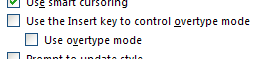
left Overtype mode in, but arranged the default keyboard settings so that the
Insert key doesn’t engage the mode. It’s always been possible in Word for an
advanced user to unmap the Insert key from Overtype mode. Word 2007 simply
does this by default, then adds an explicit option to turn the old keyboard
mapping back on:
I conjecture that Overtype mode is a user interface fossil: a piece of
behavior leftover from a long bygone era whose entire ecosystem has been so
utterly changed that the very rationale for the UI is hard to reconstruct. I
have a dim memory of IBM character mode terminals that let a user could freely
navigate a cursor with directional arrow keys across data entry forms. These
forms to some extent mirrored the behavior of paper forms, letting a user
“fill in the blanks” on the screen. Entering text into a field with existing
text would overwrite the old text with the new. By some twist of fate, some
author of a character mode word processor was compelled—perhaps under duress,
we may never know—to include support for this behavior. An age passed, and
support for this behavior became a requirement for backward
compatibility—leading directly to its carefully preserved (but neutralized)
existence years later in Microsoft’s latest word processor.
You can read more about the substantial UI changes in Office 2007 in Jensen
Harris’
Office User Interface Blog.
When I start my PC these days, I see six or seven different applications in
the Windows system tray screaming for attention. “An update is available!
Update me!” “No—Update ME!” they cry. Great. Another click, another progress
bar, another completely minor upgrade accomplished. One wonders: is there a
meaningful role for the user in this process at all?
When it comes to updates, companies making client software have an enormous
disadvantage versus web-based competitors. Deploying new server bits is a
problem of considerable complexity in its own right, but at least the web
software company gets to decide when to deploy and who conducts the upgrade.
The user has no choice whether to use the updated site or not. In my own
experience, most site updates seem to go rather well (your mileage may vary),
so it’s not something I even pay attention to.
The client software manufacturer, meanwhile, has the challenging task of
deploying bits to a quantity of machines orders of magnitude greater in size.
The target machines could be running in any number of configurations the
manufacturer isn’t even aware of, much less have in their test matrix. The
update process is under the supervision of a user who generally has no idea
what to do if something goes wrong.
Nevertheless, the mere existence of the constantly upgrading web-based
competitor puts considerable pressure on the client software manufacturer to
make the update process as transparent as possible. To be sure, client
software updates are much less of a pain than they used to be.
DLL hell is, by and large,
no longer a nightmare plaguing every single update. Persistent broadband
connections make checking for updates easy, and downloading new bits quick. In
the vast majority of cases, the user needs to supply no additional data, the
updates fall under EULAs the user has already agreed to, and the software
already knows where it should be installed.
So why make the user agree to the update at all? Why not just do the update
for them—at least in the cases where the user doesn’t have to do anything
else?
Users at the extreme end of the techno-savvy spectrum may demand the ability
to control when updates happen. Let’s stipulate that they should have the
right to do so. I expect that most users, however, don’t care to exercise this
right. I think the average person would only ask the following of any client
software manufacturer regarding updates:
Rule 1: Don’t screw up my PC. This includes things like surreptitiously
switching my home page, spamming my desktop, etc.
Rule 2: Don’t try to upgrade your product when I’m in the middle of using
it. In general, don’t distract me from what I’m doing right now. To be
honest, you’re really not that important to me.
Rule 3: Don’t reboot my PC. That’s rude. Whatever Adobe Acrobat Reader is
doing that requires a reboot isn’t worth it to me.
I think that’s about it. Is the typical client software upgrade user
experience these days actually supporting these goals?
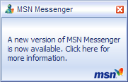
Following a reboot on my main home PC, MSN Messenger (now called Windows Live
Messenger) is the application most likely to be yelling for attention. Its
upgrade experience is at the, er, “good” end of the user experience continuum
for these sorts of things.
This little window that pops up is called a “toast” by the MSN design team
because it pops up like a piece of toast. This particular piece of toast is
lying. Clicking it brings up a dialog that does not, in fact, offer any more
information.
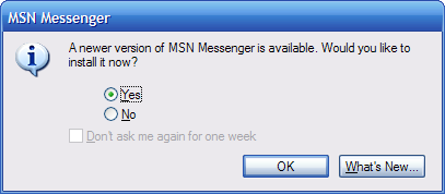
Instead, the toast has actually tricked the user into starting the upgrade
process. (For the record, this particular upgrade to MSN Messenger Version 7.5
will require a reboot.) The user can try to leave, but only by being forced to
agree to be bothered again later. The user can click yet another button to see
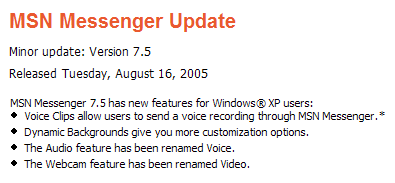
a web page that (finally) tells them why they should care about this upgrade:
It’s interesting to wonder which of the features listed above was the one that
required a reboot.
In any event, the list of new features is beside the point. The placement of
this information—three clicks away from the user—makes this fact obvious. The
user has no choice in this process. It really doesn’t matter whether they like
the new features or not. The manufacturer has updated the software, and will
at some point stop supporting the old software. The user is going to have to
upgrade at some point, or run the risk of being shut out when they really do
need the service.
Why can’t the manufacturer simply arrange to have the client software
automatically upgrade itself at some convenient time?
First, there’s the matter of preference—the user might not actually prefer the
new software to the old software. This is entirely likely, but allowing them
to keep running the old version seems like an incredibly inefficient solution
to the problem. This creates tribes of users running old versions,
complicating maintenance and improvement of both the client and server
software. The enormous resources thus wasted could be put to better use
finding out why people hate the new software and addressing the core design
issues. This is what good web sites do. Or, if the differences are
irreconcilable, the manufacturer can resort to leaving in program options that
preserve aspects of the old user experience. In any event, making upgrades
optional simply delays the inevitable disappointment of a forced upgrade when
the manufacturer eventually can no longer support the old version.
Second, there’s the matter of bad upgrades. Sometimes this is because the
manufacturer wrote buggy code. Postponing the upgrade isn’t going to fix this
problem—the user is going to play upgrade roulette at some point. As noted
earlier, the hapless user’s hardware and software stack may operate in a
configuration outside of the manufacturer’s testing matrix. If this really is
a critical reason to leave upgrades under a user’s control, then the existing
user experiences fall far short of actually supporting this goal.
The problem is that no upgrade experience I’ve seen actually helps the user
conduct a realistic evaluation of whether they can expect the upgrade to go
smoothly in their configuration. As seen above, upgrade announcements for most
applications are entirely rosy lists of new features, with no indication of
what might go wrong. The little pop-up toast affords no links to resources
such as upgrade FAQs, knowledge base articles, or most importantly, current
user discussions of issues related to the upgrade. Users who care about
upgrades currently must find this information on their own.
Given that the mainstream user can’t invest that kind of time, the only user
experience that makes sense for them is automatically upgrading them at a
convenient time (e.g., the machine is idle and it’s the middle of the night).
If the program is in use, the program should at least download the bits,
install as much as it can, and be prepared to cut over to the new version when
the user next restarts the application. (Mozilla Firefox does this, although
with too many dialogs for my taste.)
To support those users who want to carefully manage the upgrade process, the
manufacturer can offer an option for manual upgrades. This option
should—quietly—notify users when an upgrade is available. Since the mainstream
user can’t be bothered to understand that option, the option should default to
automatic upgrades. This scheme is, in fact, the route that Microsoft has
finally taken with Microsoft Windows upgrades. Their user experience certainly
isn’t ideal, and yet on balance Automatic Updates probably saves far more
grief than it inflicts. Given the challenge of the client software upgrade
problem, that’s about as good as anyone can expect.
For someone who loves to see new user interface ideas, it doesn’t get much
better than the current season of Microsoft betas. Last week Microsoft
released a beta of Windows Media Player 11, followed this week by betas of
Office 2007 and Windows Vista. These products are all such significant updates
that, regardless of one’s opinion of Microsoft and its products, they should
all present ample inspiration for user interface designers.
Although I don’t think Microsoft has billed it as such, I believe Windows
Media Player will end up being considered to be the first product in the Vista
wave of UIs to actually ship. (Rumored release dates put it sometime in the
next month or so.) Windows Media Player 11 already embodies many of the Vista
user interface principles and the Aero visual style.
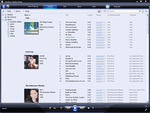
Vista and Aero elements that can be seen in the beta include:
Clean, minimalist UI. All parts of the previous XP-era UI have been
thoroughly overhauled to make sense for this app’s needs, while retaining
clear guiding elements for the new user.
Black glass visual style. This includes pervasive use of lighting effects,
particularly simulated reflection. (The “R” in the original AERO acronym
stood for “reflective”.) Particular design attention has been lavished on
the front and center Play button, which sports a very nice hover effect.
Back/Forward buttons in upper left corner. Web-style navigation is applied
much more consistently in WMP 11 than in previous versions. WMP 11 follows
the general Vista application of navigation to views. For instance, commands
that effect the presentation of a view (the sort order, say), but not its
contents, do not count as navigation events. Changes that effect the
contents (filtering, view changes) are considered navigation events. These
events can be undone by going Back. That is, you click Back to return to
your previously view. This navigation model has been a long time coming, and
feels pretty good to me in practice.
Toolbar across the top spells out the application’s value proposition. Aside
from offering quick access to the WMP’s major features, the toolbar also
lets a new user quickly grasp what it is that WMP actually has or does: play
music, (organize a) Library, Rip, Burn, Sync, and purchase music from a
store. This toolbar element isn’t properly speaking a Vista UI guidelines
element (i.e., something Microsoft asks other ISVs to follow), but is a
hallmark of a number of Microsoft’s own applications included in the Vista
product itself.
Breadcrumb bar across top of viewing area. As in the Vista shell, clicking a
breadcrumb element ("Music", "Library", or
"Songs", in the image above) navigates to that point in the
virtual search hierarchy. Clicking a breadcrumb element’s dropdown arrow
(revealed on hover) allows fast navigation to that element’s siblings in the
hierarchy.
Full text search box in the upper right.
Property tree on left. Of all the Vista element in WMP 11, the property tree
seems the most rudimentary. The Vista shell will eventually deliver a much
richer experience here for filtering and viewing lists, but it’s interesting
to see that WMP is already lined up with that future direction.
New views. The default “Songs” view is an instance of an Expanded Tile that
shows song information alongside album art. I find this more useful and
attractive than either a flat track listing or album art view. This Songs
view will probably not be interesting to folks who acquire individual music
tracks (by whatever means).
I do have one minor nit: The toolbar buttons across the top are split buttons
(on hover, a small portion of the button reveals a dropdown menu), but the
target area for the dropdown arrow is a incredibly thin horizontal rectangle
across the bottom of the button. Common sense (and consequences of Fitts’ Law)
suggest that targets are easier to hit if they’re big and square. The decision
to use a target area along the bottom of the button was presumably influenced
by aesthetic considerations. (Putting the dropdown arrow on the right would
spoil the general horizontal symmetry throughout this UI.) I can appreciate
the importance of aesthetic concerns, but here it seems they should have been
overpowered by the practical need for usability. Or perhaps it’s the case that
only young people with hyperfine dexterity are the people that want to quickly
rip albums at specific bit rates.
Anyway, after a week of using WMP 11, I’m quite impressed.
Over the past few months I’ve found myself confronted by an unexpected
problem: the lack of a functioning platform and ecosystem for using custom
fonts in applications. I’d assumed this problem had been solved long ago, but
practical experience suggests otherwise, as does the the world of extant UI
out there. Something like 99% of the client UIs seem to use a stock system
font, and 95% of all the real text in web pages seems to be set in a standard
sans serif font (Arial or Helvetica). I’ve come to view this as one of the
tightest practical constraints on UI expression today.
User experiences suffer from this bland uniformity, as does an organization’s
ability to reinforce its identity. Type is such an important part of
establishing brand. No one designs printed material without careful
consideration of typography, yet we put up with only tiny amounts of custom
type on web pages and in applications—and this text is inevitably hardcoded as
images where it can’t do as much good. To me this is akin to the color
limitations of yesteryear.
16 colors: Limited, boring, lame
Stock sans serif font: Limited, boring, lame
Here are just some highlights from the catalogue of pain accompanying attempts
to use a custom font in a user interface:
Lack of decent development support for rich text. On most
client UI platforms, if you want to display static text, you use a simple
label control. This label control can generally display a block of text in a
single typeface, point size, weight, and style. There’s generally no support
for simple inline changes like this that apply to a span
within the text; text properties always affect the entire text block. This
leads to a general apathy towards typography that pervades the entire
development experience: since doing anything interesting is hard, why bother?
There’s generally no support for styling, so evolving a user interface that
uses anything but the system font becomes a tedious exercise in tracking down
font references and making sure that every obscure dialog is using your fonts
the right way. Most platforms include a rich text control, but these are meant
for run-time editing, not design-time editing, and their performance is
usually terrible. Alternatively, you could host your text in a browser
control, which has an even worse design-time experience, even worse
performance, and complicates your development substantially as you have to
factor text into tiny fragments of HTML.
Licensing minefield. Oh, you thought you could just give away
that font with your app, huh? That font file is intellectual property that you
need to pay for, and licensing anything can be a legal nightmare. Designers at
large software companies can call in airstrikes from their legal department to
have licensing agreements negotiated on their behalf. Startup folk have to do
this on their own, and what a royal pain it is.
Font foundries are focused on graphic designers. A graphic designer usually
needs one copy of a font for their own use. They create something in Photoshop
or whatever with the font, then create the desired physical (print) or
electronic rasterized output (PDF, etc.). Approaching a company like this with
a request to include their font in your application or site will get you the
email equivalent of a blank stare. I spent an entire morning on the phone with
one of the largest font vendors on the planet trying to find someone who could
license one of the company’s fonts to me. I was transferred
seven times to different people, none of whom had the faintest idea
was I wasking for. One person asked me whether my application would be used by
more than 5 people. The company’s web site was no help—in fact, it was
misleading and therefore worse than useless. Whever a company has this much
trouble accepting money from someone desperate to do the right thing and pay
them, something is seriously wrong.
Installation hassles. For Microsoft Windows, at least,
support for custom fonts remains the same as it has for years: you can only
reference fonts that installed in system’s Fonts folder. This means that your
Setup program has to physically copy the required font files to the user’s PC.
The copied fonts are loose font files
that the user can then use themselves. This is Lame with a capital
"L", particularly because it compounds your licensing nightmares
(above). Why on earth should you have to pay to give all your customers the
ability to use a font in their own documents just because you want to use it
in your app’s UI? You don’t have to give your customers loose copies of your
audio files, or image files, or videos, or any other type of resource. Recent
experience has convinced me that installing fonts on Windows is a fragile and
buggy proposition. Even with the substantial assistance of a widely-used setup
framework, it’s absurdly difficult to ensure that the fonts you want get
registered in such a way that they can be used immediately (without requiring
a reboot) under all conditions. Other OSes may fare better here, but given the
problems I’ve witnessed in Windows, it’s no big surprise that most Windows
ISVs punt and stick with Tahoma.
Web limitations. Web sites that want to use custom fonts can
resort to what can only be described as hacks. You can use Microsoft’s
WEFT
(Web Embedding Fonts Tool) if you want to limit yourself to Internet Explorer
and sign up for a bunch of deployment hassle. You could also look at tricks
like sIFR that (amazingly)
work but involve gyrations with scripting and Flash. Isn’t it odd that it’s
easier to make text blink than it is to format that same text in a font that
is part of your organization’s visual identity? One can infer that the small
number of sites using any of these hacks is a reasonable indiciator that the
problem remains unsolved.
Flash is a bright spot here, giving designers the choice of embedding fonts or
referencing installed fonts. Unfortunately, for a variety of reasons, I don’t
find Flash a viable option for mainstream application development. If you’re
someone who gets to use Flash, I envy you your freedom of typographic
expression.
Given the pace of change, I’m sure this problem will eventually be fixed. In a
few years we’ll look back at screen shots of client apps or web pages from
this time and instantly recognize them as dating from an earlier era—because
most of the text will be formatted in the same stupid sans serif fonts.
One of the realities of startup life is that there’s not much time left for
side pursuits like blogging. Every project ebbs and flows between periods that
are busy and periods that are completely, insanely busy. The last two months
have qualified as insanely busy, forcing an unplanned hiatus from blogging
here on flow|state.
Many thanks to those of you who shared their support and quietly expressed
interest in when the next post was coming. As my company’s first product
trundles along towards its initial launch, there will be more insanely busy
periods, but I’m hoping to find a posting schedule that lets me keep
contributing even through those periods.
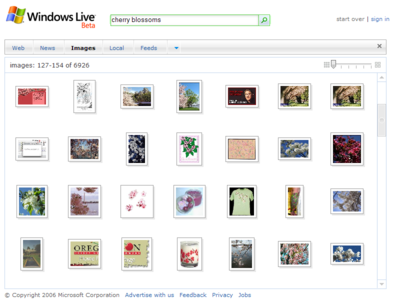
It’s a relief to finally see Ajax-based search pages moving beyond the
limitations of vanilla HTML pages. A good example is the recent update to
Windows Live
Image Search, which allows you to browse an entire set of search results in a single
scrolling region.
I use Google’s
image search
a lot. The most time-consuming part of posting to this blog is often getting a
decent screenshot, and while a
good screen capture tool
is invaluable, it’s often faster to google for a screenshot. For certain types
of UIs, such as cell phone UIs, this is sometimes the only reasonable way to
get a good screenshot at all.
Google’s image search tool is good but doesn’t seem to have changed
significantly in a year or so, whereas Microsoft’s image search tool makes a
number of important advances. Live’s single scrolling region is much faster to
navigate than Google’s multiple pages, especially since Google insists on
putting the Next button only at the bottom of the page (where it often ends up
below the fold). Live also lets you scale the size of the thumbnails so you
can either quickly scan lots of images or linger over more detail. Live makes
good use of large ToolTip pop-ups that give you a decent preview of the image
before you navigate. Finally, after you click a thumbnail, Live provides a
filmstrip view of your search context down the left side of the page, allowing
you to continue navigating without having to return to the main results page.
It must said that even though Live’s virtualized image list box is faster in
practice to navigate than browsing multiple pages, the scroll bar feels just
slow enough to make the overall user experience seem unresponsive. Hopefully
they haven’t hit the upper bound of what’s possible in Ajax yet, and we’ll see
some improvement in performance in Live—and in Google as they play
catch-up.
Thanks to those of you who pointed out that the first Windows delete
confirmation dialog described in the previous post only appears when the user
presses the Del key, but not if they use drag and drop. (I’d been trying to
reproduce the dialog using drag and drop.)
Both Windows and the Mac offer multi-key keyboard shortcuts (Shift+Del and
Command+Backspace, respectively) to delete a file without displaying a
confirmation dialog. Since the Mac doesn’t offer a single key shortcut for
deleting a file, it has no need of a confirmation dialog. Personally, I find
this to be an elegant answer, although it’s inconceivable that Windows would
take its Del shortcut away.
I still argue that the dialog in Windows should fade away. As a comment to the
earlier post describes, the dialog would be an appropriate place to educate
the user on how the Recycle Bin works, where to find it, and how to get things
back out of it. Once the user has figured out how the Recycle Bin works, they
should be able to easily get rid of the dialog with an option in the dialog
itself (and not in a property dialog far away). Alternatively, Windows could
simply track user actions and determine when the user no longer required this
education.
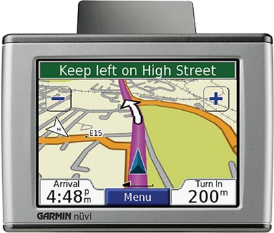
The new Garmin Nuvi GPS
presents a well thought-out UI, cleanly knitting together three modes of
interaction: display, touch, and audio.
Garmin and other manufacturers have been making GPS units since the late
1980s, and during that time have continually made incremental improvements in
size, form factor, performance, and UI. From time to time I’ve looked at the
category, but beyond the flat-out magic of finding your way using satellites,
I found little captivating about the products themselves. GPS units have
suffered from a wide range of UI problems, such as the heavy use of jargon,
awkward use of a few buttons to accomplish complex tasks (such as entering an
address), and cumbersome systems for transferring maps to a device with
limited memory.
Sometimes you encounter a product and get the strong feeling its the first one
in its category to really be Designed, with a capital "D". In my
case, TomTom had the first GPS with that
distinction. From the branding to the startup sound to the UI, they had
clearly thought about the product as a consumer experience. Despite breaking
that ground, I still felt that the TomTom product I saw came up short.
The Garmin Nuvi is the first GPS I’ve seen that meets my bar for a good user
experience. They’ve given a lot of thought to an overall package of
functionality a traveler might want in a single pocket device. In addition to
the GPS, the Nuvi unit includes an MP3 player, a photo vault, a currency
converter, a world clock, a foreign language dictionary, and a travel guide.
This is a good sign that Garmin’s considering the overall user experience of
the device, not just trying to make a housing for a satellite receiver.
You can read thorough plenty of reviews of the Nuvi elsewhere, so I’ll focus
on the nice bits in the user experience:
Clear screen organization, with careful use of color, shape, contrast, and
typography to define a hierarchy of screen elements. Consider that in the
above image they’ve made the "200" in a significantly larger font
than the "m" (meters) unit that follows it. Moreover, they’ve
top-aligned the "m" unit to maintain the legibility of the much
more important number. In this particular application, it’s critical for the
user to be able to glance down at the screen and get a sense of how far they
have to go until they need to turn. That is, if they see three characters,
they know they have hundreds (3 characters) of meters left to go, not
thousands (4 characters). Displaying the units as "200m" in the
same font and aligned along the text baseline would make it harder for the
user to intuitively grasp this.
Responsive touch screen. Unlike some folks (like
Toyota), Garmin generally makes good use of buttons placed flush against the
corners to improve the chance you’ll actually hit what you want. (The map
screen above is an exception.)
Generally solid implementation of a
BBOP
(Back, Buttons, One Task, Page Based) UI. One small nit: they show a Back
button on almost every page, but not on all pages. In particular,
if you click the Menu button in the main driving map (shown above), you end
up a menu page with no clear way to get back to what you were looking at. It
turns out you need to pick one of the menu options: the one called
"View Map". I found this counter-intuitive. In general, I think
that if you’re going to offer a Back button on the screen, you need to offer
this button on every screen and in the same location.
Judicious use of "transparent" buttons on maps to add UI elements
that take up a surprisingly small amount of actual screen pixels. The Zoom
In/Out buttons shown above are roughly 46x46 pixels square and the border is
two pixels thick. The borders only consume about 350 pixels, and for that
price they get a pretty big transparent button. A transparent button like
this consumes about the same number of pixels as a 19x19 solid button, which
would be incredibly tiny on a touch screen.
Reasonably good voice prompts with text-to-speech. I was impressed with the
Nuvi’s ability to not only pronounce local street names, but to apply fairly
natural phrasing and intonation to an entire instruction. I do think Nuvi
and similar products could benefit by tightening up the phrases they’re
trying to read. No human passenger includes street type or direction markers
when giving instructions to a driver, unless such information is currently
salient. Instead of saying, "Turn left of East Galer Street" like
the Nuvi does, people say, "Turn left on Galer". People generally
add more information like "East" only when that helps discriminate
among the current roads the driver can turn down. It would be relatively
trivial to add this refinement to a GPS voice UI.
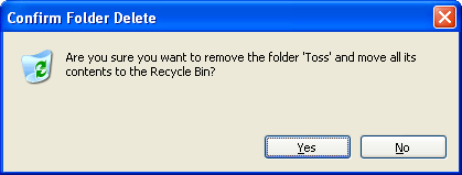
Before leaving behind the previous topic of deletion patterns, let’s briefly
look at one of the weakest implementations of the Trash pattern anywhere: the
Recycle Bin in Microsoft Windows. On the Mac, when you move something to the
Trash, it moves to the Trash. In Windows, when you move something to the
Trash, you get this:
When Microsoft appropriated the Trash pattern (from Apple and Xerox), it was
apparently helpless to resist the desire to protect the user with a
confirmation dialog—even though
the entire point of the Trash pattern is to avoid irritating the user with
a confirmation dialog. File this one under, "Unclear on the concept".
For what it’s worth, both Windows and the Mac display an additional
confirmation dialog if you manually invoke the Empty Trash command. The
Windows dialog says like, "Are you sure you want to delete these
<number> items?" The Mac dialog says: "Are you sure
you want to remove the items in the Trash permanently? You cannot undo this
action." It’s a matter of opinion, but here I give a slight preference to
the Windows version, since the Mac dialog is redundant; an action that’s
permanent is, by definition, an action that can’t be undone. (You could also
argue that, if you know how to use disk utilities, the delete operation
isn’t actually permanent. Either way, the dialog is wrong.)
The confirmation dialogs in the Windows means the lucky user has at least
three chances to avoid accidental deletion! They can: 1) say No to
the first confirmation dialog, 2) Undo the move to the Recycle Bin, or 3) say
No to the second confirmation dialog. It’s nice to know that, with all this
protection, no Windows user anywhere has ever deleted something they didn’t
want to delete.
It’s possible that Microsoft has silently made some progress on this issue.
When I tried to reproduce the first delete confirmation dialog to take a
screen shot of it, I was unable to get it to appear on any of five different
Windows XP PCs. The "Display delete confirmation dialog" check box
still exists in the Recycle Bin’s Properties dialog, but as far as I can tell,
this check box no longer has any effect. Perhaps the dialog was quietly
dropped in a service pack update? I can find no confirmation of this on the
net. If anyone has an authoritative account on whether this dialog has been
dropped, let me know. It’d be nice to say good riddance to an unloved dialog.
Many client applications and web sites let the user enter and manipulate data,
and these manipulations often include the ability to delete data. Designers of
UIs that include deletion of data generally feel the need to protect the user
from unintentionally destroying data. For such a UI, it’s important to
consider the context surrounding the Delete command (or whatever action
triggers deletion) before settling on a solution.
It’s worth asking: exactly what is the concern with the user clicking a Delete
button? I’ve often heard people express fear that the user’s mouse might slip
and click a Delete button, or that the user might not be paying much attention
to what they are doing and might stab at the Delete button without
understanding what it will do. I suspect that, in many cases, designers now
habitually second guess the user’s intention behind a deletion without
considering alternatives.
Designers actually have more choices at their disposal than a delete
confirmation dialog. Here’s a quick survey of some UI patterns for a Delete
command, in rough order of what I perceive to be the most frequently
encountered to least frequently encountered:
Delete with Confirmation Dialog. The user selects a Delete command (or press
the Del key, etc.) and the application displays an "Are you sure?"
dialog; the application only deletes the data if the user responds
affirmatively. Such dialogs are ubiquitous. The goal is to provide the user
with a second chance to consider their action. In my experience, such
dialogs provide slender protection—users can blow past the confirmation
dialog before their brain has even registered what it is asking them.
Delete Immediately. The user selects Delete, and the application deletes the
data immediately. This is generally used if the amount of accidental loss is
very small, or if it’s quite easy to reconstruct any accidentally deleted
data. A good example here is the Delete button next to items in today’s
typical web shopping cart. In my opinion, this plain "Delete
Immediately" pattern is woefully underused. As shopping carts show,
it’s perfectly fine to blow away data immediately if the user can just
quickly add back something they didn’t mean to delete. (This is probably
another case where the difficulty of producing a dialog in vanilla HTML
inadvertently leads to a better UI.)
Delete + Undo (single or multi-level). The application deletes the data
immediately, but allows the user to undo the deletion by selecting separate
Undo command. The application may allow the user to Undo only the most
recent operation, or any arbitrarily long history of operations. The classic
example here is a text editor. Most decent file system browsers support an
Undo stack as well. This model is actually quite nice: it provides the
benefits of Delete Immediately, and moves the complexity of restoring data
to those users actually facing the need to get their data back. Even a
single level of Undo can be helpful, as described in this
post about Gmail’s Undo Deletion command.
Trash (with manual or automatic cleanup). The application moves deleted data
to a temporary Trash bin (or Recycle Bin, if you’re afraid of being sued by
Apple). The user can recover deleted data from the Trash. The data is
permanently deleted at some later point in time: when a time interval
elapses, when some space threshold is exceeded, or when the user manually
empties the Trash. The classic example here is the Mac Trash can, but most
email clients follow this model as well. Perhaps because of these strong
precedents, the Trash pattern is used almost exclusively in icon-based
object-oriented UIs, and rarely anywhere else.
Mark for Deletion. The user invokes Delete, and the selected data is marked
in some way (e.g., grayed out, or with strikethrough) to indicate
that the data is still there, but will no longer be treated as active
(included in calculations, etc.). As with the Trash pattern, the data is
permanently deleted at a later point. Example: IMAP email clients such as
Mozilla Thunderbird. I consider this to be another under-utilized
pattern.
Delete with Context-Sensitive Confirmation Dialog. The user selects Delete,
and the application determines from the data to be deleted or other
contextual information whether the user is likely to be unaware of
consequences of the operation. In other words, the delete confirmation
dialog only comes up with when it’s important. A tepid example of
this pattern comes up in text editors that only give you a "Save
changes?" dialog if you’re trying to close a non-empty document, but
that close an empty document silently. This is another pattern that could
benefit from much wider use. The basic idea is that, if the dialog only came
up in the 10% of the time the user was really about to shoot themselves in
the foot, the user would have a higher chance of stopping to read what it
said. "Are you sure you want to delete this file you’ve been working on
for the last eight hours?"
Any time an "Are you sure?" dialog is about to be added to a UI
should force you to at least briefly consider whether an alternative pattern
might better suit the context.
Earlier this month I attended the massive CES 2006 show in Las Vegas. When you
meet someone during or after the show, the stock question you get is:
"What was the coolest thing you’ve seen at the show?" My answer: the
new
Sony Reader.
What was impressive about this device was not the electronic ink technology,
nor the range of improvements this version 2.0 device shows over its
predecessor. No, the most amazing this about this device is that
this is a Sony device that accepts SD media cards.
In early 1988 I had the chance in Japan to see a Sony representative
demonstrate the Mavica, their first production digital camera. For the past 18
years I’ve watched Sony’s relentless efforts to foist this memory format on a
rather uninterested public. In all those years I have experienced exactly one
occasion where I found myself needing to transfer files between two devices
that turned out to both be Sony devices and where I was hence able to use a
Memory Stick to directly transfer the files.
It’s gratifying to see Sony finally concede the inevitable and recognize the
standard media formats that consumers actually want to use.
Most UI platforms allow a designer to indicate which button in a dialog should
be the default button: the button that will be pressed if the user
types the Enter key. The default button is generally the button the user is
most likely to press next, often a button like OK that closes the dialog. In
very high-traffic dialogs, you may want to consider dynamically changing the
default button to save keystrokes and help speed the user’s task.
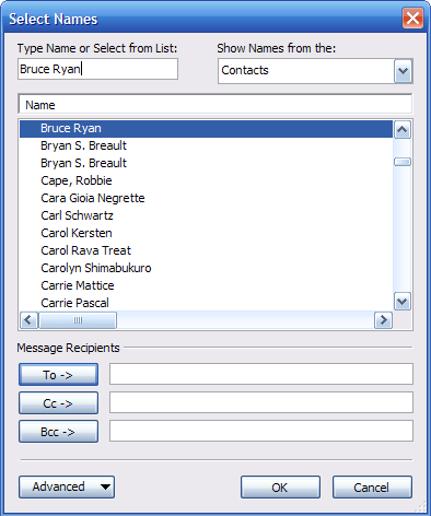
The best example I can think of is the "Select Names" dialog in
Microsoft Outlook for picking recipients for an email message. When the dialog
opens, the focus starts out the "Type Name" field, and the default
button is the "To ->" button:
The user can start typing a name immediately, and when they’ve finished typing
the name (or have selected a name in the list), they can press Enter to do the
most likely thing: add the name to the message’s To line.
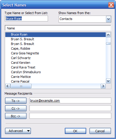
Here’s where things get interesting. Watch what happens after the user presses
Enter:
The OK button is now the default button! Having added someone to the To line,
the user’s most likely next action has changed: they’re now most likely to
want to click the OK button and close the dialog. So, the OK button becomes
the default button. (Leaving the To button as the default would be a bit of a
waste here, because there’s essentially no chance that the user wants to add
the same recipient to the message twice.)
The keyboard focus stays in the "Type Name" field. (The previous
name is left selected in case the user wants to edit it, but typing will
replace the selection.) The user can type any key but Enter (or Escape, etc.)
to start entering a new name, in which case the "To ->" button
becomes the default button again. That is, the user is returned to the state
shown in the first image.
The overall result is that a user can open the dialog, type a name, then press
Enter twice to add the name and close the dialog. This behavior is natural
enough that most users zip through the dialog without even noticing what’s
going on.
Since this technique is somewhat unusual, it should be used judiciously. The
above dialog was arrived at after many, many iterations, and capitalizes on a
very predictable sequence of user actions to shave time off a very common
task. Without careful attention to detail, it would be easy to end up moving
the default button to the wrong place and cause users to accidentally press
the wrong button. The larger point here is that it’s worth exploring the
limits of standard user interface behavior to streamline a UI that will
receive a high volume of traffic.


