Approachable UI package in Garmin Nuvi GPS
The new Garmin Nuvi GPS presents a well thought-out UI, cleanly knitting together three modes of interaction: display, touch, and audio.
Garmin and other manufacturers have been making GPS units since the late 1980s, and during that time have continually made incremental improvements in size, form factor, performance, and UI. From time to time I’ve looked at the category, but beyond the flat-out magic of finding your way using satellites, I found little captivating about the products themselves. GPS units have suffered from a wide range of UI problems, such as the heavy use of jargon, awkward use of a few buttons to accomplish complex tasks (such as entering an address), and cumbersome systems for transferring maps to a device with limited memory.
Sometimes you encounter a product and get the strong feeling its the first one in its category to really be Designed, with a capital "D". In my case, TomTom had the first GPS with that distinction. From the branding to the startup sound to the UI, they had clearly thought about the product as a consumer experience. Despite breaking that ground, I still felt that the TomTom product I saw came up short.
The Garmin Nuvi is the first GPS I’ve seen that meets my bar for a good user experience. They’ve given a lot of thought to an overall package of functionality a traveler might want in a single pocket device. In addition to the GPS, the Nuvi unit includes an MP3 player, a photo vault, a currency converter, a world clock, a foreign language dictionary, and a travel guide. This is a good sign that Garmin’s considering the overall user experience of the device, not just trying to make a housing for a satellite receiver.
You can read thorough plenty of reviews of the Nuvi elsewhere, so I’ll focus on the nice bits in the user experience:
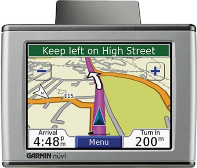
- Clear screen organization, with careful use of color, shape, contrast, and typography to define a hierarchy of screen elements. Consider that in the above image they’ve made the "200" in a significantly larger font than the "m" (meters) unit that follows it. Moreover, they’ve top-aligned the "m" unit to maintain the legibility of the much more important number. In this particular application, it’s critical for the user to be able to glance down at the screen and get a sense of how far they have to go until they need to turn. That is, if they see three characters, they know they have hundreds (3 characters) of meters left to go, not thousands (4 characters). Displaying the units as "200m" in the same font and aligned along the text baseline would make it harder for the user to intuitively grasp this.
- Responsive touch screen. Unlike some folks (like Toyota), Garmin generally makes good use of buttons placed flush against the corners to improve the chance you’ll actually hit what you want. (The map screen above is an exception.)
- Generally solid implementation of a BBOP (Back, Buttons, One Task, Page Based) UI. One small nit: they show a Back button on almost every page, but not on all pages. In particular, if you click the Menu button in the main driving map (shown above), you end up a menu page with no clear way to get back to what you were looking at. It turns out you need to pick one of the menu options: the one called "View Map". I found this counter-intuitive. In general, I think that if you’re going to offer a Back button on the screen, you need to offer this button on every screen and in the same location.
- Judicious use of "transparent" buttons on maps to add UI elements that take up a surprisingly small amount of actual screen pixels. The Zoom In/Out buttons shown above are roughly 46x46 pixels square and the border is two pixels thick. The borders only consume about 350 pixels, and for that price they get a pretty big transparent button. A transparent button like this consumes about the same number of pixels as a 19x19 solid button, which would be incredibly tiny on a touch screen.
- Reasonably good voice prompts with text-to-speech. I was impressed with the Nuvi’s ability to not only pronounce local street names, but to apply fairly natural phrasing and intonation to an entire instruction. I do think Nuvi and similar products could benefit by tightening up the phrases they’re trying to read. No human passenger includes street type or direction markers when giving instructions to a driver, unless such information is currently salient. Instead of saying, "Turn left of East Galer Street" like the Nuvi does, people say, "Turn left on Galer". People generally add more information like "East" only when that helps discriminate among the current roads the driver can turn down. It would be relatively trivial to add this refinement to a GPS voice UI.
Overall, a nice information appliance.