Matching design sketches to the desired level of design feedback
When you ask people for feedback on a design that has not yet been implemented, take care how much polish you put on the design’s representation. A counter-intuitive principle of soliciting early design feedback is that people reviewing a highly polished design may concentrate on superficial details and overlook fundamental issues. In the early stages of the process, you may be able to elicit deeper feedback by striving for an unfinished look in your design representations.
Even novice designers can employ production tools like Adobe Photoshop or Flash to quickly work up beautiful conceptual screen shots or prototypes. They can lavish attention on the presentation of early design concepts, even those that might be thrown away. However, when such a design is shown for review, reviewers may fixate on such details as the color on a button—and fail to question why the button, or indeed the entire screen, needs to exist at all.
One obvious force at work here is the visually engaging nature of beautiful imagery. I believe another, subtler issue is that people unintentionally calibrate their criticism according to their impression of where you are in the development process. A highly polished image may look like a screen shot of an implemented UI, or at least the result of many weeks’ work, leading someone to assume that only small details can be changed at this point. Even if you repeatedly remind them that the design is just an early sketch, they may still demur from suggesting anything so bold as starting over. People may also have difficulty criticizing a design if the representation seems far beyond what they could have created themselves.
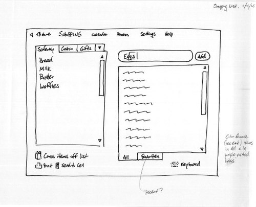
As an antidote to this phenomenon, in my own design process I usually keep early designs looking rough, and try to refrain from jumping straight to a polished result. I often draw early sketches by hand with paper and ink. Why ink and not pencil? I don’t want to give myself too much opportunity to polish up even a hand-drawn sketch. To avoid the tedium of recreating design elements like navigation bars, I sometimes draw a sketch of just the global design elements, then photocopy that to create a template for sketches of individual screens. I take care to leave even the template sketch looking pretty rough.
Here’s a scan of an early sketch for Cozi Central’s Shopping Lists area:

No one has any trouble giving feedback at this stage, any may indeed call for something completely different. Reviewers figure, "How hard could it have been to crank that out? I could have done that!"
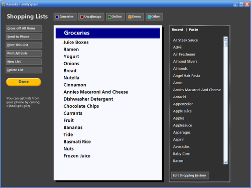
After I’ve had a chance to iterate at this hand-drawn level, I may create a prototype in Microsoft PowerPoint to explore some interactive elements. Again, I resist the temptation to apply visual polish. It’s still too early.
I’ll eventually create a skeleton UI directly in a development environment’s visual designer, leading to a design like this:

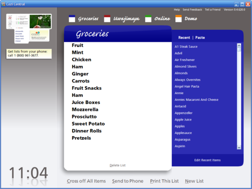
At this stage, things are being to feel more solid and less mutable. Design feedback may begin to focus on smaller details, but people still recognize substantial room for change. Following further iteration, the design stabilizes enough to warrant a full treatment from visual design specialist:

The design is now polished to the point that many people may find it difficult to look past the surface. Luckily, by now significant portions of the design are often functional enough that people can interact directly with the user interface. This opportunity can counteract the tendency to notice only superficial issues. People who have a chance to actually use a design will generally notice when it suddenly does something they didn’t want. A thoughtful user will step back and realize the problem lies with the software (and not with them), and deliver this feedback to you.
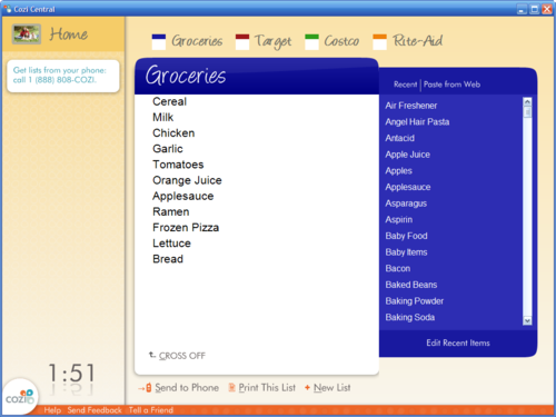
In this particular interface, feedback that came late in the game on the surface appearance turned out to be quite important too. People who looked at the above design said that it was "cool", in both senses of the word: interesting, but also cold. Since we were aiming the product at families for use at home, we iterated on the design to produce a warmer feeling. The feature finally shipped like so:

If you’re intrigued by the idea of presenting rough sketches early in the development cycle, but appalled by the idea of manually drafting paper sketches, you might consider modifications to your own design process. This past week I conducted design reviews of a PowerPoint prototype that used a free handwriting font (at a suitably legible point size) for the UI text. The feedback collected during the reviews was at the right level for this stage of the process, and it was easy to refine the design between reviews, so I’m likely to use this approach again in the future.