Windows Media Player 11: Early bit of Aero
For someone who loves to see new user interface ideas, it doesn’t get much better than the current season of Microsoft betas. Last week Microsoft released a beta of Windows Media Player 11, followed this week by betas of Office 2007 and Windows Vista. These products are all such significant updates that, regardless of one’s opinion of Microsoft and its products, they should all present ample inspiration for user interface designers.
Although I don’t think Microsoft has billed it as such, I believe Windows Media Player will end up being considered to be the first product in the Vista wave of UIs to actually ship. (Rumored release dates put it sometime in the next month or so.) Windows Media Player 11 already embodies many of the Vista user interface principles and the Aero visual style.
Vista and Aero elements that can be seen in the beta include:
- Clean, minimalist UI. All parts of the previous XP-era UI have been thoroughly overhauled to make sense for this app’s needs, while retaining clear guiding elements for the new user.
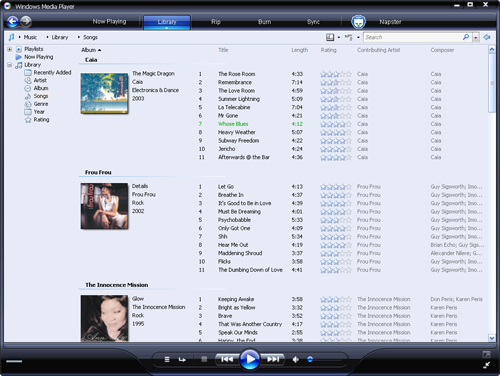
- Black glass visual style. This includes pervasive use of lighting effects, particularly simulated reflection. (The “R” in the original AERO acronym stood for “reflective”.) Particular design attention has been lavished on the front and center Play button, which sports a very nice hover effect.
- Back/Forward buttons in upper left corner. Web-style navigation is applied much more consistently in WMP 11 than in previous versions. WMP 11 follows the general Vista application of navigation to views. For instance, commands that effect the presentation of a view (the sort order, say), but not its contents, do not count as navigation events. Changes that effect the contents (filtering, view changes) are considered navigation events. These events can be undone by going Back. That is, you click Back to return to your previously view. This navigation model has been a long time coming, and feels pretty good to me in practice.
- Toolbar across the top spells out the application’s value proposition. Aside from offering quick access to the WMP’s major features, the toolbar also lets a new user quickly grasp what it is that WMP actually has or does: play music, (organize a) Library, Rip, Burn, Sync, and purchase music from a store. This toolbar element isn’t properly speaking a Vista UI guidelines element (i.e., something Microsoft asks other ISVs to follow), but is a hallmark of a number of Microsoft’s own applications included in the Vista product itself.
- Breadcrumb bar across top of viewing area. As in the Vista shell, clicking a breadcrumb element ("Music", "Library", or "Songs", in the image above) navigates to that point in the virtual search hierarchy. Clicking a breadcrumb element’s dropdown arrow (revealed on hover) allows fast navigation to that element’s siblings in the hierarchy.
- Full text search box in the upper right.
- Property tree on left. Of all the Vista element in WMP 11, the property tree seems the most rudimentary. The Vista shell will eventually deliver a much richer experience here for filtering and viewing lists, but it’s interesting to see that WMP is already lined up with that future direction.
-
New views. The default “Songs” view is an instance of an Expanded Tile that
shows song information alongside album art. I find this more useful and
attractive than either a flat track listing or album art view. This Songs
view will probably not be interesting to folks who acquire individual music
tracks (by whatever means).
I do have one minor nit: The toolbar buttons across the top are split buttons (on hover, a small portion of the button reveals a dropdown menu), but the target area for the dropdown arrow is a incredibly thin horizontal rectangle across the bottom of the button. Common sense (and consequences of Fitts’ Law) suggest that targets are easier to hit if they’re big and square. The decision to use a target area along the bottom of the button was presumably influenced by aesthetic considerations. (Putting the dropdown arrow on the right would spoil the general horizontal symmetry throughout this UI.) I can appreciate the importance of aesthetic concerns, but here it seems they should have been overpowered by the practical need for usability. Or perhaps it’s the case that only young people with hyperfine dexterity are the people that want to quickly rip albums at specific bit rates.
Anyway, after a week of using WMP 11, I’m quite impressed.