Windows Live image search makes strides beyond Google
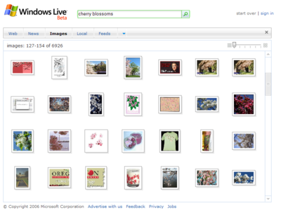
It’s a relief to finally see Ajax-based search pages moving beyond the limitations of vanilla HTML pages. A good example is the recent update to Windows Live Image Search, which allows you to browse an entire set of search results in a single scrolling region.

I use Google’s image search a lot. The most time-consuming part of posting to this blog is often getting a decent screenshot, and while a good screen capture tool is invaluable, it’s often faster to google for a screenshot. For certain types of UIs, such as cell phone UIs, this is sometimes the only reasonable way to get a good screenshot at all.
Google’s image search tool is good but doesn’t seem to have changed significantly in a year or so, whereas Microsoft’s image search tool makes a number of important advances. Live’s single scrolling region is much faster to navigate than Google’s multiple pages, especially since Google insists on putting the Next button only at the bottom of the page (where it often ends up below the fold). Live also lets you scale the size of the thumbnails so you can either quickly scan lots of images or linger over more detail. Live makes good use of large ToolTip pop-ups that give you a decent preview of the image before you navigate. Finally, after you click a thumbnail, Live provides a filmstrip view of your search context down the left side of the page, allowing you to continue navigating without having to return to the main results page.
It must said that even though Live’s virtualized image list box is faster in
practice to navigate than browsing multiple pages, the scroll bar feels just
slow enough to make the overall user experience seem unresponsive. Hopefully
they haven’t hit the upper bound of what’s possible in Ajax yet, and we’ll see
some improvement in performance in Live—and in Google as they play
catch-up.