Times Reader finally delivers long-promised digital newspaper reading experience
For the past month I’ve been playing with Times Reader, a Windows client application for browsing the New York Times. I think the computing industry has been promising this sort of digital newspaper for, oh, 30 years or so, so it’s nice to see it finally happened.
I remember reading about early prototypes of digital newspapers in coverage of work at the MIT Media Lab in the 1980s. The basic idea is that the computer would download news articles, then use principles of layout and typography to create a result that was optimal for browsing and reading on the user’s display. Since then we’ve seen the advent of newspaper web sites, but in my opinion, none of them offer anything close to the pleasure of reading a paper newspaper.
In general, Times Reader effectively realizes the original digital newspaper vision. It makes intelligent layout decisions that maximize legibility, achieve a reasonable aesthetic appearance, keep articles on one page if possible (to avoid scrolling), and allow for advertisements. It also renders type exceedingly well by using ClearType.
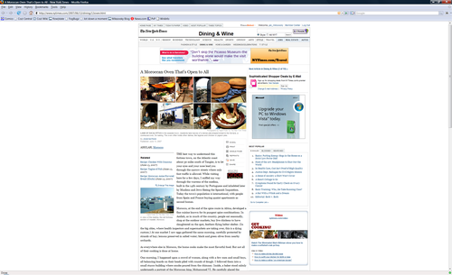
The results are particularly interesting on a large monitor. Compare a typical New York Times article in a web browser:

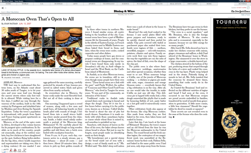
The browser version is quite static, and makes poor use of the display space. Times Reader, in contrast, takes full advantage of the available screen real estate, all the while following time-honored rules for column widths, leading, margins, and so on:

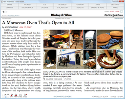
At a modest window size, Times Reader still does its best to create an effective presentation of the same article:

I find Times Reader actually does deliver a more newspaper-like reading experience. When I don’t have a chance to read the paper edition of the Times, I enjoy catching up in Times Reader over reading the basic nytimes.com site.
That said, I’m not sure many people will find the experience so much better that it’s worth a download and the additional hassle of using a separate application. According a Microsoft press release about Times Reader, the application is developed in Windows Presentation Foundation (Avalon), which in turn requires the Microsoft .NET framework. (Interestingly, the ads appear to be implemented in WPF as well, so the marketing verbiage can also be rendered in gorgeous ClearType.) If you’ve got Vista, the install isn’t a big deal, but Windows XP users will probably struggle.
I’ve found some practical issues with Times Reader as well. In theory Times Reader has a component that downloads and caches content when you’re not running the app itself, but this doesn’t seem to always work. At least, in my experience, I’ve found that I sometimes boot the app only to discover that the content is stale. A progress indicator in the corner spins for several minutes to let me know it’s working, but as new content begins to appear (over many minutes), I have no way of knowing which content is stale and which is fresh.
Moreover, Times Reader uses a newspaper-style columnar layout for the section summary pages. These look great, but their minimalist appearance unfortunately leaves the reader wondering which articles are the most recent: is the article in the upper left the most recent, or the most important, or some combination?
Finally, while Times Reader does a better job than a browser at rendering a page of content, the actual browser frame of the application is unremarkable, and it’s tiresome to use a separate browser just to read one site. I’m looking forward to seeing Times Reader rewritten in Silverlight so the entire thing can just run in the browser.
I think it’s interesting to note that Times Reader omits a feature always stressed in early digital newspaper prototypes. Those demos invariably showed off a user’s ability to selectively express interest in certain types of news. ("In the future, we engineers won’t have to even see the Sports pages!") By now, most news sites don’t make a big deal of this sort of personalization. If someone’s really interested in a particular topic, they can either set up a news filter for it or, more likely, just visit a specialized news site focused solely on that topic. If someone’s uninterested in a topic, they can just ignore it.
I first saw early demos of Times Reader several years ago and it’s frankly stunning that the product actually broke through to see the light of day. It’s exactly the sort of technology collaboration that sounds so great in principle, but in practice is hardly ever pulled off. Kudos to the Times Reader teams at both Microsoft and the New York Times for their success in bringing this to fruition.