Many thanks to people who shared suggestions in the previous post on
keyboard navigation. I’m looking forward to trying them out on Cozi’s
site.
Continuing a discussion of
keyboard navigation, it’s worth asking whether the Tab navigation model itself is a problem that
needs fixing. The Tab model works well in the small dialogs for which it was
designed, but has completely failed to scale up to navigating complex web
sites. Consider two user interfaces, one old and one contemporary:
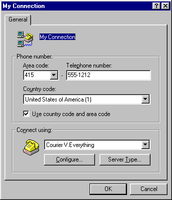
Windows 95 dialog with approximately 10 focusable controls
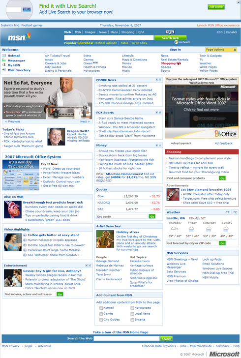
Default MSN.com home page with approximately 200 focusable controls
Note that
the relative scale of these two screens has been preserved.
Both spatially and logically, the user has a much, much larger area to move
around.
Modern operating system UIs provide two standard mechanisms for moving the
focus around a window using the keyboard: a linear Tab model, and explicit
keyboard shortcuts (e.g., Alt keys). The Tab model is the most commonly used
for moving between fields in a UI. It evolved from a UI intended for
navigating through the modest collection of input fields that could fit on
small character-based display (with, for example, 24 rows of 80 characters),
and represented an evolution in turn from Tab keys on typewriters. The Tab
model hasn’t evolved much since the character-based days. A single control in
the active window has the keyboard focus. This control indicates its active
state in one of several ways: button-like controls and list boxes show a
dotted marquis or other highlighting effect, while text controls show an
insertion point or selection. Pressing the Tab key moves the keyboard focus
through the focusable (interactive) controls on the page in a linear order
defined at design time by the programmer. Pressing Shift+Tab moves the focus
through that order in reverse.
That the Tab model was adequate for simple dialogs like the one above is
evidenced by the model’s survival over decades of change in UIs. To my mind
this model has completely broken down, however, in its application to typical
web pages. The first issue is one of scale: the page above has
twenty times the number of focusable controls as the simple
dialog. A user trying to use the keyboard to reach a link in the middle of the
page might have to press the Tab key 125 times to reach it. (Or, if they were
exceptionally efficient, they could tab around the other direction and only
have to press Shift+Tab 75 times.) The second issue is that the page has a
much more complex two-dimensional columnar layout that the dialog, but that
layout cannot be captured in the one-dimensional tab order. To the user, the
behavior of the Tab key is therefore quite unpredictable.
The other standard keyboard navigation technique—explicit keyboard
shortcuts—are also inadequate for complex user interfaces. Microsoft Windows
allows users to move the focus directly to a control on the dialog by pressing
a keyboard shortcut, generally the Alt key plus a single letter in the
control’s label. (OS/X does this too, although I find it less discoverable and
generally weaker in execution.) This system is workable for dialogs with a
small number of controls and a reasonable distribution of letter frequencies
in control labels, but is obviously unable to scale well beyond a handful of
controls. (I remember once running out of available letters in a large dialog
and having to resort to using the label’s trailing colon as the shortcut
character.)
The leading web browsers have adopted these legacy keyboard navigation
techniques despite their inadequacy to scale up to modern web-based UIs.
Mozilla Firefox, for its part, does offer one more keyboard navigation
technique: Emacs-style incremental searching. This lets the user move the
focus to a specific link by typing the apostrophe (‘), or to specific text by
typing a slash (/), then typing the initial text of the desired target. This
is quite fast, although I personally find this method less than satisfying. I
find it less brain-taxing to just point at the thing I want instead of having
to read it and type it. I also have trouble keeping straight the three
different keys for the three slightly different kinds of search Firefox offers
for searching within a single page. In practice this UI doesn’t work well for
long scrolling pages: you need to be able to see the thing you want. Once you
start typing and move the focus somewhere, you can’t easily move the focus to
an adjacent element without starting over or falling back to tabbing. The
incremental search mechanism can’t target controls other than textual links,
and then only if the link text is unique. A substantial number of links are
images, and don’t even have visible text. And finally, because the keyboard
shortcuts are unmodified by a key like Ctrl, they don’t work if the keyboard
focus is already in a text box.
Interestingly, a much better user interface for navigating screens with lots
of elements is already ubiquitous—but not on PCs. It’s found on mobile phone
web browsers, which of necessity do a good job at keyboard navigation. They
support two-dimensional directional navigation by using Left, Right, Up and
Down arrow keys (or a joystick) to move to the "nearest" element in
the corresponding direction. For example, if you press the Right key,
heuristics determine whether there’s an element you might be trying to reach
towards the right, and if there are multiple elements, which element you
probably want.
Significantly, these heuristics
respect the rendered visual representation of the page, not
the structure of the document’s object model or the original location of
elements at design time. This is necessary to account for the fact that the
user may be viewing the page at a different width than the designer used, with
different fonts, at different sizes, etc. Directional navigation UIs also
tightly connect keyboard focus and scroll position, allowing someone to
continually press the Up and Down keys to move through focusable controls
and to page over large blocks of text.
The first time I saw a directional navigation UI was actually in the original
WebTV browser, later acquired by Microsoft and rebranded as MSN TV. I was
inspired by that UI to push for inclusion of directional navigation support in
Windows Presenation Foundation ("Avalon"), and was happy to hear
that that work eventually saw the light of day in the .NET 3.0 release. (I
haven’t played with the final result myself, but my understanding is that you
can turn it on or off for a page via its DirectionalNavigation property. I’m
not sure if that feature made it into Silverlight.)
Directional navigation works so well on mobile devices, I’m hoping it will get
built into a browser someday. To avoid conflict with the existing semantics of
arrow keys, the final UI could optionally support a keyboard modifier like
Ctrl. (So that, e.g., Ctrl+Left means move the focus to the
"nearest" control to the left). Microsoft has already filed for a
patent on the very elegant heuristics in the WPF DirectionalNavigation
feature, so it would make a natural addition to a future version of Internet
Explorer. I’d love to see a similar approach adopted by Firefox, or at least
developed as a Firefox add-on.
As more of my UI work moves from client software to web sites, I’m often
struck by the lack of attention most web sites spend on details of UI
interactions. As a case in point, compare the degree to which a software
company considers its keyboard users. Most client software products do a fair
to middling job of keyboard support, but at least provide some basic
facilities like keyboard accelerators for input fields, and give at least a
bit of thought to the order in which a user will tab through fields. Most web
sites, in comparison, apparently fail to give the keyboard user the slightest
bit of thought.
Keyboard support is often considered to be something done just for people who,
for various physical reasons, can’t use a mouse. That’s an important community
to serve, but not the only reason to think about keyboard users. Most people
use a keyboard at some point in a given computer session. The vast majority of
people searching with Google, sending email, IMing, twittering, and so on,
every day are doing so with a keyboard. Laptop users routinely find themselves
in situations where using a mouse or pointing device is cumbersome. As with
many services initially intended for users with disabilities (closed
captioning, sidewalk curb cuts, wheelchair ramps), keyboard support benefits
the broader public.
For all people complain about Microsoft Windows, the platform and its
applications do a great deal of work in service of keyboard users. As much as
I love my MacBook, I’m often frustrated by operations that have no obvious
keyboard shortcut. And I was amazed to discover OS/X disables a good portion
of its keyboard support by default, requiring a trip to System Preferences to
fix. Still, OS/X does a fantastic job of keyboard support in comparison to
almost every web site today.
The very simplest thing a UI designer to help keyboard users is
deliberately pick a good control to receive the keyboard focus by
default.
This is usually a trivial task—just figure out which control the user is
likely to want to interact with first, and put the focus there. Often this
control will be a text box. In a decent visual UI designer, setting the
default keyboard focus is usually something that can be done purely through
design-time UI, without resorting to code. In HTML, the default focus can
usually be easily set with a tiny amount of the most rudimentary JavaScript in
an onload event handler. [Example:
onload="document.myform.textbox1.focus()"]
Yet virtually no web pages bother to do this. This is pretty
remarkable, even more so for web forms with text input fields. On such pages,
almost every user is going to have to click the mouse on the first input field
so they can start typing. Every user, every day, will have to spend a second
or two to do this. In a minute or so, a web developer could permanently
eliminate the need for that extra click. So why don’t more people
bother?
As far as I can tell, the most prominent class of web sites that consistently
set the default keyboard focus is search engines:
Google,
Yahoo,
Windows Live, etc. Most other sites don’t
bother, even those like Facebook that
have obvious fields, like Search boxes, that could receive the focus. And even
the search engines that do set the keyboard focus don’t appear to reflect a
consistent corporate design goal.
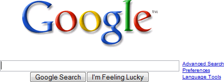
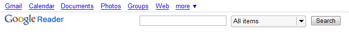
Google home page sets the default keyboard focus
Other Google properties generally don’t
Google’s home page sets the keyboard focus, but the main page for other Google
properties like Google Reader,
Google News, and
YouTube don’t. Windows Live does, but
Microsoft’s corporate home page
doesn’t. This last example is particularly telling. Microsoft spends untold
hundreds of hours every year ensuring that its Windows products comply with
regional accessibility regulations such as the wide-reaching
Americans with Disabilities Act. American federal agencies generally insist that suppliers like Microsoft
create products that comply with these laws if they want to do business with
the agency. I have no specific knowledge, but it’s reasonable to assume that
the Microsoft home page doesn’t fall under these regulations—maybe for the
simple reason that no one’s paying to use the page.
I think the primary reason web companies ignore keyboard users boils down to
expectations. Web sites don’t bother to set the keyboard focus because other
web sites don’t, and because by now users don’t expect them to. This double
standard is so pervasive that, as much as I care about well-designed keyboard
support, the web version of the product I work on generally doesn’t set the
keyboard focus either. It just never occurred to me as something to worry
about,
even as I devoted attention to keyboard users of the downloadable Windows
client version of the same product.
Starting to write this post provided me the impetus to finally address this UI
problem in some portions of on Cozi’s marketing site. Some pages like the
Cozi sign-up page
had forms that were completely straightforward to fix. The
Cozi home page proved tougher to fix. I
wanted to set the focus to the search box. Unfortunately, that control happens
to use hint text, the light gray text inside a field that serves as a field
label. Like most HTML implementations of hint text, the particular
implementation we happen to use clears the hint text when the control receives
the focus. This means setting the default keyboard focus has the unwanted side
effect of removing the hint text, thereby obscuring the purpose of the very
field the user might want to type in. As it turns out, we’ve been developing a
better hint text implementation anyway that won’t disappear until the user
starts typing, and I’m looking forward to eventually using that control for
our search box.
In the meantime, I’ve at least resensitized myself to the interests of
keyboard users, myself included. If your web product has a commonly used form
or search box, why not take a minute to put the default keyboard focus in the
right place? Setting the default keyboard focus is only a simple tiny step
towards designing a good experience for keyboard users, but at least it’s a
start.
I’m reading the book
Sketching User Experiences
by Bill Buxton. The author’s
attention to the presentation of examples make for an engaging book, and he
covers some interesting ground. I came across an interesting list he presents
(pp. 111-2) of attributes that characterize design sketches, in which he
asserts that sketches are (or have):
Quick: A sketch is quick to make, or at least gives that
impression.
Timely: A sketch can be provided when needed.
Inexpensive: A sketch is cheap. Cost must not inhibit
the ability to explore a concept, especially early in the design
process.
Disposable: If you can’t afford to throw it away when
done, it is probably not a sketch. The investment with a sketch is in the
concept, not the execution. By the way, this doesn’t mean that they have
no value, or that you always dispose of them. Rather, their value largely
depends on their disposability.
Plentiful: Sketches tend not to exist in isolation.
Their meaning or relevance is generally in the context of a collection or
series, not as an isolated rendering.
Clear vocabulary: The style in which a sketch is
rendered follows certain conventions that distinguish it from other types
of renderings. The style, or form, signals that it is a sketch. The way
that lines extend through endpoints is an example of such a convention, or
style.
Distinct gesture: There is a fluidity to sketches that
gives them a sense of openness and freedom. They are not tight and
precise, in the sense that an engineering drawing would be, for
example.
Minimal detail: Include only what is required to render
the intended purpose or concept. Lawson (1997, p. 242) puts it this way,
"… it is usually helpful if the drawing does not show or suggest
answers to questions which are not being asked at the time."
Superfluous detail is almost always distracting, at best, no matter how
attractive or well rendered. Going beyond "good enough" is a
negative, not a positive.
Appropriate degree of refinement: By its resolution or
style, a sketch should not suggest a level of refinement beyond that of
the project being depicted. As Lawson expresses it: "… it seems
helpful if the drawing suggests only a level of precision which
corresponds to the level of certainty in the designer’s mind at the
time."
Suggest and explore rather than confirm: More on this
later, but sketches don’t "tell", they "suggest".
Their value lies not in the artifact of the sketch itself, but in its
ability to provide a catalyst to the desired and appropriate behaviours,
conversations, and interactions.
Ambiguity: Sketches are intentionally ambiguous, and
much of their value derives from their being able to be interpreted in
different ways, and new relationships seen within them, even by the person
who drew them.
Point #9 above states that sketches should exhibit an appropriate degree of
refinement, a point echoed in a post I made a while back on
matching design sketches to the desired level of design feedback. I found the other attributes listed here interesting food for thought.
A while back I tried signing up for an
OpenID, an "open,
decentralized, free framework for user-centric digital identity." The
basic idea is that, instead of needing to choose a user name and password for
every site you visit, you can identify yourself with an ID that many sites
will accept. It sounds great, but in practice I found the whole process
bewildering. In my opinion, it’s not ready for consumer use.
Beyond security criticisms of the scheme that can be found elsewhere, I think
OpenID has some significant user experience issues. Some of the problems can
be fixed, others are integral to the way the system works.
It’s way, way too hard to get started. All the sites supporting OpenID point
curious users to the home page for the
OpenID Foundation. From this site, it’s
actually stunningly difficult to find a link to a place where you can
actually get an OpenID. A link to a site called
I want my OpenID! sounds promising,
but the destination page doesn’t actually deliver on the promise of getting
a user an OpenID either.
The content and tone of the OpenID Foundation site is oriented at
developers, not end users. The second sentence of the home page boasts,
"OpenID starts with the concept that anyone can identify themselves on
the Internet the same way websites do—with a URI." You know what? To
most people, that doesn’t sound like an advantage; it sounds geeky,
dehumanizing, and more than a little bit frightening.
While there are very cool benefits that come from identifying oneself with a
URL (URI), pity the poor consumer. They have dutifully learned that a user
name is an identity and a URL is a place to go. Now they must wrap their
weary brains around the concept that, when asked to identify themselves,
they should provide a location. "Why can’t I just use my email
address?" they’ll wonder.
The process of selecting an OpenID provider will stump the average consumer.
They’re being asked to pick an ID that they will, in theory, use everywhere
and forevermore to gain access to everything they own. They’re supposed to
obtain this ID by making an effectively random selection from a group of
providers they have never heard of.
Various OpenID sites also promote the notion that users should set up their
own OpenID provider. This is fine for a teeny tiny portion of web users, and
scary and out of the question for everyone else.
The lists of OpenID providers are presented in a static order. In some cases
this will be
alphabetical. The most
commonly referenced
list of OpenID providers
is presented in chronological order of when the service went live, an order
that is effectively random. It’s not immediately clear in most of these
lists why a user would pick one provider over another. None of the lists
I’ve seen are organized around attributes which are relatively easy for a
user to base a decision upon, like: Do you have a blog already? Or, Which
language do you prefer to speak?
As an aside, when you ask a normal person to choose a provider from a list
for a service they don’t understand, most people are just going to pick the
first or last entry. (If a default value is provided, they’ll pick that. The
default value will almost always be the first entry.) So, a static list of
providers turns out to be a really good way to screw the bulk of providers
whose entries sit in the middle of the list. Microsoft learned this lesson
the hard way in various places in Windows, addressing such problems by
dynamically shuffling provider names so that all providers spend equal time
at the top of the list. More usefully, the lists could reflect
community-based provider ratings.
The ostensible universality and permanence of an OpenID actually makes the
task of picking a provider harder. Even if I happen to currently have a
SixApart blog with a TypeKey,
am I really prepared to use that ID everywhere? Exactly how long can a
consumer expect a given OpenID provider to remain in existence? In my
playing around on one site, when I remapped a URI from one provider to
another, I lost my ID-related preferences. This gives me pause in depending
upon any provider that could potentially die before the web service I’m
using the ID with. Frankly, many of the OpenID providers seemed like tiny
organizations that could disappear overnight. Nowhere could I find anything
that would tell me what should theoretically happen to my ID-bound accounts
if that were to happen.
Suppose that, at some point, a visitor to an OpenID-enabled site is really
intrigued by this OpenID thing they keep coming across, and decides on the
spot that they want to get one for themselves. The OpenID community, and the
sites that use it, appear to have given little thought to addressing this
scenario. Go to the
LiveJournal home page and try
figuring out how you’d get an OpenID and come back to use it. I’ll
bet analytics on the site will show that, of the tiny percentage of visitors
to LiveJournal who go off from there to get an OpenID, only the most
determined will make it back. Why would a site operator let anyone leave
their site to perform a task from which they will never return?
An OpenID is an identity (like a user name), not an account. A consumer
still needs an account to use the site. However, this isn’t at all obvious
to a consumer. When I tried to sign in to
Plaxo with my OpenID, I got an otherwise
blank page displaying the error, “Unable to verify the specified OpenID.”
Some sites do a reasonable job of letting a user who has never logged on
before create an account on the spot. When I tried to sign in to
LiveJournal with my OpenID, they let me
create an account and then start using it. This inconsistency among
implementations will confuse a lot of people.
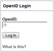
When I actually tried to use my OpenID on a site, I got a confusing message
from the OpenID provider requiring me to confirm that I really wanted to let
the site access personal information I had associated with my OpenID. The
clarity of such messages varies from OpenID provider to provider, ranging
from puzzling to incomprehensible. In the case of Verisign, I was instructed
to select which “Trust Profile” I wanted to associate with the site—or did I
want to create a new Trust Profile? Wha?
Since most users have never encountered the concept of sharing
information across sites, a ton of education would be necessary to make
these messages meaningful to the average user.
Currently, even those sites that do implement OpenID generally treat OpenIDs
as a second-class form of identification. They put their own proprietary
means of signing in (generally with a user name and password) on their home
page, and bury the OpenID sign in facility behind a link. This means that
the hip OpenID-using visitor has to make more clicks than the proprietary
ID-using masses… which doesn’t exactly sound like a reward.
And all this is for—what, exactly? To save me from having to pick a user name
and password? As annoying as that can be,
it’s just not that hard! Remembering an arbitrary user name
does cause real trouble, but simply allowing email addresses to be used as IDs
can solve almost all of that problem. As more and more sites allow email
addresses as IDs, the need for OpenID becomes less compelling to a consumer.
For the time being, I can’t imagine a sane business operator forcing their
precious visitors through this gauntlet of user experience issues just for the
marginal benefits that accrue to a shared form of ID. I’ve read numerous
claims that all it will take is for someone big like Google to support OpenID
to crack this problem open. Unfortunately, there’s no business of any size
that can afford to direct their traffic down a dead end.
Most service operators will, at best, offer users a choice between using a
proprietary ID or an OpenID, creating a terrible economic proposition for a
consumer. Faced with the proposition of: 1) struggling once for thirty minutes
to struggle through a process they can barely understand, or 2) spending two
minutes on every new site breezing through a familiar process they’ve done
countless times before,
normal busy people will choose the familiar route time and time
again. I’ll bet anything that most people will keep going for proprietary IDs,
further deferring the network effects possible from OpenID adoption.
This isn’t to say that OpenID isn’t worth attempts to fix it. At least some of
the above problems can, and should, be addressed head on by the OpenID
community. My recommendations:
Redesign the OpenID home page for consumers. The page’s main content should
contain a brief explanation of OpenID in consumer-friendly terms, along with
a giant Get an Open ID button. Move all the developer material behind a
Developers button.
Design an end-to-end process for getting an OpenID from a service operator’s
site. Since most services won’t care which provider the user uses, let these
services send the user into a real flow for picking a provider, getting an
ID, and most importantly
coming back to the original service to use the new ID. When they
get back to the service, the new OpenID should be prefilled.
Give the above flow a sidebar titled "Do you have a blog?" that
explains that, if they have a blog on LiveJournal, TypePad, etc., they can
use that for their OpenID. A link in the sidebar should shunt the user into
a page that has them pick their blog provider, then tells them what the
(blog service dependent) form of their OpenID is. The flow should then
return the user to the service they started on (again, with their OpenID
prefilled).
Organize the list of providers around factors that can actually influence a
user’s decision. Consider offering provider ratings based on ease of use,
uptime, etc.
Refine reference designs for the complex range of cases that come up in
using OpenID with a service. E.g., define the expected behavior and
terminology that should be used when a user tries to log in with an OpenID
but does not already have an account with that ID.
Define guarantees that services should offer to users in the event their
OpenID provider goes out of business.
Build an organization that can do real usability testing on this service
with real consumers.
UPDATE (October 7, 2007): This week OpenID.net overhauled
their site, and the new site addresses a number of the criticisms listed
above.
A user interface designer, like a journalist, should avoid
burying the lede: engaging the user with an opening question or statement that omits the most
critical point of interest. The
lede
is the all-important opening sentence of a news story, and journalists labor
over them. User interface interactions have ledes too, and they should be
crafted with as much care.
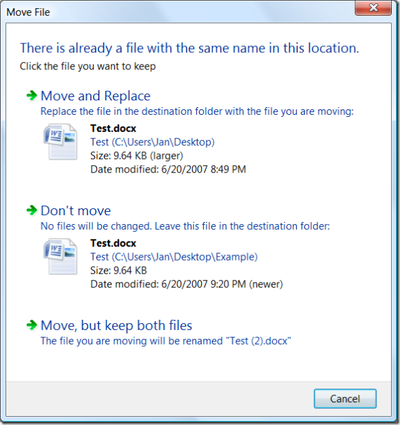
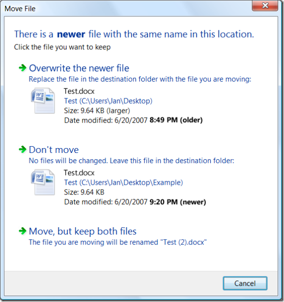
The Move File dialog in Windows Vista offers a convenient example. (Although a
dialog is used here, this principle applies equally well to web pages or other
UI modalities.) The Move File dialog appears when a user attempts to move a
file into a folder that already contains a file of the same name:
Can you see the disaster in progress? Most users can’t either.
This dialog has buried the lede. It focuses the user’s attention on the fact
that there is another file with the same name in the destination folder. It
fails to point out a much, much more interesting condition:
The user is about to overwrite a newer file with an older file.
To its credit, this Move File dialog does improve upon the older File Replace
dialog in previous versions of Windows: it offers more details that can help
the user make a decision, and offers a new option to keep both files. (The
latter is particularly helpful when dealing with files like auto-named digital
photos, because a user can easily take different photos that end up with the
same name.)
Overwriting a file is not, by itself, an uncommon or bad thing. It is a daily
occurrence for users to overwrite an older file with a newer version of that
same file. The user may be posting an updated copy of a document to a backup
location, or to a server for use by others, or to removable media for
transportation elsewhere, etc. This is business as usual.
Going the other way—overwriting a newer file with an older files—is a much
rarer event. The user might be giving up on work they’ve done and throwing it
away. Alternatively, they could be restoring a backup file to replace one that
has become corrupted. Either event is unusual, a point which should be
emphasized in the dialog.
The above dialog’s text fails at this, as does its layout and typography.
There are numerous pieces of text competing for attention, but among the most
prominent are the bolded file names. That’s a bit odd, since the entire
premise of the dialog is that these two file names will be the same.
The dialog has carefully drawn the user’s attention to information which is
guaranteed to be redundant. (If the user is moving multiple files, only some
of which have conflicts, the file names are relevant—but that case can and
should be handled specially.)
As just a very first cut at revising the above dialog to restore the lede,
some text could change. The typography could be tweaked to focus on the
salient time stamps. A different sound is probably also in order, to
distinguish the invocation of this dialog variant from the more normal one
above, and emphasize that something unusual is going on.
(It should be pointed out that the designers of Vista’s Win32-based UI can’t
actually set a run of text in bold, as shown in the dialog’s introductory
statement, because Win32 is
font impoverished.)
This revision would clearly needs a ton more work, but is a start in the right
direction. At least the dialog now opens with the lede.
For the past month I’ve been playing with
Times Reader, a
Windows client application for browsing the New York Times. I think the
computing industry has been promising this sort of digital newspaper for, oh,
30 years or so, so it’s nice to see it finally happened.
I remember reading about early prototypes of digital newspapers in coverage of
work at the
MIT Media Lab
in the 1980s. The basic idea is that the computer would download news
articles, then use principles of layout and typography to create a result that
was optimal for browsing and reading on the user’s display. Since then we’ve
seen the advent of newspaper web sites, but in my opinion, none of them offer
anything close to the pleasure of reading a paper newspaper.
In general, Times Reader effectively realizes the original digital newspaper
vision. It makes intelligent layout decisions that maximize legibility,
achieve a reasonable aesthetic appearance, keep articles on one page if
possible (to avoid scrolling), and allow for advertisements. It also renders
type exceedingly well by using ClearType.
The browser version is quite static, and makes poor use of the display space.
Times Reader, in contrast, takes full advantage of the available screen real
estate, all the while following time-honored rules for column widths, leading,
margins, and so on:
At a modest window size, Times Reader still does its best to create an
effective presentation of the same article:
I find Times Reader actually does deliver a more newspaper-like reading
experience. When I don’t have a chance to read the paper edition of the Times,
I enjoy catching up in Times Reader over reading the basic nytimes.com site.
That said, I’m not sure many people will find the experience so much better
that it’s worth a download and the additional hassle of using a separate
application. According a
Microsoft press release about Times Reader, the application is developed in Windows Presentation Foundation (Avalon),
which in turn requires the Microsoft .NET framework. (Interestingly, the ads
appear to be implemented in WPF as well, so the marketing verbiage can also be
rendered in gorgeous ClearType.) If you’ve got Vista, the install isn’t a big
deal, but Windows XP users will probably struggle.
I’ve found some practical issues with Times Reader as well. In theory Times
Reader has a component that downloads and caches content when you’re not
running the app itself, but this doesn’t seem to always work. At least, in my
experience, I’ve found that I sometimes boot the app only to discover that the
content is stale. A progress indicator in the corner spins for several minutes
to let me know it’s working, but as new content begins to appear (over many
minutes), I have no way of knowing which content is stale and which is fresh.
Moreover, Times Reader uses a newspaper-style columnar layout for the section
summary pages. These look great, but their minimalist appearance unfortunately
leaves the reader wondering which articles are the most recent: is the article
in the upper left the most recent, or the most important, or some combination?
Finally, while Times Reader does a better job than a browser at rendering a
page of content, the actual browser frame of the application is unremarkable,
and it’s tiresome to use a separate browser just to read one site. I’m looking
forward to seeing Times Reader rewritten in Silverlight so the entire thing
can just run in the browser.
I think it’s interesting to note that Times Reader omits a feature always
stressed in early digital newspaper prototypes. Those demos invariably showed
off a user’s ability to selectively express interest in certain types of news.
("In the future, we engineers won’t have to even see the Sports
pages!") By now, most news sites don’t make a big deal of this sort of
personalization. If someone’s really interested in a particular topic, they
can either set up a news filter for it or, more likely, just visit a
specialized news site focused solely on that topic. If someone’s uninterested
in a topic, they can just ignore it.
I first saw early demos of Times Reader several years ago and it’s frankly
stunning that the product actually broke through to see the light of day. It’s
exactly the sort of technology collaboration that sounds so great in
principle, but in practice is hardly ever pulled off. Kudos to the Times
Reader teams at both Microsoft and the New York Times for their success in
bringing this to fruition.
A few months ago I came across Geni, a
genealogy site that offers the slickest trial-to-signup path I’ve seen yet. I
wanted to post on Geni, but to appreciate how good a job they do, I thought it
was useful to look at old school sites, where signup is one of many
hurdles to site usage, and new school sites that avoid some of these hurdles through the use of
anonymous accounts. Geni goes beyond all the rest in creating what, in my opinion, is the
most inviting initial user experience for a site to date.
Right off the bat, you’re cleverly dropped into a family tree that’s already
partially started: there’s a place for you, and obvious points to add your
parents. No fanfare is needed to introduce the site or explain what it’s for.
The very nature of the task’s UI makes it obvious that you’re building a
family tree:
You’re asked for an email address, and in the most compact text imaginable,
they define the key points of their privacy policy (“never spammed, never
shared”).
It’s not advertised to the user at this point that the email address they
enter for themselves will become their user ID on the site. This is revealed
the first time the user tries to return to the site. At that point—the
second visit—the user is asked to sign in with their email address
and a temporary password that was emailed separately to that address.
The second visit also includes a minor but noteworthy detail: the user is
asked to agree to the service’s “Terms of Use”. This strikes an elegant
balance between the ease of use and legal risk. Terms of use generally come in
two flavors:
Browse-wrap. The act of browsing the site implicitly signals agreement.
Because a user could argue that they didn’t notice or were unaware of the
site’s terms of use, this form of consent is considered comparatively weak.
This is generally used for sites that don’t require the user to sign up at
all.
Click-wrap. You must
explicitly check a box or comparable control to indicate that you agree to
the terms. This presumably confers stronger legal protection for the site,
because it would be harder for a user to claim that they were unaware of the
terms.
DISCLAIMER: I’m not a lawyer, and you would have to be a complete
idiot to base a legal strategy on the content of this blog without
consulting an attorney.
Most services that require accounts go for click-wrap terms, hence the
ubiquitous “I agree to the terms and conditions” check box found on service
signup pages. The site feels obligated to obtain explicit agreement because
the user and site are forging an ongoing relationship, and each future
interaction could increase the likelihood a legal issue might arise. The
downside is the “I agree” check box becomes just another hurdle in the way of
the user trying out the service, and creates another opportunity for the user
to decide they’d rather just walk away.
Geni’s approach to terms of use strikes a nice balance. You can try out the
site once under a browse-wrap agreement, but for future visits you must accept
the click-wrap agreement. By that second visit, of course, you’ve clearly
indicated your interest in what the site has to offer, and you’re motivated to
regain access to the family tree you’ve already begun to create. So, agreeing
to terms of use at that point seems like a trivial matter. In their approach
to terms of use, Geni has managed to move one more hurdle from the entrance of
the site to somewhere deep within. This incredibly careful attention to detail
pervades the Geni user experience.
The Geni site is worth checking out for their signup experience alone. The
other thing to marvel at their intensely viral proposition. Genealogy lends
itself to reaching out to people you know, and they make it drop-dead simple
to enter a relative’s email address and invite them with a single click. The
beauty of this is that you get to offload all the data entry tedium to the one
or two relatives in the family that actually enjoy that sort of thing.
Everyone in the family receives the benefit of their work—as does Geni.
For while now I’ve been trying
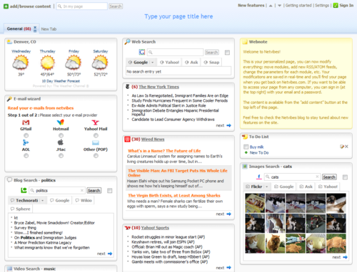
Netvibes and
Pageflakes, two members of a new
school of sites that invert the traditional service signup experience. As
discussed in the last post, old school sites put up numerous marketing,
signup, and technology-related
hurdles at the entrance to their service. New school sites like Netvibes and Pageflakes turn this experience on its
head: first the visitor tries the product using something
tantamount to an anonymous account. Once the visitor is convinced they like
the service and want to get more out of the service—only then do they complete
the steps to form a relationship with the service.
Both Netvibes and Pageflakes let users build and edit a highly customizable
home page. Such home pages have existed for years, but in the past
customizations were generally available only to users with established
accounts. These two sites, in contrast, take a new visitor straight to their
very own customizable home page. In Netvibes, for example, a small portion of
the page explains what the service does, but most of the page is given over to
functional widgets that demonstrate the service with real examples:
The general idea is that
the user will figure out what the product is by using the product
itself—not by reading marketing verbiage or sitting through a demo. The page
reveals customization capabilities through a combination of self-explanatory
elements ("Type your page title here") and additional options
revealed on hover.
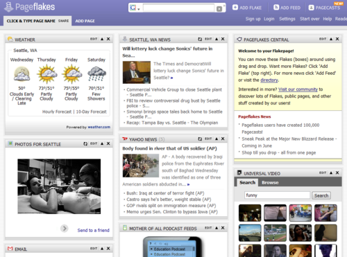
PageFlakes is very similar to Netvibes. Pageflakes does almost as good a job
as Netvibes in welcoming visitors to their product, although for some reason
they feel compelled to display a welcome page first. In using both sites,
PageFlakes seems to be slightly more polished than Netvibes (though I
personally wouldn’t have attempted to build a brand around the word
"flake").
These sites both use cookies to establish a tentative, anonymous relationship
between you and the site. You can even enter personal data to customize the
various widgets, but until you’ve established an account, you’re generally
using the service anonymously. (Of course, even without a user ID, each
additional piece of data you enter to customize the site can be used to more
precisely identify you.)
You can use your anonymous account for as long as you want to, provided you
use the same browser on the same machine to do so. Whenever you reach that
point—maybe even months after starting to use the service—you can sign up for
an account. The basis of your relationship with the site transfers from your
anonymous browser cookie to a real account secured with a user ID and a
password. (Both these sites use your email address as a user ID, to eliminate
the signup hurdle of picking a user ID.)
The deep principle at work is that a site doesn’t need to rush to secure a
relationship with a visitor. Inevitable interest in getting more out of the
site (in these cases, the desire to use your customized home page from another
location) slowly pushes you, the casual anonymous visitor, to finally forge a
permanent relationship with the site as an identified user.
The site knows a relationship with you will develop in its own
time.
I’ve been searching for a compelling real-world analogy to this kind of
anonymous trial-before-signup experience. The best I’ve come up with so far: a
public library. Anyone can walk in off the street and participate in a highly
useful basic level of service—just pick a book off the shelves and start
reading. You can do this for as long as they want, and you don’t need to
supply identification to do so. However, when you eventually want to take a
book home, you must "upgrade" to a higher level of service. You must
establish an account with the library, and this step requires that you
identify yourself (with, for example, a document showing your address).
I still have yet to establish a full account with either Netvibes or
Pageflakes, but have continued to try both out anonymously. I might never
elect to sign up with either service. Yet, even if I eventually abandon them,
I will have used each far longer than I ever would have if it had made me sign
up first.
It’s not unusual for a site to position a long sequence of hurdles just inside
their entrance. Someone walking in the door might have to clear some or all of
these hurdles before they can even try out the site:
Figure out what the service does, and whether it meets
their needs. This can be a lot harder than it sounds. The site might
describe itself in text, images, or Flash demos. Even assuming the user has
Flash installed, sitting through a demo can be tedious. The worst case: the
site already assumes visitors know what it does.
Find the entry point for signing up. You’d think this would
always be obvious, but on some sites it’s not.
Pick a user ID. Often the first thing the service wants a
new customer to do is pick an identifier such as a user name with which to
identify themselves to the site later. If the site doesn’t use email
addresses as IDs, the user generally picks some variation on their own name.
If they have a common name, they might have to guess several times before
they find a variation of their name that hasn’t already been picked as an
ID.
Enter their email address. If the user ID isn’t an email
address, the user almost always has to enter their email address separately.
Even if the service can be used without an email address, the site is eager
to obtain this critical piece of marketing data from the user.
Pick a password.
Enter the password again to confirm it.
Pick the password several more times to comply with
arbitrary security requirements.
Write down their password somewhere before they forget the
new variation of their usual password that finally made it past the
arbitrary security requirements.
Enter personal data used to configure the service to their
needs.
Comply with (or carefully turn down) requests for demographic
data
for marketing purposes. This may include opting out of requests to be added
to email newsletters.
Agree to terms of use and other legal agreements.
Activate their account. The user might need to switch to a
completely different application—their email client—and look for a message
from the service. They might have to wait for a period of time for this
message to arrive. The length of this time period is unknown: it could be a
few seconds, or a few days. When the user finally receives the message, they
have to find a link somewhere in it that they need to click on in order to
verify that they are, in fact, the proper owner of the email address.
Download software. If the service entails client software
or browser plug-ins, the user has an additional dozen hurdles to jump
through: the browser’s save dialog, progress dialog, "Are you sure you
want to run this?" dialog, an elevate-to-administrator security dialog,
and probably a firewall dialog—not to mention the software’s own overly long
sequence of setup questions.
And finally, after all this, the person gets to try the actual
service—and decide whether it’s worth using.
With all these hurdles, it’s a small miracle some web-based services end up
with any users at all. Each hurdle constitutes an opportunity for the user to
leave. The site is effectively asking the user, "Are you sure you want to
use us? Are you really sure? How about now? Are you sure you’re sure?
Hmm?" Some users are going to take one of these opportunities and leave.
People are growing increasingly leery of starting down the hurdle-strewn path
of a new site. They’ve been down similar paths so many times that they’ve
concluded the experience won’t be worth their time unless they’re already
confident the site will provide substantial value.
Admission: The signup experience for
Cozi Central isn’t exactly a disaster in my
opinion, but it’s clearly old school in this regard, and puts up many of the
hurdles listed above. I can’t say the demo’s great, and our setup experience
is, unfortunately, waaaaay too complex (and almost entirely a result of the
development framework we selected for building the product). We’ve got a lot
to learn, but there are some great sites to learn from.
Developers use the term technical debt to refer to the backlog of
inevitable future work produced when things are implemented in a quick and
dirty way. An application can accrue design debt as well—user interface issues
created by design hacks that must be resolved eventually. Like financial debt,
you may find you don’t have control when the next payment needs to be made.
I was recently forced to make a minimum payment on some of Cozi’s design debt.
In our case, our flagship PC application
Cozi Central had a
setup experience that omitted an important step. Cozi Central includes a photo
collage screen saver that we think is pretty darn cool. Until this month,
however, when you first ran Cozi Central on a Windows PC,
the application took over your screen saver, and it didn’t even ask you.
Terrible, no? The story starts way back when we first created the product. The
screen saver happened to be the first part of Cozi Central we wrote. We
started giving families our very first pilot release, and Cozi Central did at
that point was act as a screen saver. There didn’t seem to be any point in
asking them if they wanted to use the screen saver—why else would they install
it?
Fast forward a year, and Cozi Central now did a bunch more: it had a family
calendar, a shopping list you can call up with your mobile phone from the
grocery store, and a way to leave messages for family members. In fact, the
product did enough that there were some adopters who wanted to use everything
in it but the screen saver. Those people didn’t want the setup
experience to silently take over their screen saver. We knew we needed to take
care of that, but month after month we kept pushing off this work in favor of
fighting bigger fires. We were carrying design debt.
The vast majority of users love the screen saver. One even wrote us
specifically to relate how delighted they’d been by the photo screen saver
they didn’t even have to ask for. We did hear complaints from a small number
of families, though, and a few weeks ago we finally heard from one user who
was irate. Let’s just say that business professionals may have photos on their
PCs that they don’t want suddenly displayed during a presentation.
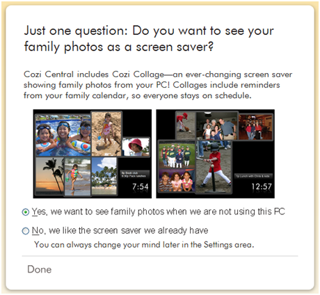
It was finally time to pay down our design debt, so we recently added new page
to our setup experience that describes the screen saver and asks the user
whether they want it:
This isn’t a great solution—throwing a question into the setup experience is a
clear hallmark of a design hack. This approach could easily cause issues later
if we ever really do need to ask the user another question during setup, and
discover that two questions in setup is one too many. We’ve made the minimum
payment, but we’ve still got more design debt going forward.
I’m happy that at least one Cozi user
found the new UI acceptable. (Their post is, hands down, the funniest commentary I’ve read about Cozi
Central yet.) On we go.
I normally avoid any overt plugs for Cozi Central here, but everyone here in
my office is very excited by a favorable review of Cozi
Central in today’s Wall Street Journal:
Getting Families Synced Up.
"Cozi just works. It looks clean, organized and uncluttered,
regardless of hectic schedules. It’s also easy enough for anyone to use, and
Cozi Group Inc. is constantly working to improve the program, which is a
good sign."
The Journal’s research into our product was extremely thorough. I’ve fielded
dozens and dozens of fact-checking questions in the past two days alone. Katie
rightfully dinged the product for a few minor issues that had been missed by
others, and in each case we’re looking forward to fixing the issue as soon as
possible.
As a designer, it’s always gratifying to see an objective evaluation like this
confirm that you’re on the right track. Ultimately, users decide for
themselves whether a product meets their needs, but the press obviously plays
a vital role in getting the word out to them.
A tiny bit of language support can turn a simple text box into a compact and
powerful way to let a user quickly supply complex data. An application can
constrain the allowable text to adhere to a small and computer-friendly
grammar that mirrors somewhat a natural human language. Even a highly
constrained grammar can still produce a user experience that feels natural.
This works best when the domain of text a user might enter is small, when the
user can easily imagine what they can type, and when the designer and
developer can collaborate on thoughtful construction of the grammar.
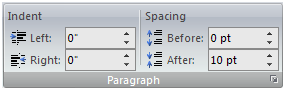
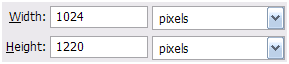
A simple example of a micro-grammar at work is a UI combining a scalar
quantity and a unit into a single field, such as the measurement fields in
Microsoft Word 2007. These fields throughout Word accept a variety of units,
such as inches, metric centimeters, points, or lines. As in natural (here,
English) language, the units directly follow the numeric value:
The fields on the left in the image above happen to be showing measurements in
inches (") while those on the right are showing points, but all the
fields accept all supported units. The controls not only parse out the value
from the units, they can also convert and render measurements in a canonical
format. In the default settings for the Microsoft Word on a U.S. system,
indentations are converted to inches, and leading is converted to points.
Compare the above to an application like Adobe PhotoShop CS2 that uses
standard operating system controls:
Here the user must enter units separately, requiring that they move the focus
with the mouse or keyboard. The UI also looks significantly more cluttered.
Word’s text-parsing micro-grammar let one control in Word do the job of two in
Photoshop. The trade-off is one of cleanliness versus discoverability. This
efficiency is critical in cases like Word’s Ribbon, in which a large number of
controls are packed into a small space. On the other hand, using two controls
makes clearer what units are supported. A UI with separate controls is also
significantly easier to implement.
One distinct advantage of text boxes that support micro-grammars is that they
can offer shortcuts to power users without compromising the simplicity of the
typical user’s experience. The date fields in Microsoft Outlook, for example,
not only accept dates in local form, but also accept shortcut phrases such as
"tomorrow" or "next Tuesday". Some supported shortcuts
don’t seem to add much value. The U.S. version of Outlook lets the user type
the names of a number of common American holidays like "Christmas"
(but not Easter, the date of which involves non-trivial astronomy, and even an
overeager Microsoft Office developer has to stop somewhere).
It’s dubious that the ability to type in "New Year’s Day" as an
appointment date has ever actually helped anyone—who schedules appointments on
New Year’s Day, anyway? Still, even these dubious shortcuts don’t clutter
anything up. Another advantage is that such text boxes allow the pasting of
complete text from other sources directly into the UI in one step, letting the
application do the work of breaking apart relevant information instead of
forcing the user to do this by hand.
To have a program understand text the user has typed requires that a developer
create a parser: a chunk of code that implements the rules of the grammar to
determine what the user is trying to express with that text. If the desired
grammar is extremely simple, a developer might hand-code a parser for it, but
this can quickly get out of hand. More complex grammars typically entail the
use of a parser generated by a tool. For example, if it’s possible to restrict
the supported input to a form known as a
context-free grammar, there are a wide variety of tools for generating a parser that can handle
such grammar.
Any attempt to optimize a micro-grammar for the nuances of one natural
language will, of course, complicate matters if and when the need arises to
localize the UI for other languages. Suppose some culture normally puts the
units before the numeric value. Users in this culture might
reasonably expect to be able to enter data that way. If the parser has been
generated with a tool, it should be relatively straightforward for the
developer to create a new grammar definition that swaps the position of those
elements. The rest of the application logic should remain virtually unchanged.
I’m not sure how many software companies would actually go through the trouble
to adapt a micro-grammar for a specific market. Then again, companies rarely
go through much trouble to change the layout of a dialog like the one from
PhotoShop above, in which the layout of the controls is heavily biased in
support of the designer’s natural language. The work required to update a
well-factored grammar definition is likely less than that required to
reposition a significant number of controls across a large number of pages or
dialogs.
I’ve been using Windows Vista on my production machines for two months now,
and I’ve noticed my habits have already shifted to take advantage of some of
the new features. You can always tell a new feature is actually worthwhile if
you suddenly find yourself cursing its absence on an older machine. One such
feature in Vista that’s quickly becoming a must-have for me is the search box
in the overhauled Windows Start menu. This search box serves as a useful
text-based command prompt, even for mainstream users.
Vista preserves the older Run dialog and Address bar (including the one on the
task bar), but the Start menu’s search box adds the ability to issue a fast
search across program names, control panels, document names, and web favorites
(if you use Internet Explorer). Like Apple’s Spotlight, this search box leads
to a surprisingly quick and natural way to launch documents. I find that I’ve
virtually stopped groveling through the Start menu for programs at all, and
end up having to surf the file system far less often. (My only gripe is that
there are subtle behavioral differences between the Start menu, the Run
dialog, and the Address bar, with the result that none of these tools does
everything I want.)
Because the search box uses prefix matching, you can type just the beginning
of the word(s) you’re looking for. This lets you launch Windows Media Player
for example, by typing "play" or "m p", and son. This
leads to a shorthand mode of using the operating system that feels curiously
like a finely-tuned command shell and its collection of obscure abbreviations.
There are a number of other places in which command prompt-style interactions
have seen a resurgence of mainstream use. The best example is probably Google
and its multifaceted search box, which now offers a
long list of search features
such as dictionary lookup and phone number lookup. These search features also
have a quasi-command shell feel to them. Google’s command structure isn’t as
rigid as that of a typical command shell—indeed, many search forms don’t
require a command at all, just search terms—which gives the search experience
a natural feel. The nice thing about these text-based command prompts is that
they can translate well to a number of environments, even plain text
mobile phone text messages.
During the past 20 years, most user interface designers worked as hard as they
could to get away from text-based commands. In the mid 1990s, Don Gentner and
Jakob Nielsen wrote a paper called
The Anti-Mac Interface
that anticipated an evolution beyond pure pointer-based UIs and to
environments that reincorporated language:
Mouse buttons and modifier keys give us a vocabulary equivalent to a few
different grunts… Computer interfaces must evolve to let us utilize more of
the power of language. Adding language to the interface allows us to use a
rich vocabulary and gives us basic linguistic structures such as
conditionals. Language lets us refer to objects that are not immediately
visible. For example, we could say something like "Notify me if there
is a new message from Emily." Note we are not advocating an interface
is based solely on language. Neither does the interface have to understand
full natural language. Real expressive power comes from the combination of
language, examples, and pointing.
While the Vista start menu or Google’s search features aren’t exactly natural
language, they do form a grammar of sorts. These UIs marry the speed and
expressiveness of text with highly responsive processing engines to create
command prompts even mortals can use. Pure graphical UIs in other applications
may similarly benefit from the introduction of a well designed text-based
command area.