Directional keyboard navigation could improve PC-based browsing too
Many thanks to people who shared suggestions in the previous post on keyboard navigation. I’m looking forward to trying them out on Cozi’s site.
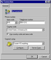
Continuing a discussion of keyboard navigation, it’s worth asking whether the Tab navigation model itself is a problem that needs fixing. The Tab model works well in the small dialogs for which it was designed, but has completely failed to scale up to navigating complex web sites. Consider two user interfaces, one old and one contemporary:

Windows 95 dialog with approximately 10 focusable controls

Default MSN.com home page with approximately 200 focusable controls
Note that the relative scale of these two screens has been preserved. Both spatially and logically, the user has a much, much larger area to move around.
Modern operating system UIs provide two standard mechanisms for moving the focus around a window using the keyboard: a linear Tab model, and explicit keyboard shortcuts (e.g., Alt keys). The Tab model is the most commonly used for moving between fields in a UI. It evolved from a UI intended for navigating through the modest collection of input fields that could fit on small character-based display (with, for example, 24 rows of 80 characters), and represented an evolution in turn from Tab keys on typewriters. The Tab model hasn’t evolved much since the character-based days. A single control in the active window has the keyboard focus. This control indicates its active state in one of several ways: button-like controls and list boxes show a dotted marquis or other highlighting effect, while text controls show an insertion point or selection. Pressing the Tab key moves the keyboard focus through the focusable (interactive) controls on the page in a linear order defined at design time by the programmer. Pressing Shift+Tab moves the focus through that order in reverse.
That the Tab model was adequate for simple dialogs like the one above is evidenced by the model’s survival over decades of change in UIs. To my mind this model has completely broken down, however, in its application to typical web pages. The first issue is one of scale: the page above has twenty times the number of focusable controls as the simple dialog. A user trying to use the keyboard to reach a link in the middle of the page might have to press the Tab key 125 times to reach it. (Or, if they were exceptionally efficient, they could tab around the other direction and only have to press Shift+Tab 75 times.) The second issue is that the page has a much more complex two-dimensional columnar layout that the dialog, but that layout cannot be captured in the one-dimensional tab order. To the user, the behavior of the Tab key is therefore quite unpredictable.
The other standard keyboard navigation technique—explicit keyboard
shortcuts—are also inadequate for complex user interfaces. Microsoft Windows
allows users to move the focus directly to a control on the dialog by pressing
a keyboard shortcut, generally the Alt key plus a single letter in the
control’s label. (OS/X does this too, although I find it less discoverable and
generally weaker in execution.) This system is workable for dialogs with a
small number of controls and a reasonable distribution of letter frequencies
in control labels, but is obviously unable to scale well beyond a handful of
controls. (I remember once running out of available letters in a large dialog
and having to resort to using the label’s trailing colon as the shortcut
character.)
The leading web browsers have adopted these legacy keyboard navigation techniques despite their inadequacy to scale up to modern web-based UIs. Mozilla Firefox, for its part, does offer one more keyboard navigation technique: Emacs-style incremental searching. This lets the user move the focus to a specific link by typing the apostrophe (‘), or to specific text by typing a slash (/), then typing the initial text of the desired target. This is quite fast, although I personally find this method less than satisfying. I find it less brain-taxing to just point at the thing I want instead of having to read it and type it. I also have trouble keeping straight the three different keys for the three slightly different kinds of search Firefox offers for searching within a single page. In practice this UI doesn’t work well for long scrolling pages: you need to be able to see the thing you want. Once you start typing and move the focus somewhere, you can’t easily move the focus to an adjacent element without starting over or falling back to tabbing. The incremental search mechanism can’t target controls other than textual links, and then only if the link text is unique. A substantial number of links are images, and don’t even have visible text. And finally, because the keyboard shortcuts are unmodified by a key like Ctrl, they don’t work if the keyboard focus is already in a text box.
Interestingly, a much better user interface for navigating screens with lots of elements is already ubiquitous—but not on PCs. It’s found on mobile phone web browsers, which of necessity do a good job at keyboard navigation. They support two-dimensional directional navigation by using Left, Right, Up and Down arrow keys (or a joystick) to move to the "nearest" element in the corresponding direction. For example, if you press the Right key, heuristics determine whether there’s an element you might be trying to reach towards the right, and if there are multiple elements, which element you probably want.
Significantly, these heuristics respect the rendered visual representation of the page, not the structure of the document’s object model or the original location of elements at design time. This is necessary to account for the fact that the user may be viewing the page at a different width than the designer used, with different fonts, at different sizes, etc. Directional navigation UIs also tightly connect keyboard focus and scroll position, allowing someone to continually press the Up and Down keys to move through focusable controls and to page over large blocks of text.
The first time I saw a directional navigation UI was actually in the original WebTV browser, later acquired by Microsoft and rebranded as MSN TV. I was inspired by that UI to push for inclusion of directional navigation support in Windows Presenation Foundation ("Avalon"), and was happy to hear that that work eventually saw the light of day in the .NET 3.0 release. (I haven’t played with the final result myself, but my understanding is that you can turn it on or off for a page via its DirectionalNavigation property. I’m not sure if that feature made it into Silverlight.)
Directional navigation works so well on mobile devices, I’m hoping it will get built into a browser someday. To avoid conflict with the existing semantics of arrow keys, the final UI could optionally support a keyboard modifier like Ctrl. (So that, e.g., Ctrl+Left means move the focus to the "nearest" control to the left). Microsoft has already filed for a patent on the very elegant heuristics in the WPF DirectionalNavigation feature, so it would make a natural addition to a future version of Internet Explorer. I’d love to see a similar approach adopted by Firefox, or at least developed as a Firefox add-on.