Don't bury the lede: What's the real story behind a UI interaction?
A user interface designer, like a journalist, should avoid burying the lede: engaging the user with an opening question or statement that omits the most critical point of interest. The lede is the all-important opening sentence of a news story, and journalists labor over them. User interface interactions have ledes too, and they should be crafted with as much care.
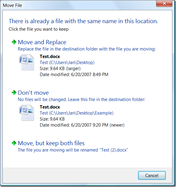
The Move File dialog in Windows Vista offers a convenient example. (Although a dialog is used here, this principle applies equally well to web pages or other UI modalities.) The Move File dialog appears when a user attempts to move a file into a folder that already contains a file of the same name:

Can you see the disaster in progress? Most users can’t either.
This dialog has buried the lede. It focuses the user’s attention on the fact that there is another file with the same name in the destination folder. It fails to point out a much, much more interesting condition: The user is about to overwrite a newer file with an older file.
To its credit, this Move File dialog does improve upon the older File Replace dialog in previous versions of Windows: it offers more details that can help the user make a decision, and offers a new option to keep both files. (The latter is particularly helpful when dealing with files like auto-named digital photos, because a user can easily take different photos that end up with the same name.)
Overwriting a file is not, by itself, an uncommon or bad thing. It is a daily occurrence for users to overwrite an older file with a newer version of that same file. The user may be posting an updated copy of a document to a backup location, or to a server for use by others, or to removable media for transportation elsewhere, etc. This is business as usual.
Going the other way—overwriting a newer file with an older files—is a much rarer event. The user might be giving up on work they’ve done and throwing it away. Alternatively, they could be restoring a backup file to replace one that has become corrupted. Either event is unusual, a point which should be emphasized in the dialog.
The above dialog’s text fails at this, as does its layout and typography. There are numerous pieces of text competing for attention, but among the most prominent are the bolded file names. That’s a bit odd, since the entire premise of the dialog is that these two file names will be the same. The dialog has carefully drawn the user’s attention to information which is guaranteed to be redundant. (If the user is moving multiple files, only some of which have conflicts, the file names are relevant—but that case can and should be handled specially.)
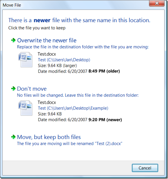
As just a very first cut at revising the above dialog to restore the lede, some text could change. The typography could be tweaked to focus on the salient time stamps. A different sound is probably also in order, to distinguish the invocation of this dialog variant from the more normal one above, and emphasize that something unusual is going on.

(It should be pointed out that the designers of Vista’s Win32-based UI can’t actually set a run of text in bold, as shown in the dialog’s introductory statement, because Win32 is font impoverished.)
This revision would clearly needs a ton more work, but is a start in the right direction. At least the dialog now opens with the lede.