Cozi calendar UI overhaul
It’s been way too long since I was last able to post here, mostly because having three small children equates to having zero personal time. Still, work has been productive. Today Cozi posted an update to the web version of our family calendar. Our web calendar has long lagged behind the PC version, but we’ve been working hard to correct that, and today’s release represents a big step towards that goal.
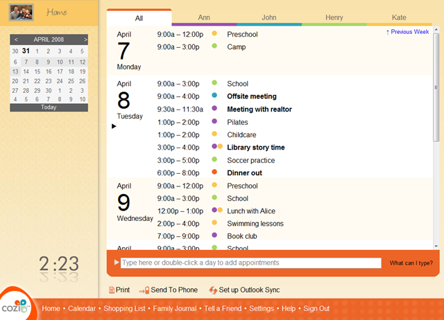
Before today, the calendar was a bare-bones UI that looked like this:

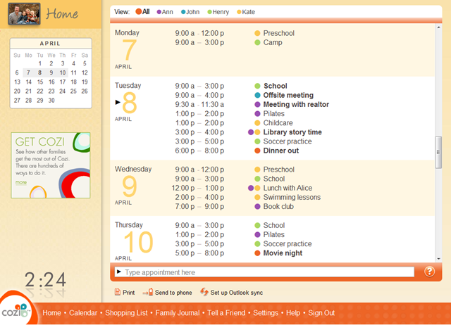
The new calendar looks like this:

We still have a long list of improvements in the works for the calendar, but this latest public release already includes a range of large feature enhancements and small fit-and-finish details that collectively make the new calendar, IMHO, quite polished for an AJAX UI:
- Asynchronous loading of appointment data. We used to reload the entire page whenever we needed to display new calendar data (e.g., when adding an appointment). Now we just refresh the days we need to.
- Infinite scrolling. The old implementation would only let you see one week’s worth of appointments at a time. Movement between weeks was generally managed with "Previous Week" and "Next Week" links. The new UI uses infinite scrolling, so the user can move as far into the future (or past) as they need to with just the scroll bar. This work dovetails with the aforementioned async loading of data.
- Complete typography overhaul. Improved margins and leading make it easier to visually parse the information into three vertical columns and a large horizontal row for each date. This included details like right-aligning the color-coded family member dots so that they are visually grouped with the appointment subject.
-
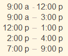
We took extreme pains to line up the start times and end times by the colons
to improve legibility. This was somewhat at odds with our desire to follow
proper typographic convention and separate times with an
endash instead of
a hyphen. Using an endash with vertically-aligned colons produced a
situation in which a bit of extra white space would appear before end time
that had a single hours digit. That is, "– 3:00" would have more interior space than
"– 12:00". We finessed this by using an endash when the end time has a single
digit hour, but a hyphen when the end time has a double digit hour:

For all we know zillions of other people have done the same thing, but we think this bending of the rules lets you produce a clean and highly legible timetable with plain HTML.
- Tuned the color of all text elements in the calendar data. Dates are shown in color, body text in gray. For contrast, the subjects of a non-routine appointment (something that doesn’t happen weekly) are set in black to make them stand out—since those are the appointments a family needs to focus their attention on.
- Placed the day of the week over the date. Users of a family calendar are extremely interested in what’s happening during the coming week, and much less so in what’s happening months away. Placing the day of the week over the date reflects that priority.
- Tweaked the background color banding on alternate days to make it a bit more prominent. This is really hard to get right so that it’s perceptible on all monitors, but not overpowering on monitors with excessive contrast.
- Revised the UI controls for selecting the family member whose calendar you want to look at. The old design had big tabs, which users immediately understand, but they occupied more space than was justified by their relatively infrequent use. We took the opportunity to more explicitly present the list of names as a legend for the color-coded dots.
- Added gradients to the colored bars at the top and bottom of the calendar. These are done as a series of one pixel-high DIVs so that we can easily swap out the gradient based on the current family member’s color without needing to store a ton of images.
- Cleaned up element margins overall.
- Tightened borders around the natural language appointment entry area at the bottom.
- Shifted the little triangle that had been to the left of the text box so that now it’s inside the box. That triangle is one of a pair of triangles used to visually imply a connection between the text box and the calendar: the triangle on the calendar indicates the day where new typed appointments will go (if you don’t type a date). Moving the bottom triangle inside the box more clearly connects the two triangles: they’re now directly horizontally lined up, and they can now both share the same black color. (Users will readily infer a connection between two elements on a page if they share a color.)
- Shortened the hint text inside the text box. Although being able to double-click a day to create an appointment is a useful shortcut, users can find it on their own without instruction.
- In that same area, replaced the "What can I type?" link (which was spec’ed as white, but had ended up as black due to a bug) with a smaller question mark icon.
- Cleaned up the "Home" button script in the upper left. We’d previously used sIFR for this and other instances of "handwritten" text in the product. It’s a nice bit of technology, but in this case the text was static, so using Flash was complete overkill. Now it’s a simple transparent PNG (or a transparent PNG8 in IE 6.x).
- Cleaned up the mini-calendar on left. The mini-calendar now shows a minimal set of information and controls in its normal state (when the mouse isn’t over it). This keeps the UI clean. When the user moves the mouse over the mini-calendar, various navigation controls appear for navigation to the previous month, the next month, and today. In the rollover state, the mini-calendar also shows the dates at the end of the previous month and the dates at the beginning of the next month. This makes it quicker to navigate to dates just outside the current month. We’ve built this calendar by styling the jQuery UI date picker, which has worked well in practice.
- Added advertising in the left pane. Hey, we have to pay for all this work somehow! We’ve been careful to keep advertising separate from the family’s calendar content on the right.
Overall, we’re quite happy with the result. We have more improvements to the Cozi calendar in the works, and are eager for those to see the light of day too.