Tinkering endlessly with computer hardware and software can be fun… if you
have the time. As for me, I eventually came to the paradoxical conclusion that
the more I tuned a product to my specific needs, the less likely the product
would actually work as intended—and the less likely I could find someone to
help me when a problem did arise. Product manufacturers often tout the ability
of their products to be configured to a user’s idiosyncratic needs, but maybe
users can most effectively minimize heartache this way:
The Shared Suffering Hypothesis: You’re best off configuring a product so
as to maximize the number of other people who can help identify and
resolve problems with that configuration.
Here’s an example: A number of years ago I set up a media PC, eschewing the
small number of commercial media PCs then available to get a tricked-out gamer
PC. I maxxed every spec—video card, hard drive, etc.—and for its day, this
machine rocked. What didn’t occur to me was that, with each component
I picked, I was reducing the number of other people who had the same device I
had. And upon receiving the box, I wiped it and installed an early beta of an
obscure OS version. Fantastic! Now I had a blazingly fast PC, the likes of
which were possessed by no one else on the planet!
I was a user community of one. When sorting through the inevitable driver
weirdness and other nightmares, I had no one to turn to for help, because no
one else shared this configuration or anything like it. The OEM and its
component manufacturers, of course, had no experience with that OS, nor had
the OS manufacturer ever tested on any of that hardware. The nascent media PC
user community couldn’t help either. This left me solving every configuration
issue on my own. I spent hours on exciting tasks like trying to see if the PC
motherboard would cope better with the hard drive configured for RAID 0 or
RAID 1, or maybe I should try RAID 5? Damn, and all I wanted to do was watch
TV on this thing.
Lesson learned, when I bought a new media PC a couple years later, I abandoned
impressive computer specs in favor of amassing the largest number of people
who could share my problems. If I ran into a problem, I wanted a hundred other
people to have already hit it and collectively solved it. I purchased a basic
media PC from a huge OEM—not because they made great media PCs, but because
they sold a lot of them. I purchased the most vanilla configuration possible,
more or less blindly accepting the OEM’s self-serving default hardware
recommendations. The more defaults I could accept, the more likely it was
someone else would have something like the same box I did. When the box
arrived, I tried hard to avoid changing anything from the default config, and
in generally avoided installing funky apps on the box. In the end, the new PC
wasn’t a perfect media experience—but it worked, and I spent very little time
keeping it that way.
(And now the impending forced cutover to digital cable in the U.S. is going to
kill me. It’s forcing me to rebuild a perfectly good media PC setup, all so
that our seldom-watched analog cable TV can now be a seldom-watched digital
cable TV. Once again I’ll be searching for the solution that involves the
least weird configuration.)
The problem here are the economics of configuration. You’d think you’d benefit
by tailing a product to your needs, but I believe in most cases that benefit
is overwhelmed by the benefits of not customizing. And the issue has
implications for software designers: each time you add an option to your
product, you might be making things worse for your users, not better. I’ll
take a cut at that question in the next post.
Last week Cozi posted an update to our
family calendar
that included a small but significant usability fix to the UI for entering
appointments. In addition to a traditional form-based UI for entering
appointments, the bottom of the main calendar page offers a text box in which
a user can type an appointment in English:
In general this UI for entering appointments works well, but usability testing
had indicated that a sizable population of users would hesitate when entering
an appointment. They would type the text of the appointment, then move their
mouse over the right end of the text box, apparently searching for a button
they could click to save the appointment.
These users were likely conditioned by web browsers, which generally have a Go
button to the right of the address field. Advanced users generally don’t click
the Go button (and may take steps to hide it), but many users navigate with
it. We had originally left off a Go button in the interests of reducing visual
clutter, and expected people would be able to figure out they could just press
the ENTER key to save the appointment.
In testing, it became apparent that we were correct, but only to a point. Most
users would, in fact, eventually try pressing the ENTER key. The issue is that
it would take a second or two of uncertainty before they would figure it out.
We didn’t like the thought of producing any uncertainty or anxiety, especially
in relation to the natural-language appointment feature. That’s a star feature
in our calendar, and we want to show off. (Yes, Google Calendar and others
have a similar feature, but we think ours is better.)
We were reluctant to add a permanent button to the page if we could avoid it.
Instead, we opted to follow the lead of Internet Explorer and Firefox and use
a transient control: a control that’s only visible part of the time.
Both IE and Firefox used to have their Go buttons visible all the time, but
both changed the Go buttons to a transient control that is only visible when
the user is actually typing a URL.
Here’s how it works in Cozi’s case. When the user enters the page, the focus
is in the appointment entry text box. The text box sports hint text to let the
user know what the text box is for. (Significantly, the hint text does
not disappear when the text box has the keyboard focus—since the text
box has the focus by default, hiding the hint text on focus for this field
would mean the hint text was invisible when it would have been most valuable.
If the user clicks on the text box, we do hide the hint text, so the user
doesn’t waste any time trying to delete the hint text before typing their own
text.)
When the user starts typing, the transient Enter button appears on the far
right:
When the user moves the mouse (not shown below) over the Enter button, the
Enter button exhibits its hover state:
The user presses the button or types the ENTER key, and the appointment data
is sent to the server to be parsed. During this round-trip to the server, the
text box and its associated change to a quasi-disabled state to suggest that:
a) something is happening, and b) the user shouldn’t type again until the text
box has left this state.
When the updated calendar data returns from the server, the calendar view
updates to show the new appointment. The appointment entry text box resets to
its original state to let the user know they can type again:
So far, this transient Enter button seems to work well, but we will continue
to watch that button closely in testing. We’re cautious about employing this
UI technique, because it’s easy to accidentally sacrifice discoverability in
the name of visual cleanliness. Here the transient control works well because
it manages to appear just when a user is about to start looking for it. In
other cases, a user might hold their mouse still while looking around the
page, and if they didn’t see the control they were expecting, they might jump
to the reasonable conclusion that such a control did not exist.
I find myself faced with the question of whether to accept animated ads in an
ad-based product. An animated ad likely detracts from the user’s
experience—everyone says they dislike them—but to what degree? I’m finding it
difficult to find persuasive research quantifying that effect.
It’s relatively easy to find data on the side of the advertiser or the site
showing the ad. An animated ad will likely be noticed by more people, and can
have higher click-through rates, which is what an advertiser is looking for.
Accordingly, a site willing to show an animated ad can charge a higher premium
for such an ad over a static ad. Animated ads = more revenue. It’s hard to
argue with that—especially at an ad-funded startup.
To put the potential revenue upside in perspective, I’m looking for concrete
research on the impact of animated ads on the user experience. Here’s the kind
of research that would be most helpful:
Hard data. An anecdotal personal claim that, "I refuse to use a site
that shows an animated ad", holds little weight. Same goes for
claiming, "Everyone hates animated ads… obviously!" If everyone
hates animated ads, then it should be easy to find research proving that
point.
Focused on the actual effect on site usage. The little research I can find
seems focused on user opinions. (Example, from Jakob Nielsen’s AlertBox) I don’t want to know whether people like
animated ads—I want to know how much they actually impair site usage, or
diminish a site’s brand, or drive people away.
Recent. I can’t use a study done way back in the halcyon days of 1997 when
the web was fresh and new and people didn’t think there should be ads in it
anywhere.
Expressed in money terms. It’d be helpful to find, for example, a case study
comparing a site’s gain in ad revenue from the introduction of animated ads
with the monetary downsides (if there are any) of those same ads.
Objective. A tiny study done by a user interface designer with a personal
bias may not help. A large study done by a company that’s taking the long
view, and trying to balance revenue with customer satisfaction would be
better. A peer-reviewed scholarly paper on the topic would be ideal.
Any timely pointers here would be helpful in making this decision. Thanks.
Updated 6/22/08: A big thanks to Michael who in the comments posted links to a pair of relevant papers. Those papers were very helpful
to us in deciding whether to accept animated advertisements. We ultimately
did decide to accept animated ads, but did put in place some guidelines that
we hope will keep out the more egregious uses of that medium.
The previous post on Cozi’s updated family calendar reminded me to point out a
small but interesting aspect of the Cozi calendar UI that’s worked out rather
well. As it turns out, the UI in question is in the Settings area of the
product—an area where interesting design opportunities are often overlooked in
the haste to get that peripheral stuff out of the way so one can get back to
designing core features.
During Cozi’s early family research, we met parents who liked to color-code
calendar entries according to the person or people involved in the
appointment. Accordingly, Cozi lets families color-code appointments in the
calendar. (Color is used as a shorthand; it’s not the only way of seeing who
an appointment is for, so color blind users need not worry.) Cozi picks a
color for each family member by default, but since color is a highly emotional
element, we wanted to offer a way to let family members choose their own
color.
We had the following constraints in mind for our color settings UI:
The available colors should all be attractive and work well with the overall
Cozi color palette.
The UI should ensure each family member ends up with a unique color for each
family member, otherwise the family won’t be able to tell whose appointments
are whose when scanning the colors.
The colors need to cover a sufficiently broad range that each family member
can get a color they like.
The palette from which colors are chosen shouldn’t contain colors that are
too similar. If one family member chooses dark blue and another a slightly
darker blue, they’ll never be able to tell them apart.
It shouldn’t be hard for a family to collectively choose a set of colors
that all work well together. This is a challenging design constraint: once
you’ve got about 6 colors in a palette, your choices for each additional
color are either going to start running close to your existing colors, or
else create the potential for ugly combinations. Some applications like
Microsoft PowerPoint have a sophisticated color model to help people create
reasonably attractive combinations of colors. (Alas, they still can’t
prevent the determined user from creating something hideous.) We didn’t have
the capacity to develop such a model, and needed something simpler.
As a consequence of the above point, the palette of choices should be as
small as possible. The smaller the palette, the smaller the chance of a
clashing disaster. Here Cozi’s targeted focus on families works in our
favor, since we can optimize the UI for the demographics of a family. Our
database schema allows a maximum of 10 people per household, but in practice
our sweet spot is families with 2-4 children. A family with two parents and
two kids gets 5 colors: 4 colors for the family members, plus an additional
color to represent appointments for the whole family. We eventually settled
on a palette with 16 colors. This is sufficient to satisfy the above
constraints and still leave some breathing room. (In any given family, there
are certain to be colors liked by none of the family’s members.)
A family should be able to have some fun picking the colors.
Our starting point for the design was fairly standard: we listed out the names
of the family members, and next to each name put a dropdown color picker. You
can see something similar in other applications that let users choose a set of
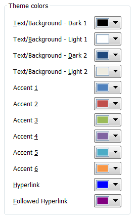
colors from a large palette. Here’s a clean example from Microsoft PowerPoint
2007’s "Create New Theme Colors" dialog, which lets users select
twelve colors from a large palette that is revealed when a dropdown color
picker is clicked:
One wrinkle in using a design like this for our calendar settings UI was
created by requirement #3 above: the need for unique color mappings. This is
an instance of a cross-field validation rule: the validity of one field value
may depend upon another. In a UI like the one above, it’s hard to come up with
a good design to communicate cross-field validation rules without confusing or
irritating the user. Suppose the colors must be unique, and the user wants to
swap the colors in field A and field B. They try to change B’s value to the
value in A, but the field complains that B’s value duplicates A’s value—and
forces the user to fix field B before they can leave it. This is terrible!
They’re forced to clear B (or assign some temporary value to B), go to A,
change it, and come back and enter the desired value in B.
One solution is to leave such cross-field validation rules until the user
tries to commit the whole form. Alternately, you can deliver the feedback
about the need for uniqueness modelessly. The problem with either solution is
that the user ends up being surprised: just at the point they think they’re
done, they have to go back and rethink their entries. You can try to let them
know the uniqueness requirement up front via instructional text, but most
users aren’t going to read it, so you’d probably just spend some screen real
estate for nothing.
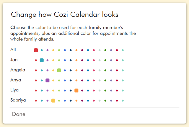
Our strategy in such a dilemma is always to refer back to our family domain
and see whether we can optimize for it. Here, we see that the above UI allows
for an arbitrarily large palette, but we don’t need that: we only have 16
choices for each color. And the typical user will only need to pick 3-5
colors. Instead of displaying the palette in a dropdown, we display all the
available choices in a row:
The immediate advantages of this approach is that the user can see all the
color choices at a glance, and they can make a choice with a single click
(instead of having to spend one click revealing the dropdown palette, and
another to make a selection). But the true benefit of this approach is that
the user will infer the requirement for uniqueness without it needing
to be enforced. In usability tests, we see users intuitively grasp that they
should pick a color from any given column no more than once. They can work
that out on an intellectual level, of course, but the UI makes that easier to
see. With that in mind, we were able to relax the enforcement of unique color
selections—the user takes care of that on their own. This lets us deal handily
with situations like the need to swap color choices. And, finally, people seem
to enjoy using the UI to pick colors.
This design approach could be applied in other situations. It’s quite similar
to what you find in online surveys. The design requirements here are slightly
different, but the final result still shares the presentation of the complete
range of choices:
It’s well understood that a dropdown control will generally be more compact
than a set of radio buttons, but in situations where the same dropdown control
is repeated across multiple rows, a grid of radio buttons can be efficient as
well. Each column only needs to be labeled once, so the individual radio
buttons don’t need their own labels. (The color swatches in the Cozi design
are effectively self-descriptive radio buttons that don’t even need column
labels.) And though the repeated controls take up considerable space, they
afford the user the ability to quickly apprehend relationships between field
values. In the Cozi color UI, the user can spot-check whether each color has
been used only once. And in the survey UI, the user can quickly perceive the
balance of their responses across the range of choices.
If you have a similar settings UI in your own product, perhaps with dropdown
controls, consider whether the set of choices is small enough that you can
display the complete range in a grid.
It’s been way too long since I was last able to post here, mostly because
having three small children equates to having zero personal time. Still, work
has been productive. Today Cozi posted an update to the web version of our
family calendar. Our web calendar has long lagged behind the PC version, but we’ve been
working hard to correct that, and today’s release represents a big step
towards that goal.
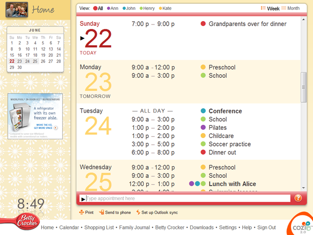
Before today, the calendar was a bare-bones UI that looked like this:
The new calendar looks like this:
We still have a long list of improvements in the works for the calendar, but
this latest public release already includes a range of large feature
enhancements and small fit-and-finish details that collectively make the new
calendar, IMHO, quite polished for an AJAX UI:
Asynchronous loading of appointment data. We used to reload the entire page
whenever we needed to display new calendar data (e.g., when adding an
appointment). Now we just refresh the days we need to.
Infinite scrolling. The old implementation would only let you see one week’s
worth of appointments at a time. Movement between weeks was generally
managed with "Previous Week" and "Next Week" links. The
new UI uses infinite scrolling, so the user can move as far into the future
(or past) as they need to with just the scroll bar. This work dovetails with
the aforementioned async loading of data.
Complete typography overhaul. Improved margins and leading make it easier to
visually parse the information into three vertical columns and a large
horizontal row for each date. This included details like right-aligning the
color-coded family member dots so that they are visually grouped with the
appointment subject.
We took extreme pains to line up the start times and end times by the colons
to improve legibility. This was somewhat at odds with our desire to follow
proper typographic convention and separate times with an
endash instead of
a hyphen. Using an endash with vertically-aligned colons produced a
situation in which a bit of extra white space would appear before end time
that had a single hours digit. That is, "– 3:00" would have more interior space than
"– 12:00". We finessed this by using an endash when the end time has a single
digit hour, but a hyphen when the end time has a double digit hour:
For all we know zillions of other people have done the same
thing, but we think this bending of the rules lets you produce a clean and
highly legible timetable with plain HTML.
Tuned the color of all text elements in the calendar data. Dates are shown
in color, body text in gray. For contrast, the subjects of a non-routine
appointment (something that doesn’t happen weekly) are set in black to make
them stand out—since those are the appointments a family needs to focus
their attention on.
Placed the day of the week over the date. Users of a family calendar are
extremely interested in what’s happening during the coming week, and much
less so in what’s happening months away. Placing the day of the week over
the date reflects that priority.
Tweaked the background color banding on alternate days to make it a bit more
prominent. This is really hard to get right so that it’s perceptible on all
monitors, but not overpowering on monitors with excessive contrast.
Revised the UI controls for selecting the family member whose calendar you
want to look at. The old design had big tabs, which users immediately
understand, but they occupied more space than was justified by their
relatively infrequent use. We took the opportunity to more explicitly
present the list of names as a legend for the color-coded dots.
Added gradients to the colored bars at the top and bottom of the calendar.
These are done as a series of one pixel-high DIVs so that we can easily swap
out the gradient based on the current family member’s color without needing
to store a ton of images.
Cleaned up element margins overall.
Tightened borders around the natural language appointment entry area at the
bottom.
Shifted the little triangle that had been to the left of the text box so
that now it’s inside the box. That triangle is one of a pair of triangles
used to visually imply a connection between the text box and the calendar:
the triangle on the calendar indicates the day where new typed appointments
will go (if you don’t type a date). Moving the bottom triangle inside the
box more clearly connects the two triangles: they’re now directly
horizontally lined up, and they can now both share the same black color.
(Users will readily infer a connection between two elements on a page if
they share a color.)
Shortened the hint text inside the text box. Although being able to
double-click a day to create an appointment is a useful shortcut, users can
find it on their own without instruction.
In that same area, replaced the "What can I type?" link (which was
spec’ed as white, but had ended up as black due to a bug) with a smaller
question mark icon.
Cleaned up the "Home" button script in the upper left. We’d
previously used sIFR for
this and other instances of "handwritten" text in the product.
It’s a nice bit of technology, but in this case the text was static, so
using Flash was complete overkill. Now it’s a simple transparent PNG (or a
transparent PNG8 in IE 6.x).
Cleaned up the mini-calendar on left. The mini-calendar now shows a minimal
set of information and controls in its normal state (when the mouse isn’t
over it). This keeps the UI clean. When the user moves the mouse over the
mini-calendar, various navigation controls appear for navigation to the
previous month, the next month, and today. In the rollover state, the
mini-calendar also shows the dates at the end of the previous month and the
dates at the beginning of the next month. This makes it quicker to navigate
to dates just outside the current month. We’ve built this calendar by
styling the
jQuery UI date picker,
which has worked well in practice.
Added advertising in the left pane. Hey, we have to pay for all this work
somehow! We’ve been careful to keep advertising separate from the family’s
calendar content on the right.
Overall, we’re quite happy with the result. We have more improvements to the
Cozi calendar in the works, and are eager for those to see the light of day
too.
Consider the following hypothetical computer experience:
One day a friend of yours sends you a one line email saying, "Hey,
check out FooBar!" That’s all the message says. "Okay",
you’re wondering, "What the heck is FooBar?" You follow the link
to the FooBar site, and all you can see is a EULA check box and a
"Sign Up" button. You have no idea what FooBar does, so you’re
reluctant to entrust any information to this site. Before leaving, you
notice a tiny link that says, "Learn more about FooBar". You
click it, and are presented with the FooBar logo and a short paragraph
that says that FooBar is pretty cool. You’re still confused about what it
does because you can’t actually get inside and see it for yourself.
Finally, overcome with curiosity about why your friend would recommend the
site, you give in and click the Sign Up button.
Once inside the site, you realize the site is stupid, and wish you’d
never signed up. You later discover that all your friends have just
received a one line email from you saying "Hey, check out
FooBar!"
This, in a nutshell, seems to be the experience of trying the typical
Facebook app. Granted, in Facebook, the
above experience would generally take place entirely within the world of
Facebook (with its own messaging system, etc.), but I think the story captures
the basic pointless mystery of it all.
I’ve been watching with interest how Facebook’s application model will pan
out, particularly the user experience of engaging with an application:
discovering it, learning about it, adding it to one’s profile, and using it. A
while back I noted how many companies were busily removing
hurdles at a site’s entrance
so people could experience a product’s value (or at least a taste of the
product’s value) before committing to the product. Facebook, in contrast,
seems to be confidently bucking this trend with the apps that live on top of
its platform.
On the one hand, Facebook users can quickly add a new app to their profile
because they don’t have to reenter personal information for each app. However,
in my opinion, this advantage is overwhelmed by the
de facto requirement that a user add a Facebook app to their profile
before they can derive any meaningful value from it—or even understand what it
does.
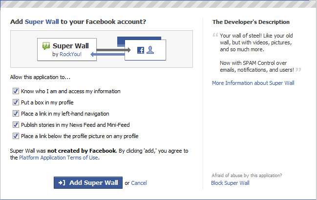
The first point of contact you may have with an app may be when it tries to
catch your attention in your feed:
Many apps are deliberately coy about what they do before you install them.
Many (or sometimes all) of the links in the feed entry will require that you
first add the app to your profile:
If the anecdotal accounts of my friends are anything to go by, at this point
most people just go ahead and click the big Add button. A curious user can
read the laconic and non-descriptive Developer’s Description. An especially
cautious user can click the tiny "More information about
<application>" link to view an About page:
If you do add the application, unless you’re careful to uncheck "Publish
stories in my News Feed and Mini-Feed", you’ll end up telling all your
friends that you’ve just added the app to your profile (in the manner of the
original news feed entry shown above). The app has enlisted your unwitting
help in perpetuating its pointless mystery.
That mystery would, in fact, seem to be the basis for the viral distribution
model of many Facebook apps. I have trouble with this approach, being founded
on a disregard for a user’s intelligence and precious time.This model relies
entirely on mystery to entice you add the application—and then banks on the
fact that, once you add an application to your profile, you’ll just leave it
there rather than remove it. This is fundamentally deceptive.
(The deception is compounded in cases like the one above, in which the app
developer has deliberately incorporated a huge amount of white space
into their description. Below the app’s description, Facebook displays
commentary from friends and other users of the app about the app itself. The
obvious purpose of incorporating lots of white space into the description is
to push all the commentary far below the fold, the better to leave the app’s
potential users uninformed.)
That a Facebook app would hide information about itself suggests the app
offers no persistent, real value. If it were actually valuable, the app would
employ all the means at the disposal of a normal web site to balance the
amount of value they provide to user with the degree of commitment they
require from the user. For example, a normal site might let a curious
potential customer: start a process but not finish it; read content but not
write content; do something a fixed number of times; use the site for a trial
period; perform certain basic operations but not other, more interesting ones;
etc. Even the most brain-dead web site at least presents information about
itself first, before making you sign up for the site. The first
generation of Facebook apps generally forego all these techniques in favor of
an all-or-nothing requirement that you add the app to your profile.
Remove a Facebook app you don’t like is not hard, requiring a simple click on
the little "X" in the app’s profile box. Still, it’s a tiny bit of
work, and the work adds up with every app you try. I have to believe that most
people will eventually tire of removing applications, and therefore tire of
adding them. That in turn means the Facebook world is biased in favor of the
first set of Facebook apps a user comes into contact with (i.e., all the apps
used by their initial Facebook friends), and impairs the ability of later apps
to succeed.
One could argue that it’s in the interests of Facebook and an app’s developer
to force a user to agree to an app’s terms of use before they can use it. And
yet somehow the rest of the Internet doesn’t have this problem. In the normal
web, users implicitly agree to a "browse wrap" agreement whenever
they visit the site, conferring a degree of legal protection to the site.
Presumably this same level of protection extends to browsing Facebook apps, so
it’s unclear why Facebook would be more concerned about this than sites on the
open web.
I also find it hard to stomach the presumption that, when you add an app on
Facebook, by default the platform and app presume to advertise that the app is
now part of your identity. That’s absurd.
You haven’t even seen what the app does. What else in the world works
this way? When you pick up a book in a bookstore to consider buying
it, are you really prepared to declare to everyone you know that you’ve picked
up the book? The news feed entries about adding applications seem like nothing
more than spam. They do, however, also also serve Facebook’s ulterior goal of
giving every user the illusion of social activity, regardless of how many
friends they have or how active those friends are.
All the behavior described here appears to stem from a combination of
deliberate platform limitations, unintentional platform limitations,
de facto conventions that arose around the plaform’s first apps, and
plain bad design. A newer generation of apps do let you see a tiny bit of
their functionality before you the add the application to your profile, but
what you can see is generally still a very limited subset of what the app
does.
Regardless of their intent, it’s fascinating to see Facebook facilitate such a
closed app adoption model—and still create a successful and vibrant
application platform. Clearly there are a huge number of people who don’t mind
(yet) adding unknown applications to their profile, nor do they mind (yet)
advertising that fact to the world. What’s odd is that those same users don’t
tolerate the same experience on every other web site. I’m hopeful those users
will eventually turn away from Facebook’s unnecessarily mysterious apps, and
eventually force those apps to open their front doors as wide as the rest of
the web.
Last month I received a Microsoft Zune 80 as a gift. (Thanks, Johnny!) Having
used the device for several weeks now, I wrote up some opinions of that
experience to send to a friend on the Zune team, and have decided to share
those thoughts here as well.
My experience with Zune actually goes back a few months, to when I first
subscribed to the Zune music service without actually owning a Zune device.
I’m partial to having a music subscription rather than
"owning" tracks. This is due to personal past experiences wrestling
with DRM, and the sense of freedom I find in paying a flat fee for unlimited
music. For $15/month I can listen to whatever I want within the reasonably
spacious Zune Marketplace. In practice I could use the same amount to buy a
big pile of audio tracks from iTunes, but for me a subscription enables a
freer sense of experimentation. Case in point: a relative who visited over the
holidays wanted to share music by an obscure Chilean musician. It felt great
to listen to several esoteric albums through the subscription, and there’s
simply no way I would have felt good forking over money on the spot to listen
to something I might never listen to again.
Nevertheless, owning a Zune in an iPod world feels akin to belonging to an
oppressed religious minority. Discussions about the Zune with fellow Zune
owners must be conducted in secret, lest the conversation be overheard by the
dogmatic iPod-wielding masses. This is too bad, since I found the
second-generation Zune client software and the Zune device itself to work
quite well in practice.
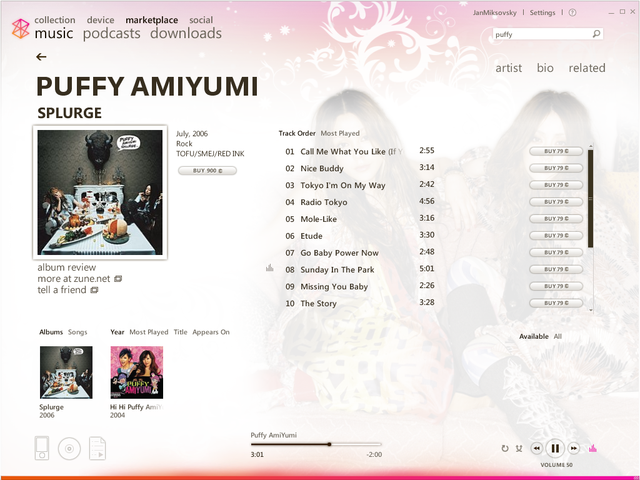
The Zune client on Windows generally looks attractive. The client UI is
designed carefully enough to reward a close look:
I found it trivial to find new music, download it, and sync it to the Zune.
YMMV.
The original Zune client felt like a warmed-over skin for Windows Media
Player, while the new one feels distinct enough to have its own style. The
swirly background fractal may not be to your taste, but at least it’s making
a statement. I like it.
A very subtle visual orange/pink gradient animates in the background at the
bottom of the window when music is playing. I didn’t notice this until I
tried to take screenshots for the image above and compared them. It’s
similar to, but much more subdued than, the background effect in Windows
Media Center. I assume the effect is there to confer a (slight) sense of
movement.
The UI makes extensive use of elements that come alive or reveal more detail
on hover, such as scroll bars, the volume label, the device/disc/playlist
icons in the lower left.
The five-star rating system from Media Player always seemed to be more
detail than I cared to supply. The Zune client replaces this with three
simple states: neutral, I Like It, or I Don’t Like It.
The client makes good use of web-style navigation, a style I’ve referred to
as a
BBOP
UI (Buttons, Back, One task, Page-based). My only complaint is that the
little back arrow in the upper left disappears in the Settings area, which
is treated like a giant modal dialog. I think that’s a mistake—if you’re
going to offer web-style UI with a Back button, you really have to
offer the Back button on every page, or you’re really going to confuse the
user. I can sympathize with the designers’ dilemma, though. It’s hard for
client software designers to accept the fact that a user might want to walk
away a page in which data has been entered—without making an explicit
command to save their changes or cancel the operation. People do this every
day on the web without issue. The Settings area should offer a Back button,
and if the user happens to click it and loses it, so be it. That’s how
virtually all web pages already work.
I was happy to discover that I could sync recorded TV shows from my Windows
Media Center to the Zune. This worked well overall, even if video files did
have to go through a slow conversion process. One annoyance was that the
Videos view on the Zune client only shows the episode title, not the show
title, air time, or episode description. This makes it hard to find the show
you want to sync. I assume that essentially no time has been spent designing
Zune and Media Center to coexist happily, and that minor issues like this
will get resolved as Media Center integration improves in the future.
I’m no hardware guru, but the Zune device itself seems well designed.
The out-of-box experience was reasonable.
The Zune 80 device itself is attractive and lightweight.
The headphones seem better than most. My only complaint is that, like most
headphones, you can’t tell the Left and Right phones apart without looking
closely at them to find a tiny "L" or "R". It would be
great if one could feel which one was which through some means (a raised
letter, dots, whatever). Interestingly, the Zune cable already does
something similar: there’s a raised bump on one side of the connector so you
can tell which of the otherwise identical flat surfaces on the connector
needs to be facing up as you plug it in.
Just once I wish I could buy a device with an expensive screen that came
with its own cheap plastic stick-on screen protector in the box, instead of
having to hunt for an aftermarket screen protector myself.
The software on the Zune device also looks and feel pretty good.
The touchpad is an elegant way to scroll up and down through lists—while
allowing you to navigate laterally across lists to the left or right.
The UI uses animated transitions to good effect.
I wish the Zune device UI weren’t quite so minimalist. It feels
like Microsoft is trying to out-minimize Apple by pursuing
Apple’s desire for a UI that’s clean to the point of inscrutability. Case in point: I couldn’t find the UI for turning on Shuffle. Through
trial and error I discovered that pressing the middle of the touchpad
brought up a context menu of sorts which included the Shuffle command. If
hardware buttons must be context sensitive to keep down the number of
buttons, I always appreciate an on-screen indication of what they’re going
to do if I press them now. Windows Mobile does a decent job of this by
always showing what the two soft buttons directly below the screen will do.
I’m really curious about the decision to have the main menu scroll. In the
above image, you can see that the designers have very carefully sized and
positioned the menu items so that one item ("podcasts") is clipped
at the bottom of the screen. This is a great way to indicate that the user
can scroll down to see more items without having to resort to a heavy-handed
scroll bar. Very elegantly done, yes? So, how many additional menu items do
you think you will gain access to if you scroll down? One. One! If
you scroll down, you’ll see one more item ("settings"). I’d be
inclined to dismiss this as insanity, if it weren’t for the careful
attention to detail here. It would have been trivial to position and size
the text slightly differently to get all the text to fit on the screen
without scrolling. More to the point, it would have a been a
lot easier to develop. I can only conclude that making the menu
feel more dynamic (by forcing the user to scroll) felt better than offering
a completely static menu.
The Photos area was fine, but I was disappointed the device doesn’t include
a rotation sensor like the iPhone (or most modern digital cameras). This
means that, when looking at photos, valuable screen real estate is often
wasted, and pictures are shown at a size smaller than that of the screen.
The Zune offers a modest personalization option: you can set the background
of the main menu to a photo. Surprisingly, that was entirely sufficient for
me to feel like I’d made the device mine. Many other devices do this, of
course, but here the trick felt a particularly effective because the main
menu itself is so minimal.
In putting the device through its paces, I ran into more than a few issues:
The Zune client incorrectly catalogued a few albums under the wrong artist.
This appears to be a
bug introduced during
the upgrade from Zune 1.x to Zune 2.0.
I was puzzled why the Zune client doesn’t offer a context menu on every UI
element a user might conceivably want to right-click on. There are no
context menus on many online store data elements, for example. A UI that
makes inconsistent use of context menus can be pretty frustrating, here all
the more so because context menus are a nearly perfect way to offer a rich
set of commands without cluttering the UI.
I’d prefer a Now Playing area in the client that showed what was playing
without a distracting album art visualization.
The Zune Marketplace often appears to get confused as to which online tracks
are already in my collection.
The client frequently hiccups when I move between PCs. One of the major
benefits of a music subscription is being able to move from one PC to
another and not have to go through the absurd exercise of copying massive
piles of audio bits everywhere I want to listen to music. The Zune client
sometimes gets confused if I switch PCs and try to listen to music through
the subscription. Signing out and back in always fixes the problem, but
that’s an irritating workaround. I’m hoping the client will eventually do a
better job of automatically signing in whenever one switches to a different
PC.
I had trouble syncing over WiFi: nothing would happen, or else I would see a
cryptic error message. I eventually discovered that the error message would
go away if I got closer to the wireless router, so presumably the error
message was just a (very bad) way of saying the WiFi signal wasn’t strong
enough.
The aforementioned Settings area pegs its buttons to the lower right, which
is a bad idea. On a large monitor, these controls all but disappear in a
distant corner of the screen, far from the content they pertain to. This
common UI flub occurs when
designers optimize too much for a specific window size.
While home videos on my local PC show up in the Zune library, videos on a
networked PC don’t show up at all, with no explanation. I still can’t figure
this out.
The Zune would make for a decent podcast player—if it weren’t for a
crippling bug: the Zune sometimes (randomly?) forgets what portion of the
podcast already I’ve listened to. For me, being able to Resume a paused
podcast is the feature that distinguishes a music player from a podcast
player. The unreliability of this feature on the Zune nearly wipes out it’s
value as a podcast player.
Both the Podcast and Videos areas are missing a crucial feature: the ability
to remove a podcast or TV show when you’re done listening or watching to it.
A list of podcasts isn’t like a list of songs you want to listen to over and
over. It’s more like a To Do list of things you want to listen to once. It’s
tedious to have to go back to your PC just to remove a podcast you’ve
listened to or a TV show you’ve watched.
Overall, I’m pretty happy with my Zune 80. As a music player for an online
music subscription service, the Zune works nearly flawlessly. It’s less
effective as a podcast or video player, but I’m looking forward to seeing
those deficiencies addressed.
I’m not sure what Microsoft can do about Zune’s biggest handicap: its brand.
People like buying Apple products because of what they feel the purchase says
about them. At this point, buying a Zune either tells people that you’re a
Microsoft-loving sap, or else so uninformed as to be unaware that you’ve just
purchased a second-place music player. Virtually all of this bad vibe is
attributable to the unshakable feeling that Microsoft is trying too hard to be
cool. I actually think Microsoft has made some bold and innovative moves in
designing and marketing the Zune, but all that works has to fight against the
grain of the intrinsically uncool brand of Microsoft itself. And for what? I
can’t think of a single way in which the Microsoft brand has helped the Zune
in any way, and one can only wonder how much more successful the Zune would be
if it had been marketed as a completely independent entity. To their credit,
the Zune folks at Microsoft are painfully aware of this enormous marketing
handicap, and I wish them the best of luck overcoming it.
In the meantime, I’ll be happily listening to all the music I can eat on my
Zune.


_thumb.png)