Showing the complete range of choices in a grid
The previous post on Cozi’s updated family calendar reminded me to point out a small but interesting aspect of the Cozi calendar UI that’s worked out rather well. As it turns out, the UI in question is in the Settings area of the product—an area where interesting design opportunities are often overlooked in the haste to get that peripheral stuff out of the way so one can get back to designing core features.
During Cozi’s early family research, we met parents who liked to color-code calendar entries according to the person or people involved in the appointment. Accordingly, Cozi lets families color-code appointments in the calendar. (Color is used as a shorthand; it’s not the only way of seeing who an appointment is for, so color blind users need not worry.) Cozi picks a color for each family member by default, but since color is a highly emotional element, we wanted to offer a way to let family members choose their own color.
We had the following constraints in mind for our color settings UI:
- The available colors should all be attractive and work well with the overall Cozi color palette.
- The UI should ensure each family member ends up with a unique color for each family member, otherwise the family won’t be able to tell whose appointments are whose when scanning the colors.
- The colors need to cover a sufficiently broad range that each family member can get a color they like.
- The palette from which colors are chosen shouldn’t contain colors that are too similar. If one family member chooses dark blue and another a slightly darker blue, they’ll never be able to tell them apart.
- It shouldn’t be hard for a family to collectively choose a set of colors that all work well together. This is a challenging design constraint: once you’ve got about 6 colors in a palette, your choices for each additional color are either going to start running close to your existing colors, or else create the potential for ugly combinations. Some applications like Microsoft PowerPoint have a sophisticated color model to help people create reasonably attractive combinations of colors. (Alas, they still can’t prevent the determined user from creating something hideous.) We didn’t have the capacity to develop such a model, and needed something simpler.
- As a consequence of the above point, the palette of choices should be as small as possible. The smaller the palette, the smaller the chance of a clashing disaster. Here Cozi’s targeted focus on families works in our favor, since we can optimize the UI for the demographics of a family. Our database schema allows a maximum of 10 people per household, but in practice our sweet spot is families with 2-4 children. A family with two parents and two kids gets 5 colors: 4 colors for the family members, plus an additional color to represent appointments for the whole family. We eventually settled on a palette with 16 colors. This is sufficient to satisfy the above constraints and still leave some breathing room. (In any given family, there are certain to be colors liked by none of the family’s members.)
- A family should be able to have some fun picking the colors.
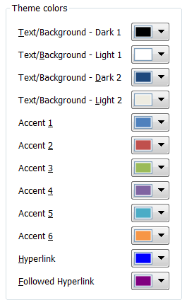
Our starting point for the design was fairly standard: we listed out the names of the family members, and next to each name put a dropdown color picker. You can see something similar in other applications that let users choose a set of colors from a large palette. Here’s a clean example from Microsoft PowerPoint 2007’s "Create New Theme Colors" dialog, which lets users select twelve colors from a large palette that is revealed when a dropdown color picker is clicked:
One wrinkle in using a design like this for our calendar settings UI was created by requirement #3 above: the need for unique color mappings. This is an instance of a cross-field validation rule: the validity of one field value may depend upon another. In a UI like the one above, it’s hard to come up with a good design to communicate cross-field validation rules without confusing or irritating the user. Suppose the colors must be unique, and the user wants to swap the colors in field A and field B. They try to change B’s value to the value in A, but the field complains that B’s value duplicates A’s value—and forces the user to fix field B before they can leave it. This is terrible! They’re forced to clear B (or assign some temporary value to B), go to A, change it, and come back and enter the desired value in B.
One solution is to leave such cross-field validation rules until the user tries to commit the whole form. Alternately, you can deliver the feedback about the need for uniqueness modelessly. The problem with either solution is that the user ends up being surprised: just at the point they think they’re done, they have to go back and rethink their entries. You can try to let them know the uniqueness requirement up front via instructional text, but most users aren’t going to read it, so you’d probably just spend some screen real estate for nothing.
Our strategy in such a dilemma is always to refer back to our family domain and see whether we can optimize for it. Here, we see that the above UI allows for an arbitrarily large palette, but we don’t need that: we only have 16 choices for each color. And the typical user will only need to pick 3-5 colors. Instead of displaying the palette in a dropdown, we display all the available choices in a row:
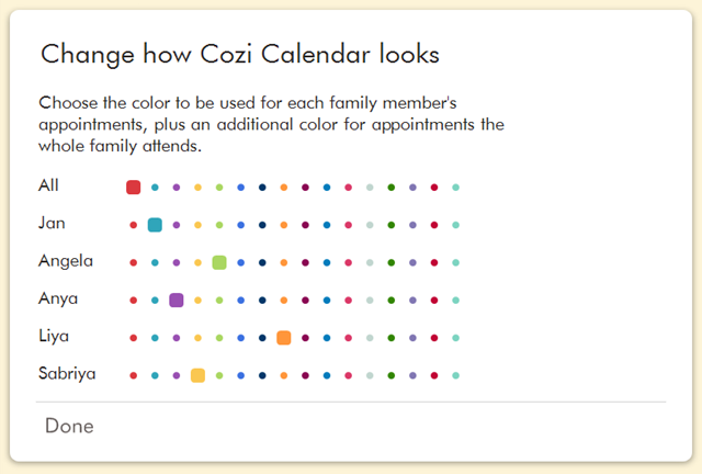
The immediate advantages of this approach is that the user can see all the color choices at a glance, and they can make a choice with a single click (instead of having to spend one click revealing the dropdown palette, and another to make a selection). But the true benefit of this approach is that the user will infer the requirement for uniqueness without it needing to be enforced. In usability tests, we see users intuitively grasp that they should pick a color from any given column no more than once. They can work that out on an intellectual level, of course, but the UI makes that easier to see. With that in mind, we were able to relax the enforcement of unique color selections—the user takes care of that on their own. This lets us deal handily with situations like the need to swap color choices. And, finally, people seem to enjoy using the UI to pick colors.
This design approach could be applied in other situations. It’s quite similar to what you find in online surveys. The design requirements here are slightly different, but the final result still shares the presentation of the complete range of choices:
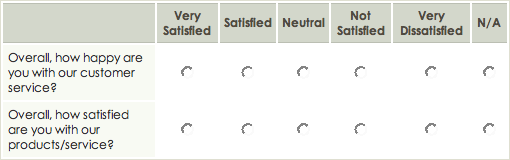
from SurveyGizmo
It’s well understood that a dropdown control will generally be more compact than a set of radio buttons, but in situations where the same dropdown control is repeated across multiple rows, a grid of radio buttons can be efficient as well. Each column only needs to be labeled once, so the individual radio buttons don’t need their own labels. (The color swatches in the Cozi design are effectively self-descriptive radio buttons that don’t even need column labels.) And though the repeated controls take up considerable space, they afford the user the ability to quickly apprehend relationships between field values. In the Cozi color UI, the user can spot-check whether each color has been used only once. And in the survey UI, the user can quickly perceive the balance of their responses across the range of choices.
If you have a similar settings UI in your own product, perhaps with dropdown controls, consider whether the set of choices is small enough that you can display the complete range in a grid.