Transient controls: a delicate balance between discoverability and visual clutter
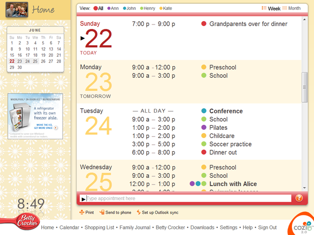
Last week Cozi posted an update to our family calendar that included a small but significant usability fix to the UI for entering appointments. In addition to a traditional form-based UI for entering appointments, the bottom of the main calendar page offers a text box in which a user can type an appointment in English:

In general this UI for entering appointments works well, but usability testing had indicated that a sizable population of users would hesitate when entering an appointment. They would type the text of the appointment, then move their mouse over the right end of the text box, apparently searching for a button they could click to save the appointment.
These users were likely conditioned by web browsers, which generally have a Go button to the right of the address field. Advanced users generally don’t click the Go button (and may take steps to hide it), but many users navigate with it. We had originally left off a Go button in the interests of reducing visual clutter, and expected people would be able to figure out they could just press the ENTER key to save the appointment.
In testing, it became apparent that we were correct, but only to a point. Most users would, in fact, eventually try pressing the ENTER key. The issue is that it would take a second or two of uncertainty before they would figure it out. We didn’t like the thought of producing any uncertainty or anxiety, especially in relation to the natural-language appointment feature. That’s a star feature in our calendar, and we want to show off. (Yes, Google Calendar and others have a similar feature, but we think ours is better.)
We were reluctant to add a permanent button to the page if we could avoid it. Instead, we opted to follow the lead of Internet Explorer and Firefox and use a transient control: a control that’s only visible part of the time. Both IE and Firefox used to have their Go buttons visible all the time, but both changed the Go buttons to a transient control that is only visible when the user is actually typing a URL.
Here’s how it works in Cozi’s case. When the user enters the page, the focus is in the appointment entry text box. The text box sports hint text to let the user know what the text box is for. (Significantly, the hint text does not disappear when the text box has the keyboard focus—since the text box has the focus by default, hiding the hint text on focus for this field would mean the hint text was invisible when it would have been most valuable. If the user clicks on the text box, we do hide the hint text, so the user doesn’t waste any time trying to delete the hint text before typing their own text.)

When the user starts typing, the transient Enter button appears on the far right:

When the user moves the mouse (not shown below) over the Enter button, the Enter button exhibits its hover state:

The user presses the button or types the ENTER key, and the appointment data is sent to the server to be parsed. During this round-trip to the server, the text box and its associated change to a quasi-disabled state to suggest that: a) something is happening, and b) the user shouldn’t type again until the text box has left this state.

When the updated calendar data returns from the server, the calendar view updates to show the new appointment. The appointment entry text box resets to its original state to let the user know they can type again:

So far, this transient Enter button seems to work well, but we will continue to watch that button closely in testing. We’re cautious about employing this UI technique, because it’s easy to accidentally sacrifice discoverability in the name of visual cleanliness. Here the transient control works well because it manages to appear just when a user is about to start looking for it. In other cases, a user might hold their mouse still while looking around the page, and if they didn’t see the control they were expecting, they might jump to the reasonable conclusion that such a control did not exist.