Paternalistic design
A recent Cozi usability study offered an interesting example of the paternalism latent in the task of designing something for someone else. In short, a designer is often required to make decisions which are directly counter to the requests of some of their users.
The usability subject in this study was an avid user of Apple iCal. A particular iCal feature which they repeatedly praised was its ability to show color-coded appointments in Month view. In contrast, Cozi’s Month view eschews our own color-coding scheme (which we use in our Week view and our new Day view) and presents all appointments in monochrome.
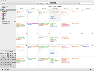
Apple iCal (left) and Cozi (right) views of the same calendar
The iCal user insisted that they required a Month view with color-coding. They found other Cozi features like liked, but they repeatedly dinged Cozi for the lack of color in Month view. At the end of the study, when asked if they had any general comments to offer on Cozi, they returned to this point. And then a curious thing happened. As they flipped between Apple iCal and Cozi to make their point, they stopped on the Cozi calendar. They paused, then slowly began:
“Hmm… you know, now that I look at the two calendars side by side, there is something about the Cozi calendar. It’s cleaner…
“Gosh, all that color is really kind of distracting.
“I guess it’s easier to read the calendar without all that color. And because the one-time appointments are in bold, I can really see the stuff I need to pay attention to…
“Okay, I’m going to take back everything I said. I like the Cozi calendar better. Maybe if I had been using Cozi’s calendar, I wouldn’t have missed this usability study scheduled today.”
This was the clincher. The user had in fact been completely surprised at the beginning of the appointed study time we had scheduled with them, even though we could see they had the usability study appointment on their iCal calendar. They had completely missed it in the rainbow of color.
Design requires a degree of paternalism. The word has an unfortunate nuance; adult users are not children, and not to be treated as such. But there is nevertheless something about listening and responding to user feedback that mimics the way a parent listens and responds to requests from their children. A child may ask for all kinds of things that the parent judges to be counter to the short and long term interests of the child, the parent, the family, or society. Due to cognitive or developmental limitations, the child may not be able to arrive at the same point of view, or at least not at that time.
Adult users are constrained by different forces. They are extremely busy, and don’t have the time, skills, energy, or interest to pursue a particular point of feedback to its logical conclusion. They use a product, something about it differs from their expectations, a response pops into their head, and they voice it—sometimes strenuously.
That feedback has to be taken seriously, but not slavishly. Many, many users have similarly demanded that Cozi’s Month view show color-coding. It’s a reasonable request, which of course we have considered closely. From the earliest days of work on our calendar, we have tried various approaches to introduce color coding into Month view. (Cozi has the the additional challenge of showing a single family appointment that involves multiple users, each with their own color.) To date, none of our design experiments with color-coding in Month view have satisfied us.
Maybe someday we’ll crack the design problem, and delight that we can finally give these users what they’ve been asking for. In the meantime, the consequences of following through on that feedback would so compromise the legibility of the calendar that we think it would represent a net loss in utility. (Offering color-coding in Month view via an option is another story, but the short answer there is that such options compromise things in a different way.)
An individual user doesn’t have anywhere near the time (or, likely, the ability) to perform these design explorations on their own, or even to find and read through arguments like this one here as to why we’ve done what we’ve done. In the end, we make a conscious, paternalistic decision not to give them the very thing they’re asking for. We trust in our own judgment, then look for research like this usability study to confirm that we’ve made the right call.