At various points in my adult life, I’ve taken up the challenge of creating
puzzles for other people to solve, generally in the context of fairly
elaborate treasure hunts created for friends or my children. A relative of
mine recently observed the contrast between designing such puzzles and
creating user interfaces. I’d never really considered how these activities are
similar; ultimately they’re both examples of experience design. The
interesting thing to me is that they both involve careful consideration of
progressive disclosure — in one case hard-won, while in the other case, it
should be effortless.
User interface designers often concerned themselves with what they call the
initial user experience: the sequence of actions they expect a new user to
take in, say, the first ten minutes of using a product. Similarly, a puzzle
designer gives careful consideration to the alternating sequence of bafflement
and insights they hope the solver will experience. Both design tasks require
consideration of the audience’s abilities and especially motivation, which in
turn establishes a timeframe.
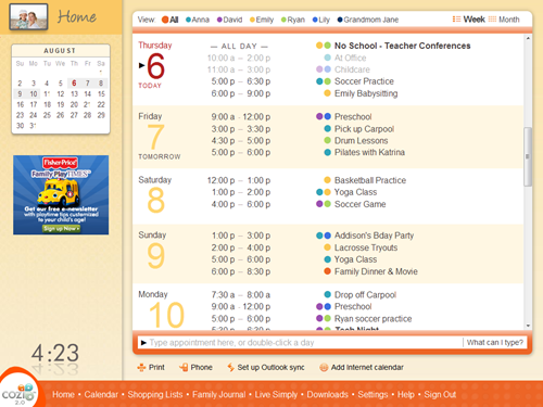
Take, for example, a simple puzzle I created for Hope2Die, the 1996
installation of
The Game
in Seattle. Treasure hunts for The Game entail something like 18-20 puzzles
over 24 hours, including driving time between locations, and the time required
to solve the puzzle. This leaves about 15-45 minutes for actual puzzle solving
time. The audience is a set of 10-20 teams, which are highly motivated by the
desire to outperform their peers. They have free access to technological
tools, including the Internet, in solving a puzzle.
In this case, game teams found the following card (in a burned-out building, I
believe, although that’s not relevant to solving the puzzle):
The hope2die text on the card is simply a logo. Likewise the “PW” is just an
indicator that the clue will produce a password to unlock the next clue — in
that day and age, on a CD-ROM each team had received. The title and body text
constitute the puzzle.
The experience I’m looking for goes something like this:
First reading. Bafflement.
Attempts to interpret the clue as simply as possible. (Here, trying to make
sense of the text as English words.) A tiny bit of frustration, but reader
was expecting — or desiring — it, so this really leads to satisfaction.
The search of patterns. Confidence, crumbling to frustration.
Opening the set of possible interpretations. New but dwindling hope with
each, wilder, idea.
Catching hold of something that seems significant; identification of a
hypothesis. Faint hope.
Initial testing of the hypothesis (applying it to a few cases; here, words).
Anxiety about whether this will work, turning to excitement as each result
doesn’t disqualify the hypothesis.
First intelligible results. Complete elation.
Complete application of the confirmed theory. Satisfaction.
In many cases, the puzzle has more than one layer, in which case this
process repeats.
Some nice parts of this puzzle: The word “BeAm” here turned out to
coincidentally reference the next clue. The password obtained by solving the
puzzle produced the surprisingly short and vague instruction to simply “Go to
Redmond” (Washington). This didn’t seem to be nearly enough specific
information to get teams to the next clue. It was early evening as the teams
approached the town of Redmond — where they saw green lasers shooting into the
sky from the location of the next clue. The password itself was also fun to
select, being the longest interesting one I could construct given the puzzle’s
mechanics, and one consistent with the over-the-top tone of the game show
theme in this particular Game.
The real challenge in designing a puzzle like this is trying to get
everyone through it in somewhere between 15 and 45 minutes. It’s easy
to make something that looks like a puzzle but is, in fact, trivial. It’s also
not that hard to make a puzzle that’s impossible — that requires either
time-consuming brute force, or some completely wild conceptual leap for which
the puzzle offers insubstantial support. The puzzle needs to resist easy
solution, then yield upon sustained effort. Some individuals will see the
solution to the above puzzle instantly; others will need a full-team effort
for the full time.
Over and over again, I keep asking myself: Is this puzzle going to be fun to
solve? I’m just a dilettante puzzle designer, so in a case like The Game, I
feel satisfied if the puzzle simply keeps hyped-up teams in the flow of the
event. This felt like the right puzzle for the right place in the treasure
hunt. In the end, it was part of a sustained sequence of about 5 hours’ worth
of puzzles and activities that were, by all accounts, interesting, and for
many the highlight of the game.
Designing a puzzle requires controlling that progression of understanding so
that it unfolds at just the right pace to produce the intended experience.
Designing a user interface is the same: the user’s understanding needs to
unfold at just the right pace to produce the intended experience. Unlike a
puzzle, a UI needs to look simple, interesting, and useful at the very first
glance. In the next few minutes, it needs to show the user everything they
think they might want to do, while still not overwhelming them. And
then it needs to tuck a bunch of rarely-used stuff away somewhere where the
user won’t even notice it until the day, maybe months later, when they
suddenly need it and think to look for it. The emotional experience needs to
balance the sense of potential power and possible mastery with delight and
instant accomplishment.
Pulling that off, of course, can be quite a puzzle.
[If you’ve found the solution to the puzzle, feel free to offer it, or
perhaps a hint, as a comment.]
Ever since I wrote the first version of the
Cozi Collage photo screen saver
in 2005, I’ve been itching for the chance to port it from Windows to the web.
Things that were only possible on a desktop client five years ago — access to
user photos, animated transition effects — are now trivial in a web app. A
quick attempt to generate photo collages from Facebook photos led to an idea:
what if you could condense an entire year’s worth of interesting moments in
your friends’ lives into a 3 minute video showing Cozi-style photo collages
set to music?
This seemed like a fun year-end project for the holiday season, when people
are inclined to take a look back at the past year. A Cozi colleague joined me
in bringing the idea to fruition, and we released the app earlier this week.
The result is
The Year in OUR Pictures 2010.
I thought this came out pretty neat myself. The experience of creating this
was itself fun and interesting, so I thought I’d share some highlights
and lessons.
The Facebook Graph API is awesome. I worked on a Facebook app just about a
year ago using their older JavaScript SDK, and it was a complete pain (you
couldn't easily develop on localhost, etc.). The new API is
straightforward and easy to use. In particular, it was a joy to discover
that Facebook can return data via JSONP in exactly the right way to be
consumed by jQuery’s AJAX functions. The result of this was that the entire
application is comprised entirely of static web resources and client-side
code. The app entails no code running on Cozi’s servers, which makes it
highly scalable. All the heavy pounding to get photos happens on servers
that belong to Facebook. (Thanks, guys!)
The first time the user clicks on one of the video thumbnails (above),
they’re presented with a Facebook permissions dialog. We were pretty
concerned about the degree of fall-off we’d see at that point. We crafted a
bunch of language for the above screen intended to prepare the user for the
Facebook permissions dialog. (“When you click the button above, you’ll see a
dialog from Facebook…”) We ultimately concluded that this sort of text
wouldn’t help. People weren’t likely to read it, and there didn’t seem to be
any wording we could put in that would increase the number of
people successfully getting through the dialog. As it turns out, the vast
majority of visitors are making past the Facebook permissions dialog with no
preparation. This is great for us and lets us keep the above introduction
very clean.
The whole user interface is created in jQuery and QuickUI, which let us move extremely quickly. It was great to have a QuickUI
library of general-purpose JavaScript/CSS-based UI components
that already worked in all browsers, so we could just drop them in and focus
on the experience. And being able to refactor UI classes cleanly kept things
stable even as we iterated quickly.
Today’s web browsers rock. The original Cozi Collage screen saver has a
drop-dead simple crossfade animation between collage slides
implemented in DirectX. That simple, stupid DirectX crossfade cost us
days and days of development time. No matter how we coded it, the
hardware-accelerated transition was only as good as the user’s video card
driver — which is to say, we could always find someone whose machine would
crash when running the screen saver. The current state of browser rendering
engines and JavaScript engines is such that we can make simple jQuery
fadeIn/fadeOut calls that work reasonably well everywhere. (Oh: To move
quickly, we completely ignored IE 7. Good riddance.)
We were excited to use the HTML5 audio tag. (Hey, we wanted to join the
HTML5 bandwagon.) However, for backward compatibility with IE 8, we also included a
standard Flash audio player. We ran into a puzzling JavaScript error, and
eventually learned there are
issues using jQuery to insert HTML5 tags into IE 8.
The music completely makes this user experience what it is. It was a delight
to discover Wikimedia Commons’ extensive catalog of freely usable
audio files in the Ogg format so we could find music that was both appropriate and free.
The volume of information posted by Facebook friends is literally
overwhelming. Even if your best friend posts a photo album of people you
care about, the chances are very high you’re not going to see it because it
will be quickly buried below the “Older posts” fold. The most common
reaction to seeing a slideshow of friends’ pictures is: “I never saw any of
these”.We’ve discovered that people really enjoy posting photos of food,
cats, and weird signs.
People are more narcissistic than we’d imagined. It’s our observation that
most people have a more interesting experience if they click the option to
see a slideshow of “Your friends’ pictures”. However, they’re more likely to
share the experience if they click the option to see their own
pictures. Since we want people to share this, we moved the “Your pictures”
option to be first, where it gets the most clicks.
The one thing I’d wish we could get via the Facebook Graph API that is a
list of friends sorted by Facebook’s own magic friend-weighting algorithm.
With no way to evaluate the quality of a friend relationship, the
end user’s experience is something of a crapshoot. If the user has liberally
accepted all Facebook friend requests (or they’re just really unlucky and
our algorithm happens to pick their least-favorite friends), they’ll see a
bunch of people they don’t even know, and they’ll have a lousy experience.
On the other hand, when this thing works, it really works. If someone’s been
parsimonious in accepting Facebook friendships (or they get very lucky, and
our algorithm happens to pick their best friends), they’ll see a bunch of
photos of people they care about celebrating meaningful moments of the past
year: a birth, a vacation, a wedding. And the music can get people into a
contemplative mood. (We’ve been using Debussy’s
Clair de Lune, but are thinking of switching to a shorter piece.)
One person wrote me to tell me that watching this made them choke up and cry.
Wow. I’ve worked on Microsoft Windows, which has probably made a lot of people
cry. But I’ve never before written a piece of software that made someone cry
for joy.
This past September, I was invited to present a short 20 minute talk on user
experience design at the StartupDay 2010 conference in Bellevue, WA. This is a
nice bootcamp event for nascent entrepreneurs—a single day touching on every
aspect of starting a company, from finding cofounders, identifying an
audience, searching for a business model, getting funding, … all the
way to potential exits.
Since the vast majority of the audience were engineers and business types
(i.e., not designers), I focused on the topic: What should user experience
design at a startup look like to a founder or executive?
Video (took me a while to find my groove; things pick up around 03:00)
Slides (not much text, might be interesting where the slides in the
video are too hard to make out)
Sheesh, there’s a lot of
HTML5 talk these days. I was
initially confused and disappointed by HTML5’s buzzword status, until I
realized that its very buzzword existence could ultimately help me deliver a
better user experience.
The Canvas tag makes a game like Agent 008 Ball awesome — but a
productivity app, maybe not so much
Each time I hear someone tell me that HTML5 the answer to, say,
the challenge of developing mobile clients for multiple platforms, I have to wonder if they have actually reviewed the set of technologies
actually comprising HTML5. On its face, HTML5 would seem to mean very little
for a productivity app like Cozi.
The most immediately useful aspect to Cozi is probably the <audio> tag
for the few situations in which the Cozi web application plays a sound. We
currently do that with Flash, and it’d be nice to jettison that baggage.
Audio is not a big deal for us, however.
Offline storage? Maybe. The cynic in me is betting that, once we begin
investigating this, we’ll discover that HTML5 offline storage solves 70% of
what we want. Still, this is somewhat interesting.
And, from what I can see, that’s about it for Cozi. I’m missing the magic of
the rest.
The <canvas> tag is a huge step forward for slick
graphically-intensive apps like
Agent 008 Ball, but I’m not seeing the
big breakthrough for an app that can already render everything it wants with
native HTML elements.
We don’t do much with video.
Drag and drop. This is only interesting if you believe that drag and drop is
an intuitive and convenient UI for moving files. My own belief is that users
would benefit much more from optimized modal UIs designed for common tasks
like picking photos. (The File Open dialog could start out showing the
user’s actual photo storage location, show thumbnails by default, the dialog
could allow multiple selection across multiple folders, etc.)
The pile of new tags of purportedly general utility like <section> or
<figcaption> solve no problem anywhere on our list of the 50 Biggest
Problems We Have. What would really help instead would be a framework by
which different communities could define new domain-specific tags that solve
domain-specific problems. Hence my investment of time and labor in the
QuickUI web control framekwork.
“But wait!” cry the poorly-informed or deliberately overexcited
HTML5 buzzword-pushing media. “What about animations? And things with rounded corners and drop-shadows?
And
embedded fonts? And single-page applications?
And increased standardization? Those things are all revolutionary!” Yes, they
are—and all those things were possible before HTML5.
There are however, some very important second-order benefits of HTML5:
HTML5 provides a useful shorthand for “modern web browser”. All I really
need to pull off most of Cozi’s current feature designs is a fast JavaScript
engine and CSS3. Those things are independent of HTML5 — but chances are
that if someone claims their browser supports HTML5, it also sports
a fast JavaScript engine and CSS3 support. So even though Cozi may not care
about HTML5, the term “HTML5” provides a great proxy for the things we
do care about.
The relentless repeating of the HTML5 buzzword may have the beneficial
side-effect of finally giving consumers a way to evaluate whether, for
example, the latest mobile phone they’re considering buying is going to
provide them a good browsing experience. “I’ve heard that I need HTML5. Does
this phone has HTML5?” It doesn’t matter that the literal interpretation of
the question is probably not what the consumer cares about; the question’s
answer may still give the user what they want. We might finally see
consumers and IT departments wake up and jettison their ancient copies of IE
in favor of a modern browser on a reasonable upgrade cycle.
Of course, I’m sure there are many web applications that will directly benefit
from HTML5 in ways that completely change their business. They must be very
happy. For now, my company probably isn’t one of those beneficiaries. Still,
the above second-order effects of HTML5 might eventually allow me to deliver a
better user experience to more users. If that means reducing HTML5 to a
buzzword, I’m all for it.
UI designers can find themselves challenged today by the need to address a
huge range of window sizes. In Cozi’s case, we still target 1024x768, but we
want to take advantage of additional space in larger sizes (sometimes much
larger), and we want pages to function all the way down to 800x600. Sometimes
we have to invent to tricks to work well across this range of sizes.
That 800x600 minimum size, for example, comes into play surprisingly often. It
never fails to surprise me how many users with small monitors leave windows in
their default positions, which can often be unnecessarily small. And the
current generation of netbooks (and now tablets) can have rather short or
narrow displays, so even users who maximize window size can still end up with
a pretty small window.
Cozi’s current design places navigation links in a left pane, and page content
on the right. One challenge at small window sizes is leaving ample room for
the left-hand navigation at all sizes, while still making right-hand page
content (e.g., calendar data) wide enough to be useful. Typical patterns for
balancing these forces:
Make the left navigation as narrow as possible. The
downside here is that, on large monitors, the navigation ends up feeling
narrow — literally marginalized.
Size the left navigation width as a percentage of window width. Others might find that they can pull this off, but in our case, we couldn’t
find a simple percentage that worked well across the range of window sizes
we wanted to support.
Let the user set the width of the left navigation. This can
work well, but punts the problem to the user to solve. Many users won’t
realize they can resize the left pane, and even for those who do, many won’t
bother investing time tuning the display of a tool they only use
sporadically.
Let the user collapse/dismiss the left navigation. A
special case of the above point, with the same issues.
We came up with another solution:
let the page content overlap with the left navigation pane.
It’s likely we’re just independently reinventing an existing solution, but
it’s worked out well, so here’s how it works. At wide window sizes, a typical
Cozi page looks like this. The navigation links and other content (e.g., the
family photo) on the left are completely exposed.
As the user resizes the window to be narrower, the page reduces the width of
the right-hand page content. When a threshold is reached, however, the
right-hand content begins to overlap the left pane. This threshold varies by
page, depending on how much width they need to show their content. (The
calendar shown here in Month view demands a good deal of width, so its
threshold is above 1024px page width. Other pages, like Settings, don’t need
so much.)
This overlap continues all the way down a size that reveals a minimum amount
of the left pane. (Below this size, the right content will start to clip.)
In this overlapped state, the user can still see enough of each navigation
link to tell what each one is. E.g., the visible text “Calen” on the left is
obviously a link to the calendar; “Shopp” is the shopping list, and so on. In
this state, the user can mouse over the left navigation to see the full pane
pop forward:
If the user now moves their mouse back to the right, the left pane drops back
to the background.
The show-navigation-on-hover solution requires that we handle one case
specially: If the user clicks a navigation link on the left, then when they
arrive on the new page, the mouse will still be over the left pane.
The user’s most likely next action is to move the mouse to the right to
interact with the page content. As soon as they move the mouse, the page
will sense the mouse hovering over the left pane. It’d be annoying at that
point to pop the navigation forward again — this would distract the user,
who is trying to get to the right. So we disable the hover on page load
until the user got the mouse to the right, then turn it on.
However, some of the time, the user may be using the left pane to surf
around the product. Perhaps they’re just exploring, or they’re looking for
something and don’t know what page it’s on. They’ll be clicking in the left
pane immediately after the page loads, without ever moving the mouse to the
right. To support that case, we examine two factors: the direction
the mouse is moving, and the time that has elapsed since the page loaded. If
the user moves the mouse to the right reasonably quickly, we continue to
suppress the hover behavior. However, if they move the mouse straight up or
down, or linger on the left, then we re-enable the hover behavior.
(The latter behavior was borrowed from a similar trick used to finesse pop-up
behavior in hierarchical menus. I believe it was Microsoft who first came up
with this trick for Windows or Office; it then made its way to OS/X.
[Update: Commenters recall that the Mac had this first.] If the user
wants to move from a top-level menu item to a submenu, their mouse may cross
over a point that’s not over either of those elements. So the OS uses a
combination of timing and mouse direction to decide whether the user is still
moving towards the submenu, or has decided to explore other top-level menu
items instead.)
So far this overlap solution seems to be working in practice. Most users don’t
see it much, and users with narrow window sizes can now see more page content
while still having full access to site navigation. All of this is achieved
automatically; the user doesn’t have to pick up the burden of optimizing the
page display for the current window size.
For the last few weeks I’ve been playing with an Android phone, a Motorola
Droid X. The UI takes some adjustment for an iPhone user like me, not unlike
they adjustment I’ve made going back and forth between the Mac and PC several
times over the years. In evaluating the Android user experience (including
aspects shaped by Motorola), the following points seemed interesting to me.
On a touch device, it’s easy to constantly forget the presence of the
hardware buttons.
A glowing, colorful screen with detailed interactive elements is just too
visually compelling to remember that, in some applications, critical
features are only available via the hardware Menu button. A typical
experience for me has been to stare at a screen looking for the UI element
I’m certain should be there, and only a frustrating minute realize, “Oh,
that’s right, I forgot to check what’s hidden behind the Menu button.” If
it’s not on the screen, I can’t be bothered to keep checking it. It took me
forever how to get out of “directions” mode in Google Maps because I was in
a maze of twisty little passages (all alike) each of which produced a
slightly different Options menu when the Menu button was pressed.
I think the Menu button flies in the face of evidence that users do
better when they have a clear and consistent search path for finding the
commands available at any given point. Jensen Harris wrote on this topic in
his discussion of
why the Microsoft Office team invented the Ribbon
to provide “the one and only place to look for functionality in the
product”.
The same thing goes for the other hardware buttons, especially the
Search button. It seems like a shameless ploy to plug Google search out of
all proportion to the button’s utility. Even if an application has a Search
feature, it seems like they’d want to be certain users remembered it was
there by offering an on-screen UI to invoke it. Given that, why burden the
user with an extra hardware button?
Long press to invoke commands = Win. The ability to hold
down one’s finger on an object to invoke what’s essentially a context menu
(“Quick Actions”) is a gain for power users, and doesn’t impact users who
are unaware of this facility. When I go back to the iPhone, this is the
Android feature I miss the most. Thankfully, this useful UI convention is
already starting to make its way over to iPhone apps.
On the downside, this UI will likely lead to a wave of “long press
people”. Their habit will parallel that of “right-click people” on Windows:
users who, at some point in the past, found the right click button produced
some interesting commands. They therefore now right-click on everything—the
Windows Start menu, OK buttons, everything—whether it has a context
menu or not.
Dear Google: Thanks for taking the iconic dropdown arrow, an element
which otherwise universally communicates “Click me”, and using it as a
completely static element that offers no interaction whatsoever.
That little arrow-in-a-circle next to "Map mode"?
Users want to click on it. They want to click on it because every
other app they have ever used has used a similar icon as an affordance for
interactivity. By abusing this dropdown arrow icon, Google might untrain
users from clicking on it when they see it. Google’s non-standard use of
this arrow is precluding the standard use of it on Android. (Cozi’s own
mobile UI plans called for using a dropdown arrow-in-a-circle very much like
the one above, and we’ve had to abandon that for fear that Android users
wouldn’t click on it.)
Motorola made a curious decision to set the geeky robotic “Droid” sound
from a Droid X marketing campaign as the phone’s default error
sound.
So Motorola has decided that, at completely random intervals throughout a
customer’s day, the device should proclaim in a loud robotic voice, “MY.
OWNER. IS. A. GEEK.”
If you like that, great; I'm all for
self-expression. If you want to customize your phone to announce new emails
with Worf's voice stating, "Captain… Incoming message", more
power to you. That's your choice. Having a phone manufacturer make a
choice like this without user participation seems unaccountably
presumptuous.
This one tiny experience made me feel like Motorola
views me as nothing more than a marketing tool, and they don't care if
they make me feel stupid in front of my friends. I disabled the sound at the
first opportunity. It took a bit of hunting around. Let’s imagine there’s a
normal person out their who doesn’t want to have their phone scream
that they’re a geek. How quickly will they learn to hate their new phone?
Motorola has managed to completely conflate Droid and Android in the
minds of mainstream consumers.
Perhaps this is due to the aforementioned marketing campaign, but it’s more
likely a result of Motorola’s savvy willingness to pay Lucasfilm through the
nose for the rights to the “Droid” name. I’ve personally seen the
effectiveness of this branding decision—on a daily basis I see requests from
Cozi users asking when we’re going to have a “Droid version”. It’s certain
that many of those users are actually asking for an Android version (which
we’re working on, BTW)
[UPDATE: A reader pointed
out that Verizion, not Motorola, is the firm that licensed the
"Droid" trademark from Lucasfilm.]
I still don’t see the high value of Home page widgets. Maybe my usage will change over time, but it still seems odd to have to,
say, swipe my Home page to the left twice in order to see a few calendar
appointments, when I could also just launch the Calendar app and see
all my calendar appointments. When I go back to the iPhone, I don’t
miss Home page widgets at all. Widgets seem like a great idea in theory. In
practice I’d imagine most people just can’t be bothered to invest a bunch of
time optimizing their phone’s Home page in order to get a miniscule gain in
efficiency. YMMV.
It’s fantastic to be able to install apps without valueless interference
by the carrier, manufacturer, or OS provider. Freedom to install the apps you want is a core part of the Android value
proposition. It’s good for users. It’s great for ISVs during app
development. Platforms that make ISVs happy often do well; the conventional
wisdom is that it’s an unnatural—and probably unsustainable—state of nature
for developers to hate the OS they’re developing for. Installing a
prerelease build of Cozi’s iPhone application is a pain: I have to get my
device ID to a developer, who has to embed that ID in a list of devices
approved to run the prerelease build, and then have to go through
shenanigans with iTunes to install the app. Installing a prerelease build of
Cozi’s Android application is a breeze: just click a link to download and
install the app, and I’m done.
One of my core design principles is that, when a designer tackles a new
problem, they start by trying the simplest thing that could possibly work.
Once you get that into users’ hands, you’ll discover whether the simple thing
works. You might have gotten lucky, and can move on — or else you’ll learn
what users really want (as opposed to what you thought they wanted) and your
next iteration will be much better. The thing to avoid is stopping after the
first iteration, avoiding improvements to UI elements that are clearly core to
a product’s function. This situation often comes up with the use of stock
controls, because their ubiquitous presence and fundamental nature often
blinds people to other possibilities.
Take the standard solution for entering a time into a form. Given the above
design principle, it’s completely reasonable that people designing calendar or
calendar-like interface would start by using stock HTML controls to input
appointment or event data. In the case of entering the appointment time, the
standard solution is a SELECT tag, which on most browsers produces a dropdown
list box. Here’s a typical example from Expedia flight search form:
Expedia time picker
This time dropdown list works, but isn’t particularly elegant, and has
numerous shortcomings. Depending on your browser, you may only see about 18
times at once, so you’re often forced to scroll to select a time. This
scrolling issue is exacerbated by having the dropdown start by showing times
from midnight through the early morning — times that are unlikely to be
selected. (In other words, the first third of the options shown will rarely be
picked.) Furthermore, the times aren’t aligned for easy reading. And, despite
the heavy capitalized AM and PM markers, from usability experience I can
attest to the fact that users will often overlook these, and select a time 12
hours off from the time they want.
Overall this is a brute force solution to a problem. That would be fine for an
initial attempt, but seems puzzling on the home page of a site where task
completion time (here, selecting flight parameters) almost certainly has an
inversely proportional effect on revenue.
It’s even more puzzling to see the same stock control used as a core component
of a web-based calendar, where the entire point of the site hinges on entering
appointments. Yahoo! Calendar uses essentially the same stock control, with
all the same shortcomings:
Yahoo! Calendar time picker
Google Calendar and Microsoft’s Hotmail Calendar (or Windows Live Active
Calendar, or whatever it’s called this week) are more puzzling still. Both
sites have developed custom time pickers, and in both cases they’ve created
combo boxes to allow typing times (in addition to picking from a list). From
experience, I can say that this is a non-trivial endeavor — it’s surprisingly
difficult just to correctly reproduce all the keyboard navigation and other
interaction behavior of a standard dropdown list, let alone improve upon it.
But for all their investment, as far as I can tell, in both cases the dropdown
list behavior is no better than the standard solution. In fact, both solutions
are worse because the dropdown list is, amazingly,
shorter than the stock control. The Google solution only shows six
times at once; Hotmail’s shows ten. It’s almost impossible to use these UIs
without scrolling to find the time you want. It’s also noteworthy that both
sites fail to take the opportunity to improve the legibility of the times and
leave them left-justified.
Google Calendar time combo box
Hotmail Calendar time combo box
With these object lessons in mind, I really wanted to find a better time
picker solution for Cozi’s own
family calendar. When we
began working on our own combo box time picker (following the same pattern as
Google and Hotmail), it struck me that all the scrolling pain resulted from an
insistence on showing all times in a single vertical column. Moving to
multiple columns let us show a complete day’s worth of times at once, and
completely eliminate scrolling:
Cozi multi-column time combo box
Once we introduced the idea of using the horizontal dimension, we realized we
could take it even further. Each row normally shows just the top of the hour,
but the row the mouse is over also shows additional fifteen minute increments
within that hour. This allows the user pick, with a single click, from 96
discrete times. We also align right-align the hours to improve legibility. The
fact a user can see all the hours at once makes it slightly more likely they
will choose the AM or PM time correctly, an effect we’ve tried to reinforce
through a background gradient to suggest day versus night.
In practice, this control works exceedingly well. It’s very fast, and thorough
usability testing of the control over the years has shown that users
intuitively grasp its use, despite never having seen anything like it before.
I mention this not (just) to toot Cozi’s horn or to sneer at other calendar
sites. The other sites mentioned above all have aspects in which their user
interface is better than Cozi’s, and I aspire to match them in those areas. My
point is that stock controls such as dropdown lists are so pervasive as to be
invisible even to the product’s own designers. These controls are a perfect
starting point for a UI design—but they shouldn’t be the end. If your product
uses a stock control (or any basic UI pattern) in a core function, it might
well be worth your time to reconsider those controls and explore an optimized
solution.
This past weekend I had a lot of fun giving a talk at
StartupDay 2010 on the
topic of user experience design in the context of a startup company. After my
talk, I volunteered my time at a table in the advisory area, where lawyers,
VCs, and various experts on others topics of interest met with new and hopeful
entrepreneurs. I ended up spending time with four entrepreneurs, and three of
them asked the exact same question:
Where can I find budget design talent?
I really wanted to help these people get their business started, so did my
best to come up with a meaningful suggestion. They all liked my advice, so I
want to share it with you too:
Try finding a college student to do your design project.
Photo: Matt Hintsa
There are a bunch of good reasons to hire a college student:
There are incredibly talented undergraduate and graduate students studying
every form of design that’s out there.
They are looking for a job that pays better than part-time work in the
campus library or a local restaurant, and so are willing to work for less
money than you might imagine. (That said: Be fair.)
They want to build a portfolio. The extent to which your design project is
actually interesting increases the chance the result of the project will
look good in their portfolio. This portfolio benefit can translate into more
motivation (and possibly willingness to work for less).
They can have drive and energy to spare.
Instructors want their students to work on real-world problems! I’ve been
approached in the past by professors looking for projects for their
students. They are farming out cheap (or free) labor, but don’t always know
who’s looking for design work, and may not have local small-company
connections. These engagements can come with particular constraints: the
project probably needs to start and end within a given semester, you may be
obligated to submit an evaluation at the end of the project, etc.
If the relationship works well, you can use them for future projects, or
potentially recruit them. You may discover someone great before anyone else
does!
This is a way of doing some good in the world.
The obvious downsides to hiring a college student for a real business project
are lack of experience: specifically in the particular design discipline
you’re looking to hire, and generally as a professional with business
responsibilities. They may not yet have worked on a project for which failure
can entail consequences worse than a bad grade.
It can also be hard to find a good student—it takes time to separate the wheat
from the chaff—but if you’re on a budget, it may be worth the extra
time. And if you’re on a really tight budget, you may have no better option.
Reaching out to local instructors can be a good place to start; even if they
don’t have a specific work/study project coming up (or one that matches your
parameters), they may know current or past students that might be good for
your project. These instructors can be found not only at the local college or
university, but also at trade schools and other adult learning institutions.
Cozi is expanding its family software to the mobile domain. We have a
Cozi iPhone application, and are obviously looking at Android as well. The problem is what to do
about Blackberry, Palm webOS, and perhaps Windows Phone 7. As an entrepreneur
with friends at two of those companies, I wish good luck to those OSes in
third place and beyond. As a designer of family software, I have a goal to
address the needs of my users, and support whatever phone they find meets
their needs. And as an executive at a company that makes mobile phone
applications, I wish those OSes in third place and beyond would please die—and
soon, if they wouldn’t mind.
Dear Blackberry, Windows Phone 7, Palm webOS: Could you all go away?
Please?
As an ISV working on top of a platform, I want exactly two platform providers.
Not one, not three, or four, or ten. Two. If there’s only one platform
provider, the provider inevitably becomes arrogant and insensitive to the
needs of the ISVs that keep it alive. Not three, or four, or more—those
platforms can never get enough market share to make it worth your while. All
they will do is produce enough users to make your life miserable with endless
requests for when you’ll get around to supporting the OS they prefer, with its
3% market share. The only good case with the smaller players is if they can
become commoditized, ideally in combination with the first or (more likely)
second place platform, in which case their existence makes no difference to
the ISV.
An ISV wants exactly two platform providers in any given space. The first one
can be the successful one, with something like 70% market share. The second
one can be the underdog, with 25% market share. From the ISV’s perspective,
the underdog’s job is to keep the top dog honest, while maintaining sufficient
market share to justify the ISV’s investment developing for that platform.
Without the latter justification, the ISV can’t justify the investment, which
means the underdog eventually loses compelling apps, and loses market share
until they can no longer play a meaningful role as underdog. The remaining 5%
of the market should be splintered among tiny players. None of them should
have sufficient market share to create a compelling business case to the ISV,
so the ISV can focus on the two players that really matter.
This effect has been demonstrated over and over again.
In the golden age of personal computer OSes, the Mac had just enough market
share to be worth developing for, which kept Microsoft honest. When the Mac
nearly became irrelevant, Microsoft slowed its pace of innovation, and took
forever to release Vista. Without OS/X nipping at its heels, it’s
exceedingly unlikely that Microsoft would have gone on to produce a nice
Windows 7. Thankfully, a personal computer OS is now largely a commodity
whose greatest purpose is to run a web browser, and web-based ISVs can often
ignore the space entirely.
In the gaming console space, game ISVs resent Nintendo’s steadfast refusal
to die. Microsoft and Sony can keep each other honest on their own. So, from
a game developer’s perspective, Nintendo’s existence doesn’t improve their
life, it only complicates it.
When Microsoft maneuvered IE into a position of browser dominance, ISVs had
no choice but to optimize for IE, giving Microsoft so much market power that
they could ignore the call to adopt standards. When Mozilla, Chrome, and
Safari eventually became clawed their way to being good enough and
threatening enough, Microsoft finally had to get serious again about making
IE good. In this particular case, web standardization has commoditized the
smaller players, so as an ISV, I really don’t care whether Mozilla and
WebKit both stick around. All that matters is that, collectively, they can
force Microsoft to improve.
Now, the mobile OS space is increasingly dominated by iOS and Android. To an
ISV, that’s fantastic news! The fewer players, the less work the mobile ISV
has to do to reach more users. I’m really hoping Android manages to create a
meaningful application marketplace and sustain fast growth. When iPhone was
the sole high-end mobile OS of interest, they could afford to subjugate ISVs
with completely mysterious and arbitrary rules for who could be in the App
Store. With Android on the rise, Apple has been finally forced to
open up a bit.
The mobile ISV wants to see that tussle between Apple and Android. But what
would really make me happy would be to see those other guys get a lot weaker.
The other mobile OS providers don’t weigh enough on their own, and hence can
only serve to make the ISV’s life harder. Hey, you guys can all share that
last 5%!
Anyone designing a form will eventually come across the problem of: 1) when to
validate the form data which the user has entered, and 2) how to provide the
user feedback on fields that don’t meet the validation criteria. Many
approaches have been tried for the second problem, but I think the first
problem—when to validate the data and provide feedback—could use more
consideration.
Suppose you’re designing a form containing a text box in which you will ask
the user to enter a mobile phone number. For a variety of reasons, you’ve
decided that you want to perform some initial validation of the number to
minimize the chance of later problems. There’s no easy way to ensure, on the
spot, that the number is, in fact, that of a real mobile phone, but you can at
least ascertain via some regular expression that the text looks like a valid
phone number. (Er, have fun with that, especially if you want to support
international numbers.) Your regex is quick to evaluate, but you need to
decide when to evaluate it and do something with the result.
Here are some choices for when to validate the phone number, along with some
pros and cons:
When the user types a key.
Pros: The user will get the feedback as quickly as possible, and so
they should be able to correct the problem immediately. Because they’re
looking at the phone number field, feedback positioned next to the field
will be noticeable. Because the user is thinking about the phone number,
they don’t need much prompting to spot the problem. The keyboard focus is
probably already in exactly the right place to fix the problem.
Cons: It can be incredibly irritating to use a program which instantly
complains about a problem which you yourself can tell you’ve made. If you’re
reaching for the “1” key, and see you’ve accidentally hit the “q” key, you
can see for yourself you’ve made a mistake. You don’t need the additional
shame of being yelled at. A program that validates on a key press can act
like the jerk in the car behind you who honks their horn the instant the
traffic light turns green.
There are also plenty of situations in which such error feedback is
completely premature. Suppose the user is pasting in a phone number they’ve
copied from their address book or some other location, and the pasted text
contains some extra characters. The user can see the extra characters, and
would be perfectly happy to remove them if only the program wouldn’t yell so
loud.
When the field loses focus (e.g., the user has moved the
keyboard focus to the next field).
Pros: The user has had a chance to get the field text into the state
they desire, so any feedback at this point is likely more warranted. Perhaps
the user may not have noticed that they’re missing a digit from the phone
number.
Cons: The user’s attention has already begun to move on, so the error
feedback may need to be more prominent. Also, while this technique is less
hasty than the one above, the error feedback may still preempt the user’s
own ability to recognize the problem. The user has to manually move the
keyboard focus back to the phone number field.
When the user attempts to save the form.
Pros: By pressing a commit button like Save, the user has indicated
that they think they’re done entering data. If there’s an error at this
point, they haven’t noticed it, so the feedback will be timely.
Cons: By this point, the user’s attention may be far from the phone
number field, so the feedback needs to be quite prominent. It may need to be
supplemented by overall form validation feedback near the commit button or
at the top of the page. Once the user sees that overall feedback, it may
take a moment for them to visually reacquire the problematic phone number
field, diagnose the problem, and get the insertion point to the point where
they can correct it.
All these methods have their place, although in a situation like this, I
personally prefer to defer giving validation feedback to the point where the
user is attempting to save the form (#3 above). I’d rather give the user a
reasonable chance to fix any errors, and have observed countless usability
studies in which they have done so. I believe this leaves the user feeling in
control, and to me this is worth the disadvantages listed above for this
approach.
Still, there’s one common downside to this approach:
applications that validate on Save tend to keep the error feedback visible
until the user tries to save again. I find this annoying; it’s like the program continues to scold me even
after I’ve admitted I was wrong and atoned for my mistake. Once I see the
problem and have fixed it, I wish I could get credit for fixing it right away.
Asymmetric validation feedback triggers
There’s no reason the triggers for showing and hiding the validation feedback
need to be symmetrical. I’ve been working on the idea of asymmetrical
validation triggers: validate on save to show validation feedback
and validate on keypress hide the feedback. In this scenario, the UI
shows validation feedback (validation message, change field background color,
etc.) if the user attempts to save the form with something that doesn’t appear
to be a phone number. But as soon as the user types the key that fixes the
problem, the validation feedback goes away.
The user is typing…
They mistype. The UI doesn’t complain; maybe the user will fix the
error.
The user tabs away with the error uncorrected. Still no complaint.
They try to save the form. NOW validation feedback appears (with an
explanation nearby).
The user clicks to correct the error…
As soon as they type that fixes the error, the validation feedback goes
away.
In other words, the UI is slow to complain, and quick to forgive.
I think this is generally the proper conversational posture for a program to
take regarding the validation of user input. Most programs treat validation
feedback as if it were the user’s fault, when to me this feels like almost
exactly the wrong spirit in which the view the situation. Data validation is a
sign of program weakness — a sign that it’s still too hard to design a program
that can process input flexibly and resiliently.
If I fill out a paper form that asks for my home and work phone numbers, I can
fill in the first phone number and write the word “SAME” for the second phone
number, and any human would process that correctly. I can even cross out the
field label “Work” and handwrite “Cell” and write in my cell number, and again
this is meaningful to a human reader. I can make all kinds of minor errors,
and still my input can be interpreted.
That is a breathtaking level of input flexibility which no UI today can match.
And so when a form has attempted to recognize user input, and failed to do so,
the appropriate stance should be not, “Invalid phone number”, but rather, “I’m
really sorry, I’m not smart or sophisticated enough to understand you. Could
you please help me by making this more recognizable as a phone number so that
I, a mere program, can process it for you?”
I’m not saying that’s what the program should really say, but that’s
a useful mindset to have when approaching the situation as a design problem.
Such thinking led to the asymmetric validation triggers above, and perhaps
more thought along these lines will lead to further refinements to this very
common aspect of user experience design.
It takes a while for a designer on a mature product to realize that not all
parts of the application's user interface are equally stable. As an
application evolves over the course of years, it tends to develop some
critically important yet unbelievably fragile component upon which too much
rests. I picture such a feature as a scary basement: the dark, old,
mysterious, and temperamental body of code which is vital to the running of
the operation. The scary basement is cantankerous and hard to
maintain—something only operated upon by the most senior and stalwart of the
team's engineers, and conspicuously avoided by everyone else.
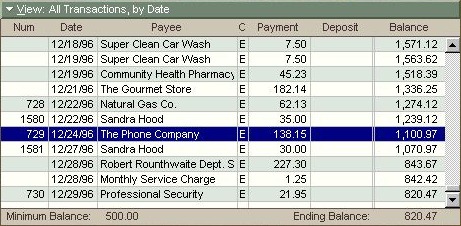
When I worked as the lead designer on Microsoft Money, I eventually came
across its scary basement: the elaborate checkbook register control for
viewing and editing account transactions. This register control was first
created around 1990 by legendary Microsoft engineer Doug Klunder. To get the
most performance out of the PCs of the day, I believe he had the register
itself more or less directly read and write transaction data from disk. In this capacity, this specific UI control was entirely and solely
responsible for validating all transaction data; there was no separation
between presentation, business logic, and on-disk representation.
This gave rise to all sorts of odd restrictions. For instance, any dialog that
created an account transaction had to instantiate, somewhere behind the
scenes, a hidden instance of the register control. When the user entered data
in dialog fields, the dialog carefully copied those values into the register,
told the register to save it, and then tried to divine whether the save
operation had worked.
With each new product version, the register control had new functionality
bolted on (investments, online banking, localized features), and each addition
increased the complexity of the code. By the time I joined the team four years
later, the register control had become so incredibly Byzantine, only one or
two people on the team could, and would, touch it.
Money register control, circa Money 95: Be afraid… be very afraid.
A distinguishing characteristic of the scary basement is that all work on it
will take an indeterminate length of time; any bug fixes or improvements are
essentially uncostable. In the case of Money’s register control, simple
changing the order of the transaction fields might take a day—or several
weeks. There was just no way to tell beforehand.
When I was first exposed to this reality, some friends on the nearby Microsoft
Word team shared stories about their app's own scary basement: a routine
called FormatLine. Given a point in a document and a column width, FormatLine
would lay out the next line of text at that point. As I heard it, this routine
had evolved into a handful of functions that were each thousands of lines
long. Developers assigned to descend into the depths of FormatLine were
treated with the same respect and concern as spelunkers attempting to reach
trapped miners.
The basement metaphor isn't just a way of describing the unnerving nature
of tiptoeing around such a feature—it's meant to reflect the fact that
such a feature is invariably foundational to the application. And like a
building foundation, this code can’t be replaced with something more solid
without a colossal engineering effort. In most cases, the scary basement just
stays that way until the platform the app sits upon becomes irrelevant, and
the app is ported over to some new, saner, foundation.
To prevent a critically important aspect of your UI metastasize into a scary
basement means investing time in refactoring as you go, and this means moving
more slowly that you would like. UI changes need to be evaluated in terms of
the degree to which they compromise the solidity of the foundation.
This past week, a developer here at a Cozi came to me with a tough decision.
I'd designed what, IMHO, was an interesting modification of our family
calendar UI that could have helped optimize screen real estate for both user
data and advertising impressions. Unfortunately, after a couple of weeks of
working on this, the developer indicated that it was proving ferociously
complicated to get the new UI to work correctly with the infinite scrolling on
our calendar page. The infinite scrolling feature was itself delicate, and
doing anything to it was complicated by the need to work across multiple
browsers. While it might be possible to slowly stabilize this particular new
feature to an acceptable level of quality, our calendar UI would likely become
unacceptably fragile—the next feature we tried to add would apply new
stresses, and things would break in unpredictable (and uncostable) ways. Our
calendar UI would turn into a scary basement.
We couldn't let that happen. For a family-focused product like Cozi, being
able to evolve our calendar UI is crucial to the business. So while it was
painful to let a neat feature improvement go, we ultimately decided that it
wasn't the right time for it. Maybe someday cross-browser compatability
won't be such a pain (probably when we can drop support for IE 7 and 8),
and we'll give it another shot. In the meantime, we have a clean, well-lit
basement.
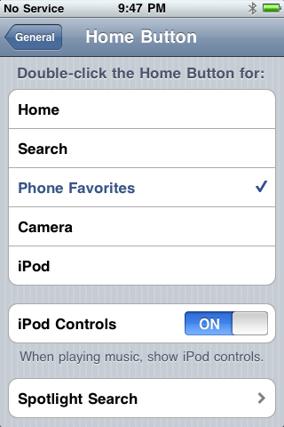
Like a lot of iPhone users, I was surprised that Apple changed the behavior of
double-click the Home button in iOS 4.0. That action had previously taken the
user to a user-selected favorite application, which by default was the Phone
application. On a phone with a tiny number of hardware buttons, having a fast
way to actually make a phone call seems like a good idea. In iOS 4.0, this
double-click action was redefined to invoke the task switching UI:
In iOS 3.x (left), double-clicking Home was customizable; in iOS 4.x
(right), it invokes the task switcher
I happen find the new behavior fine, and find a use for it many more times a
day than I did the previous behavior. Some number of users, however, howled
when they upgraded their phones and found a favorite feature was missing.
Apple essentially took a feature away, an occasion so rare in software design
that I can only think of a handful of cases in more than twenty years where
I’ve done it myself.
Regardless of what one thinks about Apple’s decision, I’m impressed by their
resolve to retire the old behavior. Features tend to live forever, sometimes
out of all proportion to their utility. It’s usually cheaper to keep things
than get rid of them, and as this case shows, every feature has at least some
number of users that will be inconvenienced and upset if the feature were to
be removed. Some of the most passionate of those feature users may, in fact,
work on the team that make the product, and those people serve as advocates to
ensure the conservation of old features.
Usually, the tendency to conserve features is so strong that old features are
usually buried as settings, rather than eliminated entirely. When Microsoft
finally
fixed the behavior of the Insert key in Microsoft Word, it still preserved the old behavior as a behavior preference. Here it would
presumably have been trivial for Apple to keep the old behavior by simply folding the new behavior into the very configuration UI it
replaced. That is, the list in the image on the left above could have been extended
with a new option to “Switch applications”, and that option could have been
made the default. Given the low cost of doing that, Apple’s decision to retire
the old behavior is even more impressive—or, depending upon your point of
view, more reprehensible.
The complexities of preserving such behavior preferences in perpetuity is one
of the many reasons I personally try very, very hard to avoid introducing them
in the first place.
Side note: This week I'll be at
UX Week 2010 in San Francisco. If
you're coming, it'd be great to meet up. Send mail to jan at cozi
dot com.
Four years ago I wrote about how
impoverished
most UIs were when it came to rendering live text in fonts other than the
small set of stock fonts generally available on all operating systems. This
situation has thankfully changed in the interim, tipping to the point where
Cozi was able to incorporate a proprietary font in a recent redesign of our
web client. We’re now using
Avenir,
a sans serif font in the Futura vein by reknowned designer Adrian Frutiger.
Sample of Avenir 45 Book
While many other sites cover the technical aspects of using fonts in web
pages, I thought it was worth sharing some lessons I learned from a designer’s
perspective. Using custom fonts is something that actually works now, but
there are still hassles today:
There are currently two distinct routes to using custom fonts:
1) buy them and host them yourself, or 2) use a font hosting service like
Typekit or the (free!)
Google Font Directory. Using a font
hosting option seems much simpler, but in my mind has some significant
limitations.
Depending on which service you use, your choices may be quite limited.
This issue will certainly fade away quickly (a year?), but at the moment,
you still don’t have access to everything you’d want. If you already have a
brand identity you care about and worked to refine, it may be impractical to
chuck it all and go with some new font just because it’s easy to reference
on a web page. In our case, we selected a font that we felt was consistent
with our brand values and good for both body text and data (like a family
calendar). The font we picked wasn’t available on a hosted service at the
time, and we were willing to go to some lengths to get it.
With the service route, actually getting the supplied font code to
work can be a hassle. Most suppliers of web componentry seems to feel that
it’s fine to dictate where you need to stick their <script>
tag. These solutions always work great in some toy test app, and completely
break when added to a large complex web application. Google actually get
this right: you can host a font with a completely plain <link> tag.
Unfortunately, Google currently offers a tiny number of fonts, none of which
were appropriate for our use.
Based on these factors, we elected to just license the fonts and host
the files ourselves. This required a bit of pain, on several fonts…
The major font foundries are still just waking up to the potential of
hosting.
The Avenir typeface we wanted to use is owned by Monotype Imaging, which
earlier this year hadn’t yet released their own
Fonts.com web fonts hosting
service. This meant we’d have to host the files ourselves, which required
signing a licensing contract. This is an old-school purchasing process: we
had to, like, sign documents and fax them to Monotype. We also had
to (or, depending on your prespective, got the chance to) negotiate a price.
This consumed quite a bit of time.
Moreover, Monotype’s lawyers were still grappling with some legal
aspects of hosting fonts. They’re used to an older world where fonts are
licensed to a customer for use exclusively within that company’s internal
design team for producing printed material, or creating web imagery in which
the text is baked into the image. In either case, there’s no risk to the
foundry that the people who read the printed material or imagery
are going to be able to use the fonts themselves. Hence, heretofore there
hasn’t been such a pressing need to clarify what can be done with the font
files.
Now that people want to serve up web pages using proprietary fonts,
that situation has changed. The lawyers are focused on protecting their
intellectual property (the fonts they own), and are nervous about
controlling where those fonts get used. If site A has paid to use a font on
site A, what’s to stop the folks who make site B from digging through site
A’s CSS, finding the reference to the font, and using that reference on site
B?
In our case, we asked Monotype if we could serve the licensed fonts in
the emergent WOFF format,
and had to wait while their lawyers finished an investigation of WOFF and
came up with legal language in the contract to cover it.
Hosting a font can entail legally-mandated server configuration.
Monotype’s licensing contract stipulated measures we had to take to protect
their intellectual property. Internet Explorer’s proprietary EOT font file
format includes built-in DRM, but the WOFF format does not. We were forced
to set up a form of Cross-Origin Resource Sharing to prevent other sites
from linking directly to Cozi’s copies of the font we licensed. This didn’t
take too long, but it was still annoying to deal with.
These hassles will likely disappear in a year or so. When our licensing
contract runs out, we’ll likely switch to a hosted solution to avoid most of
the trouble above. Even when the above issues are addressed, however, moving
from a stock web font to a proprietary font will entail some issues you should
keep in mind:
Fonts that look great in simple samples may look unacceptably bad in real
use. A font that looks great in print may look awful online unless it’s been
specifically hinted for on-screen use. That is, the font foundry
has to spend an insane amount of time optimizing the font for a range of
specific point sizes at which the font may be used to render text. The
online font stores all give you a way to see samples of the text, but (for
the time being) in many cases those samples are rendered on a server, and
may use better rendering than what your users will see in practice.
Similarly, trying out a font in Photoshop may produce great-looking results
that cannot be reproduced in a browser. The only way to ensure a font is
going to look great on a web page is to actually use it on a web page. That
wouldn’t be such a problem if…
Online font stores aren’t designed for real experimentation. You generally have to buy the font before you can really try it out. While
this may be a small cost ($25, say), that only covers one weight of the
font. We ended up having to test about 6 weights of Avenir to settle on the
two we wanted to use. This experimentation can get expensive.
I’ve seen a lot of fonts that with insufficient hinting, so I was
particularly careful to evaluate the fonts we were considering at a wide
range of point sizes. I was particularly happy to see that, just in time for
our use, Monotype made available a full set of Avenir weights with improved
hinting. Despite this attention on hinting, however, we still got burned a
bit. It turns out that a specific letter (the lowercase “e”) looks bad a
specific point size (11pt) in a specific weight (Avenir 85 Heavy) we just
happen to use in some of our menus. This was easy to work around (by bumping
the text size up a point), but just goes to show that you can’t be too
careful.
Type metrics change between fonts. The same text rendered
in the new font may be slightly bigger or smaller than the same text in the
old font. In our case, most of our web pages had been constructed well, and
were resilient to this change. I don’t recall any places where we need to
make a substantial change to the UI in response to changing the font. YMMV.
The feel of the text may change. This was something of a
surprise to me. While Arial (our old font) has roughly similar text metrics
to Avenir (our new font), the overall feel of Avenir is lighter. This is due
to a thinner stem weight; i.e., the lines that make up the characters are
slightly thinner in Avenir. When we initially deployed the Avenir font,
users responded that the text was too light. As it turns out, we’d
previously been using a medium-dark gray (#474040) for body text in Arial —
precisely to lighten Arial up a bit. So we had to tweak our colors to adjust
to the new, lighter font.
Users of older versions of Firefox, Safari, and Chrome won’t see the
proprietary font.
(Internet Explorer has supported them for years.) This lag can complicate
the tuning of your site for the specific text metrics of your new font:
optimizing for the new font can make things worse for users seeing the old
font, and it’s a pain to create slightly different style sheets for both
conditions.
So switching from a stock font to a proprietary font isn’t quite as easy or
perfect as it should be. I’m still ecstatic things have improved to the point
where sites can start making real use of real fonts to achieve new levels of
design expression. In five years, we’ll all look back on screen shots of sites
from this age and laugh at them. Today’s web sites will look old —
and part of what will make them look old will be their use of stock fonts.
Over the past week, I’ve seen an uptick in feedback from Cozi’s users, some of
it responding to a recent change we made in Cozi’s standard page template. It
seems some users have perceived a significant loss of vertical screen real
estate on the main family calendar page. The odd thing is that the new
layout has roughly the same vertical amount of calendar data as the old
design:
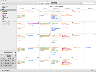
Old Cozi design
New Cozi design
Two main changes are at work here:
We
simplified the layout of our calendar UI controls
so that they take up less room. The new design consolidates three rows of
calendar controls (one from the top, two from the bottom) into a single row
at the top.
We redesigned our standard page template. Among other things, we moved the
navigation controls from a footer at the bottom to the left side. At the
same time, we moved our standard display advertising unit from the left side
to the bottom. Specifically, we upgraded the unit from an IAB 180x150
Rectangle to a IAB 728x90 Leaderboard. The latter is worth more to
advertisers, and hence commands higher revenue for Cozi.
The new design should address some long-standing usability issues, while
simultaneously increasing revenue — a win/win. So I was surprised when users
contacted Cozi to complain that the new design showed significantly less
vertical room for calendar data than the old one. There is a loss,
it’s true: at 1024x768, the old design allows for 560px of vertical height for
calendar data, whereas the new design only allows 553px. This is a loss of
seven vertical pixels of data. (As it turns out, the new design could easily
gain that space back if we get rid of the rounded corners in the visual
design. We’re working on that.)
I don’t think users begrudge the loss of seven pixels. I think the main issue
is that the new design makes it really apparent that Cozi has to make a
trade-off between the needs of its users and its advertisers. That trade-off
is just a fact of life for an ad-driven business, and most people would prefer
that Cozi to keep its product free for users. Virtually every user I’ve
interviewed on this specific point has indicated that, in the abstract,
they’re comfortable with this trade-off.
Here, though, the user can readily see what the ad is costing them. It’s very
easy for them to imagine that, if only that Leaderboard at the bottom were
hidden, they’d be able to see more data. Compare this with the old design:
it’s hard for someone to imagine what they would gain if the small Rectangle
ad on the left were hidden. It’s harder still for a user to imagine what would
need to happen at the bottom of the old design, with its multiple stacked
toolbars, to allow them to see more data. The lesson here is that
it’s easier to imagine turning off an ad than to envision a complete
redesign of the user interface. (That’s, um, actually a good thing for me, or else I wouldn’t have a job
designing user interfaces.)
We’re in the midst of making further page layout and calendar UI improvements,
so I’m looking forward to being able to gives users a design that they can see
is unequivocally better than the old one. In the meantime, we’ve learned a
valuable lesson in the user perception of advertisements in screen layouts.
Like the panels in a comic, the sequence of pages in a user interface requires
closure in the user’s mind to logically connect each step with the
preceding step. At each step, the user is trying to mentally confirm that the
place they’ve just arrived logically follows from the action they just took in
the previous step. A designer can create a smooth experience by ensuring good
closure; a disjoined interface can interfere with closure, producing
substantial confusion.
Scott McCloud describes the concept of closure in comics in his book,
Understanding Comics, as “observing the parts, but perceiving the whole”. A comic reader
subconsciously fills in the action that must be taking place
between the comic’s panels in order to give sense to the story.
from Understanding Comics
Users of a software product perform similar closure any time an interface
transitions between states: the user clicks a button and a window appears;
they click a link and their browser navigates to another page; they type
something and a button becomes enabled. Like the comic reader, the user
connects (at least subconsciously) what they’re looking at now with what they
just did. The closure either helps confirm that they’re on the right track, or
gives them pause to wonder whether things are amiss. Interfaces that
facilitate closure produce a smooth user experience and a satisfying sense of
control and accomplishment.
Any time the interface interrupts the user with an unasked-for dialog, page,
or similar state, the product runs the risk of irritating or confusing the
user. Errors are often especially problematic in this regard. A user clicks a
button that says, “Save”, and an error appears telling them that a particular
field is required. The user must expend enormous mental effort to achieve
closure between the thing they asked for, and the error they ended up with.
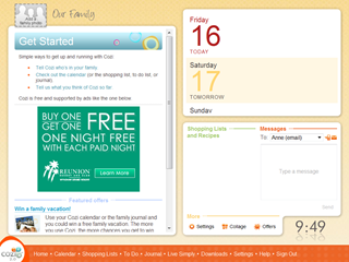
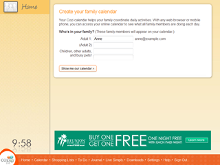
Cozi recently completed an A/B test experimenting with the destination of a
“Calendar” link on the Home page. Cozi’s calendar is oriented towards
families, and allows a family to color-code appointments with the names of the
family members who will attend. For this to work, the user has to first enter
the names of their family members. Usability studies had shown that users who
didn’t complete that task before entering the calendar overlooked that aspect
of the product, so we were looking for ways to encourage users to perform that
simple setup task.
Users in the control condition who clicked the “Calendar” link went straight
to their calendar, while users in the experimental condition went to a page
that asked for their family member names and then took them to the
calendar.
Control condition: clicking the Calendar link takes the user straight to
the calendar
Experimental condition: clicking the Calendar link takes the user to a page
to set up their calendar first
The experiment results indicates that the control condition performed better
than the experimental condition in getting new users to adopt Cozi. This
surprised us, because earlier experiments showed that completing this simple
setup task gives the user a better calendar experience. However, it seems that
forcing the users through a setup task they didn’t ask for had the
counter-productive result of making them less likely to use the product.
There are likely many factors at work here, but I expect at least one factor
is that the flow violated the user’s expectations. In other words, the closure
between the two states in the experiment was not as satisfying. When a user
clicks a link that says, “Calendar”, they expect the very next thing they see
to be a calendar. That’s an eminently reasonable expectation. When the
experiment didn’t meet their expectations, they had reason to believe that the
next link they clicked on wouldn’t deliver them to their desired
destination either (perhaps they were now trapped in some wizard of indefinite
length) and they gave up.
A recent Cozi usability study offered an interesting example of the
paternalism latent in the task of designing something for someone else. In
short, a designer is often required to make decisions which are directly
counter to the requests of some of their users.
The usability subject in this study was an avid user of Apple iCal. A
particular iCal feature which they repeatedly praised was its ability to show
color-coded appointments in Month view. In contrast, Cozi’s Month view eschews
our own color-coding scheme (which we use in our Week view and our new Day
view) and presents all appointments in monochrome.
Apple iCal (left) and Cozi (right) views of the same calendar
The iCal user insisted that they required a Month view with color-coding. They
found other Cozi features like liked, but they repeatedly dinged Cozi for the
lack of color in Month view. At the end of the study, when asked if they had
any general comments to offer on Cozi, they returned to this point. And then a
curious thing happened. As they flipped between Apple iCal and Cozi to make
their point, they stopped on the Cozi calendar. They paused, then slowly
began:
“Hmm… you know, now that I look at the two calendars side by side, there
is something about the Cozi calendar. It’s cleaner…
“Gosh, all that color is really kind of distracting.
“I guess it’s easier to read the calendar without all that color. And
because the one-time appointments are in bold, I can really see the stuff I
need to pay attention to…
“Okay, I’m going to take back everything I said. I like the Cozi calendar
better. Maybe if I had been using Cozi’s calendar,
I wouldn’t have missed this usability study scheduled today.”
This was the clincher. The user had in fact been completely surprised at the
beginning of the appointed study time we had scheduled with them, even though
we could see they had the usability study appointment on their iCal calendar.
They had completely missed it in the rainbow of color.
Design requires a degree of paternalism. The word has an unfortunate nuance;
adult users are not children, and not to be treated as such. But there is
nevertheless something about listening and responding to user feedback that
mimics the way a parent listens and responds to requests from their children.
A child may ask for all kinds of things that the parent judges to be counter
to the short and long term interests of the child, the parent, the family, or
society. Due to cognitive or developmental limitations, the child may not be
able to arrive at the same point of view, or at least not at that time.
Adult users are constrained by different forces. They are extremely busy, and
don’t have the time, skills, energy, or interest to pursue a particular point
of feedback to its logical conclusion. They use a product, something about it
differs from their expectations, a response pops into their head, and they
voice it—sometimes strenuously.
That feedback has to be taken seriously, but not slavishly. Many, many users
have similarly demanded that Cozi’s Month view show color-coding. It’s a
reasonable request, which of course we have considered closely. From the
earliest days of work on our calendar, we have tried various approaches to
introduce color coding into Month view. (Cozi has the the additional challenge
of showing a single family appointment that involves multiple users, each with
their own color.) To date, none of our design experiments with color-coding in
Month view have satisfied us.
Maybe someday we’ll crack the design problem, and delight that we can finally
give these users what they’ve been asking for. In the meantime, the
consequences of following through on that feedback would so compromise the
legibility of the calendar that we think it would represent a net loss in
utility. (Offering color-coding in Month view via an option is another story,
but the short answer there is that such options compromise things in a
different way.)
An individual user doesn’t have anywhere near the time (or, likely, the
ability) to perform these design explorations on their own, or even to find
and read through arguments like this one here as to why we’ve done what we’ve
done. In the end, we make a conscious, paternalistic decision not to give them
the very thing they’re asking for. We trust in our own judgment, then look for
research like this usability study to confirm that we’ve made the right call.
[This post marks a tentative return to blogging. We’ll see how it
goes…]
Spring and summer have turned out to be the busiest time of the year for
design at Cozi. The driving force behind this annual cycle is the Back to
School period: when parents prepare their household for their children’s
return to school from summer vacation. American schools traditionally started
in September after Labor Day, but various forces have moved the start of
school earlier, such that roughly half the school districts now have resumed
by the middle of August. As part of their Back to School preparations, parents
often reconsider the way they will manage their calendar—and the family’s
calendar—during the coming school year. This presents a good opportunity for
Cozi, and so we are often focused on delivering new features and improvements
by early August.
This year we’re making significant changes to the layout of the calendar page
to make more room for the family’s calendar data, so they can take in more
calendar information at a glance. Towards that end, there are a number of
changes in the works. One change we just released today is a consolidation of
various calendar commands into a single toolbar at the top of the page:
Before
After
Here we’ve merged three rows of user interface elements (the Week and Month
buttons at the top, the appointment entry area at the bottom, and the row of
buttons below that) into one. This buys us some vertical real estate, and lays
groundwork for some future changes.
A toolbar is a standard user interface design pattern, but applying this
design here has still been interesting for several reasons. For one thing,
it’s always interesting to me to see how UIs evolve over time.
We didn’t start with the proposition that we should have multiple places for
commands. We started with the row of colored dots at the top, and the
appointment entry area below.
Then we needed a place to put a Print command, and later a Send to Phone
command. They didn't fit anywhere else, so we created a new row for
them.
We added several other forms of Send to Phone, which evolved into a Phone
menu.
When we transitioned from a Windows application to the web, we changed the
UI model for calendar views, and moved the Week and Month buttons to the
top.
We added the ability to sync with Outlook and subscribe to Internet
calendars, necessitating more buttons.
Now we’re preparing to add some more features, which would have meant even
more buttons. But by now the UI is reaching a tipping point where it begins to
feel clunky, and so we’ve decided to simplify the UI by consolidating the
controls into a toolbar.
Many, many other UIs have passed through similar stages. In Stewart Brand’s
book,
How Buildings Learn, he describes a similar evolution of a house’s porch into a proper room:
“Porches fill in by stages, not all at once you know…. The family puts screens
on the porch one summer because of bugs. Then they see they could glass it in
and make it part of the house. But it's cold, so they add a duct from the
furnace and some insulation, and now they realize they're going to have to
beef up the foundation and the roof. It happens that way because they can
always visualize the next stage based on what's already there.”
We’ve got more changes for the toolbar coming in the next couple of months.
(And hopefully no bugs.)

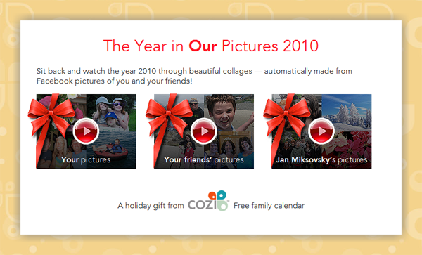
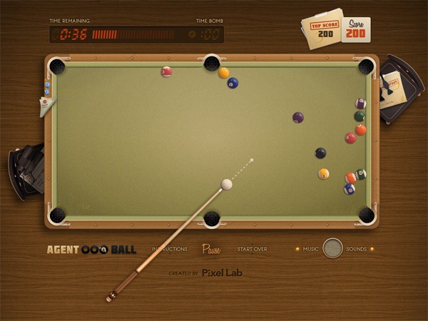
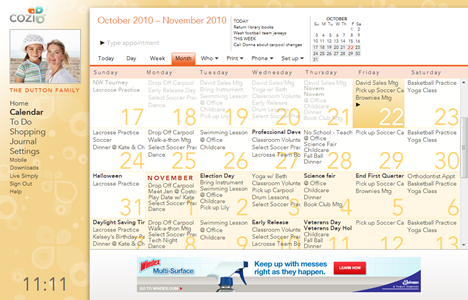
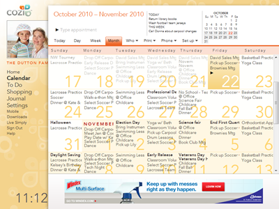
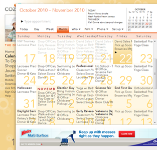
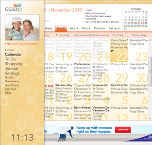
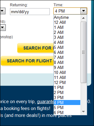
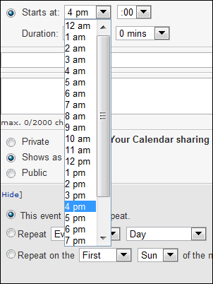
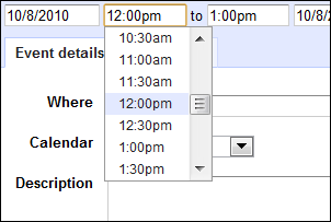
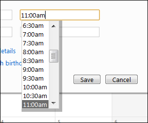
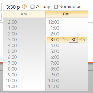

![Blackberry[4]](/images/flowstate/6a00d83451fb6769e20134877bee38970c-pi.png)