Reconsidering stock controls to create an optimized user experience
One of my core design principles is that, when a designer tackles a new problem, they start by trying the simplest thing that could possibly work. Once you get that into users’ hands, you’ll discover whether the simple thing works. You might have gotten lucky, and can move on — or else you’ll learn what users really want (as opposed to what you thought they wanted) and your next iteration will be much better. The thing to avoid is stopping after the first iteration, avoiding improvements to UI elements that are clearly core to a product’s function. This situation often comes up with the use of stock controls, because their ubiquitous presence and fundamental nature often blinds people to other possibilities.
Take the standard solution for entering a time into a form. Given the above design principle, it’s completely reasonable that people designing calendar or calendar-like interface would start by using stock HTML controls to input appointment or event data. In the case of entering the appointment time, the standard solution is a SELECT tag, which on most browsers produces a dropdown list box. Here’s a typical example from Expedia flight search form:
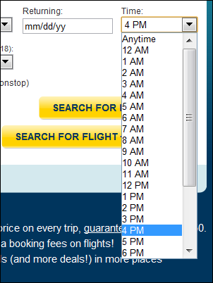
Expedia time picker
This time dropdown list works, but isn’t particularly elegant, and has numerous shortcomings. Depending on your browser, you may only see about 18 times at once, so you’re often forced to scroll to select a time. This scrolling issue is exacerbated by having the dropdown start by showing times from midnight through the early morning — times that are unlikely to be selected. (In other words, the first third of the options shown will rarely be picked.) Furthermore, the times aren’t aligned for easy reading. And, despite the heavy capitalized AM and PM markers, from usability experience I can attest to the fact that users will often overlook these, and select a time 12 hours off from the time they want.
Overall this is a brute force solution to a problem. That would be fine for an initial attempt, but seems puzzling on the home page of a site where task completion time (here, selecting flight parameters) almost certainly has an inversely proportional effect on revenue.
It’s even more puzzling to see the same stock control used as a core component of a web-based calendar, where the entire point of the site hinges on entering appointments. Yahoo! Calendar uses essentially the same stock control, with all the same shortcomings:
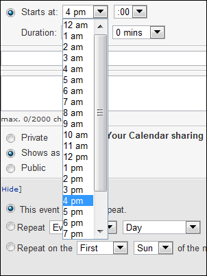
Yahoo! Calendar time picker
Google Calendar and Microsoft’s Hotmail Calendar (or Windows Live Active Calendar, or whatever it’s called this week) are more puzzling still. Both sites have developed custom time pickers, and in both cases they’ve created combo boxes to allow typing times (in addition to picking from a list). From experience, I can say that this is a non-trivial endeavor — it’s surprisingly difficult just to correctly reproduce all the keyboard navigation and other interaction behavior of a standard dropdown list, let alone improve upon it.
But for all their investment, as far as I can tell, in both cases the dropdown list behavior is no better than the standard solution. In fact, both solutions are worse because the dropdown list is, amazingly, shorter than the stock control. The Google solution only shows six times at once; Hotmail’s shows ten. It’s almost impossible to use these UIs without scrolling to find the time you want. It’s also noteworthy that both sites fail to take the opportunity to improve the legibility of the times and leave them left-justified.
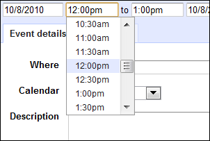
Google Calendar time combo box
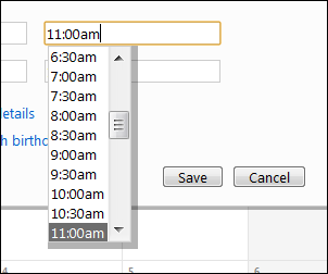
Hotmail Calendar time combo box
With these object lessons in mind, I really wanted to find a better time picker solution for Cozi’s own family calendar. When we began working on our own combo box time picker (following the same pattern as Google and Hotmail), it struck me that all the scrolling pain resulted from an insistence on showing all times in a single vertical column. Moving to multiple columns let us show a complete day’s worth of times at once, and completely eliminate scrolling:
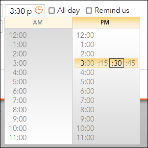
Cozi multi-column time combo box
Once we introduced the idea of using the horizontal dimension, we realized we could take it even further. Each row normally shows just the top of the hour, but the row the mouse is over also shows additional fifteen minute increments within that hour. This allows the user pick, with a single click, from 96 discrete times. We also align right-align the hours to improve legibility. The fact a user can see all the hours at once makes it slightly more likely they will choose the AM or PM time correctly, an effect we’ve tried to reinforce through a background gradient to suggest day versus night.
In practice, this control works exceedingly well. It’s very fast, and thorough usability testing of the control over the years has shown that users intuitively grasp its use, despite never having seen anything like it before.
I mention this not (just) to toot Cozi’s horn or to sneer at other calendar sites. The other sites mentioned above all have aspects in which their user interface is better than Cozi’s, and I aspire to match them in those areas. My point is that stock controls such as dropdown lists are so pervasive as to be invisible even to the product’s own designers. These controls are a perfect starting point for a UI design—but they shouldn’t be the end. If your product uses a stock control (or any basic UI pattern) in a core function, it might well be worth your time to reconsider those controls and explore an optimized solution.