Every app has a scary basement
It takes a while for a designer on a mature product to realize that not all parts of the application's user interface are equally stable. As an application evolves over the course of years, it tends to develop some critically important yet unbelievably fragile component upon which too much rests. I picture such a feature as a scary basement: the dark, old, mysterious, and temperamental body of code which is vital to the running of the operation. The scary basement is cantankerous and hard to maintain—something only operated upon by the most senior and stalwart of the team's engineers, and conspicuously avoided by everyone else.
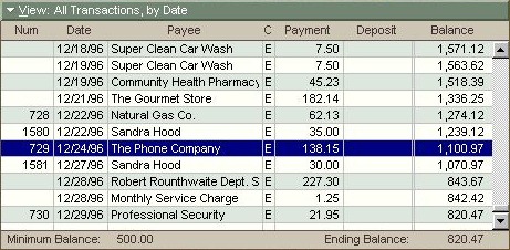
When I worked as the lead designer on Microsoft Money, I eventually came across its scary basement: the elaborate checkbook register control for viewing and editing account transactions. This register control was first created around 1990 by legendary Microsoft engineer Doug Klunder. To get the most performance out of the PCs of the day, I believe he had the register itself more or less directly read and write transaction data from disk. In this capacity, this specific UI control was entirely and solely responsible for validating all transaction data; there was no separation between presentation, business logic, and on-disk representation.
This gave rise to all sorts of odd restrictions. For instance, any dialog that created an account transaction had to instantiate, somewhere behind the scenes, a hidden instance of the register control. When the user entered data in dialog fields, the dialog carefully copied those values into the register, told the register to save it, and then tried to divine whether the save operation had worked.
With each new product version, the register control had new functionality bolted on (investments, online banking, localized features), and each addition increased the complexity of the code. By the time I joined the team four years later, the register control had become so incredibly Byzantine, only one or two people on the team could, and would, touch it.

Money register control, circa Money 95: Be afraid… be very afraid.
A distinguishing characteristic of the scary basement is that all work on it will take an indeterminate length of time; any bug fixes or improvements are essentially uncostable. In the case of Money’s register control, simple changing the order of the transaction fields might take a day—or several weeks. There was just no way to tell beforehand.
When I was first exposed to this reality, some friends on the nearby Microsoft Word team shared stories about their app's own scary basement: a routine called FormatLine. Given a point in a document and a column width, FormatLine would lay out the next line of text at that point. As I heard it, this routine had evolved into a handful of functions that were each thousands of lines long. Developers assigned to descend into the depths of FormatLine were treated with the same respect and concern as spelunkers attempting to reach trapped miners.
The basement metaphor isn't just a way of describing the unnerving nature of tiptoeing around such a feature—it's meant to reflect the fact that such a feature is invariably foundational to the application. And like a building foundation, this code can’t be replaced with something more solid without a colossal engineering effort. In most cases, the scary basement just stays that way until the platform the app sits upon becomes irrelevant, and the app is ported over to some new, saner, foundation.
To prevent a critically important aspect of your UI metastasize into a scary basement means investing time in refactoring as you go, and this means moving more slowly that you would like. UI changes need to be evaluated in terms of the degree to which they compromise the solidity of the foundation.
This past week, a developer here at a Cozi came to me with a tough decision. I'd designed what, IMHO, was an interesting modification of our family calendar UI that could have helped optimize screen real estate for both user data and advertising impressions. Unfortunately, after a couple of weeks of working on this, the developer indicated that it was proving ferociously complicated to get the new UI to work correctly with the infinite scrolling on our calendar page. The infinite scrolling feature was itself delicate, and doing anything to it was complicated by the need to work across multiple browsers. While it might be possible to slowly stabilize this particular new feature to an acceptable level of quality, our calendar UI would likely become unacceptably fragile—the next feature we tried to add would apply new stresses, and things would break in unpredictable (and uncostable) ways. Our calendar UI would turn into a scary basement.
We couldn't let that happen. For a family-focused product like Cozi, being able to evolve our calendar UI is crucial to the business. So while it was painful to let a neat feature improvement go, we ultimately decided that it wasn't the right time for it. Maybe someday cross-browser compatability won't be such a pain (probably when we can drop support for IE 7 and 8), and we'll give it another shot. In the meantime, we have a clean, well-lit basement.