Evolving Cozi's calendar UI controls
[This post marks a tentative return to blogging. We’ll see how it goes…]
Spring and summer have turned out to be the busiest time of the year for design at Cozi. The driving force behind this annual cycle is the Back to School period: when parents prepare their household for their children’s return to school from summer vacation. American schools traditionally started in September after Labor Day, but various forces have moved the start of school earlier, such that roughly half the school districts now have resumed by the middle of August. As part of their Back to School preparations, parents often reconsider the way they will manage their calendar—and the family’s calendar—during the coming school year. This presents a good opportunity for Cozi, and so we are often focused on delivering new features and improvements by early August.
This year we’re making significant changes to the layout of the calendar page to make more room for the family’s calendar data, so they can take in more calendar information at a glance. Towards that end, there are a number of changes in the works. One change we just released today is a consolidation of various calendar commands into a single toolbar at the top of the page:
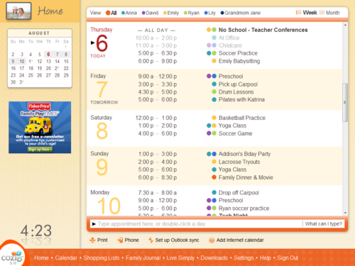
Before
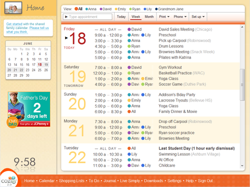
After
Here we’ve merged three rows of user interface elements (the Week and Month buttons at the top, the appointment entry area at the bottom, and the row of buttons below that) into one. This buys us some vertical real estate, and lays groundwork for some future changes.
A toolbar is a standard user interface design pattern, but applying this design here has still been interesting for several reasons. For one thing, it’s always interesting to me to see how UIs evolve over time.
- We didn’t start with the proposition that we should have multiple places for commands. We started with the row of colored dots at the top, and the appointment entry area below.
- Then we needed a place to put a Print command, and later a Send to Phone command. They didn't fit anywhere else, so we created a new row for them.
- We added several other forms of Send to Phone, which evolved into a Phone menu.
- When we transitioned from a Windows application to the web, we changed the UI model for calendar views, and moved the Week and Month buttons to the top.
- We added the ability to sync with Outlook and subscribe to Internet calendars, necessitating more buttons.
- We added some more buttons to the appointment entry area. To keep things clean, those buttons are transient controls that only appear while typing.
Now we’re preparing to add some more features, which would have meant even more buttons. But by now the UI is reaching a tipping point where it begins to feel clunky, and so we’ve decided to simplify the UI by consolidating the controls into a toolbar.
Many, many other UIs have passed through similar stages. In Stewart Brand’s book, How Buildings Learn, he describes a similar evolution of a house’s porch into a proper room:
“Porches fill in by stages, not all at once you know…. The family puts screens on the porch one summer because of bugs. Then they see they could glass it in and make it part of the house. But it's cold, so they add a duct from the furnace and some insulation, and now they realize they're going to have to beef up the foundation and the roof. It happens that way because they can always visualize the next stage based on what's already there.”
We’ve got more changes for the toolbar coming in the next couple of months. (And hopefully no bugs.)