Squeeze wide page content into narrow windows: let the content overlap the left navigation pane
UI designers can find themselves challenged today by the need to address a huge range of window sizes. In Cozi’s case, we still target 1024x768, but we want to take advantage of additional space in larger sizes (sometimes much larger), and we want pages to function all the way down to 800x600. Sometimes we have to invent to tricks to work well across this range of sizes.
That 800x600 minimum size, for example, comes into play surprisingly often. It never fails to surprise me how many users with small monitors leave windows in their default positions, which can often be unnecessarily small. And the current generation of netbooks (and now tablets) can have rather short or narrow displays, so even users who maximize window size can still end up with a pretty small window.
Cozi’s current design places navigation links in a left pane, and page content on the right. One challenge at small window sizes is leaving ample room for the left-hand navigation at all sizes, while still making right-hand page content (e.g., calendar data) wide enough to be useful. Typical patterns for balancing these forces:
- Make the left navigation as narrow as possible. The downside here is that, on large monitors, the navigation ends up feeling narrow — literally marginalized.
- Size the left navigation width as a percentage of window width. Others might find that they can pull this off, but in our case, we couldn’t find a simple percentage that worked well across the range of window sizes we wanted to support.
- Let the user set the width of the left navigation. This can work well, but punts the problem to the user to solve. Many users won’t realize they can resize the left pane, and even for those who do, many won’t bother investing time tuning the display of a tool they only use sporadically.
- Let the user collapse/dismiss the left navigation. A special case of the above point, with the same issues.
We came up with another solution: let the page content overlap with the left navigation pane.
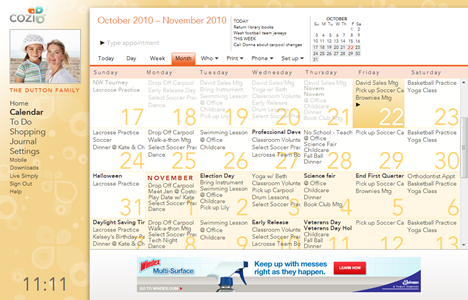
It’s likely we’re just independently reinventing an existing solution, but it’s worked out well, so here’s how it works. At wide window sizes, a typical Cozi page looks like this. The navigation links and other content (e.g., the family photo) on the left are completely exposed.
As the user resizes the window to be narrower, the page reduces the width of the right-hand page content. When a threshold is reached, however, the right-hand content begins to overlap the left pane. This threshold varies by page, depending on how much width they need to show their content. (The calendar shown here in Month view demands a good deal of width, so its threshold is above 1024px page width. Other pages, like Settings, don’t need so much.)
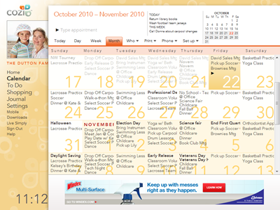
This overlap continues all the way down a size that reveals a minimum amount of the left pane. (Below this size, the right content will start to clip.)
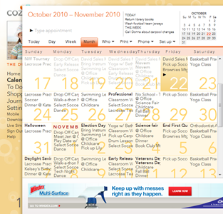
In this overlapped state, the user can still see enough of each navigation link to tell what each one is. E.g., the visible text “Calen” on the left is obviously a link to the calendar; “Shopp” is the shopping list, and so on. In this state, the user can mouse over the left navigation to see the full pane pop forward:
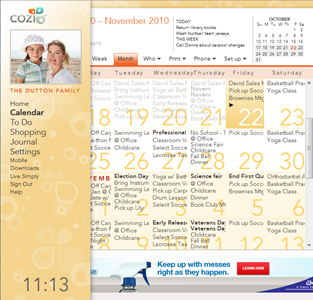
If the user now moves their mouse back to the right, the left pane drops back to the background.
The show-navigation-on-hover solution requires that we handle one case specially: If the user clicks a navigation link on the left, then when they arrive on the new page, the mouse will still be over the left pane.
- The user’s most likely next action is to move the mouse to the right to interact with the page content. As soon as they move the mouse, the page will sense the mouse hovering over the left pane. It’d be annoying at that point to pop the navigation forward again — this would distract the user, who is trying to get to the right. So we disable the hover on page load until the user got the mouse to the right, then turn it on.
- However, some of the time, the user may be using the left pane to surf around the product. Perhaps they’re just exploring, or they’re looking for something and don’t know what page it’s on. They’ll be clicking in the left pane immediately after the page loads, without ever moving the mouse to the right. To support that case, we examine two factors: the direction the mouse is moving, and the time that has elapsed since the page loaded. If the user moves the mouse to the right reasonably quickly, we continue to suppress the hover behavior. However, if they move the mouse straight up or down, or linger on the left, then we re-enable the hover behavior.
(The latter behavior was borrowed from a similar trick used to finesse pop-up behavior in hierarchical menus. I believe it was Microsoft who first came up with this trick for Windows or Office; it then made its way to OS/X. [Update: Commenters recall that the Mac had this first.] If the user wants to move from a top-level menu item to a submenu, their mouse may cross over a point that’s not over either of those elements. So the OS uses a combination of timing and mouse direction to decide whether the user is still moving towards the submenu, or has decided to explore other top-level menu items instead.)
So far this overlap solution seems to be working in practice. Most users don’t see it much, and users with narrow window sizes can now see more page content while still having full access to site navigation. All of this is achieved automatically; the user doesn’t have to pick up the burden of optimizing the page display for the current window size.