Closure between UI states
Like the panels in a comic, the sequence of pages in a user interface requires closure in the user’s mind to logically connect each step with the preceding step. At each step, the user is trying to mentally confirm that the place they’ve just arrived logically follows from the action they just took in the previous step. A designer can create a smooth experience by ensuring good closure; a disjoined interface can interfere with closure, producing substantial confusion.
Scott McCloud describes the concept of closure in comics in his book, Understanding Comics, as “observing the parts, but perceiving the whole”. A comic reader subconsciously fills in the action that must be taking place between the comic’s panels in order to give sense to the story.
from Understanding Comics
Users of a software product perform similar closure any time an interface transitions between states: the user clicks a button and a window appears; they click a link and their browser navigates to another page; they type something and a button becomes enabled. Like the comic reader, the user connects (at least subconsciously) what they’re looking at now with what they just did. The closure either helps confirm that they’re on the right track, or gives them pause to wonder whether things are amiss. Interfaces that facilitate closure produce a smooth user experience and a satisfying sense of control and accomplishment.
Any time the interface interrupts the user with an unasked-for dialog, page, or similar state, the product runs the risk of irritating or confusing the user. Errors are often especially problematic in this regard. A user clicks a button that says, “Save”, and an error appears telling them that a particular field is required. The user must expend enormous mental effort to achieve closure between the thing they asked for, and the error they ended up with.
Cozi recently completed an A/B test experimenting with the destination of a “Calendar” link on the Home page. Cozi’s calendar is oriented towards families, and allows a family to color-code appointments with the names of the family members who will attend. For this to work, the user has to first enter the names of their family members. Usability studies had shown that users who didn’t complete that task before entering the calendar overlooked that aspect of the product, so we were looking for ways to encourage users to perform that simple setup task.
Users in the control condition who clicked the “Calendar” link went straight to their calendar, while users in the experimental condition went to a page that asked for their family member names and then took them to the calendar.

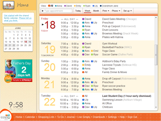
Control condition: clicking the Calendar link takes the user straight to
the calendar
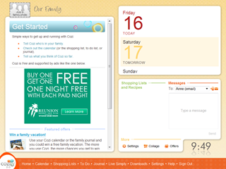
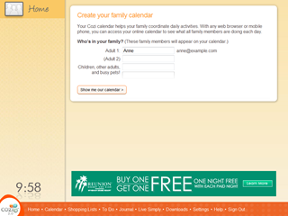
Experimental condition: clicking the Calendar link takes the user to a page
to set up their calendar first
The experiment results indicates that the control condition performed better than the experimental condition in getting new users to adopt Cozi. This surprised us, because earlier experiments showed that completing this simple setup task gives the user a better calendar experience. However, it seems that forcing the users through a setup task they didn’t ask for had the counter-productive result of making them less likely to use the product.
There are likely many factors at work here, but I expect at least one factor is that the flow violated the user’s expectations. In other words, the closure between the two states in the experiment was not as satisfying. When a user clicks a link that says, “Calendar”, they expect the very next thing they see to be a calendar. That’s an eminently reasonable expectation. When the experiment didn’t meet their expectations, they had reason to believe that the next link they clicked on wouldn’t deliver them to their desired destination either (perhaps they were now trapped in some wizard of indefinite length) and they gave up.