Once a routine animation has made its point, speed it up
As animations make their way into more user interfaces, many applications would benefit from a simple trick: speeding up routine animations after the user has had a chance to digest the animation’s message.
An interesting and fairly thorough Animations Overview from MSDN describes several different reasons for using animation in a user interface “to give feedback, preview the effect of an action, show the relationship between objects, draw attention to change, or explain a task visually.” More and more applications are using animations for these purposes as web UI frameworks like jQuery and mobile platforms have made implementing such animations trivial.
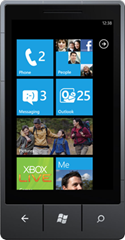
Occasionally one can come across an animation that’s elegant and informative the first time one sees it, but which eventually gets tiresome. I’ll use the otherwise excellent Windows Phone 7 home screen as a case in point. I’ve been trying a Samsung Focus phone with the Windows Phone 7 OS for the past couple of weeks, and in general I think it’s 80% awesome. (I wish the Facebook app were faster; it needs a Google Reader app as good as Reeder; it needs backup and restore; and the phone’s browser is an abomination.) In its favor, the Metro User Interface Style is elegant to a revolutionary degree. Windows Phone 7’s clean UI makes Apple’s iOS look kitschy and cluttered.

The Windows Phone 7 home screen plays a quick animation when you tap on an app tile (the squares above). The tiles on the page all flip away, but the tile you tapped on lingers just a fraction of a second longer to confirm what app you’re about to see. This is all quite elegant and subtly informative. It also gets old fast.
If you launch, say, the email client, it will play its own beautiful animation. When you navigate back to the home screen, you see both animations again in reverse. To slip between two email accounts via the home screen, you see four separate animations: email closing, home page resuming, home page launching app, email app opening. These short animations add up, and start to grate. You already understand their point, and each additional playing of the animations just beats that point into the ground.
A quick cure for a situation like this is to speed up the animation. You can play a fairly long one second animation the first time, play it for only half a second the next time, then a quarter second, and thereafter either leave a residual high-speed animation or drop it altogether.
Here’s a simple example. Cozi’s family calendar has a toolbar at the top with a text entry area in which the user can type new appointments in natural language. This text entry area is normally shown in a collapsed state to save space:

When the user starts typing, or explicitly clicks in the text entry area, the area transitions to an expanded state:

This transition has four components:
- The text area gains a box around it. This lets the user know they can type.
- The text area grows wider. This gives the user more room to type long appointments. The area animates from its original narrow width to the full width of the main page area. This animation lets the user know that the narrow text area and the wide text box are, in fact, the same thing. The user can infer that this wide box has the same intent (“Type appointment”) as the original narrow area.
- A white layer over the rest of the toolbar controls animates from fully transparent to semi-opaque. This helps make the wider text area stand out, and suggests a quasi-modal state. Again, the animation orients the user; they understand that the faded controls are the same ones they were looking at a second ago, only now those controls are not relevant.
- Additional controls appear(“X” for cancel, “What can I type”?) which are specific to this modal state.
The animation of the text box’s width (#2) and the background opacity (#3) run concurrently for a short duration. We wanted the animation to be visible to new users so they could visually parse what was happening. However, it turns out that text entry is not possible until the animation completes, so a long animation will not only get tedious, it will slow the user down. (And even if the user could type while the animation was running, most people would probably wait for the animation to finish before starting to type.)
So the compromise is this: the first time the user triggers the animation, it runs for 600 milliseconds (i.e., 6/10 of a second). Thereafter, the animation runs for only 200 milliseconds (three times as fast). This simple speeding-up seems to work well in practice. Users appear to successfully understand the animation’s message, and at the same time we’ve never heard complaints that the animation is slow or gets in the way.
Going back to Windows Phone 7, that team seems have lavished so much attention on their UI, let’s give them the benefit of the doubt, and assume that they not only thought about speeding up their routine animations, but had a good reason not to do that here. Perhaps switching an app takes a couple of seconds no matter what, and the animations at least give you something to watch while that’s happening in the background. In which case, this solution might not have helpful in this particular case.
In general, though, this is such a simple trick that it’s worth adding to your bag of tricks in anticipation of the next time you want to add an animation users will see all the time.