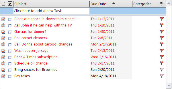
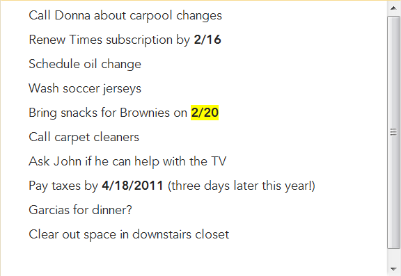
It's fairly common for a UI to present some content whose value to the
user may be unknown or may change over time. To avoid permanently distracting
the user, the app can show the content in a panel the user can collapse.
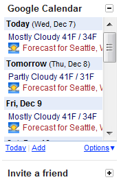
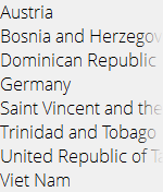
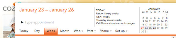
Consider the following two gadgets from Google’s Gmail client, the first
expanded, the second collapsed:
Perhaps the user leaves the calendar gadget open because they find the
considerable clutter it adds is worth its informational value. The “Invite a
friend” gadget, however, isn’t worth much to them, so they collapse it and
leave it that way. In the rare event they're suddenly inspired to invite a
friend, it's easy enough to re-expand that panel to bring the UI back.
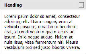
Key attributes
Clicking anywhere in the heading collapses the panel's content, leaving
only the heading visible.
The heading generally reacts to mouse-over by changing the cursor to a hand.
The heading may also react in other ways, e.g., its background color may
change.
In many cases, including the above example, the heading includes a small
button element on the far right. Clicking this button has the same effect as
clicking the heading itself, but the button offers a more obvious affordance
of interactivity.
If present, the button's icon or contents generally reflect the
panel's collapsed or expanded state. The button may show plus and minus
signs or down- and up-pointing arrows. The icon usually suggests what will
happen if you click it (e.g., if you click the plus, you’ll get
more UI), rather than indicating the current state.
The transition between the expanded and collapsed state is usually animated
to suggest that the content is rolling up into the heading, where it will be
stored until the user decides to retrieve it again.
Many applications save the collapsed/expanded state for future sessions. In
effect, the collapsible panel is offering a persistent user-configurable
option, without any of the overhead of a separate Settings or Preferences
area.
Collapsible and CollapsibleWithHeadingButton
I've posted a
Collapsible control to
the QuickUI Catalog that offers the bare-bones functionality. Because the
pattern of including a little button on the heading’s right is so common, I
also added a subclass called
CollapsibleWithHeadingButton:
Use these Collapsible classes to confer a limited degree of customizability to
a home page or information pane on the side. If most users are likely to want
the information most of the time, collapsible panels might not be necessary.
However, in cases where there's a fairly even split between users that
want a given type of information and those that don't, such a panel can be
a reasonable compromise. Similarly, if there are situations where an
individual user may change their mind about whether they want the information
(because it's useful) or not want the information (because it's
distracting), consider a collapsible panel.
Implementation notes
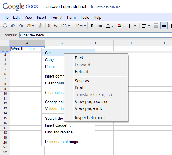
To avoid requiring lots of graphic resources, for many of these controls I use
text glyphs as button icons. Here a plus sign (“+”) is used in the collapsed
state to indicate the content can be expanded, and a minus sign (“−”) is used
when the content can be collapsed. I've seen some sites that, perhaps
unintentionally, use a hyphen (“-”) instead of a minus sign. A hyphen is too
narrow, and ends up feeling like a weak counterpart to the plus sign. (Google
avoids this by using a bitmap image, probably for tighter control over the
final result across different browsers.)
One thing that feels a bit unresolved about gadgets like Gmail's, which
offer a heading button on the right, is that the button and the heading text
both do the same thing, but that shared behavior is not obvious until
you click. My general feeling is that multiple controls that respond the
same way to a click should respond the same way on hover. In this case, I
arranged for mousing over the heading text to force the application of the
button’s hover effect, even if the mouse isn’t actually over the button, as an
extra cue that clicking either UI element will accomplish the same result. See
Where should the hit target boundaries for UI elements go?
for more thoughts on reflecting hit target boundaries.
The animation effect includes a combination of a slide and a fade: the
contents fade out during collapse, and fade in during expansion. To me, this
enhances the effect of the content rolling away and unrolling again. The
fade effect is more pronounced when there’s a large block of content.
Aside: I've invested work in reducing the number of files necessary to
use controls in the QuickUI Catalog. It used to be the case that several
files were required to use all the controls, but the whole catalog has been
consolidated into just one pair of files: quickui.catalog.js and
quickui.catalog.css. As described on
How to use these controls, you can include that pair of files directly. You can also follow the
instructions for cloning the quickui-catalog repo and choosing the specific
controls you want. Among other things, this makes it easier to try out the
controls. For example, here's a
jsFiddle that uses the QuickUI catalog
(including, for the time being, the CollapsibleWithHeadingButton control
shown above).
flow|state will off for the next few weeks for the end-of-year holidays.
See you next year!
I think many web sites could benefit from the thoughtful use of sounds in
their UI, but they avoid sound because the cost of doing so becomes too great.
Client apps on Windows and OS/X get some degree of sound support for free with
the operating system, as do mobile apps. In all cases, the OS provides a
control panel that lets the user control whether sounds play for various
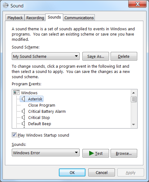
events, and which sounds to use. Here’s the venerable Sounds tab of the
Windows Sound control panel, virtually unchanged since something like Windows
95:
For each standard UI event capable of generating a sound, the user can turn
the sound off, or map the event to various sound files. Other sound control
panels work similarly: the OS/X one is, by comparison, more limited, but the
iOS Sound page in Settings has a substantial list of UI events which can be
mapped to sounds (or vibration).
With this in mind, consider the work a web team has to do just to support
sound. To support a pre-HTML 5 browser, they have to select from several
different sound-playing technologies; in HTML 5 they can at least use the
standard <audio> tag. Since many users won’t want sounds, they have to
provide a Settings area within their app where the user can adjust settings.
Maybe their app doesn’t even have a Settings area yet, so they’ll
have to create a new one from scratch. Then they have to do some real sound
design, to come up with a set of sounds that are: a) pleasing to a wide range
of users, b) high quality, c) appropriate for the UI context, and d) very,
very cheap. They’ll also have to do some work to ensure that sounds on their
pages don’t bog down web site performance, e.g., by delaying the loading of
the sound files, and being careful about which sound files are loaded and
when.
For years, I’ve been a passionate believer in the use of sounds for
positive reinforcement in a UI. That is, sounds can and should be
used to let the user know when something has gone right, as opposed
to when something’s gone wrong. The canonical example I offer is the
satisfying sound of a car door closing: even when walking away from a car, you
can hear when the door’s closed correctly. Even if you never consciously pay
attention to that sound, the absence of that door-closing sound lets
you know the door isn’t completely closed, and you turn around and walk back
to close it again.
User interfaces can similarly benefit from the use of sounds for positive
reinforcement. Not negative reinforcement; observe above what proportion of
sound events in Windows are different flavors of, “Something’s gone horribly
wrong.” I think many people in the software community, and many users, have a
strong bias against sound because sound has been used so poorly in the past.
The very best designers of sounds in UI are probably game designers, because
they work so hard to make sound an integral and emotionally satisfying part of
the game experience. The web at large could learn a lot from game sound
designers.
With that in mind, I pushed hard at Cozi to get
sounds into our web app. Cozi’s web product has only two sounds:
A “Message Sent” sound used whenever the service successfully transmitted a
message to an external destination: e.g., a shopping list was sent via SMS
to a family member’s phone.
A “Got it!” sound played by the app whenever the client had successfully
saved user data (e.g., a new appointment) on the server.
These sounds were tightly mapped to the UI, helping to subtly confirm to the
user that some desirable thing had just gone as expected. A musician and sound
designer created the sounds for us, taking care to make sure the sounds fit
the application aesthetic, were suggestive of the event in question, and were
not intrusive. With all that work, I think the sounds worked really well,
helping to round out the application user experience and gave the product some
dimensionality.
And despite claims from some people that, “No one likes web sites that play
sounds”, I never heard complaints about these. Most people didn’t even notice
them — which is just what was intended. Just like the car door-closing sound,
these sounds perform their work at a subconscious level. Still, it would have
been great to offer the user a way to turn sounds on and off, and potentially
let them change which sounds played. Unfortunately, it was hard to justify the
additional investment in doing that.
To that end, I’m hoping that someone will eventually create a shared sound
control panel for the web. This could offer sound storage, sound mapping UI
(such as the above), and easy sound integration for third-party web sites.
This could work something like
Gravatar (from Automattic, the folks
behind WordPress.com), which lets other web sites offer
user-customizable “avatars”. These are really just glorified profile pictures,
but such pictures do serve a useful role on sites in bringing a community of
users to life. A site like GitHub can use
Gravatar as a complete solution for user-customizable profile pictures at a
trivial development cost.
I think Gravatar is an example of what could be possible with shared cross-app
control panels: small bits of utility that let a user customize some settings
they can carry with them to other sites. Facebook and Google are obviously
already players in that game, but the stakes are all wrong. A site that wants
to integrate with Facebook just to get a user profile picture is both making a
substantial commitment to an entity whose behavior is sometimes threatening
and the site must force its users to entangle themselves in
Facebook’s plans — something a substantial number of people are loathe to do.
I like Facebook, but if I’m just looking for someone to store a profile
picture, frankly I trust Gravatar for that purpose more than I do Facebook.
There’s no great revenue model for a settings site like Gravatar, so
presumably most of them would exist as public services provided by larger
entities like Automattic. Hopefully more people will follow their lead, and
build out some of the web’s missing control panels.
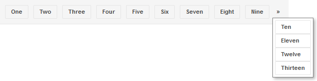
Applications with toolbars should generally give the user access to all
toolbar commands, even when the window isn't large enough to show all of
them. Wrapping a toolbar's contents is one possibility, but this is
usually avoided because it begins to steal too much space away from the
application's main content area. The standard technique is to have the
commands which can't fit horizontally overflow into a dropdown
menu.
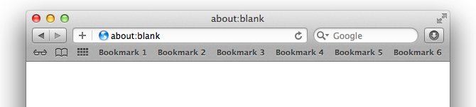
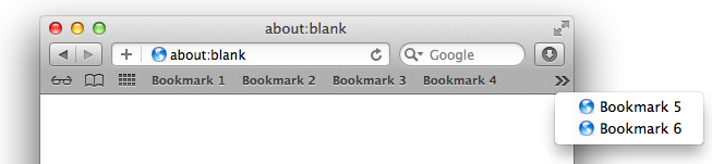
This technique is used, for example, in the Bookmark (or Favorite) toolbar in
every mainstream web browser. Here's Safari:
When the user makes the window too small to see all the bookmark buttons, the
buttons which don’t fit overflow into a dropdown menu:
Key attributes
The toolbar contents (usually buttons) are arranged horizontally.
Items which don't fit are clipped entirely; no item (e.g., Bookmark 5 in
the toolbar of the second image) is ever shown partially visible.
If there are any items which don't fit, an overflow menu button appears.
The standard is for the button to show a pair of right-pointing chevrons
(»).
Clicking the menu button produces a dropdown menu containing the items which
don’t fit in the toolbar.
Items may appear slightly differently in the menu than they appear in the
toolbar. In the Safari example above, plain-looking toolbar buttons become
vertically-oriented menu items with icons. Beyond the change in appearance,
the items generally behave the same in the menu as they do in the toolbar.
As the user resizes the window, the control recalculates whether an overflow
menu (and therefore a menu button) is necessary.
This overflow pattern is apparently so successful that the
exact same user interface — down to the use of right-pointing
chevrons to indicate overflow — is used by Chrome, Firefox, and Internet
Explorer. The funny thing is, each of these other browsers fumble one small
aspect of the behavior: determining whether or not to allocate room for the
menu button.
Google Chrome always allocates room for the menu button, even when the
button isn’t visible. This means there are cases where the toolbar button
would have fit, but the invisible menu button is still taking up room, which
forces overflow to be triggered a bit earlier than strictly necessary. For
comparison, in the top screen shot, Safari can fit the button for “Bookmark
6”, but in the same situation, Chrome will force that button to overflow.
Effectively the user has something like 10-20 pixels or so
less room in Chrome for their browser bookmarks.
Mozilla Firefox is a bit smarter, but inconsistent. It doesn't allocate
room for the menu button if the menu button's not currently visible, so
Firefox can squeeze in an extra bookmark in cases where Chrome drops it.
However, once the menu button is visible, the menu button takes up room —
even when hiding the menu button would now leave enough room to show the
last bookmark!
Internet Explorer 10 gets things right — but get points off for incessantly
flickering the menu button during a window resize. Presumably on any window
resize, IE is always hiding the menu button, then re-showing it if
it’s needed. This doesn't feel nearly as solid as Safari’s treatment,
which smoothly moves the menu button left and right as the window resizes.
These are all small points, and I doubt most users of these browsers have ever
noticed them. Still, this is not ideal. I think this is what happens when
designers and developers, even those on huge software teams, are forced to
roll their own solution to a common problem. Either they don't notice the
issue or, if they do, don't feel like it's worth taking the time to
fix.
And here we're talking about large, production web browsers built upon
rich client-side UI frameworks. Many web sites aren’t building on a rich UI
framework, so they’re forced to code everything by hand. The result is that
web application toolbars are typically far clunkier. They often blithely
assume the user’s window will be wide enough to show all the commands, and
clip or wrap the buttons when the window is narrow.
A correct, solid implementation (like Safari’s) should be available to any
site that wants it — by coding the correct solution in a reusable component.
By treating something as basic as overflow as a component in its own right, it
suddenly becomes worth lavishing the attention and effort to achieve maximum
layout efficiency, including properly handling those last 10-20 pixels,
because lots of users across multiple apps will benefit.
PanelWithOverflow
I've posted a basic
PanelWithOverflow
control to the QuickUI catalog.
As discussed above, use PanelWithOverflow in situations like toolbars where
you want to constrain the height of a toolbar while simultaneously
guaranteeing access to all the toolbar's commands at a wide range of
window sizes. For a toolbar that docks to the top of the page, nest the
PanelWithOverflow inside a
PersistentPanel.
Implementation notes
The simplest way to implement this behavior in a web control seems to be to
force the control’s contents to appear on the same line (white-space: nowrap),
then calculate which items completely fit. The ones that don't are
explicitly made invisible (using visibility: hidden) to avoid a
partially-clipped item.
In coding this, it became obvious why Chrome and Firefox browsers display the
layout oddities they do. To decide whether the nth item can fit, you
need to know how much room is available for it, which depends on whether or
not the menu button is going to be needed — which in turn may depend on
whether the next item to the right (item n+1) will fit. The layout
logic gets much simpler, however, by applying the expedient of looping over
the control's contents from right to left. If item n+1
is going to overflow, you know for sure that you need to allocate room for the
menu button when considering item n.
Just because this QuickUI control avoids a small layout bug in the various
browser toolbar implementations above doesn't mean it’s necessarily better
than those implementations. Those toolbars have many more features (e.g.,
customization), and surely have received much more testing overall. Still, I’d
argue that the QuickUI implementation is a reasonably solid start on an open,
component-based solution.
The standard list box is such a pervasive element of traditional client GUIs
that it’s surprising how hard it is to find a good list box implementation on
the web. A typical Windows example:
Your browser will probably render a standard HTML <select> tag as a
dropdown list box, but as far as I know, there’s no standard way to
get a in-line list box that supports single selection. (You will get
a list box if you set the select tag’s “multiple” attribute, but then it will
let the user select multiple items, which may not be what you want.) And all
browser list elements can only render list items as plain text; as in the
earlier discussion of combo boxes, none of the standard web list boxes support a rich presentation for a list
item. Most sites create their own “list box” elements as divs with clickable
inner elements. This usually means they end up without good keyboard support:
e.g., you can’t move the selection up or down with the Up and Down arrow keys.
Key attributes
In the most basic type of list box, zero items or one item can be selected
at a time. It’s always possible to change which item is selected, but once a
selection has been made, it’s often not possible to revert to the state
where no item is selected. There are other types of list boxes that support
multiple selection.
When the list box has focus, pressing the Up key moves the selection to the
previous item.
Pressing Down moves the selection to the next item.
Pressing Home (Fn+Up on the Mac) selects the first item.
Pressing End (Fn+Down) selects the last item.
Pressing Page Up (Option+Up) scrolls up a page. Or does it? See below.
Pressing Page Down (Option+Down) scrolls down a page.
Pop quiz: Off the top of your head, do you think you can describe exactly how
Page Up and Page Down should work?
You’d think they would just scroll the viewport by one page height in the
indicated direction. That’s the basic idea. However, the actual behavior of
these keys in a list box is more intricate. Consider Page Down. On Windows, if
the currently-selected item is somewhere in the middle of the viewport, then
hitting Page Down selects the control currently visible at the bottom of the
viewport. That is, the first press of the Page Down key in a list generally
doesn’t scroll the list at all! It’s only once the selection is
already at the bottom of the viewport that the list scrolls by one
page. Page Up works the same, only in the opposite direction. On the Mac, the
standard behavior is different: Page Up and Page Down scroll the viewport by a
full page, regardless of selection position, but these operations don’t move
the selection. (I’m not sure why. To me, at least, the Windows behavior feels
more useful.)
Another complexity of keyboard navigation is tracking whether the list
actually did anything in response to a key press. If it did, the list box
needs to stop propagation of the keyboard event. But if the list box
didn’t do anything with the key (say, the user hit the Down key, but
the selection was already sitting on the last item), then the event should
bubble up and, for example, scroll the entire page instead of just scrolling
the list box.
Finally, following any keyboard navigation, the list may need to adjust its
scroll position to ensure that the currently-selected item is completely
visible.
I think it’s safe to say that keyboard navigation is a good and desirable
thing: it can make certain tasks easier and faster, and it makes a UI more
accessible. I can’t see a significant downside to letting a user navigate a
list with a keyboard, as the UI doesn’t get in the way of mouse or touch
users. So how come more sites don’t have list boxes? It’s a bit of work to
handle the keyboard, but not that much work. I think one problem is
that it’s not free. If someone’s on deadline to produce a list of
items for a web page, even supporting the selection and navigation described
above is going to take them some time, and maybe they’re not going to get any
immediate credit for going that extra mile. This is one reason I’m hoping a
good UI framework will help make basic usability improvements in controls
easier for any site to pick up.
ListBox
I’ve posted a basic, single-selection, in-line
ListBox control to the
QuickUI Catalog:
This ListBox control is also used as the dropdown portion of a
ListComboBox.
Usage: Use an in-line ListBox in situations where picking a single item from a
list is a significant part of the UI’s task. A list box will consume more real
estate than a combo box, but also requires one less click to select an item. A
list box also makes at least some of the choices visible to the user without
forcing them to first interact with the control; this can make the task of
selection more approachable. A standard list box doesn’t allow the user to add
a choice of their own; for that, a combo box is the standard answer.
Implementation notes
As might have been expected from the above discussion, the trickiest aspect of
this control was the keyboard navigation, especially the behavior of Page Up
and Page Down. For now, at least, I’ve let Page Up and Page Down work the same
on the Mac as on Windows. (If anyone can explain to me a common situation
where the Mac’s standard viewport-scrolling behavior is better than the
Windows behavior, please let me know!)
On the plus side, now that the QuickUI Catalog finally has a rudimentary
ListBox control, I was able to drop a ListBox essentially unmodified into the
ListComboBox control to give the latter basic keyboard support. ListComboBox
originally used the more primitive
List control, which simply
renders a JavaScript array as a set of controls. ListBox builds on List, so it
also has the ability to render array items as controls; to this it adds the
concepts of single selection and keyboard navigation. A core promise of a
control framework is code reuse. In this case, there was no need to reproduce
single selection and keyboard navigation again in ListComboBox, since ListBox
already provided it. It’s wonderful when that object-oriented promise can
actually be realized.
One thing I left off this time around is making it easy to have a ListBox be
an integral number of lines tall. If you look carefully at the bottom of the
above ListBox shot, the bottom row is just a bit clipped. It would look better
if the list box were just a bit taller, so that an integral number of lines
could be completely visible. I also began experimenting with a
multiple-selection list box, but that’s a fairly intricate bit of work all on
its own.
Thanks to those of you who wrote expressing interest in using QuickUI with
plain JavaScript (i.e., without markup). I’m continuing to work on that, and
hope to have some basic documentation in place by year’s end. Stay
tuned.
Johannes Tonollo’s excellent
Meaningful Transitions site does a
thorough job cataloguing animated transitions that can be used to convey
specific messages to a user. One animation I’ve always liked was expanding an
element on hover, as in this screen within Windows Media Center:
Key attributes
When the mouse hovers over a list item (or the keyboard focus moves to it),
the item becomes highlighted.
The highlighted item animates in size, expanding in every direction. It
covers the adjacent items. The other items (the ones which are not
highlighted) retain their position.
Bringing the highlighted item forward conveys the feeling that the item is
ready for use or instruction, like a volunteer in a line of people stepping
forward. In this case, the highlighted movie is brought forward to indicate
that it’s ready to be played.
When the highlight moves to another item, the previously-highlighted item
animates back to its original state in parallel with the highlight animation
being played on the new item.
For more discussion of this specific expand-to-highlight transition and some
live demos on the Meaningful Transitions site: click
Categories, then click
Highlight, then Expand to Highlight.
HighlightEffects
I’ve posted a
HighlightEffects
control to the QuickUI Catalog that permits the easy creation of animated
effects such as expand-to-highlight. Here’s a sample showing the result of
moving the mouse over the second of five items:
Usage
Use HighlightEffects with lists to help the user see which element is
highlighted, and to suggest that the highlighted item is ready for use. You
can apply a variety of highlight effects to achieve different results. The one
shown here – expand to highlight – effectively draws the user’s attention to
the item without being too distracting.
Implementation notes
I thought it would be elegant to let the UI designer/developer define the
package of highlight effects as CSS in a JavaScript property map, just as in
jQuery’s $.animate() function.
The HighlightEffects control uses this property map to determine which CSS
rules will need to be un-done when the highlight moves away from an
item. E.g., if the property map includes background-color, then the element’s
original background-color is saved; when the highlight is removed, this
original background-color is restored.
The main challenge with the expand-to-highlight effect is keeping the layout
of the page steady as the highlight moves around. To get the highlighted
element to pop out, we need to change its size and z-index, and apply absolute
positioning. Without that, the expanded item would push the other items in the
list to the sides. However, the use of position: absolute will remove the item
from the layout flow. To keep things from moving around, we can empty the same
technique
discussed last week
for PersistentPanel:
wrap each list item in a placeholder of the item’s normal size. This
placeholder remains in the layout flow even when the item is highlighted, so
nothing behind the highlighted element will move around.
In playing around with various animation effects, it was clear that some
arrangements animate more smoothly than others. For example, I originally
tried to keep the text of the elements centered, but the repositioning of the
text during resize was a bit jittery. Animations which change size, position,
and color all seem to behave fairly smoothly on the devices and browsers I’ve
got. It turns out that jQuery’s built-in $.animate() function doesn’t support
color animations out of the box, but that ability can be supplied with a
plugin like
Color Animation.
As was the case when writing the
post on ListComboBox, I left out keyboard support, so this currently only works with a mouse (and
touch, although the effect isn’t as nice). My plan is to follow up with a
ListBox control that can handle moving a selection with a keyboard, then
update HighlightEffects to work with that.
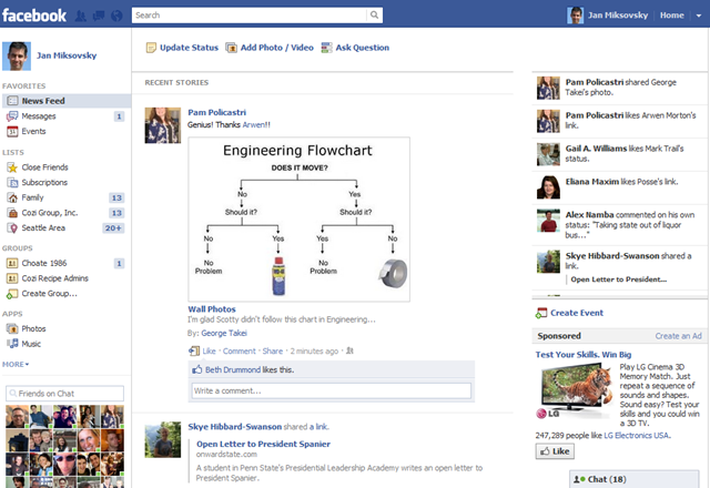
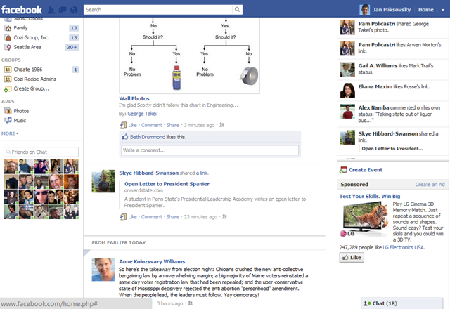
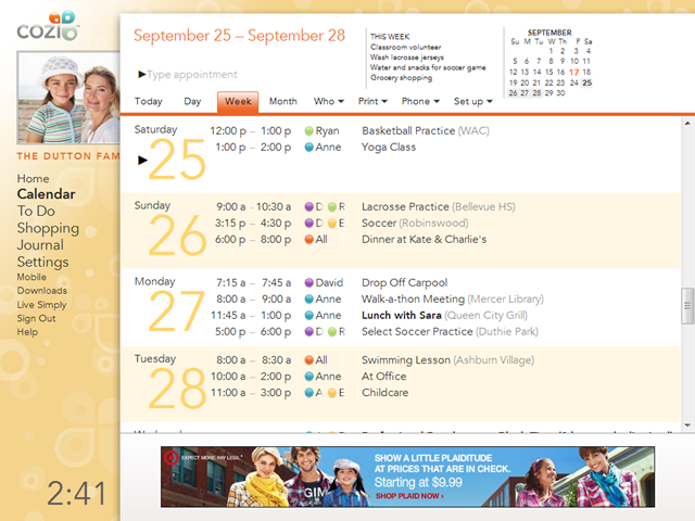
Whether or not you’re the type of person that likes the way Facebook is
evolving their UI, Facebook is certainly leaving no stone unturned in their
search for possible improvements. In a recent change, they introduced a panel
on the right side that shows the user’s live activity feed and an ad. This
side panel is initially a bit below the blue toolbar, and vertically aligned
with the top of “Recent Stories” on the left:
Keep an eye on the upper-right corner. When the user starts to scroll the
page, the left side of the page scrolls out of view, but the right side panel
bumps up against the toolbar and remains docked there:
It’s hard to see in static images like this, but the right side panel remains
entirely visible during scrolling, while the main portion of the page scrolls
away under the blue toolbar.
This is a pretty subtle bit of work to finesse the treatment of a small number
of vertical pixels above the panel. It would be have been much simpler to have
the panel always docked up right under the toolbar. I’d hazard a few reasons
Facebook used this technique here. First, they really want to focus
user attention on the critical “Update status” button at the top. Keeping the
feed panel below that line creates a nice wide band of white space that puts
the eye’s focus on the “Update status” button. If the panel were initially
docked right below the toolbar, that button would be harder to find. At the
same time, permanently keeping a vertical gap of 30 pixels or whatever between
the toolbar and the panel wouldn’t be satisfactory either. Facebook users
spend a lot of time scrolling through this page, and that gap would probably
stand out once the buttons above the news feed were scrolled away. Finally,
it’s possible that Facebook had plans to show an ad or other content
above the panel, and developed this solution for that purpose, then
later dropped that ad but kept the solution.
Key attributes
The persistent panel can either be to the side of the page content (as in
the Facebook example above), or can span the width of the page content (as a
toolbar).
In both the side panel and toolbar cases, any content above the panel can
scroll off, but the panel stays visible. In Facebook’s case, it just happens
there’s only white space above the panel (and below the blue toolbar). Other
sites put content above the panel or toolbar that they initially want the
user to see at least once, but which can later scroll away.
As the panel just begins to move out of view (off the top of the viewport),
there may be a single jerky repositioning of the panel, but otherwise it’s
quite stable. This is a significant improvement over earlier techniques to
keep certain page elements visible. Some sites have tried to keep a side
panel visible by using JavaScript to constantly adjust the panel’s position
as the user scrolls, but the resulting performance is jerky and distracting.
Yelp used to do this, for example, and tried to add a
Map, stay put! check
box that disabled the behavior, but ultimately concluded it was better to
just drop this repositioning behavior entirely. In contrast, the technique
here uses JavaScript to flip the document’s CSS position to “fixed”whenever
the panel would otherwise be scrolled out of the viewport. This may jerk the
panel into the correct position once, but thereafter the result feels very
stable.
In general, I think this is a technique more sites, particularly
advertising-funded sites, could productively adopt. For example, I’ve
noticed that Google’s recent app redesigns are leaving them with much thicker
sets of controls permanently stuck at the top of a page. It’d be nice if at
least some of those controls could scroll away, leaving only the most
important there all the time, and giving more room to the document I’m reading
or editing.
PersistentPanel control
I’ve posted a
PersistentPanel
control to the QuickUI Catalog. There are two demos:
Use a PersitentPanel to offer a small number of controls that are so important
they should always be within quick reach. As shown in both demos, a
PersistentPanel can be used when some content must initially appear above the
panel so that it attracts enough attention. If this content can later scroll
away, a PersistentPanel can ensure that the tools or information below the ad
can remain visible. Without this requirement (for content to appear above the
panel), it’s probably simpler to give the toolbar or panel a permanent
position along the top, side, or bottom of the page.
Note: Both demos show an ad scrolling away. Facebook uses the same
panel concept to keep an ad visible. Which way you go depends upon
how likely it is that your users are going to click ads as soon as they see
them, or whether you think the additional revenue from persistent ads makes up
for the permanent clutter.
Implementation notes
The basic strategy here is to have the panel content sit within a placeholder
element that can occupy the same space as the content whenever the content is
switched to position: fixed. Without that placeholder, content below the panel
would reflow in an unacceptable manner whenever the panel pops into and out of
the normal document flow.
This is the first control I’ve done in this blog series that actually worked
in IE8 without modification. Hooray! I usually start in Firefox, then test in
Chrome and IE9. (I rarely test in Safari, as I’ve yet to create something that
works in Chrome but not in Safari.) Then I take a deep breath, open the demo
in IE8, and brace for some weird bugs. But this time IE8 played nice and
everything worked. Good IE! Sit. Stay.
Although I’ve never seen a PersistentPanel dock against the bottom of the
viewport, that case wasn’t hard to handle, so I added support for that as
well.
In both the toolbar and side panel demos, I wanted to block out the space for
an IAB universal ad unit, so I created a general
AdPlaceholder control
for that purpose. Now I’ve got a control I can use to quickly say, “Leave room
for a Leaderboard here”, which is nice. This is one case where I’m thinking
the control’s generic style should be a bit more colorful and distracting, to
better approximate the visual noise of a page with ads.
Extra: In response to feedback, I've begun investing in documentation
for using the QuickUI framework in plain JavaScript. People are often
intrigued by the framework, but put off by idea of having to use a
proprietary markup language (however elegant and efficient it may be).
Everything in QuickUI, including all the catalog controls, is already
accessible in plain JavaScript, although there's yet sufficient
documentation for how to do this. So, in parallel with these control posts,
I'm also working on documentation that addresses that gap. The first
piece in that series is a list of the core principles which serve as the framework's foundation.
Once again, it’s amazing how hard it is to get the small stuff right. Building
on both
last week’s CalendarMonthNavigator post
and the
earlier ComboBox post, this week’s control is the standard date picker found in countless web
sites and applications. Date pickers are generally optimized to pick a date in
the near future, such as a date of travel or a date for an upcoming
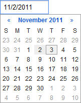
appointment. Here’s a typical example from Google Calendar:
Key attributes
The control always includes a text box. In the control's normal state,
this may be all that is visible. Generally speaking, clicking in the text
box or moving focus to it opens the dropdown calendar.
The control may include an icon, often a downward-pointing arrow, to
the right side of the text box to indicate that the user can interact
with the control to make a selection from a set of choices (i.e., the popup
calendar). Some controls that offer an icon will require the user to click
there to open the calendar, and will not dropdown the calendar when
the user clicks in the text box.
The input portion of the combo box and the dropdown portion are generally
kept in sync. As the user types, the calendar reflects the new date. As the
user navigates the calendar, the text box shows the new date.
The user is generally expected to enter dates in short date format. In the
U.S., this is month/day/year.
The control validates the user’s typed text to verify it represents a date.
This validation may occur as the user types, after they move the focus away,
or when they try to save the form.
Some variants of this control (e.g., Expedia’s) show two calendar months at
a time. This makes it easier to select a date in the next few weeks when the
current month is almost over.
Ideally, the dropdown should implicitly close if the user tabs away from the
field or switches to a different window.
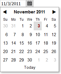
The dropdown calendar may offer a “Today” button that lets the user quickly
select, or jump back to, the current date.
Given the wide variety of implementations, and the complexity of this control,
it’s not surprising to see wide variation of the quality of implementations.
Some do a terrible job dealing with loss of keyboard focus, some don’t parse
dates very well, some can’t keep the text and calendar in sync, and so on.
Commentary
Date pickers seem boring, but I think there’s something quite fascinating
about them: they may represent a theoretical maximum of complexity possible in
a monolithic approach to creating user interface elements. Nearly every user
interface framework will offer a date picker — but they will rarely offer
something more complex. Why is this?
Apps need to let people enter valid dates that a program can understand.
This means constraining input and/or parsing dates, and usually rendering a
month calendar — and all these tasks turn out to be pretty hard. The problem
gets even harder when one wants to handle multiple cultures.
The standard combo box solution for a date picker means that, in its normal
state, the control to look very boring. It’s just a text box. This lets it
fit in with pretty much any application’s visual style.
The popup calendar month navigator may not always look elegant, or fit in
with the app’s visual style, but since it’s only a transient part of the
user experience, design teams decide they can live with it — especially when
confronted with a realistic development cost for something better.
The variety of situations that come up when picking a single date in the
near future is small enough that a monolithic control can handle most of the
common situations. Suppose you want to constrain the selected date to a
weekday. You can probably find a date picker that lets you handle that
specific constraint.
The problem is that, once you get outside the narrow set of common scenarios,
you’re out of luck. Suppose you want to let the user pick two dates
that are usually close together. In the example above, they want to let the
user pick the departure and return dates for a trip. But picking a date range
is beyond the complexity of most date pickers. Even if they wanted to support
that scenario, the variety of needs would quickly multiple out of control.
Some apps would want to force the two dates to be within a certain number of
days of each other, others would want to force the two dates to be a minimum
number of days apart, and so on. There’s just no way to build a monolithic
date picker than can handle all the common cases with a big pile of properties
governing control behavior. So user interface frameworks give up on this
problem, offer the single-date date picker, and let everyone cobble together
multiple date pickers to get the desired result.
In an extensible user interface framework, you could simply provide all the
building blocks required to construct a date picker, then let app designers
snap those together to get the control they want. So if they want a stock
single-date picker, fine, that’s provided, but the same parts can
also be snapped together to produce a two-date date picker, or whatever else
is needed. Those in turn can be offered as reusable user interface controls.
HTML 5 is not going to solve your problem
The HTML 5 spec defines a new “date” input type, allowing the browser to
provide a standard date picker UI. That effort is laudable, but so far
inadequate for all but the most basic needs.
The stock date picker controls in the mainstream browsers are god-awful. (Try your own browser’s date control.) Here’s a screen shot of Chrome’s date control:
This is an unadulterated user interface disaster. The format Chrome’s
decided to support (YYYY-MM-DD) is one that might be helpful to programmers,
but I expect essentially zero consumers actually use it in their personal
lives. I can’t think of a single situation in normal life where that format is
even seen. In the U.S., at least, people expect to enter a short date like
“11/7/2011”, but this format is rejected by Chrome’s control. So this
browser’s standard date picker fails to support its home country’s single most common input format. And the little up/down spinner arrows are completely out of place here.
They only advance the day portion of the date, they’re tiny hit targets, they
don’t let people think in calendar terms, etc., etc. And let’s not overlook
the fact that so little attention has been paid to this control that the “up”
spinner button is missing its top border.
If you take a look at
Opera’s date picker, it’s more functional (it adds a dropdown arrow, a real calendar navigator,
etc.) but, visually speaking, it still looks terrible. It’s hard to imagine a
design team happy including this bit of UI in a consumer-facing application.
If these controls represent the sorts of designs which browser creators are
capable of creating, that doesn’t bode well for the notion that adding
more semantics to HTML is going to solve any meaningful user
interface problems. Either the browser designers don’t care about those
controls, or they don’t have the expertise to design them well, or they don’t
see a payoff in doing so. It’s worth noting that having the browser try to
solve everyone’s date picker needs is an even more implausible answer than
having a monolithic date picker control solve everyone’s date picker needs.
Browser controls are less flexible than nearly every date picker
control out there.
Whatever the case, in their current state, I wouldn’t advise anyone to use
these controls on a web site where even modest usability or aesthetics are a
requirement. For reference: Even Google Calendar doesn’t even use Google
Chrome’s own date picker.
The situation is different on mobile platforms, where the browser can fall
back to the OS’ native date picker UI. They are generally well-designed, or at
least have received a considerable amount of design attention (those are
different statements).
On all platforms, it should be observed that there’s nothing that says a
dropdown combo box is the ultimate UI for picking a date. In fact, in many
applications, an inline calendar might actually be preferable. If you have a
page that’s all about getting the user to pick a date in the near future, why
force them to have to dropdown the calendar first? This is just to say that
the right control for the job really depends on context. If anyone tells you
that you must use the stock HTML 5 elements to let users enter data,
I’d think very hard about whether that person actually has the interests of
your users (and your business) in mind, or are simply touting a standard
because it’s a standard.
The DateComboBox control
I’ve posted a
DateComboBox control to
the QuickUI Catalog. (Taxonomy note: this control is called DateComboBox
instead of DatePicker to reflect the fact that it’s a combo box, and the fact
that there are many other UIs possible for picking a date.)
As noted last week, the generic appearance of these controls is minimalist by
design; they’re meant to be useful and unobtrusive as is, but can also receive
further styling, subclassing, etc.
Usage
Use DateComboBox in situations where you want to let the user type or choose a
single date (especially one in the near future) and space is a concern or you
don’t want to focus too much attention on the date. If picking a date is, in
fact, the focus of a UI, then it may be more appropriate to use an inline
calendar, such as a
CalendarMonthNavigator.
Note that, if the user omits a year, the current year will be assumed. In
applications I’ve worked on that let users enter dates (Microsoft Money,
Cozi), we always found that users generally expect dates without a year to
reflect the future. E.g., if it’s November 2011, and a calendar user
in the U.S. creates an appointment with a date of “2/15”, they expect the
appointment to end up on February 15, 2012 (in the future) and not February
15, 2011 (the current year, but in the past). At some point, this might be
worth fixing in DateComboBox, but for now the control makes the more
simplistic assumption about current year.
DateComboBox uses
asymmetric validation, which is to say that it will be slow to complain and quick to forgive. By
default, if the user types an invalid date, this fact is not reflected
visually by an error state until the user leaves the field (or, depending on
the UI, saves the form). However, any error state is removed immediately upon
the keypress that fixes the error; the user doesn’t have to leave the field to
see whether their date entry is now acceptable to the app.
Because the content of the days in the dropdown calendar can be customized,
you’re not limited to just showing dates in the calendar. You could show a
small amount of date-specific information (e.g., room availability) in the
calendar itself, helping the user make a more informed initial date choice.
Implementation notes
To me, the most interesting aspect of the implementation here is that the
DateComboBox is assembled by snapping together three main controls, are three
of which are interesting in their own right:
The input portion of the combo box is a
DateTextBox. This is a
subclass of
ValidatingTextBox, and is responsible for parsing typed dates.
The above elements are joined in a
ComboBox. This is the
same parent class which was used to create the
ListComboBox and
ColorSwatchComboBox
discussed earlier.
Since I already had the first and third controls in the catalog, the bulk of
the work this week was building a reasonable solid date-parsing text box. The
hardest part of that work was handling tricky event interactions to ensure,
among other things, that the user could navigate within a dropped-down
calendar; that behavior to some extent conflicts with the desire to have the
dropdown automatically close whenever the user moves the focus away from the
text box.
I was happy I could delegate much of the date parsing responsibility to the
fantastic jQuery
Globalize library mentioned
last time, which covers a huge range of culture-specific date formats. In
addition to supporting a standard short date format, Globalize also parses a
number of other date formats, which is nice even if most users won’t ever use
them. (If the culture is set to English, for example, you can type “January
2012”, and that will get parsed and shown as 1/1/2012.) If Globalize is not
present, then the control falls back to a simpler parser that supports
U.S.-style short dates (e.g., 12/31/2011).
I extended the supported abbreviated formats to handle short years (e.g.,
12/31/11) and missing year (12/31). Those formats come up daily in people’s
normal lives, so I thought it was important that a date control handle them.
(It drives users absolutely nuts that, when scheduling a flight or booking a
hotel, they have to enter a full four digit year. Is there some
other century they’re going to be traveling in?) The supported
abbreviated formats are sensitive to the local culture, so in France those
examples would look like 31/12/11 and 31/12, respectively.
This control is designed for full web browsers only. At noted above, mobile
browsers already provide fairly good date pickers. It should be
straightforward to create a control that uses the HTML 5 date field on a
mobile browser and a DateComboBox otherwise.
This week’s UI control comes from Flickr, which for a number of years has
offered a cool way to browse the most interesting user-contributed photos with
their
Interestingness
calendar:
As cool as this is, most of the work to build this specific page was probably
allocated to reproducing the same aspects of any month calendar built
anywhere. That is, some Flickr developer spent a long time mucking about with
date math, writing code that had nothing to do with Flickr. I’m guessing that,
since the web was first created, the logic to render and navigate a calendar
for an arbitrary month in HTML like this has probably been written hundreds if
not thousands of times. And there are probably web sites that would benefit
from displaying data in a month calendar, but can’t be bothered to make that
investment.
Key attributes
The calendar shows a complete month at a time.
The user can navigate to the previous or next month. In Flickr’s case,
navigation into the future is disabled.
Each month shows 4 to 6 rows of seven days a week.
Days in the previous month (on the first row, to the left of the first day
of the month) and the next month (in the last row, to the right of the last
day of the month) are hidden.
Given how the photos are selected based on historical data, Flickr only
shows photos for days in the past. The current date and days in the future
are grayed out.
A given date is represented visually in two ways: 1) as the number for the
day of the month, and 2) as a photo thumbnail. In this case, the photo is
the most interesting photo (according to the number of comments, etc.) on
Flickr for that given day.
Clicking a thumbnail pops up more thumbnails of interesting photos on that
same day. The popup offers links to specific photo pages, or to a more
complete list of the interesting photos for that day.
Usage
I started by creating a general-purpose
CalendarMonthNavigator
to handle the date and navigation logic:
Basic controls like this in the QuickUI catalog deliberately come with very
generic styling. This allows one to try out the control in a minimalist mode,
which hopefully makes it easy to see what the control actually does without
getting distracted by its appearance. The generic styling is automatically
turned off in a subclass so one doesn’t have to fight much with styles defined
by the parent classes. The class used to render individual days is intended to
be overridden, so that arbitrary content can be placed within a day.
A month calendar like this is well-suited for displaying date-based
information using the
principle of small multiples. This could be done to render historical information (sales data, etc.) as
Flickr has done here, or to represent information about the future (a weather
forecast, a calendar of events, etc.). If navigation is not desired — for
example, if the application wants to fix which month is shown — the
lower-level
CalendarMonthWithHeadings
can be used.
Implementation notes
Following the principle of separation of concerns, the base
CalendarMonthNavigator is comprised of
LateralNavigator
and a CalendarMonthWithHeadings, which itself breaks down into a calendar
control cornucopia:
MonthName,
DaysOfWeek,
CalendarWeek, and
finally CalendarDay.
Once the base CalendarMonthNavigator was finished, creating a custom
FlickrInterestingnessDay class was quite straightforward, as was styling the
month navigator. Flickr’s calendar shows the names of the next/previous month
alongside the next/previous buttons, which wasn’t hard to add. By dropping the
day class into the month navigator, the FlickrInterestingnessNavigator
(Update: Now called
FlickrInterestingNavigator.) fell out cleanly. The result is pretty close to the Flickr
Interestingness calendar. One might even say it’s interestingnessish.
As far as I can tell, Flickr’s API lets you grab interesting photos only for a
single date per call. Presumably they have an internal API that lets them grab
the most interesting photo for each day of a given month in a single call, but
no such call is documented. So this particular calendar is forced to make a
separate call for each day, which is obviously terrible. Nevertheless, that
performance seemed acceptable in a calendar intended mostly as a demonstration
of how to create a custom CalendarMonthNavigator. In a real application, one
would want to grab all the data in one call at the month level, then apportion
the data to the corresponding days.
Given that performance was already an issue, I chose not to implement the
popup Flickr shows when you click on a day (which shows additional interesting
photos for that day). Instead, clicking a day takes you straight to the page
listing the most interesting photos for a given date.
In creating the calendar controls, I was able to make use of the excellent
jQuery Globalize project,
which defines culture-specific information like month names and day names for
a staggering number of cultures. (Thanks are due to Microsoft for contributing
their vast culture database.) So the subcomponents MonthName and DaysOfWeek
localize their output to the current culture if the culture has been set via
Globalize.culture(). Since Globalize also indicates which day of the week
should be shown as the first day of the week — i.e., in the leftmost column —
I went ahead and localized that as well. For example, the first day of the
week will be Sunday in the U.S., but will be Monday in France, or Saturday in
Saudi Arabia. (Flickr’s own Interestingness calendar localizes the month and
day names into other languages, but doesn’t correctly adjust the calendar
presentation to reflect in the local culture’s first day of the week.)
Aside: I’ve added a new gallery to the
main QuickUI Catalog page, showing live demos of all the controls in the catalog so far. This is
only the fourth Control of the Week, but the catalog started out with a
handful of controls, and most weeks see the addition of multiple related
controls to the catalog, so there’s about 40 controls there now. Based on
community feedback, a high priority for the next month or so will be making
it possible to use the catalog controls in plain JavaScript, without needing
to know anything about how QuickUI controls are created, and without having
to use the QuickUI markup language (which is more concise, but entails a
learning curve).
Sometimes the important user interface components aren’t the glamorous ones.
One control the web could really use is a robust, extensible combo box. A
standard dropdown combo box has been part of the UI lexicon for at least
twenty years. I think I first heard about them when I was a summer intern at
Microsoft in 1988 and some application group, perhaps the Microsoft Excel
team, circulated a memo (on paper!) proposing their creation. (Perhaps there
are antecedents in earlier platforms as well.) The gist of that memo then is
the same as the core functionality now: let the user type whatever they want,
but also offer them a list of choices they can pick from:
A combo box is one of those controls that seems like it couldn’t be that hard
to implement, but in reality is ferociously complex.
Key attributes
The user can type arbitrary text into the text box portion of the combo box.
In some cases (such as the point size combo box directly to the right of the
font combo box above), the text box performs its own validation (e.g.,
requiring that the input text be a number).
The user can click the arrow button to dropdown the list of choices. When
the user makes a selection from this list, the dropdown collapses, the
choice is placed into the text box, and the text is left selected.
The list provides AutoComplete behavior, even when the dropdown list is
collapsed.
While the choices in the list ultimately can be represented with a text
string, the choices may be rendered in richer ways. In the image above, a
font is represented by an icon (indicating the type of font: TrueType,
etc.), the font name (rendered in the font itself), and additional
information on the right in the local language of the culture associated
with the font. (I have no idea what the examples on the right say in the
image above, but their English equivalents elsewhere in the list indicate
the recommended usage for the font: for headings, for body type, etc.
UPDATE: Commenter Jonathan indicated that the
characters next to the Hebrew font are the first several letters of the
Hebrew alphabet. Presumably the other fonts show similar samples of the
font’s alphabet.)
If the current entry in the text box is present in the list, the
corresponding list item is highlighted.
The list provides extensive support for keyboard navigation. The user can
toggle the list by pressing Alt+Down; they can navigate the list using arrow
keys, Page Up/Down, Home/End; they can make a selection by pressing Enter;
etc.
The list is resizable.
By default, the dropdown list is at least as wide as the text box. (This
behavior is not shown in the image above, but can be found in other combo
boxes.)
The dropdown list is a transient popup that can be dismissed by clicking
outside it.
It’s too bad there’s no support for a solid, extensible combo box in HTML,
because it’s really quite an elegant control. Many controls on the web are
described as combo boxes, but in fact are slightly different, or exhibit fewer
features than standard Microsoft Office combo boxes.
A dropdown list box created with a standard HTML <select> tag (without
the “multiple” option) does have a dropdown list, but does not allow the
user to type arbitrary text. Moreover, the resulting dropdown list can only
render choices as plain text.
A text box with AutoComplete does save the user some keystrokes, but does
not give the user a way to see all the choices. The user may inadvertently
(or intentionally) discover some of the choices through typing, but there’s
no way to see the complete list.
The HTML 5 spec defines a <datagrid> element which browsers can use to
create a combo box. However, at the time of this writing,
support for <datagrid> is lacking, even in the WebKit browsers. Moreover, the existing Mozilla
implementation doesn’t offer the user a true combo box, but rather a text
box with AutoComplete, and the choices are only represented in plain text
(see both of the above points).
Usage
I’ve posted a reusable, extensible
ListComboBox
in the QuickUI Catalog. This accepts any array of items which can be rendered
as choices in the list. By default, choices are rendered as a generic button
(without borders), but any custom control class could be used as well.
As implied above, a combo box is well suited for any situation in which you
want to allow the user to type arbitrary text, while at the same time offering
them choices. The ability to render a choice in the list as a custom control
gives you the option of adding more detail, or otherwise helping the user to
make a more informed choice. Because a combo box is very compact in its normal
state, it can be used in almost any place a text box can.
Although combo boxes have a long history in user interfaces, I’ve observed
many usability studies where a user did not actually notice the dropdown
arrow. This is most likely a result of the arrow’s small size and placement on
the far right; I expect the problem is a bigger issue in very wide combo
boxes. Perhaps as a response to this shortcoming, many web sites that have
hand-rolled combo boxes automatically pop up the list of choices whenever the
user clicks on the text box or moves the focus into it, rather than requiring
the user to click the arrow. That actually seems like a reasonable improvement
on Office’s combo boxes – it doesn’t seem to hurt much to have the list
available, even if the user doesn’t want to use it – so I’ve included that
behavior as well, with an option to turn it off.
Implementation notes
ListComboBox derives from the more fundamental base class
ComboBox, which
is the class that actually binds together a text input control, the dropdown
button, and the popup containing the choices. ListComboBox happens to render
the choices as a vertical, single-column list, but it’s easy to create
controls that drive from ComboBox that present their choices in very different
ways. (To present an example, I’ll follow up in a later post on how to create
a traditional date picker by deriving from ComboBox.)
As a testament to the complexity of a combo box, I was forced to leave out
certain aspects of the Microsoft Office example. In particular, full keyboard
support would have taken to long to implement reliably in the time I allotted
for this control. Along with keyboard navigation, I’ve postponed working on a
means to highlight the current item in the list. The list box currently grows
as tall as necessary to show all the choices; with long lists it would
obviously be helpful to let the list grow no longer than the bottom of the
viewport. Finally, the resizability of the list didn’t seem worth the trouble.
Per usual, various aspects of the control were much trickier to implement in
IE. It proved challenging to implement the behavior described above in which
choosing an item from the list closed the list and left the entire text
selected. Attempting to affect the selection in IE after the list had been
closed had the unfortunate side-effect of leaving the list open: programmatic
inspection revealed that IE claimed the list was now hidden, when in fact it
was still clearly visible. For now, in IE, when the user makes a choice from
the list, the full text of their choice is placed into the text box, but is
not left selected.
Possibilities
With ListComboBox in hand, it’s quite easy to create a new kind of combo box
that works basically the same way, but uses a custom input area and a custom
list presentation. In about an hour, I was able to throw together a
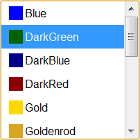
ColorSwatchComboBox
that lets the user choose CSS colors by name or value:
Both the input area and the list show color swatches next to color names. The
list of choices is populated simply by feeding the combo box a set of strings
(the color names). The ComboBox ancestor class puts the input area and the
list together, along with the dropdown behavior. The ListComboBox parent class
takes care of rendering of the choices as list items, as well as doing the
AutoComplete behavior. So most of the behavior of this rather intricate color
picker is handled by the base classes; the classes specifically associated
with picking colors are quite simple. It’s this sort of UI factoring that
should allow people to quickly create much richer web sites than with the raw
HTML controls, even the ones in HTML 5.
It’s nice to have multi-line text boxes resize to fit their contents. The
native HTML <textarea> tag, which creates a multi-line text box, gives
the text box a fixed height. (Chrome and Firefox will let you manually resize
a textarea, which helps, but the resizing isn’t done for you.) A fixed height
text box never feels like it’s the right height: if you don’t have any text to
enter, a tall box is too big, and if want to actually enter a block of text,
you always find yourself wishing the box were bigger.
Auto-sizing feels like a missing feature of web forms. Many forms need to let
the user type in lines of text into a text box, and since the size of that
text can vary, it seems to make sense to start out with a small text box, then
grow the text box when necessary. HTML has had form support since at least
HTML 2.0, so it’s surprising this feature is still not standard. For
comparison, Microsoft Word’s form support has had auto-sizing text boxes for
years.
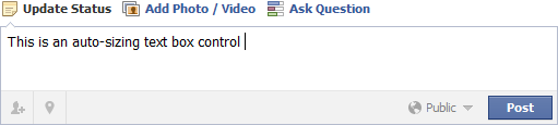
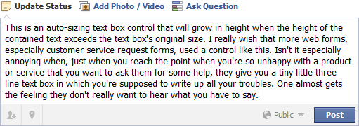
I think the first solid implementation of a web auto-sizing text box was on
Facebook, which offers you such a text box to enter a status update:
Facebook's design varies from week to week (and user to user), but at the
time I took the image above, the text box started out tall enough to contain
three lines of text. As the user types more, the text box grows in size:
Key aspects
The text box has a minimum height. This can be sufficient for a single line
of text or (as on Facebook) can be bigger.
As the user types, the text box grows. In a normal layout, the text box’s
increased size will push down any elements below the text box.
The height of the text box is sufficient to contain the current text, plus
an additional blank line. This latter aspect is helpful to let the user know
that there’s still more room to type — i.e., that they don’t need to stop
yet.
The text box may also have a maximum height. Note that this is different
than the text box’s maximum length, which establishes how many
characters can be entered.
Usage
See AutoSizeTextBox in the QuickUI Catalog for a working, reusable implementation.
The default height of an AutoSizeTextBox is set to accommodate two lines of
text. This suggests to the user that they’ll have ample room to type. As they
begin to type on the second line, a third will automatically be created for
them. As a result, they’ll never feel like they’re running out of room. In
tight spaces, this minimum height can be overridden to produce an
AutoSizeTextBox that’s only one line tall when empty.
Implementation notes
I’m not aware of a pure CSS solution to this problem; the variety of ways to
implement an auto-sizing text box all require some degree of JavaScript. A
while back I posted a
solution on StackOverflow
that, at its core, leaves most of the layout calculations to the browser. In
this approach, the textarea and a hidden element are both placed inside a
containing div. I'd originally used a div for the hidden element, but
realized that using a <pre> (preformatted) element would automatically
preserve line breaks and white space.
The hidden pre is set to use visibility: hidden, which tells the browser to
layout the control as normal, but leave the pre invisible. When the user
types in the textarea, a small bit of JavaScript simply copies the contents of
the textarea into the hidden pre element. As the pre gets bigger, it forces
the containing div to become bigger, which in turn makes the textarea grow.
The textarea ends up as big as the hidden copy of the text (plus an extra
line), which gives us the effect we want.
The most finicky bit of the implementation deals with letting the control work
with different font sizes. During initialization, the font of the overall
control is copied over to the textarea and hidden pre so that the text metrics
of the two elements will be the same. This operation has to wait until the
control is actually in the DOM so that any relevant styles will have been
applied.
Moreover, the initialization logic needs to know the line height of the text
in the textarea. Unfortunately, if line-height has not been explicitly set,
WebKit and IE report the line-height as “normal”, instead of giving us an
actual measurement we can use. So the control calculates an approximate
line-height by applying a constant factor to font-size. This approximation
means that the text box height can be off by a pixel or so in WebKit and IE.
I think the web UX field would benefit from having access to an open,
comprehensive catalog of working, ready-to-use user interface controls. All
programming platforms provide class libraries replete with hundreds of base
classes, which are both standard implementations and starting points for
custom work — but when it comes to user interface libraries, most provide
something like a dozen very basic controls: a Button, a ListBox, a SpinBox, a
Slider, etc. There’s also always a DatePicker, and it usually represents the
pinnacle of complexity for the UI library. That’s about it. Everything else —
i.e., much of the UI components a design team needs — has to be custom made
from scratch.
This is incredibly inefficient, and a state of affairs tolerated perhaps in no
other branch of software development. Few people seem to realize that a
solution is even possible. I think at least one key reason for that is that
most UI frameworks don’t define the semantics of specialization (subclassing)
by which one person can take another person’s component and specialize both
the component’s appearance and behavior to their needs. With such
semantics in hand, it should be possible to build a much richer ecosystem for
UI components.
A core purpose for the QuickUI framework is
to address exactly that need: let people build robust, solid, well-tested base
controls that can get quickly specialized for particular needs. To prove that
is possible, and to verify QuickUI can do that well, I’m starting a project to
create a large library of UI control base classes. My plan to tackle (first on
my own, and then hopefully with the help of some of you) as many of the common
UI controls found around the web as possible. Many of these aren’t even
recognized as shareable controls; they’re often referred to as “patterns”,
suggesting there’s no common behavior which could be shared.
These controls will get collected into a catalog of live examples and
ready-to-use source code. Each control in the catalog will be live code: not
screen shots of examples, not a pattern, not a template for a prototyping
tool, not a recipe for doing it yourself. Each one should be ready to use in
your web app. Furthermore, each control should be able to serve as the
starting point for your own custom refinements. As a side effect, the catalog
should also be a useful reference for developers building UI in other ways,
but the biggest benefits should accrue to people who can just pick up the
working controls and start using them.
As a working format for the project, I’ve been inspired by the efforts of
various artists to create a something-a-day for 365 days (e.g., Noah Scalin’s
Skull a Day).
I think a good control implementation might take longer than a day to code and
write up. I think a control a week is a more reasonable goal.
So here’s my plan for Control of the Week:
Each week I’ll pick a common control to implement (or improve) and discuss.
I’ll code up a solution in QuickUI. Each implementation will generally focus
on doing a single UI task really well.
I’ll do my best to verify that the solution works as expected in the major
browsers: Chrome, Firefox, IE 8+, and Safari. Visuals will be done in CSS3
whenever possible, so things might look different (clunkier) in IE8, but
I’ll try to allow for graceful degradation.
I’ll add an entry for the control to the
QuickUI Catalog. The control’s
notes may include suggestions on when and how to use the control in a UI.
The Catalog already contains a number of controls ready to go. Some of those
will be revisited and spiffed up as part of this project.
I’ll post the control’s source code in the
quickui-catalog repo on GitHub. From there the source could get copied into any web app project. For now,
QuickUI is designed for use with an accompanying markup language, but they
could fairly easily be invoked from regular JavaScript. I’ll be working on
better documenting how to do that.
I’ll blog about the control here. This will likely include a look at one or
two examples of sites using the control, and any thoughts on how the control
came out. Additional related controls (like RotatingPagesWithDots, below)
may fall out of the week’s work, and as time allows I will write up some of
those as well.
The project format and details will certainly evolve, but rather than plan
that all out, I want to dive in and get started. So without further ado,
here’s…
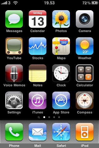
Control of the Week: Apple-Style SlidingPagesWithDots
SlidingPagesWithDots
presents its content as a horizontal sequence of pages in which navigation
between pages shows a sliding animation. The classic representation of this
control is found in the iOS app launcher:
Key aspects
This control renders its content as a set of pages, one of which is shown at
a time.
A set of small dots below the pages show the user how many pages there are;
a highlighted button indicates the current page.
The user can navigate horizontally.
The pages slide left and right to provide a sense of physicality — even the
unseen pages are conceptually “there”, just not seen.
To increase physicality, navigation doesn’t wrap once the user reaches the
first or last page. Navigating from the last to the first page shows all
intermediate pages sliding quickly by.
In a touch screen implementation like the one above, the user swipes left and
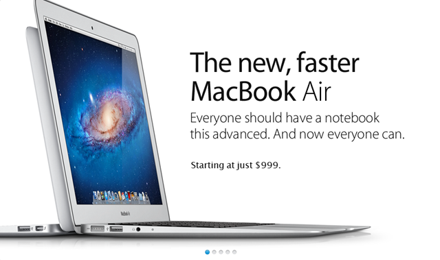
right to navigate the pages. Apple’s store also uses this device in the “hero”
element of a product page (e.g., the
MacBook Air page) to rotate
between product shots:
Here the pages automatically rotate once through on a timer; the user can also
click a dot to navigate to a specific page.
Implementation
Since iOS doesn’t (yet) make swiping easy to implement, for the implementation
I’ve focused on the Apple Store-style example. The control renders each child
as a separate page, so their visual treatment and behavior is completely open.
The dots can be replaced with custom controls. A subclass of
SlidingPagesWithDots called
RotatingPagesWithDots
adds the Apple Store rotation behavior; the rotation interval can be
customized.
As will likely become a common theme, getting this to work in Mozilla and
WebKit was straightforward, and getting it to work in IE9 wasn’t too bad.
Getting it to work in IE8 was an enormous pain that necessitated fixing some
optimistic assumptions deep in the QuickUI framework. Furthermore, IE8's
lack of border-radius support means that the circular “dots” will
degrade to squares. This could be addressed by falling back to a sprited image
on IE8, but as I’d already spent more time than I’d intended on IE8, I’ve
punted on that for now.
Usage notes
This control seems useful for showing a small set of, say, 3-7 pages. The
sliding animation is nice, but for high-frequency tasks could become annoying.
The automatic rotation could be distracting in any situation where the user is
forced to perform a task while the animation is playing. It seems more
appropriate for, say, a site’s home page, where it could be used to
temporarily highlight content in the hopes of showing something that interests
the user.
I recently stepped back from day-to-day work at
Cozi, the family-focused startup I cofounded
with Robbie Cape in early 2005. The past six and half years were a marvelous
education for me: Cozi was my first startup, and Robbie and I had the great
luck (and perhaps a little insight) to stake out what has proved to be
incredibly fertile product territory. It’s been gratifying to design something
from the ground up, and also rewarding to contribute to the formation of a
wonderful company culture. The company’s business has never been stronger, so
from a business perspective, this year’s been quite an exciting time.
Still, what draws me to the office ach morning isn’t business success, it’s
working on challenging user experience design problems. And it’s turned out to
be harder to find fresh challenges in a project that’s heading for its seventh
birthday. I think a designer who works indefinitely in the same product space
may run the risk of becoming dogmatic in their response to new design
problems, which potentially limits the ability to respond to users and dilutes
the satisfaction of designing. Although I’d intended to stay with the startup
for as long as it exited, over the past year I found my imagination sparked
less and less by work, and more and more by personal projects. Robbie and I
spent a long time talking this over, and ultimately concluded the company and
the product were strong enough that other designers could pick up where I’m
leaving off.
I remain extremely bullish about the product’s future, and am still retaining
a hand in shaping the evolution of Cozi as a board observer and an adviser to
its design team. But I’m no longer going into the office. For now, I’m using
this opportunity to focus my attention on developing and promoting QuickUI,
which I’ve now been working on for almost four years. (Among other things,
I’ll be giving a talk on QuickUI at
jQuery Boston 2011 on
October 2nd.) I’m really curious to see whether it’s possible to create a rich
ecosystem of UI controls for the web built on an easy-to-use design and
development framework. I’ll likely post more about that work as time goes on.
This is actually the third time in my life I’ve made a break from my work, and
each time I’ve made the break without any definite plan of what would come
next. Each time, I’ve not only enjoyed the sabbatical from work and happily
pursued independent projects, but ultimately found myself very happy with
where I landed. We’ll see what comes up next.
This past week I had the occasion to reflect upon the towering list of
fantastic feature suggestions people have contributed for Cozi which I’ve had
to keep out of the product. I regularly hear good—sometimes
brilliant—ideas for Cozi's product, but I’m generally forced to say,
“Maybe later”, to nearly all of them.
One core aspect of software’s nature which shapes the user experience design
discipline is the inherently iterative and additive nature of the
publicly visible output. UX design shares this iterative trait with fields
like urban planning and certain types of performance (e.g., stand-up comedy)
where the artist is constantly tweaking what people see and hear. Those
fields, however, are often zero-sum: a new downtown building replaces what was
there before, and a new joke pushes an older joke out of the routine.
In contrast, there's a nearly irresistible tendency for software features
to accrete:
A user who has found something they like will scream bloody murder if that
feature is taken away, and it turns out that every feature will always have
at least some passionate adherents.
Removing a feature that affords access to previously-entered user data would
effectively maroon it, a nearly unforgivable transgression. You’d have to
first create some way of getting that data out, which is extra work, which
means time, which you don’t have.
If you remove a feature, it will almost certainly be perceived as if you’re
lowering your value proposition. Even if you hope the increase in usability
will eventually allow you to deliver a better experience in the long run,
that’s a pretty hard argument to sell to a customer.
Someone who worked hard to bring the feature into existence may still be
around and defend it vigorously (perhaps failing to recognize the market has
changed).
Or, on the other extreme, your team may have forgotten the feature exists.
Or, your team knows the feature exists, but may have forgotten
why it exists. No one wants to pull the plug on something in case
it turns out to be critical. Surely someone important needs it, right?
Better to be safe and leave it there.
Given all the above, at any given decision point, the cost to keep an old
feature working often seems pretty low compared to the cost of retiring it.
The catch is this:
not all those features will retain their relevance over time. The
world will change, user priorities will evolve, and your business goals will
shift. A feature that was deemed vital when introduced may lapse into
persistent clutter in your user interface or a persistent drag on your
operation.
Here’s a common situation: we’re working hard on a pending release, and
there’s a feature just out of reach; it’s not going to make it into the
release. It’s painful to defer working on it, because we’re certain it’s very
important. Then, when the pending release is finally finished, and we finally
have time to do that important thing — no one’s really that excited about it.
In the few weeks that have passed, we’ve learned something new that has
convinced something else is more important. The earlier idea, which
has previously seemed mission-critical, never ships. And—whew—that’s
a good thing. We came this close to adding new clutter to our product that we
can (obviously, in hindsight) live without.
Some people say you need to say, “No”, to ideas to keep a product clean and
simple. But that makes it sound like you can make one decision and be done
with it. You just never know; the feature you’re saying “No” to might turn out
to be important after all. I think maybe it’s more correct to say, “Maybe
later.” A good idea (or a clear user need) will be persistent, and over time
will keep knocking at you until, one day, something clicks and you realize how
you can address it and three other things at the same time, in a much better
way than you could have if you’d plunged in right away. During this long
period of consideration, the idea has aged and matured until it’s time has
finally come.
This can only happen if one adopts a deliberately slow pace of idea adoption.
Ultimately, I think being able to say, “Maybe later”, to a really great idea
is a hallmark that distinguishes an experienced UX designer from a novice.
Every UI that renders textual data has to cope with the question of what to do
when text is too long to fit in the space allocated for it in the UI. Here are
some basic approaches:
Clipping. This is straightforward to do, and the result looks
clean. If the text gets clipped in the middle of a word or, ideally, a letter,
it will be obvious to a user what’s happened. In some cases, a column of
clipped letters can create a virtual border, avoiding the need for an explicit
border. (See this
discussion of Cozi’s Month view.) The biggest risk is that text will get clipped at a word boundary, and the
user will be unaware (or unsure) there is more content.
Ellipsis. The traditional client OS solution is to remove the
last character or two that would have fit, and replace those with an ellipsis
(…). The user is easily made aware of missing text. This strategy requires the
ability to quickly measure the width of text runs at runtime—an ability
current browsers lack—to determine where the ellipsis should go.
One minor disadvantage of this technique is that, even when this approach is
possible, it can lead to visual clutter if many lines of text will be so long
that they require ellipsis. One variant of the ellipsis technique is employed
by OS/X’s Finder and various IDEs, using ellipsis in the middle of a
text run. This is particularly useful when showing long URLs or file paths,
where the final page or file name is probably more interesting than a long
list of directories in the middle. As a side benefit, this also reduces visual
clutter in cases where many lines of text require ellipsis.
Fading. This strategy employs an alpha-blended gradient on
the right edge (or, for blocks of text, on the bottom) to make the text appear
as if it has faded out. This technique, which looks quite clean, is beginning
to get more popular as modern browsers support alpha-blended gradients. (See
the QuickUI
Fader
control for sample code.)
Selective condensing. This tactic can be combined with any of
the above techniques. Long strings are rendered with tighter kerning or in a
condensed font variant, permitting extra characters to be shown which would
have otherwise not been visible. If this effect is handled carefully, users
may not even be aware of it. Like ellipsis, condensing requires the ability to
measure text length. This is still not trivial in a web browser, which will
generally require text to be added to the DOM before its width can be
measured, but can be done by rendering text in an element with “visibility:
hidden”. (See the sample QuickUI
TextCondenser
control.)
This post marks my 100th post on flow|state. My
/posts/2005/07-11-cant-sleep.html”
>first post was on July 11, 2005, so by pure coincidence this milestone comes
exactly on the blog’s birthday. There was a 1½ year blogging hiatus in 2009-10
(because 1 startup + 3 little kids = 0 discretionary time), so I’ve done about
4½ years of actual blogging. This works out to a post roughly every two weeks.
I’m still passionate about learning and teaching the craft of user interface
design. When I started this blog, I thought I would focus exclusively on
client-side app UI, but I shifted my attention to the web when my company,
Cozi, did so in 2008; later my interests extended to mobile UI as well.
I’ve tried to focus on my own direct personal experiences as a UX designer,
with an eye towards sharing practical knowledge to people in the industry, or
conveying a sense of the designer’s work to a general audience. I generally
prefer to write about the products I know best: the ones I’ve worked on. In
cases where I critique other products to make a point, I try to concentrate on
the nitty-gritty details of a UI that may go overlooked by users, but which
nevertheless affect the user experience.
This focus is borne out in this list of the most popular posts on flow|state,
either having driven the biggest transient spikes in traffic or for driving
the most visits over time.
One thing I’ve missed over the past year is more engagement with you, the
readers. A while back I tried to ward off comment trolls and spam by turning
on the requirement that commenters must be signed in. This kept away trolls
and spam—and everyone else. On the suggestion of a friend, I’m giving unsigned
moderated comments a try to see that encourages more discussion.
In that spirit, I’d love to hear from you about this blog, especially the
sorts of posts you’ve found most helpful or interesting. Leave a comment or
send email via the About page.
While reviewing UI text recently, a question arose regarding exactly which
words in a sentence should be used as a hyperlink. My standard tactic to cut
through this design problem is to ask: what if your user were blind? Assume
they have a screen reader that, by default, is going to let them tab through
just the links on the page and read the link text aloud to them. Which link
text would produce the best experience?
At Microsoft I was first exposed to the proposition that creating products
with universal access in mind (i.e., making the product’s features accessible
to users who were visually impaired, hearing impaired, motion impaired, etc.)
would also produce benefits for all users. I’d love to see a rigorous defense
of this proposition from an economic point of view: could resources invested
toward universal access have produced better products if those resources have
been invested elsewhere? But even without that defense, I do believe this
mindset opens up new ways of looking at design problems.
To get an approximate sense of how this page might appear to a blind user (via
the default screen reader experience) you can remove all the text that
surrounds the links. You can easily do this on almost any web page by using
your browser’s developer tools to change the body and paragraph text color to
match the background color:
With the body text rendered invisible, the use of the link text “here” in
“Click here to see a sample of the new Calendar redesign” jumps
out. If the link text had been written without depending on the surrounding
text, perhaps better link text might have been selected: e.g., “See a
sample of the new Calendar design”. The link text “wrote” could
be similarly improved.
I think it’s striking that, even when one tries very hard to focus on
just the link text in the first image, you still don’t get the same experience
as the second image. The second image makes it impossible for your eyes to
grab a little bit of context from the surrounding text.
Perhaps the persistence of weak link text can be partially attributed to the
assumption that web usability guidelines for, say, visually impaired users,
apply only to companies or organizations that focus on those users. In this
case, following the guidelines for link text (and using link titles that
appear on hover, etc.) can benefit all your users.
I can’t pretend to understand or fully appreciate the user experience of blind
users. I can speak to the question of what a typical user does when scanning
UI text: they tend to focus on the links. Writing as if the surrounding body
text were going to be invisible can help guide you in the selection of good
link text.
A standard trope in software is that, “Users don’t read”. This claim is often
made after someone observes a user blow straight through an “Are you sure you
want to do X?” dialog without reading it (possibly with some
catastrophic result). There’s plenty of usability research showing that users
do indeed scan text instead of reading it, which has resulted in some good recommendations for writing for the web. But I think most of that discussion overlooks the fact that much UI text is
almost pathological in its lack of empathy, failing to consider the situation
from the user’s perspective.
Let’s consider some situations you might encounter in UI text, then consider
how you would view similar behavior in a human conversational counterpart.
UI text is highly redundant. A page or dialog may state its main question or point multiple times. If a person stated the same point to you three different ways, you’d
either think they were stupid, or conclude they
thought you were stupid.
UI text can be highly predictable. Suppose an app displays a confirmation
dialog every single time you perform a common action, perhaps an act that is
universally confirmed. A typical example might be a dialog intended
to prevent accidental deletion. A person who asks you such a near-pointless question signals a lack of
interest in the interaction, and in you as a person generally. (How did you
feel when airline ticket agents used to ask questions whether you were
carrying weapons or whatever?)
UI text doesn’t address questions from the perspective of the your task. If
an app, say, focuses on some technological detail rather than the user’s
goal, the app sounds more interested in itself than in you or your goal.
This sort of behavior in people is characterized as narcissistic.
UI text uses jargon. By using words you are unlikely to know, the app
signals more than disinterest in you, it places itself in a superior
position as it pushes you down. In a human conversational counterpart, this
behavior can be placed on some continuum between obtuse and elitist.
UI text may bury the lede in a UI interaction, that is, fail to draw your attention to the larger point. Someone who
claims to give you the information you asked for, but deliberately
obfuscates the crux of the matter, could be viewed as passive-aggressive.
UI text can be abrupt and negative. The canonical example here might be form
validation feedback that rejects your attempt to enter data: “Error: Invalid
email address” or such like. There are nearly always softer terms that could
convey the same meaning as harsh terms. If a person deliberately uses
negatively charged words like “invalid”, “incorrect”, “missing”, or “failed”
to discuss you, your goals, or your acts, you could reasonably assume they
felt disappointed or disgusted with you.
Everyone, whether speaking with you, or writing to you through UI text, gets
to choose their words. The existence of that choice allows you to infer the
emotional state and intent of your conversational counterpart. While it’s
impossible for an app today to “speak” with the same understanding of the
situation as a person, or to accurately reflect that understanding through the
nuances of its words, it is nevertheless eminently possible to improve a user
interaction by writing UI text with more empathy for the user.
Again and again, my standard UI text exercise is to envision those words
arising in conversation between two people. If I’m playing the role of the
app, and the words I’m saying sound obtuse, insulting, superior, or
disinterested, then those words must be rewritten, or the UI refactored to
avoid the need for them.
A colleague once showed me the main toolbar for an app they worked on, and
offered an archeological exposition of when and why each button had been
added. The first three buttons represented the app’s core functionality, and
had been on the toolbar since the app’s first release. All the other toolbar
buttons had been added in successive releases. Each time one of those features
were added, it had been deemed vitally important to give the feature prominent
placement on the toolbar. There those buttons had remained to the present day.
But when the team monitored click-through across all toolbar buttons, the
first three buttons accounted for nearly all user clicks. Those other buttons
were permanent meaningless clutter, doomed to forever confuse and distract
users from the first three, meaningful buttons.
When adding a new feature to an app, there’s an almost irresistible tendency
to put that new feature front and center in the UI. After all:
Your customers may have been begging for it for months, or years.
You and the entire product team have been actively thinking about, and
working on, that big new feature non-stop for many months.
You are all proud of the new feature.
Your team may be convinced this feature represents the difference between
business success and failure.
You don’t want existing users to overlook this much-requested feature when
it’s finally available.
But, wait—is this new feature really so important that it should now be the
dominant element in your UI?
It’s unlikely that in the user’s mind your new feature is more
important than the app’s core function. You most likely established that
core function of your app very early on, probably in the very first release.
It’s unlikely that you want to decrease the chance that users
successfully find and use that function.
Once users learn how to find your new feature now, they’ll still expect to
be able to find it that way a year from now—when you’re trying to release
the next new big feature. What are the odds that, at that time, the
feature that’s new today will still be so vitally important?
It’s appropriate to make a new feature visible; just make sure that, from a
user perspective, the prominence of the entry point for the feature
corresponds to its priority in the updated app’s overall functionality.
A lot of my time as a design executive is spent defending the value of the
unquantifiable. Business pressures argue for design compromises with some
quantifiable and significant ROI (Return on Investment). But as Adaptive Path
put it in their report on
Leveraging Business Value: How ROI Changes User Experience, “It’s impossible to measure ROI for user experience with a simple equation
that can be applied across a wide swath of companies and projects.” And, in my
experience, perhaps the hardest thing to quantify is the value of negative
space: the space between your user interface elements.
Typically brand new apps have lots of space, because UI elements represent
features, which require code, which requires time and money. With time and
money, however, the app evolves, and the empty space is quickly filled in with
new features. The availability of room, in fact, can contribute greatly to the
decision to place a button in what was previously empty space. “Users are
asking for this feature, and it looks like there’s room for us to squeeze in
another button on the toolbar, so let’s do the feature and make it a toolbar
button.”
I rarely hear discussion about setting aside room in a user interface for the
absence of user interface elements. Speaking both aesthetically and
from a usability perspective, negative space can be highly valuable in an
interface. Used effectively, it can create a sense of calm, balance,
manageability, and competence. It can help guide the user’s eyes across the
page towards what’s important. The presence of space can separate things that
are different; the absence of space can join things that are similar.
Cozi’s current web page template leaves some significant negative space in the
lower left (above the clock), as well as a bit in the upper right. Both those
spaces vary in size depending on the window dimensions. (The calendar view
itself also has considerable space, but that’s highly dependent on which view
is selected and how much data is on the calendar.)
The challenge is that negative space doesn’t look like it’s doing
anything. It can appear inefficient—like a lost opportunity. In a business
driven by display advertising, there is pressure to make pixels generate
revenue. It’s nearly impossible to count the value that effective negative
space contributes to a user experience, but it’s very easy to estimate the
rent those same pixels might generate if they were converted to display
advertising inventory. The thing is, those empty pixels are doing
something. The user experience would be different—worse—if the space were
filled.
Negative space is hard concept to love, but it turns out that most people
demonstrate an intuitive grasp of negative space in the context of their own
homes. In home after home, you can observe that the occupants have very
carefully hung pictures or paintings on the wall so as to give each piece
space to breathe. You will rarely see a bunch of paintings crammed together on
a wall. Most people effectively use negative space with no training beyond the
casual observations of positive examples in other homes, museums, offices, or
anywhere art is displayed. At some subconscious level, people must be so
sensitive to the value of negative space that they are willing to do work to
preserve negative space in their own surroundings.
The defense of the negative space in a user experience, however, is a
never-ending battle. New proposals to “fill that space in” with a new feature,
ad, or other element arise on a monthly, sometimes weekly, basis. Defense of
the open space is wearisome but necessary. Once that’s space is gone, it’s
usually gone forever.
Probably the most painful experience I have on a regular basis in my
professional life is watching usability studies. Last year I became a big fan
of UserTesting.com for conducting
remote, unmoderated usability studies. In my experience, it’s been
ridiculously fast, highly informative, and very inexpensive. Years ago I could
only experience the agony of watching a floundering user by sitting behind a
one-way mirror in a very expensive usability research lab. Now I can recapture
that agony for only $39.
The most painful aspect of watching a usability study is seeing a
well-intentioned UI — one you were sure would be a success — actually cause a
user emotional distress. But the second most painful aspect of
watching a usability study is seeing a user successfully accomplish a task in
10 steps which they could have accomplished in two. For example:
A user wants to copy and paste a word. They carefully mouse down at the
beginning of the word, slowly drag across the word, then let go. They move
their mouse waaaay up to the Edit menu, click, then slowly read down the
list of menu items until they come to “Copy”. They select Copy. Whew,
they’re halfway there. They reorient themselves, and then click where they
want to paste the word. They move their mouse waaaay back up to the Edit
menu, click, then slowly read down the list of menu items until they come to
“Paste”. Click. Voilà!
A user wants to move a window. They drag the upper-left corner of the window
to a new location. They then drag the lower-right corner of the window to a
new location, taking care to make sure the window is now roughly the same
size it was before.
A user wants to browse to a URL. They click their browser’s Home button to
return to a page that has a Google search box. They type the URL into the
Google search box, then click Search. Google displays a long page of results
(with ads!). The user finds a link to the desired URL at the top and clicks
it.
It’s impossible to watch these events and not want to rush in and tell the
user about how to use keyboard shortcuts, drag a window’s title bar, type in
the address bar. Hey, user, you could be so much more efficient! This
instinct, while natural, and somewhat altruistic, also has at its core some
compulsive behavior. Software developers obsess a bit about
Whitespace, The Silent Killer. Software designers obsess a bit about user inefficiency.
To be clear, being on the lookout for such inefficiencies is an absolutely
critical design skill, as is being able to iterate towards a design that’s
more likely to encourage efficient behavior. It’s worth asking, however: if
the user got what they wanted, and is satisfied with the time and energy they
spent, why should the fact that they ignored a more efficient route have to be
troubling?
Changing a design—even for the better—has its own costs: the designer’s, the
engineer’s, the tester’s, the support staff’s, not to mention the existing
users’ time to learn something new. And sometimes a blunt attempt to
force-train the user a more efficient path is worse than the original problem.
(Remember all those “Tip of the day” dialogs that used to pop up on
application startup to tell you all about a keyboard shortcut the app’s
designers thought you really should know?)
Sometimes, however, it’s best to leave well enough alone. It can be enough to
rely on the user’s ability to follow the
information scent down a path that’s circuitous, long — and successful. If a feature’s
design is generally letting users accomplish their goals, you probably have
more urgent design priorities to address.
I’m always interested in hearing cases like this, where a user followed a
circuitous but ultimately successful path. What’s the most extreme case of
this you’ve seen?
Have you ever clicked on a portion of a screen you thought was interactive,
but it had no effect? Or tapped on something expecting one action, but got
another? Sometimes the issue is that the actual hit target for a UI element
differs from what can be assumed from the element’s visual appearance. There
are some subtleties in picking the hit target boundaries for a UI element, but
I haven’t seen much analysis of the topic, so thought I’d share some
observations.
Time was, if you wanted a UI element to be clickable, you put a thick 3D
border around it:
The 3D border lets the user they can activate the UI element by “pressing” it
with a pointing device. The hit target here could not be missed: it was the
entire area defined by the rectangular border. This is clear, but those 3D
borders add a considerable degree of clutter. The borders of the button above,
from Windows 95, are actually quite refined from an earlier age of thicker,
heavier, and uglier borders. (In the early 90s, I was asked to sit on a
Microsoft task force in which representatives of different teams spent months
arguing about what the standard button border treatment should be. The group
fought over the correct width for a 3D border, over the placement of the
apparent light source, and over the precise shadow treatment for corner
pixels. See how the white line on the top dives into the black line on the
right, so that the upper-right corner pixel is black? You have no idea how
much blood was spilled over that corner pixel.)
As time passed, it became apparent there were other ways to suggest
interactivity. For example, it turns out that an element’s mere existence can
suggest interactivity: if you put a little icon in the corner of a window, and
there’s no other obvious reason for why that icon would be there, a user can
reasonably conclude the icon is an interactive element. Similarly, giving an
otherwise flat piece of text a distinctive appearance (say, blue and
underlined) can be enough to let a user know the text constitutes a clickable
link. So borders began to drop away.
But once borders are removed, a question arises: exactly which pixels should
constitute the element’s hit target? There seem to be several basic
strategies:
1. Explicitly define the hit target with a boundary line.
This is the strategy behind the 3D border shown above, although many other
boundary treatments are possible. The boundary itself can be a line with an
inner and outer edge, or it can simply be a change in background color. The
boundary’s shape is nearly always rectangular, even if the corners sometimes
appear to be rounded.
2.
Implicitly define the hit target as being relatively close to the visible
pixels
for an irregular object, such as text or an icon.
The little heart icon in the upper right of this control group is interactive
— but exactly which pixels are clickable? If only the gray pixels were
clickable, that would be a disaster; a user could click through in the middle
of the heart and miss the target. (I seem to recall an OS long ago—Windows?—in
which it was indeed possible to double-click through holes in desktop icons
and not actually open the corresponding application.) [Update: David Buxton
reports that the OS in question was actually the original Mac OS.] To avoid
this problem, hit targets almost always surround the element’s visible pixels.
Since today’s UI tools still make it much easier to define
rectangular UI elements than ones with irregular shapes, the most common hit
target for an irregular element is a bounding box: the smallest rectangle that
completely encloses the visual pixels in the icon or text. The bounding box
for a very small element may have additional padding to make it easier to
click or tap. Picking the degree of padding requires judgment; if the hit
target extends too far away, a casual click or tap might inadvertently
activate the element. This problem is especially acute with circular icons,
where the corners of the rectangular bounding box can actually extend far past
the visible pixels.
3. Create a row whose intervals define hit targets. By
placing elements at regular rhythm in a visual grid, even irregular shapes end
up implying a bounding box.
In this image from Twitter for iPad, the regularity of the inter-button
spacing in the upper-right suggests horizontal cells that constitute bounding
boxes for the icons they contain. In such a row, a button’s hit target
typically extends halfway to its neighbors. That amount of padding is much
larger than would be expected if one of these buttons were standing on its
own. This approach was what allowed toolbar buttons to be some of the first
buttons to lose their thick, 3D borders. It’s particularly useful on touch
device, where large hit targets are beneficial.
Regardless of which hit target strategy you pursue, on a device with a mouse,
you can employ mouse hover effects to clarify the hit target. The hover effect
might reveal the actual hit target: e.g., showing the rectangular hit target
boundary being applied to an irregular object. Or, in a case like that of a
change in link color on hover (which still leaves an irregular shape), the
appearance of the hover effect at least indicates when the mouse has crossed
the hit target boundary.
This toolbar ribbon from Microsoft Word 2010 uses all three of the above
strategies:
The combo boxes use visible boundary lines (the first strategy above). The
toolbar buttons appear in rows with regular spacing (the third strategy). The
visual rhythm isn’t perfectly regular; it’s somewhat altered by narrow group
separators, as well as dropdown arrows that make some buttons effectively
wider, but the inter-button spacing is consistent. Finally, the tiny icon in
the lower right corner, which is not part of any row, defines its hit target
with a bounding box tightly drawn around the icon’s visible pixels (the second
strategy). In all cases, hover effects are used to good effect to clarify the
hit target.
As the opening questions of this post suggest, there are cases where hit
targets may not be apparent, and may confuse users. In these palette tabs from
Adobe Photoshop CS5, consider the small dropdown icon in the upper-right
corner:
The dropdown icon is an irregular shape, which suggests a tight-fitting
bounding box — but it’s also inside a rectangular boundary (the leftover space
not used by the tabs), which suggests the whole rectangle is targetable. The
former is actually the strategy which Adobe employed here, but a user might
easily be led to click in the empty space to the left of the icon. This is
clarified somewhat by a hover effect on the icon, but there’s still
opportunity for confusion.
Confusion can also arise when hit targets overlap, or appear to overlap. Apple
makes occasional use of (apparently) overlapping hit targets in iOS table
views:
The blue disclosure arrow button at the right is a independently targetable UI
element sitting on top of another, larger targetable table row. Tapping the
disclosure button has a different effect than tapping the overall row. To me,
at least, this is endlessly confusing. Sometimes I tap the blue button when I
mean to tap the row; sometimes I want the effect of tapping the button, but
tap the row instead, forgetting that action has a different effect. This
confusion is compounded by the fact that
slightly different disclosure arrows used elsewhere in other iOS
table views to indicate that tapping anywhere in the row
including on the arrow will bring up more detail. The table view UI
above looks clean, but in my opinion, that comes at too great a cost. Perhaps
the UI would be clearer if, for example, this table view displayed a vertical
line, just to the left of the arrow, to carve out a square box on the right
end of the row for the disclosure arrow (i.e., used the first strategy above
instead of the second).
Hit target boundaries are rarely this confusing, however. In most cases,
following one of the strategies above will lead to a UI people can readily
pick up and use effectively.
La perfection est atteinte, non pas lorsqu'il n'y a plus rien à
ajouter, mais lorsqu'il n'y a plus rien à retirer. Perfection is attained, not when no more can be added, but when no more can
be removed.
—Antoine de Saint-Exupéry
I love the spirit of this oft-heard design maxim, but it’s not a
recipe for design, or at least not for iterative software user
experience design. The statement suggests you could design something that’s
more elaborate than what would be ideal, then chisel away at it until you’re
done. That approach might work for a one-off product, but in an evolving
software app, removing something is rarely an option. All apps have to evolve
or die, and since a product’s feature set nearly always increases in
complexity over time, virtually all UI evolution is additive. Indeed, it’s so
rare that a designer gets the chance to actually remove something in version
n+1 that it’s notable
when it happens.
The only time you, as a designer, generally have the freedom to remove
anything is before it gets into a user’s hands. After that, it’s almost a
foregone conclusion that the feature will stay around for the life of the
product. The only way to “remove” something is often to start over with a
completely new product, typically on a new platform. The corollary of
Exupéry’s claim in the UX realm might be that each product iteration should
add as little as possible. You never know in which ways your evolving feature
set will impose new design considerations, and what was perfect in version
n might no longer be desired in version n+1.
With that in mind, when Cozi first designed a month view for our web client in
late 2007, we felt that it was our last best chance to strip all the junk that
normally clutters up month views (here, Microsoft Outlook 2010):
Aside from the obvious clutter, it’s worth pointing out that this view
doesn’t even show the majority of the appointments actually in this user’s
calendar. At this size, the user only sees the first few appointments each day (which
may or may not be the most important). To see the rest, the user must click
the disclosure triangles in the lower-right corner of each day—which take the
user completely out of context to another view entirely. And, in my opinion,
the category-based color coding that’s quite useful in day view unfortunately
overwhelms the user’s attention in month view.
Since we were effectively starting over on a new platform (as noted above, the
most likely opportunity to remove something), we did have the chance
to remove stuff. Asking ourselves, “What would Tufte do?”, we produced a
minimalistic initial design concept:
The main points were to remove the boxes around everything, eliminate
background color for all but the most notable events, and to tone the
gridlines way back. We also decided that a calendar view was almost useless if
it hid appointments, and decided that the grid rows would vary in height to
contain all the data. Since many people use months to conceptually map out
their near future, we wanted to clearly delineate the month transitions with
both boundary lines and a color change. We made the dates much larger (like
those on many wall calendars) and pushed them into a background layer so that
they could be easier to spot without consuming more room. And we maintained
the Cozi precedent for showing non-routine appointments in bold so that they
would be easier to spot.
By the time we shipped, we’d actually gone even further, removing all
gridlines entirely. This is our initial web implementation:
Users told us we’d gone too far, and that it was hard to figure out which
appointments went on which dates. In a later version, we added the horizontal
rules line in:
This design has generally performed well, although we receive a range of
feedback. For example, there’s a certain type of user who really,
really wants vertical gridlines, not just horizontal gridlines. We
prefer to use negative space itself as a sort of virtual gridline. We clip
long appointment text on the right end of a day cell, which creates a vertical
line of negative space. This effectively separates one day from the next
without the cost of additional clutter.
One issue not revealed in these images is that we hadn’t gotten around to
coding the thicker boundaries between months as called for in the original
design. We recently got around to fixing that, and now use both a thick line
and a background color change to delineate months:
We’ve also made other changes made along the way, like a switch to a
custom font, and dynamically vary leading to pack in more appointments into the same
vertical space. We still haven’t implemented highlighting for special dates
like birthdays or holidays, although perhaps we’ll get to that at some point.
We’re generally pretty cautious about adding something new.We’re cognizant of
the possibility that the design might not work out for everyone—but the users
who did like it would be unhappy if we tried to take the feature
away. As said before, app UIs generally accrete new elements. This makes it
challenging to deliver a clean design—and keep it clean.
Is anyone else bothered by photo thumbnails that are smaller than they need to
be?
The window above leaves plenty of empty space that could be better utilized
to show the photos in more detail. Sure, there’s a Zoom slider in the
toolbar, and I could fiddle with it to find the best zoom level that shows
all the photos at the largest thumbnail size without forcing the appearance
of scroll bars. One problem is that this zoom level applies to
all photo albums, regardless of how many photos a given album has,
so I have to keep fiddling with it to get the best results for any one
album. When I switch to a different album with a different number of photos,
I end up playing with the Zoom again until I’ve got the thumbnails at the
biggest size that still lets them all fit. Another problem is that, if I
change the window size at all, I have to play with Zoom yet again.
Virtually all photos apps, including OSes that display photos, work this
way. Perhaps we’ve had manual Zoom sliders for so long we haven’t
reconsidered their shortcomings. To me they feel cumbersome—like they’re
making me do work the app should be able to do on its own. If I can manually
fiddle with the Zoom slider to make the photos as big as possible and still
fit all of them (or a good number of them), why can’t the app adjust the
zoom level for me?
Perhaps the standard Zoom slider is a vestige of a time when dynamically
scaling photos was slow, so apps (and users) didn’t want to do it that
often. That’s no longer the case; CPUs and GPUs are such that photo scaling
just screams these days. In many situations, and especially for small albums, I think a user would
prefer to see the photos at the biggest possible size, to make effective use
of their window real estate. This might not be the case for every user or
for every app, but surely this would be useful in many cases.
An interesting question is: given an arbitrary canvas size, and a
collection of n photos with various aspect ratios, how big can
those photos be shown and still have them all fit? This turns out to be an issue of how to best divide the screen into
squares. Squares are generally used to display thumbnails to account for the
fact that photos have different aspect ratios. The bigger the square given
to each thumbnail, the bigger the average rendered thumbnail can be. So the
real question becomes: what grid dimensions (number of rows and columns)
will divide the canvas into the biggest squares?
This line of thinking led to an algorithm I call MaxSquare which calculates
the optimal grid size for a collection of n images such that each
image is allocated the largest possible square cell. It seems to work well,
and I’d love to see it find some real use.
In that spirit, I’ve put together a MaxSquare
demo and
posted the
source. The demo is written in QuickUI, but the core MaxSquare algorithm is in a
standalone JavaScript file
with no dependencies.
The demo is especially fast under Chrome, and works nicely under Firefox
and Safari as well. (The demo currently doesn’t run in IE; while MaxSquare
itself performs fine under IE, the demo’s use of jQuery.get seems to have
trouble retrieving the sample photos from Flickr.)
Once you’ve opened the demo, resize the browser window to see the photos
automatically zoomed to use the available space. You can also adjust the
“count” parameter on the URL to view a smaller or larger number of photos.
E.g., enter count=24, and as you resize the browser, you can watch the
column and row dimensions jump between the various factor pairs of 24 (8x3,
6x4, etc.).
To walk through some examples: Given a window with a 2:1 aspect ratio and
twelve photos (drawn from Flickr’s Interestingness set), MaxSquare renders the photos in a 6x2 grid:
When the window is resized to approach a 4:3 aspect ratio, MaxSquare
appropriately determines that a 4x3 grid is better, again giving each photo
the maximum square possible:
When more photos (say,
30) are
added to the same 4:3 window, MaxSquare determines that a 6x5 grid gives the
best results:
For large albums (or small window sizes), the thumbnails can be too small
to be useful, so there’s still a role for scrolling. This could be governed
with a minimum thumbnail size: once the thumbnails hit that size, a scroll
bar kicks in. The minimum thumbnail size could be chosen by the user. In
fact, maybe that’s the right use for a Zoom slider: to pick the
minimum thumbnail size which the user finds acceptable.
If you work on an app that presents photo or image thumbnails, try using
MaxSquare in your UI and let me know what you think; I'd love to hear if
it works well in practice. (Or if you like the demo, and have a favorite
photo app that could benefit from this behavior, ask the app makers to
consider picking this up. It's free, and open!)
Most task list management applications abuse their users by displaying overdue
tasks in red text. The original, noble intent is to use red, a highly
noticeable color, to draw the user’s attention to a task they must have missed
so that they can take immediate corrective action. The reality (as best as I
can determine it) is that tasks usually fall overdue for reasons that have
nothing to do with the user’s lack of attention.
For example, a person might assign an arbitrary due dates to a task, in the
belief that this self-imposed deadline will goad them into action.
Unfortunately, since the person is well aware the date is completely
arbitrary, when that date arrives, there’s no reason they can’t push the task
out one more day. A sort of personal time management mathematical induction
kicks in: day after day, the task can be pushed out one more day, ad infinitum. The person will likely leave the original deadline untouched—why
bother? Even if they assign a new date, that date will also be arbitrary, and
time will eventually catch up to the new date as well. The inevitable result,
for all but the most disciplined user, is a sea of red ink:
This is software UX at its soul-crushing worst. One technique for evaluating a
UX design is to imagine a human being performing the same task
and in the same manner as the software. So ponder the question:
who would want a personal assistant who behaved like this? Someone who was
utterly silent about a task until after it was due, and then began ranting:
“You’re late! You’re late! You’re so completely late! Everything on
your list is late! You’re pathetic! You can’t get anything done! You’ll
never get anything done!” No one would put up with this abuse—from a
person. But millions of people put up with this abuse from software.
When Cozi created its initial area for
To Do lists, I determined to
avoid this UI and come up with something more humane. I would rather have
delivered a bare-bones UI that met at least some people’s needs than one which
purported to meet broader needs, but did so in an obviously terrible way.
Without time to do better than the above, we shipped our original To Do list
implementation without support for dates on tasks. As an alternative to
assigning arbitrary dates, the design allowed people to drag-and-drop tasks to
prioritize them.
Interestingly, when I observed paper To Do lists in user homes, tasks were
largely free of dates. Penciled dates that did appear were often
externally imposed deadlines. Those were meaningful, and the users
knew it. Such dates were probably motivating. Why, then, do people apply
arbitrary dates so readily in task management software? Probably just because
there’s a “Due Date” field. The field’s there. They feel compelled to fill it
in. The abuse ensues.
Now let’s reconsider our human personal assistant, and ask how we’d really
want them to work with us. We want someone who will give useful
advance notice of a task before it becomes due. This assistant should
recognize that, if a deadline has passed with a task still incomplete, perhaps
that’s not the end of the world. Either the task just wasn’t that important,
or we couldn’t get it done by the original date (and are taking steps to
remedy the situation already), or we just couldn’t work up the energy to do it
(but still mean to). Our clever assistant recognizes that can’t know which one
of these is the case, and takes the most prudent course of action—it shuts up.
This line of thinking gave rise to the upgraded To Do lists design which Cozi
recently deployed:
Key points:
There’s no Due Date field. For tasks with external deadlines, users can type
a date anywhere in the text of the task. Cozi parses out the date and
formats it in bold to confirm recognition.
Cozi highlights imminent tasks: tasks due within the next week. The
yellow highlighter effect is used to draw attention without raising alarm
(the way red can). The user interface says: “All is well; just pay
particular attention to these few tasks.”
Cozi does absolutely nothing special with overdue tasks. You’ve had a week’s
notice of the imminent task, so once the date passes, the task's
priority is entirely for you to determine.
A side effect of the above point is that the the highlighted tasks can’t
pile up. Because the highlighting gets dropped from past due tasks, the
overall “volume” at which the task list speaks to you is relatively constant
from day to day.
For extra reference, Cozi puts tasks with dates on your
family calendar so you
can track them there as well.
While not perfect, I think it’s a big step forward towards a more humane task
management UI. If your own application includes any sort of date-based view,
and it’s currently yelling at users in red text, consider turning down the
volume on the “overdue” representation and focusing instead on proactive
highlighting of imminent tasks.
A common instinct I’ve observed in inexperience designers is a desire to
overly complicate a new feature based on their own expectations about how
perfectly suited the feature needs to be to a wide range of scenarios. In
fact, users constantly surprise me with their ingenuity at adapting basic
features to cover their idiosyncratic needs.
I recall a user who built an organization chart in a very early version of
Microsoft Excel (the only productivity app they really knew) by entering
employee names in cells—and then carefully drawing connecting lines with cell borders
for cells in between. On Microsoft Money, I saw users employ Money’s
general-purpose system of accounts and categories to track a bewildering array
of financial instruments and personal financial arrangements. As time goes on
and an application’s user base grows, the feature set can expand into the long
tail of specialized needs. But in the beginning, users find all kinds of ways
to make do with what they’ve got.
Cozi’s own UI contains a basic household settings page for defining the
names
of each family member. Early pre-release builds of the product allowed a
family to define two primary adults at the head of the household, followed by
a list of children. This definition of a family might cover many households,
but it obviously couldn't represent every family. This didn’t cover a
grandparent or other relation that lived with the family, nor did this
arrangement handle divorced families. We debated whether to add more UI
complexity to better model a wider range of families before shipping.
In the end, we launched with this basic definition of a family, and it turned
out that many families had no trouble adapting it to their needs. Users were
quick to realize the shortcomings of the UI, but just as quick to realize that
the list labeled “children” imposed no real functional restriction against
entering adults. So while it wasn’t ideal to describe a grandparent as a
“child”, the family could still accomplish their objective of tracking the
grandparent’s schedule in the family calendar. A surprising number of families
went further, entering their dog or cat (or horses!) as family members.
Where the UI didn’t explicitly cover the users’ needs, they improvised. This
makeshift arrangement was functionally acceptable for those families, and
allowed to Cozi to deliver value to them sooner than if we had had to postpone
the release until we could explicitly cover a wider range of cases. It’s that
value, in fact, that caused users to put up with the need for adaptation.
Cozi’s household data model remains essentially the same today, although we
have responded to user feedback by relabeling the list of children:
The current label for the list of additional household members is “Children,
other adults, and busy pets!” With that change, we essentially recognized,
accepted, and formalized the adaptation our users were already making. (The
“busy pets!” bit took some time to settle on. We wanted to encourage families
who were inclined to count pets as family members to do so. However, simply
saying “pets” would suggest to families that they needed to record every fish
or hamster they owned, even if those pets never had vet appointments or
otherwise appeared on the calendar. Hence, “busy pets”. We wanted to be clear
that this was somewhat tongue-in-cheek, and considered adding a smile
emoticon, but that seemed to trivialize the UI. The exclamation mark seemed to
strike the right balance of playfulness and utility.)
In the end, it turned out that having, for example, a separate section of the
settings page for other adults was not strictly necessary; the common
adaptation proved sufficient. We’ll continue to evolve Cozi’s definition
of a family (to, say, handle divorced families), but for now this seems to be
good enough for many, many families.
In general, I think it’s a sound strategy to assume that a user who wants to
make your product work for them will find ways to do so. You’re best off
shipping the simplest thing that could possibly work, seeing how people use
it, then evolving the design from there.
My
last post
referenced the toolbar in Cozi’s
family calendar for
entering appointments in natural language. Interestingly, the toolbar’s little
“X” button for cancelling appointment entry is something of a placebo
control—it’s not strictly necessary, but nevertheless improves usability:
It turns out that the user can implicitly cancel appointment entry and close
the toolbar by clicking anywhere on the page outside the highlighted
box. They can also press the ESC key. These mechanisms seem to suffice when
the text box is empty; the user figures they can click outside the box to
close it, and discovers that does exactly what they want.
However, once the user enters some appointment text, the stakes for a mistake
increase. In that state, it’s not at all clear whether clicking outside the
box will save the appointment or throw it away. By offering a little “X” close
box, the user can see a clear, explicit means of cancelling the appointment,
and can be confident that a click on that control will produce the expected
result.
Here both the implicit and explicit means of closing the toolbar feel
necessary to me. The implicit means isn’t clear enough when it really matters,
and the explicit means feels too demanding in the common case where the user
is just clicking around to explore the product. A casual click inside the
toolbar produces the state shown above, and a click outside cancels that
state. So both mechanisms play a useful role.
As animations make their way into more user interfaces, many applications
would benefit from a simple trick: speeding up routine animations after the
user has had a chance to digest the animation’s message.
An interesting and fairly thorough
Animations Overview
from MSDN describes several different reasons for using animation in a user
interface “to give feedback, preview the effect of an action, show the
relationship between objects, draw attention to change, or explain a task
visually.” More and more applications are using animations for these purposes
as web UI frameworks like jQuery and mobile platforms have made implementing
such animations trivial.
Occasionally one can come across an animation that’s elegant and informative
the first time one sees it, but which eventually gets tiresome. I’ll use the
otherwise excellent Windows Phone 7 home screen as a case in point. I’ve been
trying a Samsung Focus phone with the Windows Phone 7 OS for the past couple
of weeks, and in general I think it’s 80% awesome. (I wish the Facebook app
were faster; it needs a Google Reader app as good as Reeder; it needs backup
and restore; and the phone’s browser is an abomination.) In its favor, the
Metro User Interface Style
is elegant to a revolutionary degree. Windows Phone 7’s clean UI makes Apple’s
iOS look kitschy and cluttered.
The Windows Phone 7 home screen plays a quick animation when you tap on an app
tile (the squares above). The tiles on the page all flip away, but the tile
you tapped on lingers just a fraction of a second longer to confirm what app
you’re about to see. This is all quite elegant and subtly informative. It also
gets old fast.
If you launch, say, the email client, it will play its own beautiful
animation. When you navigate back to the home screen, you see both animations
again in reverse. To slip between two email accounts via the home screen, you
see four separate animations: email closing, home page resuming, home page
launching app, email app opening. These short animations add up, and start to
grate. You already understand their point, and each additional playing of the
animations just beats that point into the ground.
A quick cure for a situation like this is to speed up the animation. You can
play a fairly long one second animation the first time, play it for only half
a second the next time, then a quarter second, and thereafter either leave a
residual high-speed animation or drop it altogether.
Here’s a simple example. Cozi’s family calendar has a toolbar at the top with
a text entry area in which the user can type new appointments in natural
language. This text entry area is normally shown in a collapsed state to save
space:
When the user starts typing, or explicitly clicks in the text entry area, the
area transitions to an expanded state:
This transition has four components:
The text area gains a box around it. This lets the user know they can type.
The text area grows wider. This gives the user more room to type long
appointments. The area animates from its original narrow width to the full
width of the main page area. This animation lets the user know that the
narrow text area and the wide text box are, in fact, the same thing. The
user can infer that this wide box has the same intent (“Type appointment”)
as the original narrow area.
A white layer over the rest of the toolbar controls animates from fully
transparent to semi-opaque. This helps make the wider text area stand out,
and suggests a quasi-modal state. Again, the animation orients the user;
they understand that the faded controls are the same ones they were looking
at a second ago, only now those controls are not relevant.
Additional controls appear(“X” for cancel, “What can I type”?) which are
specific to this modal state.
The animation of the text box’s width (#2) and the background opacity (#3) run
concurrently for a short duration. We wanted the animation to be visible to
new users so they could visually parse what was happening. However, it turns
out that text entry is not possible until the animation completes, so a long
animation will not only get tedious, it will slow the user down. (And even if
the user could type while the animation was running, most people would
probably wait for the animation to finish before starting to type.)
So the compromise is this: the first time the user triggers the animation, it
runs for 600 milliseconds (i.e., 6/10 of a second). Thereafter, the animation
runs for only 200 milliseconds (three times as fast). This simple speeding-up
seems to work well in practice. Users appear to successfully understand the
animation’s message, and at the same time we’ve never heard complaints that
the animation is slow or gets in the way.
Going back to Windows Phone 7, that team seems have lavished so much attention
on their UI, let’s give them the benefit of the doubt, and assume that
they not only thought about speeding up their routine animations, but had a
good reason not to do that here. Perhaps switching
an app takes a couple of seconds no matter what, and the animations at least
give you something to watch while that’s happening in the background. In which
case, this solution might not have helpful in this particular case.
In general, though, this is such a simple trick that it’s worth adding to your
bag of tricks in anticipation of the next time you want to add an
animation users will see all the time.
Most users I see these days know they can use the right mouse button (or, if
you’re being picky, the secondary mouse button) to produce a context menu.
Essentially all creators of operating systems and UI frameworks (for platforms
with mice) allow for this behavior. An interesting question is what happens
when the user, having produced a context menu,
right-clicks again on the context menu itself.
This isn’t odd at all to see in practice. For one thing, there are plenty of
“right-click people” who habitually right-click on anything. And even for
users who understand the difference between a left and right click, it’s
fairly natural to inadvertently use the right mouse button twice in close
succession to first invoke a context menu and then, in the next second, to
select a command from that menu.
Microsoft Windows and Apple OS/X both handle this gracefully: right-clicking
on a context menu command has the same effect as left-clicking the command.
This behavior lets people who aren’t playing very close attention to which
mouse button they’re clicking to still get what they want. The user can click
with the right-mouse button to get the menu, and then immediately right-click
again to select a command. (I’ve personally found this behavior worth
exploiting; it feels faster to select context menu commands more quickly with
two right clicks than a right and then a left click.)
This right-click-on-a-menu behavior is an example of a behavior that
distinguishes long-time UI platforms from application UI creators that think
they know better than the platform—or haven’t studied the platform closely
enough. Virtually every application with custom context menus I’ve found fails
to implement this behavior.
Case in point: Microsoft Office 2010, which should know better. I could have
sworn they had this right at some point, but this knowledge was probably lost
during the creation of their 19th proprietary UI framework. And if Office got
this wrong, it's no surprise that most other apps with custom context
menus get this wrong too. Generally, right-clicking on a context menu in such
an application has no effect, which isn’t what the user wanted, but at least
no harm is done.
It’s worse in the case of web application that override the browser’s context
menu to provide their own context menu. The user gets seriously confused when
the browser’s context menu comes up
on top of the custom context menu:
Now, there's a small chance that the browser's context menu is left
active by design; i.e., that a standard context menu on a custom context menu
actually provides some value. Say, the custom context menu provides a plain
hyperlink, and the user wants to be able to right-click on the link to copy
the link's address. However, that rarely seems to be the case with most
custom context menus. It seems more likely the implementors just didn't
consider this scenario.
This whole situation isn't a big deal, but it’s precisely small details
like this that prove the value of relying on the OS (or a mature UI platform)
to provide stock control behavior. Most people assume that stock controls like
menus, scroll bars, and combo boxes can’t be that hard to
implement, failing to appreciate the years of hard usability learning baked
into the platform. If you do have to roll your own context menus,
consider whether you could save your users a bit of confusion by taking the
time to get this right.
I wonder how much of the current design process would go away if building
real, functioning, deployable UI code were cheap and easy.
The conventional wisdom of the UI design industry generally espouses a process
in which a design proceeds through a series of increasingly sophisticated
representations: starting with hand-drawn sketches, then wireframes, paper
prototypes, simple interactive prototypes, and finally high-fidelity images
(often PhotoShop) or movies showing the desired result. Most of these outputs
are often completely static or otherwise reduced (less than fully functional)
representations of the desired result. Much of them are thrown away when the
real coding begins. Are those steps really necessary, or are they just a way
to minimize the risk of spending time and money building the wrong UI?
Over the last two years, my own design process has changed radically. In 2006,
in a post titled
Matching design sketches to the desired level of design feedback, I outlined a fairly standard design process that started with hand-drawn
sketches and proceeded from there. At that time, I felt that it was vital to
receive critical feedback on a design concept before it got too far along.
That post offers two reasons to recommend that practice:
A minimalistic representation of the UI focuses reviewer attention on deep
content instead of surface details.
People feel more comfortable criticizing a crude representation of the UI
because they assume it didn’t take long to create, and so they won’t be
asking you to waste too much investment if you have to throw it away.
The post does not mention a third, implicit reason I created sketches:
developing a real, functioning UI was, in comparison, at least two orders of
magnitude more costly. I could sketch in one hour’s time enough UI complexity
to consume several weeks of an engineer’s time. Worse, the cost (to the
designer) of a design change often has a non-linear relationship to the cost
(to the engineer) of the implied architectural change. Pixels can be pushed
around like so much fingerpaint; changing real UI code can be like trying to
the change the framing for a house. Once you pick an architectural direction,
you may not be able to simply change your mind without tearing it all down and
starting over.
Surely that’s not a given, however. Surely someday we’ll have dev tools that
let us tinker with the whole UX stack as easily as we tinker with pixels in
PhotoShop. It’s not even like a computational breakthrough is required for
that to happen—all that’s probably necessary is a much, much better model for
the UI, and a corresponding set of tools.
So assuming we someday do have better coding tools that let even
fundamental design decisions be reconsidered at any stage—what would our
design process look like then? Would we really still have wireframes
and paper prototypes and all?
It’s not too hard to imagine all the paper stuff going away. If you could
write real code as fast as creating a paper prototype, why bother with
something that’s not as close as possible to the final UX? Static wireframes
probably go too, for the same reason. It does seem like there still might be a
point to creating stripped-down representations of a UI to focus user
attention more on the content of the interaction (point #1 above), although
even that I wonder about.
Let’s assume you had the UI componentry to quickly assemble a UI whose very
first representation already looked drop-dead gorgeous. Who’s to say that
you’d get more meaningful results by showing users something less than
beautiful? And, if that really were the case, would people still bother to
create stripped-down UIs that looked like they were drawn on napkins
(something deliberately crude, to hit point #2 above)? If everyone knew you
could whip out something amazing in an hour, surely they’d recalibrate their
reluctance to give you their honest opinion. And, ultimately, wouldn’t the
whole idea of reviewing a UI change radically, moving away from off-the-cuff
reactions to PowerPoint presentations in a conference room and more about
watching the real performance of real users test-driving a real UI?
I can’t wait for that day. Although such tools still aren’t here yet, my
design process these days focuses a great deal more on UI coding at the very
earliest stages, with an eye towards creating something interactive right away
and refining from there. I’ll try to cover that process in more in detail in a
separate post.