UI Control of the Week: Facebook-style PersistentPanel keeps important controls from scrolling away
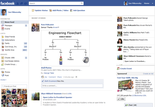
Whether or not you’re the type of person that likes the way Facebook is evolving their UI, Facebook is certainly leaving no stone unturned in their search for possible improvements. In a recent change, they introduced a panel on the right side that shows the user’s live activity feed and an ad. This side panel is initially a bit below the blue toolbar, and vertically aligned with the top of “Recent Stories” on the left:
Keep an eye on the upper-right corner. When the user starts to scroll the page, the left side of the page scrolls out of view, but the right side panel bumps up against the toolbar and remains docked there:
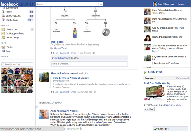
It’s hard to see in static images like this, but the right side panel remains entirely visible during scrolling, while the main portion of the page scrolls away under the blue toolbar.
This is a pretty subtle bit of work to finesse the treatment of a small number of vertical pixels above the panel. It would be have been much simpler to have the panel always docked up right under the toolbar. I’d hazard a few reasons Facebook used this technique here. First, they really want to focus user attention on the critical “Update status” button at the top. Keeping the feed panel below that line creates a nice wide band of white space that puts the eye’s focus on the “Update status” button. If the panel were initially docked right below the toolbar, that button would be harder to find. At the same time, permanently keeping a vertical gap of 30 pixels or whatever between the toolbar and the panel wouldn’t be satisfactory either. Facebook users spend a lot of time scrolling through this page, and that gap would probably stand out once the buttons above the news feed were scrolled away. Finally, it’s possible that Facebook had plans to show an ad or other content above the panel, and developed this solution for that purpose, then later dropped that ad but kept the solution.
Key attributes
- The persistent panel can either be to the side of the page content (as in the Facebook example above), or can span the width of the page content (as a toolbar).
- In both the side panel and toolbar cases, any content above the panel can scroll off, but the panel stays visible. In Facebook’s case, it just happens there’s only white space above the panel (and below the blue toolbar). Other sites put content above the panel or toolbar that they initially want the user to see at least once, but which can later scroll away.
- As the panel just begins to move out of view (off the top of the viewport), there may be a single jerky repositioning of the panel, but otherwise it’s quite stable. This is a significant improvement over earlier techniques to keep certain page elements visible. Some sites have tried to keep a side panel visible by using JavaScript to constantly adjust the panel’s position as the user scrolls, but the resulting performance is jerky and distracting. Yelp used to do this, for example, and tried to add a Map, stay put! check box that disabled the behavior, but ultimately concluded it was better to just drop this repositioning behavior entirely. In contrast, the technique here uses JavaScript to flip the document’s CSS position to “fixed”whenever the panel would otherwise be scrolled out of the viewport. This may jerk the panel into the correct position once, but thereafter the result feels very stable.
In general, I think this is a technique more sites, particularly advertising-funded sites, could productively adopt. For example, I’ve noticed that Google’s recent app redesigns are leaving them with much thicker sets of controls permanently stuck at the top of a page. It’d be nice if at least some of those controls could scroll away, leaving only the most important there all the time, and giving more room to the document I’m reading or editing.
PersistentPanel control
I’ve posted a PersistentPanel control to the QuickUI Catalog. There are two demos:
- A demo of a persistent side panel
- A demo of a persistent toolbar
Usage
Use a PersitentPanel to offer a small number of controls that are so important they should always be within quick reach. As shown in both demos, a PersistentPanel can be used when some content must initially appear above the panel so that it attracts enough attention. If this content can later scroll away, a PersistentPanel can ensure that the tools or information below the ad can remain visible. Without this requirement (for content to appear above the panel), it’s probably simpler to give the toolbar or panel a permanent position along the top, side, or bottom of the page.
Note: Both demos show an ad scrolling away. Facebook uses the same panel concept to keep an ad visible. Which way you go depends upon how likely it is that your users are going to click ads as soon as they see them, or whether you think the additional revenue from persistent ads makes up for the permanent clutter.
Implementation notes
The basic strategy here is to have the panel content sit within a placeholder element that can occupy the same space as the content whenever the content is switched to position: fixed. Without that placeholder, content below the panel would reflow in an unacceptable manner whenever the panel pops into and out of the normal document flow.
This is the first control I’ve done in this blog series that actually worked in IE8 without modification. Hooray! I usually start in Firefox, then test in Chrome and IE9. (I rarely test in Safari, as I’ve yet to create something that works in Chrome but not in Safari.) Then I take a deep breath, open the demo in IE8, and brace for some weird bugs. But this time IE8 played nice and everything worked. Good IE! Sit. Stay.
Although I’ve never seen a PersistentPanel dock against the bottom of the viewport, that case wasn’t hard to handle, so I added support for that as well.
In both the toolbar and side panel demos, I wanted to block out the space for an IAB universal ad unit, so I created a general AdPlaceholder control for that purpose. Now I’ve got a control I can use to quickly say, “Leave room for a Leaderboard here”, which is nice. This is one case where I’m thinking the control’s generic style should be a bit more colorful and distracting, to better approximate the visual noise of a page with ads.
Extra: In response to feedback, I've begun investing in documentation for using the QuickUI framework in plain JavaScript. People are often intrigued by the framework, but put off by idea of having to use a proprietary markup language (however elegant and efficient it may be). Everything in QuickUI, including all the catalog controls, is already accessible in plain JavaScript, although there's yet sufficient documentation for how to do this. So, in parallel with these control posts, I'm also working on documentation that addresses that gap. The first piece in that series is a list of the core principles which serve as the framework's foundation.