Where should the hit target boundaries for UI elements go?
Have you ever clicked on a portion of a screen you thought was interactive, but it had no effect? Or tapped on something expecting one action, but got another? Sometimes the issue is that the actual hit target for a UI element differs from what can be assumed from the element’s visual appearance. There are some subtleties in picking the hit target boundaries for a UI element, but I haven’t seen much analysis of the topic, so thought I’d share some observations.
Time was, if you wanted a UI element to be clickable, you put a thick 3D border around it:

The 3D border lets the user they can activate the UI element by “pressing” it with a pointing device. The hit target here could not be missed: it was the entire area defined by the rectangular border. This is clear, but those 3D borders add a considerable degree of clutter. The borders of the button above, from Windows 95, are actually quite refined from an earlier age of thicker, heavier, and uglier borders. (In the early 90s, I was asked to sit on a Microsoft task force in which representatives of different teams spent months arguing about what the standard button border treatment should be. The group fought over the correct width for a 3D border, over the placement of the apparent light source, and over the precise shadow treatment for corner pixels. See how the white line on the top dives into the black line on the right, so that the upper-right corner pixel is black? You have no idea how much blood was spilled over that corner pixel.)
As time passed, it became apparent there were other ways to suggest interactivity. For example, it turns out that an element’s mere existence can suggest interactivity: if you put a little icon in the corner of a window, and there’s no other obvious reason for why that icon would be there, a user can reasonably conclude the icon is an interactive element. Similarly, giving an otherwise flat piece of text a distinctive appearance (say, blue and underlined) can be enough to let a user know the text constitutes a clickable link. So borders began to drop away.
But once borders are removed, a question arises: exactly which pixels should constitute the element’s hit target? There seem to be several basic strategies:
1. Explicitly define the hit target with a boundary line. This is the strategy behind the 3D border shown above, although many other boundary treatments are possible. The boundary itself can be a line with an inner and outer edge, or it can simply be a change in background color. The boundary’s shape is nearly always rectangular, even if the corners sometimes appear to be rounded.
2. Implicitly define the hit target as being relatively close to the visible pixels for an irregular object, such as text or an icon.
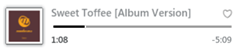
The little heart icon in the upper right of this control group is interactive — but exactly which pixels are clickable? If only the gray pixels were clickable, that would be a disaster; a user could click through in the middle of the heart and miss the target. (I seem to recall an OS long ago—Windows?—in which it was indeed possible to double-click through holes in desktop icons and not actually open the corresponding application.) [Update: David Buxton reports that the OS in question was actually the original Mac OS.] To avoid this problem, hit targets almost always surround the element’s visible pixels.
Since today’s UI tools still make it much easier to define rectangular UI elements than ones with irregular shapes, the most common hit target for an irregular element is a bounding box: the smallest rectangle that completely encloses the visual pixels in the icon or text. The bounding box for a very small element may have additional padding to make it easier to click or tap. Picking the degree of padding requires judgment; if the hit target extends too far away, a casual click or tap might inadvertently activate the element. This problem is especially acute with circular icons, where the corners of the rectangular bounding box can actually extend far past the visible pixels.
3. Create a row whose intervals define hit targets. By placing elements at regular rhythm in a visual grid, even irregular shapes end up implying a bounding box.
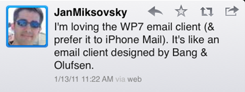
In this image from Twitter for iPad, the regularity of the inter-button spacing in the upper-right suggests horizontal cells that constitute bounding boxes for the icons they contain. In such a row, a button’s hit target typically extends halfway to its neighbors. That amount of padding is much larger than would be expected if one of these buttons were standing on its own. This approach was what allowed toolbar buttons to be some of the first buttons to lose their thick, 3D borders. It’s particularly useful on touch device, where large hit targets are beneficial.
Regardless of which hit target strategy you pursue, on a device with a mouse, you can employ mouse hover effects to clarify the hit target. The hover effect might reveal the actual hit target: e.g., showing the rectangular hit target boundary being applied to an irregular object. Or, in a case like that of a change in link color on hover (which still leaves an irregular shape), the appearance of the hover effect at least indicates when the mouse has crossed the hit target boundary.
This toolbar ribbon from Microsoft Word 2010 uses all three of the above strategies:
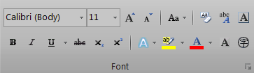
The combo boxes use visible boundary lines (the first strategy above). The toolbar buttons appear in rows with regular spacing (the third strategy). The visual rhythm isn’t perfectly regular; it’s somewhat altered by narrow group separators, as well as dropdown arrows that make some buttons effectively wider, but the inter-button spacing is consistent. Finally, the tiny icon in the lower right corner, which is not part of any row, defines its hit target with a bounding box tightly drawn around the icon’s visible pixels (the second strategy). In all cases, hover effects are used to good effect to clarify the hit target.
As the opening questions of this post suggest, there are cases where hit targets may not be apparent, and may confuse users. In these palette tabs from Adobe Photoshop CS5, consider the small dropdown icon in the upper-right corner:
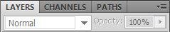
The dropdown icon is an irregular shape, which suggests a tight-fitting bounding box — but it’s also inside a rectangular boundary (the leftover space not used by the tabs), which suggests the whole rectangle is targetable. The former is actually the strategy which Adobe employed here, but a user might easily be led to click in the empty space to the left of the icon. This is clarified somewhat by a hover effect on the icon, but there’s still opportunity for confusion.
Confusion can also arise when hit targets overlap, or appear to overlap. Apple makes occasional use of (apparently) overlapping hit targets in iOS table views:
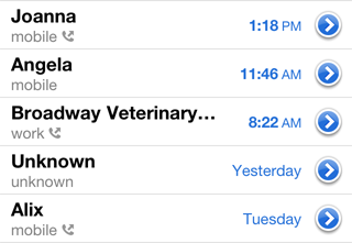
The blue disclosure arrow button at the right is a independently targetable UI element sitting on top of another, larger targetable table row. Tapping the disclosure button has a different effect than tapping the overall row. To me, at least, this is endlessly confusing. Sometimes I tap the blue button when I mean to tap the row; sometimes I want the effect of tapping the button, but tap the row instead, forgetting that action has a different effect. This confusion is compounded by the fact that slightly different disclosure arrows used elsewhere in other iOS table views to indicate that tapping anywhere in the row including on the arrow will bring up more detail. The table view UI above looks clean, but in my opinion, that comes at too great a cost. Perhaps the UI would be clearer if, for example, this table view displayed a vertical line, just to the left of the arrow, to carve out a square box on the right end of the row for the disclosure arrow (i.e., used the first strategy above instead of the second).
Hit target boundaries are rarely this confusing, however. In most cases, following one of the strategies above will lead to a UI people can readily pick up and use effectively.