UI Control of the Week: Microsoft Office combo boxes, still better than anything comparable in HTML
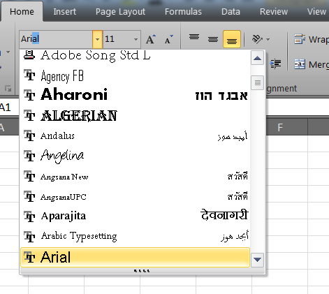
Sometimes the important user interface components aren’t the glamorous ones. One control the web could really use is a robust, extensible combo box. A standard dropdown combo box has been part of the UI lexicon for at least twenty years. I think I first heard about them when I was a summer intern at Microsoft in 1988 and some application group, perhaps the Microsoft Excel team, circulated a memo (on paper!) proposing their creation. (Perhaps there are antecedents in earlier platforms as well.) The gist of that memo then is the same as the core functionality now: let the user type whatever they want, but also offer them a list of choices they can pick from:

A combo box is one of those controls that seems like it couldn’t be that hard to implement, but in reality is ferociously complex.
Key attributes
- The user can type arbitrary text into the text box portion of the combo box. In some cases (such as the point size combo box directly to the right of the font combo box above), the text box performs its own validation (e.g., requiring that the input text be a number).
- The user can click the arrow button to dropdown the list of choices. When the user makes a selection from this list, the dropdown collapses, the choice is placed into the text box, and the text is left selected.
- The list provides AutoComplete behavior, even when the dropdown list is collapsed.
- While the choices in the list ultimately can be represented with a text string, the choices may be rendered in richer ways. In the image above, a font is represented by an icon (indicating the type of font: TrueType, etc.), the font name (rendered in the font itself), and additional information on the right in the local language of the culture associated with the font. (I have no idea what the examples on the right say in the image above, but their English equivalents elsewhere in the list indicate the recommended usage for the font: for headings, for body type, etc. UPDATE: Commenter Jonathan indicated that the characters next to the Hebrew font are the first several letters of the Hebrew alphabet. Presumably the other fonts show similar samples of the font’s alphabet.)
- If the current entry in the text box is present in the list, the corresponding list item is highlighted.
- The list provides extensive support for keyboard navigation. The user can toggle the list by pressing Alt+Down; they can navigate the list using arrow keys, Page Up/Down, Home/End; they can make a selection by pressing Enter; etc.
- The list is resizable.
- By default, the dropdown list is at least as wide as the text box. (This behavior is not shown in the image above, but can be found in other combo boxes.)
- The dropdown list is a transient popup that can be dismissed by clicking outside it.
It’s too bad there’s no support for a solid, extensible combo box in HTML, because it’s really quite an elegant control. Many controls on the web are described as combo boxes, but in fact are slightly different, or exhibit fewer features than standard Microsoft Office combo boxes.
- A dropdown list box created with a standard HTML <select> tag (without the “multiple” option) does have a dropdown list, but does not allow the user to type arbitrary text. Moreover, the resulting dropdown list can only render choices as plain text.
- A text box with AutoComplete does save the user some keystrokes, but does not give the user a way to see all the choices. The user may inadvertently (or intentionally) discover some of the choices through typing, but there’s no way to see the complete list.
- The HTML 5 spec defines a <datagrid> element which browsers can use to create a combo box. However, at the time of this writing, support for <datagrid> is lacking, even in the WebKit browsers. Moreover, the existing Mozilla implementation doesn’t offer the user a true combo box, but rather a text box with AutoComplete, and the choices are only represented in plain text (see both of the above points).
Usage
I’ve posted a reusable, extensible ListComboBox in the QuickUI Catalog. This accepts any array of items which can be rendered as choices in the list. By default, choices are rendered as a generic button (without borders), but any custom control class could be used as well.
As implied above, a combo box is well suited for any situation in which you want to allow the user to type arbitrary text, while at the same time offering them choices. The ability to render a choice in the list as a custom control gives you the option of adding more detail, or otherwise helping the user to make a more informed choice. Because a combo box is very compact in its normal state, it can be used in almost any place a text box can.
Although combo boxes have a long history in user interfaces, I’ve observed many usability studies where a user did not actually notice the dropdown arrow. This is most likely a result of the arrow’s small size and placement on the far right; I expect the problem is a bigger issue in very wide combo boxes. Perhaps as a response to this shortcoming, many web sites that have hand-rolled combo boxes automatically pop up the list of choices whenever the user clicks on the text box or moves the focus into it, rather than requiring the user to click the arrow. That actually seems like a reasonable improvement on Office’s combo boxes – it doesn’t seem to hurt much to have the list available, even if the user doesn’t want to use it – so I’ve included that behavior as well, with an option to turn it off.
Implementation notes
ListComboBox derives from the more fundamental base class ComboBox, which is the class that actually binds together a text input control, the dropdown button, and the popup containing the choices. ListComboBox happens to render the choices as a vertical, single-column list, but it’s easy to create controls that drive from ComboBox that present their choices in very different ways. (To present an example, I’ll follow up in a later post on how to create a traditional date picker by deriving from ComboBox.)
As a testament to the complexity of a combo box, I was forced to leave out certain aspects of the Microsoft Office example. In particular, full keyboard support would have taken to long to implement reliably in the time I allotted for this control. Along with keyboard navigation, I’ve postponed working on a means to highlight the current item in the list. The list box currently grows as tall as necessary to show all the choices; with long lists it would obviously be helpful to let the list grow no longer than the bottom of the viewport. Finally, the resizability of the list didn’t seem worth the trouble.
Per usual, various aspects of the control were much trickier to implement in IE. It proved challenging to implement the behavior described above in which choosing an item from the list closed the list and left the entire text selected. Attempting to affect the selection in IE after the list had been closed had the unfortunate side-effect of leaving the list open: programmatic inspection revealed that IE claimed the list was now hidden, when in fact it was still clearly visible. For now, in IE, when the user makes a choice from the list, the full text of their choice is placed into the text box, but is not left selected.
Possibilities
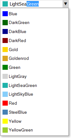
With ListComboBox in hand, it’s quite easy to create a new kind of combo box that works basically the same way, but uses a custom input area and a custom list presentation. In about an hour, I was able to throw together a ColorSwatchComboBox that lets the user choose CSS colors by name or value:

Both the input area and the list show color swatches next to color names. The list of choices is populated simply by feeding the combo box a set of strings (the color names). The ComboBox ancestor class puts the input area and the list together, along with the dropdown behavior. The ListComboBox parent class takes care of rendering of the choices as list items, as well as doing the AutoComplete behavior. So most of the behavior of this rather intricate color picker is handled by the base classes; the classes specifically associated with picking colors are quite simple. It’s this sort of UI factoring that should allow people to quickly create much richer web sites than with the raw HTML controls, even the ones in HTML 5.