Start with a stripped-down visual design and slowly add elements back in
La perfection est atteinte, non pas lorsqu'il n'y a plus rien à
ajouter, mais lorsqu'il n'y a plus rien à retirer.
Perfection is attained, not when no more can be added, but when no more can
be removed.
—Antoine de Saint-Exupéry
I love the spirit of this oft-heard design maxim, but it’s not a recipe for design, or at least not for iterative software user experience design. The statement suggests you could design something that’s more elaborate than what would be ideal, then chisel away at it until you’re done. That approach might work for a one-off product, but in an evolving software app, removing something is rarely an option. All apps have to evolve or die, and since a product’s feature set nearly always increases in complexity over time, virtually all UI evolution is additive. Indeed, it’s so rare that a designer gets the chance to actually remove something in version n+1 that it’s notable when it happens.
The only time you, as a designer, generally have the freedom to remove anything is before it gets into a user’s hands. After that, it’s almost a foregone conclusion that the feature will stay around for the life of the product. The only way to “remove” something is often to start over with a completely new product, typically on a new platform. The corollary of Exupéry’s claim in the UX realm might be that each product iteration should add as little as possible. You never know in which ways your evolving feature set will impose new design considerations, and what was perfect in version n might no longer be desired in version n+1.
With that in mind, when Cozi first designed a month view for our web client in late 2007, we felt that it was our last best chance to strip all the junk that normally clutters up month views (here, Microsoft Outlook 2010):
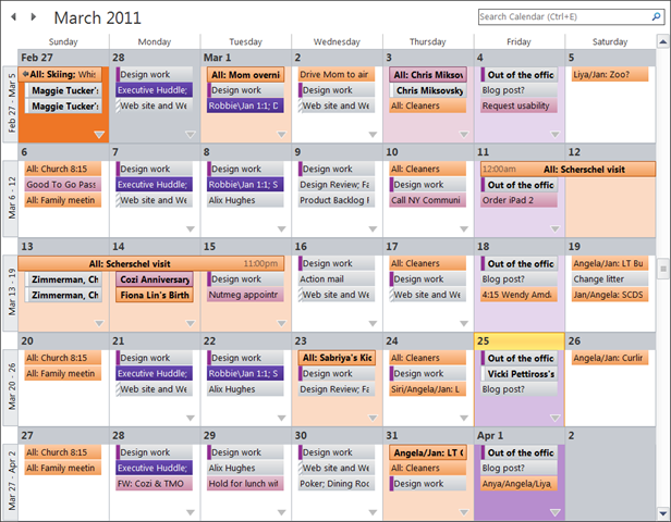
Aside from the obvious clutter, it’s worth pointing out that this view doesn’t even show the majority of the appointments actually in this user’s calendar. At this size, the user only sees the first few appointments each day (which may or may not be the most important). To see the rest, the user must click the disclosure triangles in the lower-right corner of each day—which take the user completely out of context to another view entirely. And, in my opinion, the category-based color coding that’s quite useful in day view unfortunately overwhelms the user’s attention in month view.
Since we were effectively starting over on a new platform (as noted above, the most likely opportunity to remove something), we did have the chance to remove stuff. Asking ourselves, “What would Tufte do?”, we produced a minimalistic initial design concept:
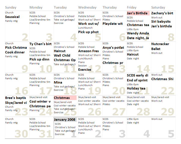
The main points were to remove the boxes around everything, eliminate background color for all but the most notable events, and to tone the gridlines way back. We also decided that a calendar view was almost useless if it hid appointments, and decided that the grid rows would vary in height to contain all the data. Since many people use months to conceptually map out their near future, we wanted to clearly delineate the month transitions with both boundary lines and a color change. We made the dates much larger (like those on many wall calendars) and pushed them into a background layer so that they could be easier to spot without consuming more room. And we maintained the Cozi precedent for showing non-routine appointments in bold so that they would be easier to spot.
By the time we shipped, we’d actually gone even further, removing all gridlines entirely. This is our initial web implementation:
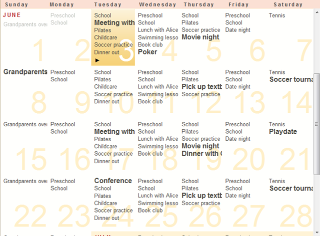
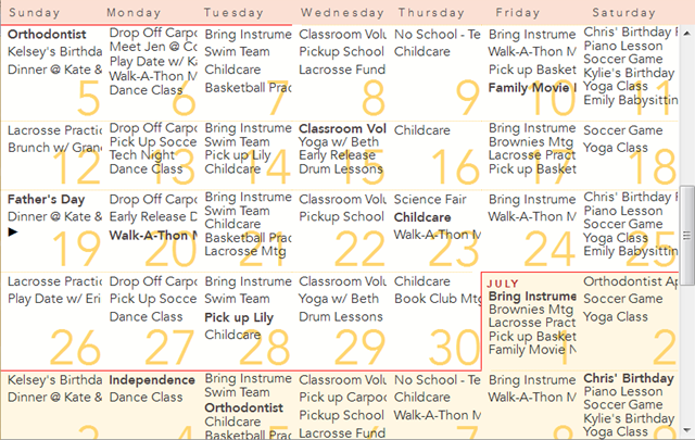
Users told us we’d gone too far, and that it was hard to figure out which appointments went on which dates. In a later version, we added the horizontal rules line in:
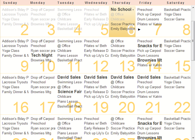
This design has generally performed well, although we receive a range of feedback. For example, there’s a certain type of user who really, really wants vertical gridlines, not just horizontal gridlines. We prefer to use negative space itself as a sort of virtual gridline. We clip long appointment text on the right end of a day cell, which creates a vertical line of negative space. This effectively separates one day from the next without the cost of additional clutter.
One issue not revealed in these images is that we hadn’t gotten around to coding the thicker boundaries between months as called for in the original design. We recently got around to fixing that, and now use both a thick line and a background color change to delineate months:
We’ve also made other changes made along the way, like a switch to a custom font, and dynamically vary leading to pack in more appointments into the same vertical space. We still haven’t implemented highlighting for special dates like birthdays or holidays, although perhaps we’ll get to that at some point.
We’re generally pretty cautious about adding something new.We’re cognizant of the possibility that the design might not work out for everyone—but the users who did like it would be unhappy if we tried to take the feature away. As said before, app UIs generally accrete new elements. This makes it challenging to deliver a clean design—and keep it clean.