MaxSquare: a fast and simple algorithm for maximizing photo thumbnail sizes
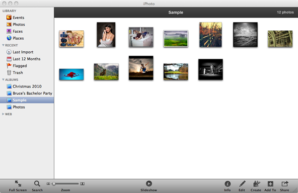
Is anyone else bothered by photo thumbnails that are smaller than they need to be?

The window above leaves plenty of empty space that could be better utilized to show the photos in more detail. Sure, there’s a Zoom slider in the toolbar, and I could fiddle with it to find the best zoom level that shows all the photos at the largest thumbnail size without forcing the appearance of scroll bars. One problem is that this zoom level applies to all photo albums, regardless of how many photos a given album has, so I have to keep fiddling with it to get the best results for any one album. When I switch to a different album with a different number of photos, I end up playing with the Zoom again until I’ve got the thumbnails at the biggest size that still lets them all fit. Another problem is that, if I change the window size at all, I have to play with Zoom yet again.
Virtually all photos apps, including OSes that display photos, work this way. Perhaps we’ve had manual Zoom sliders for so long we haven’t reconsidered their shortcomings. To me they feel cumbersome—like they’re making me do work the app should be able to do on its own. If I can manually fiddle with the Zoom slider to make the photos as big as possible and still fit all of them (or a good number of them), why can’t the app adjust the zoom level for me?
Perhaps the standard Zoom slider is a vestige of a time when dynamically scaling photos was slow, so apps (and users) didn’t want to do it that often. That’s no longer the case; CPUs and GPUs are such that photo scaling just screams these days. In many situations, and especially for small albums, I think a user would prefer to see the photos at the biggest possible size, to make effective use of their window real estate. This might not be the case for every user or for every app, but surely this would be useful in many cases.
An interesting question is: given an arbitrary canvas size, and a collection of n photos with various aspect ratios, how big can those photos be shown and still have them all fit? This turns out to be an issue of how to best divide the screen into squares. Squares are generally used to display thumbnails to account for the fact that photos have different aspect ratios. The bigger the square given to each thumbnail, the bigger the average rendered thumbnail can be. So the real question becomes: what grid dimensions (number of rows and columns) will divide the canvas into the biggest squares?
This line of thinking led to an algorithm I call MaxSquare which calculates the optimal grid size for a collection of n images such that each image is allocated the largest possible square cell. It seems to work well, and I’d love to see it find some real use.
In that spirit, I’ve put together a MaxSquare demo and posted the source. The demo is written in QuickUI, but the core MaxSquare algorithm is in a standalone JavaScript file with no dependencies. The demo is especially fast under Chrome, and works nicely under Firefox and Safari as well. (The demo currently doesn’t run in IE; while MaxSquare itself performs fine under IE, the demo’s use of jQuery.get seems to have trouble retrieving the sample photos from Flickr.)
Once you’ve opened the demo, resize the browser window to see the photos automatically zoomed to use the available space. You can also adjust the “count” parameter on the URL to view a smaller or larger number of photos. E.g., enter count=24, and as you resize the browser, you can watch the column and row dimensions jump between the various factor pairs of 24 (8x3, 6x4, etc.).
To walk through some examples: Given a window with a 2:1 aspect ratio and twelve photos (drawn from Flickr’s Interestingness set), MaxSquare renders the photos in a 6x2 grid:

When the window is resized to approach a 4:3 aspect ratio, MaxSquare appropriately determines that a 4x3 grid is better, again giving each photo the maximum square possible:

When more photos (say, 30) are added to the same 4:3 window, MaxSquare determines that a 6x5 grid gives the best results:

For large albums (or small window sizes), the thumbnails can be too small to be useful, so there’s still a role for scrolling. This could be governed with a minimum thumbnail size: once the thumbnails hit that size, a scroll bar kicks in. The minimum thumbnail size could be chosen by the user. In fact, maybe that’s the right use for a Zoom slider: to pick the minimum thumbnail size which the user finds acceptable.
If you work on an app that presents photo or image thumbnails, try using MaxSquare in your UI and let me know what you think; I'd love to hear if it works well in practice. (Or if you like the demo, and have a favorite photo app that could benefit from this behavior, ask the app makers to consider picking this up. It's free, and open!)