UI Control of the Week: HighlightEffects to expand a highlighted item without affecting layout
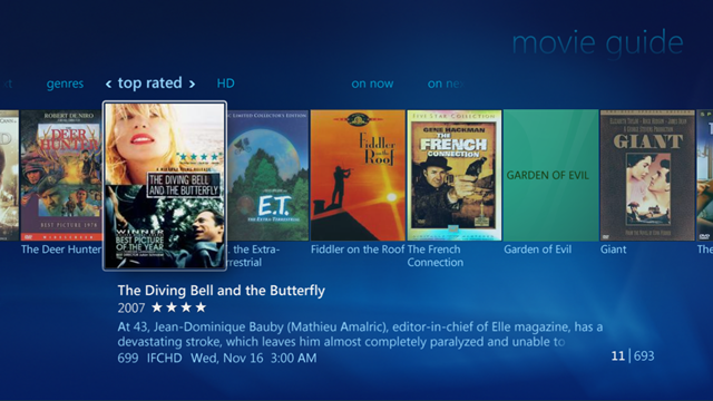
Johannes Tonollo’s excellent Meaningful Transitions site does a thorough job cataloguing animated transitions that can be used to convey specific messages to a user. One animation I’ve always liked was expanding an element on hover, as in this screen within Windows Media Center:

Key attributes
- When the mouse hovers over a list item (or the keyboard focus moves to it), the item becomes highlighted.
- The highlighted item animates in size, expanding in every direction. It covers the adjacent items. The other items (the ones which are not highlighted) retain their position.
- Bringing the highlighted item forward conveys the feeling that the item is ready for use or instruction, like a volunteer in a line of people stepping forward. In this case, the highlighted movie is brought forward to indicate that it’s ready to be played.
- When the highlight moves to another item, the previously-highlighted item animates back to its original state in parallel with the highlight animation being played on the new item.
For more discussion of this specific expand-to-highlight transition and some live demos on the Meaningful Transitions site: click Categories, then click Highlight, then Expand to Highlight.
HighlightEffects
I’ve posted a HighlightEffects control to the QuickUI Catalog that permits the easy creation of animated effects such as expand-to-highlight. Here’s a sample showing the result of moving the mouse over the second of five items:

Usage
Use HighlightEffects with lists to help the user see which element is highlighted, and to suggest that the highlighted item is ready for use. You can apply a variety of highlight effects to achieve different results. The one shown here – expand to highlight – effectively draws the user’s attention to the item without being too distracting.
Implementation notes
I thought it would be elegant to let the UI designer/developer define the package of highlight effects as CSS in a JavaScript property map, just as in jQuery’s $.animate() function. The HighlightEffects control uses this property map to determine which CSS rules will need to be un-done when the highlight moves away from an item. E.g., if the property map includes background-color, then the element’s original background-color is saved; when the highlight is removed, this original background-color is restored.
The main challenge with the expand-to-highlight effect is keeping the layout of the page steady as the highlight moves around. To get the highlighted element to pop out, we need to change its size and z-index, and apply absolute positioning. Without that, the expanded item would push the other items in the list to the sides. However, the use of position: absolute will remove the item from the layout flow. To keep things from moving around, we can empty the same technique discussed last week for PersistentPanel: wrap each list item in a placeholder of the item’s normal size. This placeholder remains in the layout flow even when the item is highlighted, so nothing behind the highlighted element will move around.
In playing around with various animation effects, it was clear that some arrangements animate more smoothly than others. For example, I originally tried to keep the text of the elements centered, but the repositioning of the text during resize was a bit jittery. Animations which change size, position, and color all seem to behave fairly smoothly on the devices and browsers I’ve got. It turns out that jQuery’s built-in $.animate() function doesn’t support color animations out of the box, but that ability can be supplied with a plugin like Color Animation.
As was the case when writing the post on ListComboBox, I left out keyboard support, so this currently only works with a mouse (and touch, although the effect isn’t as nice). My plan is to follow up with a ListBox control that can handle moving a selection with a keyboard, then update HighlightEffects to work with that.