A simple experiment to judge the quality of your link text: make the surrounding text invisible
While reviewing UI text recently, a question arose regarding exactly which words in a sentence should be used as a hyperlink. My standard tactic to cut through this design problem is to ask: what if your user were blind? Assume they have a screen reader that, by default, is going to let them tab through just the links on the page and read the link text aloud to them. Which link text would produce the best experience?
At Microsoft I was first exposed to the proposition that creating products with universal access in mind (i.e., making the product’s features accessible to users who were visually impaired, hearing impaired, motion impaired, etc.) would also produce benefits for all users. I’d love to see a rigorous defense of this proposition from an economic point of view: could resources invested toward universal access have produced better products if those resources have been invested elsewhere? But even without that defense, I do believe this mindset opens up new ways of looking at design problems.
Although the W3C published its guidelines for creating accessible web content in 2000, including the specific admonition that “click here” is a bad link choice, it’s nevertheless common to find this still done over a decade later. Here's a random news article:
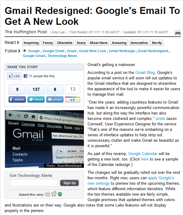
To get an approximate sense of how this page might appear to a blind user (via the default screen reader experience) you can remove all the text that surrounds the links. You can easily do this on almost any web page by using your browser’s developer tools to change the body and paragraph text color to match the background color:

With the body text rendered invisible, the use of the link text “here” in “Click here to see a sample of the new Calendar redesign” jumps out. If the link text had been written without depending on the surrounding text, perhaps better link text might have been selected: e.g., “See a sample of the new Calendar design”. The link text “wrote” could be similarly improved.
I think it’s striking that, even when one tries very hard to focus on just the link text in the first image, you still don’t get the same experience as the second image. The second image makes it impossible for your eyes to grab a little bit of context from the surrounding text.
Perhaps the persistence of weak link text can be partially attributed to the assumption that web usability guidelines for, say, visually impaired users, apply only to companies or organizations that focus on those users. In this case, following the guidelines for link text (and using link titles that appear on hover, etc.) can benefit all your users.
I can’t pretend to understand or fully appreciate the user experience of blind users. I can speak to the question of what a typical user does when scanning UI text: they tend to focus on the links. Writing as if the surrounding body text were going to be invisible can help guide you in the selection of good link text.