Stop abusive task list UIs: highlight imminent tasks, not overdue ones
Most task list management applications abuse their users by displaying overdue tasks in red text. The original, noble intent is to use red, a highly noticeable color, to draw the user’s attention to a task they must have missed so that they can take immediate corrective action. The reality (as best as I can determine it) is that tasks usually fall overdue for reasons that have nothing to do with the user’s lack of attention.
For example, a person might assign an arbitrary due dates to a task, in the belief that this self-imposed deadline will goad them into action. Unfortunately, since the person is well aware the date is completely arbitrary, when that date arrives, there’s no reason they can’t push the task out one more day. A sort of personal time management mathematical induction kicks in: day after day, the task can be pushed out one more day, ad infinitum. The person will likely leave the original deadline untouched—why bother? Even if they assign a new date, that date will also be arbitrary, and time will eventually catch up to the new date as well. The inevitable result, for all but the most disciplined user, is a sea of red ink:
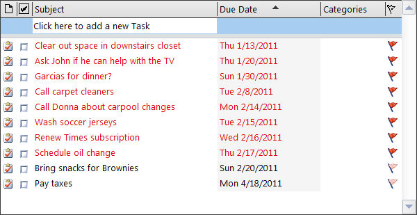
This is software UX at its soul-crushing worst. One technique for evaluating a UX design is to imagine a human being performing the same task and in the same manner as the software. So ponder the question: who would want a personal assistant who behaved like this? Someone who was utterly silent about a task until after it was due, and then began ranting: “You’re late! You’re late! You’re so completely late! Everything on your list is late! You’re pathetic! You can’t get anything done! You’ll never get anything done!” No one would put up with this abuse—from a person. But millions of people put up with this abuse from software.
When Cozi created its initial area for To Do lists, I determined to avoid this UI and come up with something more humane. I would rather have delivered a bare-bones UI that met at least some people’s needs than one which purported to meet broader needs, but did so in an obviously terrible way. Without time to do better than the above, we shipped our original To Do list implementation without support for dates on tasks. As an alternative to assigning arbitrary dates, the design allowed people to drag-and-drop tasks to prioritize them.
Interestingly, when I observed paper To Do lists in user homes, tasks were largely free of dates. Penciled dates that did appear were often externally imposed deadlines. Those were meaningful, and the users knew it. Such dates were probably motivating. Why, then, do people apply arbitrary dates so readily in task management software? Probably just because there’s a “Due Date” field. The field’s there. They feel compelled to fill it in. The abuse ensues.
Now let’s reconsider our human personal assistant, and ask how we’d really want them to work with us. We want someone who will give useful advance notice of a task before it becomes due. This assistant should recognize that, if a deadline has passed with a task still incomplete, perhaps that’s not the end of the world. Either the task just wasn’t that important, or we couldn’t get it done by the original date (and are taking steps to remedy the situation already), or we just couldn’t work up the energy to do it (but still mean to). Our clever assistant recognizes that can’t know which one of these is the case, and takes the most prudent course of action—it shuts up.
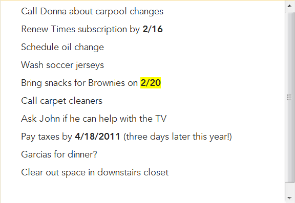
This line of thinking gave rise to the upgraded To Do lists design which Cozi recently deployed:
Key points:
- There’s no Due Date field. For tasks with external deadlines, users can type a date anywhere in the text of the task. Cozi parses out the date and formats it in bold to confirm recognition.
- Cozi highlights imminent tasks: tasks due within the next week. The yellow highlighter effect is used to draw attention without raising alarm (the way red can). The user interface says: “All is well; just pay particular attention to these few tasks.”
- Cozi does absolutely nothing special with overdue tasks. You’ve had a week’s notice of the imminent task, so once the date passes, the task's priority is entirely for you to determine.
- A side effect of the above point is that the the highlighted tasks can’t pile up. Because the highlighting gets dropped from past due tasks, the overall “volume” at which the task list speaks to you is relatively constant from day to day.
- For extra reference, Cozi puts tasks with dates on your family calendar so you can track them there as well.
While not perfect, I think it’s a big step forward towards a more humane task management UI. If your own application includes any sort of date-based view, and it’s currently yelling at users in red text, consider turning down the volume on the “overdue” representation and focusing instead on proactive highlighting of imminent tasks.