UI Control of the Week: a PanelWithOverflow to create toolbars with overflow menus and maximum layout efficiency
Applications with toolbars should generally give the user access to all toolbar commands, even when the window isn't large enough to show all of them. Wrapping a toolbar's contents is one possibility, but this is usually avoided because it begins to steal too much space away from the application's main content area. The standard technique is to have the commands which can't fit horizontally overflow into a dropdown menu.
This technique is used, for example, in the Bookmark (or Favorite) toolbar in every mainstream web browser. Here's Safari:
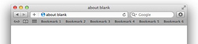
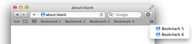
When the user makes the window too small to see all the bookmark buttons, the buttons which don’t fit overflow into a dropdown menu:
Key attributes
- The toolbar contents (usually buttons) are arranged horizontally.
- Items which don't fit are clipped entirely; no item (e.g., Bookmark 5 in the toolbar of the second image) is ever shown partially visible.
- If there are any items which don't fit, an overflow menu button appears. The standard is for the button to show a pair of right-pointing chevrons (»).
- Clicking the menu button produces a dropdown menu containing the items which don’t fit in the toolbar.
- Items may appear slightly differently in the menu than they appear in the toolbar. In the Safari example above, plain-looking toolbar buttons become vertically-oriented menu items with icons. Beyond the change in appearance, the items generally behave the same in the menu as they do in the toolbar.
- As the user resizes the window, the control recalculates whether an overflow menu (and therefore a menu button) is necessary.
This overflow pattern is apparently so successful that the exact same user interface — down to the use of right-pointing chevrons to indicate overflow — is used by Chrome, Firefox, and Internet Explorer. The funny thing is, each of these other browsers fumble one small aspect of the behavior: determining whether or not to allocate room for the menu button.
- Google Chrome always allocates room for the menu button, even when the button isn’t visible. This means there are cases where the toolbar button would have fit, but the invisible menu button is still taking up room, which forces overflow to be triggered a bit earlier than strictly necessary. For comparison, in the top screen shot, Safari can fit the button for “Bookmark 6”, but in the same situation, Chrome will force that button to overflow. Effectively the user has something like 10-20 pixels or so less room in Chrome for their browser bookmarks.
- Mozilla Firefox is a bit smarter, but inconsistent. It doesn't allocate room for the menu button if the menu button's not currently visible, so Firefox can squeeze in an extra bookmark in cases where Chrome drops it. However, once the menu button is visible, the menu button takes up room — even when hiding the menu button would now leave enough room to show the last bookmark!
- Internet Explorer 10 gets things right — but get points off for incessantly flickering the menu button during a window resize. Presumably on any window resize, IE is always hiding the menu button, then re-showing it if it’s needed. This doesn't feel nearly as solid as Safari’s treatment, which smoothly moves the menu button left and right as the window resizes.
These are all small points, and I doubt most users of these browsers have ever noticed them. Still, this is not ideal. I think this is what happens when designers and developers, even those on huge software teams, are forced to roll their own solution to a common problem. Either they don't notice the issue or, if they do, don't feel like it's worth taking the time to fix.
And here we're talking about large, production web browsers built upon rich client-side UI frameworks. Many web sites aren’t building on a rich UI framework, so they’re forced to code everything by hand. The result is that web application toolbars are typically far clunkier. They often blithely assume the user’s window will be wide enough to show all the commands, and clip or wrap the buttons when the window is narrow.
A correct, solid implementation (like Safari’s) should be available to any site that wants it — by coding the correct solution in a reusable component. By treating something as basic as overflow as a component in its own right, it suddenly becomes worth lavishing the attention and effort to achieve maximum layout efficiency, including properly handling those last 10-20 pixels, because lots of users across multiple apps will benefit.
PanelWithOverflow
I've posted a basic PanelWithOverflow control to the QuickUI catalog.
As discussed above, use PanelWithOverflow in situations like toolbars where you want to constrain the height of a toolbar while simultaneously guaranteeing access to all the toolbar's commands at a wide range of window sizes. For a toolbar that docks to the top of the page, nest the PanelWithOverflow inside a PersistentPanel.
Implementation notes
The simplest way to implement this behavior in a web control seems to be to force the control’s contents to appear on the same line (white-space: nowrap), then calculate which items completely fit. The ones that don't are explicitly made invisible (using visibility: hidden) to avoid a partially-clipped item.
In coding this, it became obvious why Chrome and Firefox browsers display the layout oddities they do. To decide whether the nth item can fit, you need to know how much room is available for it, which depends on whether or not the menu button is going to be needed — which in turn may depend on whether the next item to the right (item n+1) will fit. The layout logic gets much simpler, however, by applying the expedient of looping over the control's contents from right to left. If item n+1 is going to overflow, you know for sure that you need to allocate room for the menu button when considering item n.
Just because this QuickUI control avoids a small layout bug in the various browser toolbar implementations above doesn't mean it’s necessarily better than those implementations. Those toolbars have many more features (e.g., customization), and surely have received much more testing overall. Still, I’d argue that the QuickUI implementation is a reasonably solid start on an open, component-based solution.