UI Control of the Week: standard Collapsible panel for content that can be put away
It's fairly common for a UI to present some content whose value to the user may be unknown or may change over time. To avoid permanently distracting the user, the app can show the content in a panel the user can collapse. Consider the following two gadgets from Google’s Gmail client, the first expanded, the second collapsed:
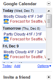
Perhaps the user leaves the calendar gadget open because they find the considerable clutter it adds is worth its informational value. The “Invite a friend” gadget, however, isn’t worth much to them, so they collapse it and leave it that way. In the rare event they're suddenly inspired to invite a friend, it's easy enough to re-expand that panel to bring the UI back.
Key attributes
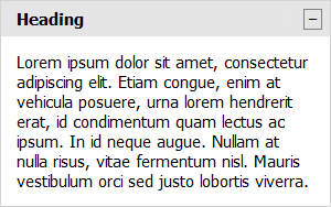
- Clicking anywhere in the heading collapses the panel's content, leaving only the heading visible.
- The heading generally reacts to mouse-over by changing the cursor to a hand. The heading may also react in other ways, e.g., its background color may change.
- In many cases, including the above example, the heading includes a small button element on the far right. Clicking this button has the same effect as clicking the heading itself, but the button offers a more obvious affordance of interactivity.
- If present, the button's icon or contents generally reflect the panel's collapsed or expanded state. The button may show plus and minus signs or down- and up-pointing arrows. The icon usually suggests what will happen if you click it (e.g., if you click the plus, you’ll get more UI), rather than indicating the current state.
- The transition between the expanded and collapsed state is usually animated to suggest that the content is rolling up into the heading, where it will be stored until the user decides to retrieve it again.
- Many applications save the collapsed/expanded state for future sessions. In effect, the collapsible panel is offering a persistent user-configurable option, without any of the overhead of a separate Settings or Preferences area.
Collapsible and CollapsibleWithHeadingButton
I've posted a Collapsible control to the QuickUI Catalog that offers the bare-bones functionality. Because the pattern of including a little button on the heading’s right is so common, I also added a subclass called CollapsibleWithHeadingButton:
Use these Collapsible classes to confer a limited degree of customizability to a home page or information pane on the side. If most users are likely to want the information most of the time, collapsible panels might not be necessary. However, in cases where there's a fairly even split between users that want a given type of information and those that don't, such a panel can be a reasonable compromise. Similarly, if there are situations where an individual user may change their mind about whether they want the information (because it's useful) or not want the information (because it's distracting), consider a collapsible panel.
Implementation notes
To avoid requiring lots of graphic resources, for many of these controls I use text glyphs as button icons. Here a plus sign (“+”) is used in the collapsed state to indicate the content can be expanded, and a minus sign (“−”) is used when the content can be collapsed. I've seen some sites that, perhaps unintentionally, use a hyphen (“-”) instead of a minus sign. A hyphen is too narrow, and ends up feeling like a weak counterpart to the plus sign. (Google avoids this by using a bitmap image, probably for tighter control over the final result across different browsers.)
One thing that feels a bit unresolved about gadgets like Gmail's, which offer a heading button on the right, is that the button and the heading text both do the same thing, but that shared behavior is not obvious until you click. My general feeling is that multiple controls that respond the same way to a click should respond the same way on hover. In this case, I arranged for mousing over the heading text to force the application of the button’s hover effect, even if the mouse isn’t actually over the button, as an extra cue that clicking either UI element will accomplish the same result. See Where should the hit target boundaries for UI elements go? for more thoughts on reflecting hit target boundaries.
The animation effect includes a combination of a slide and a fade: the contents fade out during collapse, and fade in during expansion. To me, this enhances the effect of the content rolling away and unrolling again. The fade effect is more pronounced when there’s a large block of content.
Aside: I've invested work in reducing the number of files necessary to use controls in the QuickUI Catalog. It used to be the case that several files were required to use all the controls, but the whole catalog has been consolidated into just one pair of files: quickui.catalog.js and quickui.catalog.css. As described on How to use these controls, you can include that pair of files directly. You can also follow the instructions for cloning the quickui-catalog repo and choosing the specific controls you want. Among other things, this makes it easier to try out the controls. For example, here's a jsFiddle that uses the QuickUI catalog (including, for the time being, the CollapsibleWithHeadingButton control shown above).
flow|state will off for the next few weeks for the end-of-year holidays. See you next year!