Negative space in a user interface is priceless — so it inevitably gets filled up
A lot of my time as a design executive is spent defending the value of the unquantifiable. Business pressures argue for design compromises with some quantifiable and significant ROI (Return on Investment). But as Adaptive Path put it in their report on Leveraging Business Value: How ROI Changes User Experience, “It’s impossible to measure ROI for user experience with a simple equation that can be applied across a wide swath of companies and projects.” And, in my experience, perhaps the hardest thing to quantify is the value of negative space: the space between your user interface elements.
Typically brand new apps have lots of space, because UI elements represent features, which require code, which requires time and money. With time and money, however, the app evolves, and the empty space is quickly filled in with new features. The availability of room, in fact, can contribute greatly to the decision to place a button in what was previously empty space. “Users are asking for this feature, and it looks like there’s room for us to squeeze in another button on the toolbar, so let’s do the feature and make it a toolbar button.”
I rarely hear discussion about setting aside room in a user interface for the absence of user interface elements. Speaking both aesthetically and from a usability perspective, negative space can be highly valuable in an interface. Used effectively, it can create a sense of calm, balance, manageability, and competence. It can help guide the user’s eyes across the page towards what’s important. The presence of space can separate things that are different; the absence of space can join things that are similar.
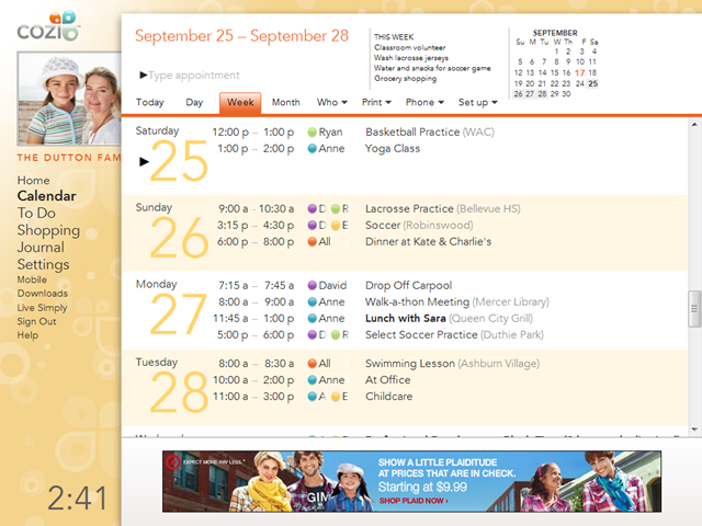
Cozi’s current web page template leaves some significant negative space in the lower left (above the clock), as well as a bit in the upper right. Both those spaces vary in size depending on the window dimensions. (The calendar view itself also has considerable space, but that’s highly dependent on which view is selected and how much data is on the calendar.)
The challenge is that negative space doesn’t look like it’s doing anything. It can appear inefficient—like a lost opportunity. In a business driven by display advertising, there is pressure to make pixels generate revenue. It’s nearly impossible to count the value that effective negative space contributes to a user experience, but it’s very easy to estimate the rent those same pixels might generate if they were converted to display advertising inventory. The thing is, those empty pixels are doing something. The user experience would be different—worse—if the space were filled.
(The Leaderboard ad in the image above is actually a different problem. That ad isn’t filling space that was previously empty; it’s consuming space that would otherwise be used to show user data. See my earlier post on why it’s easier for users to image hiding an ad than completely redesigning a UI.)
Negative space is hard concept to love, but it turns out that most people demonstrate an intuitive grasp of negative space in the context of their own homes. In home after home, you can observe that the occupants have very carefully hung pictures or paintings on the wall so as to give each piece space to breathe. You will rarely see a bunch of paintings crammed together on a wall. Most people effectively use negative space with no training beyond the casual observations of positive examples in other homes, museums, offices, or anywhere art is displayed. At some subconscious level, people must be so sensitive to the value of negative space that they are willing to do work to preserve negative space in their own surroundings.
The defense of the negative space in a user experience, however, is a never-ending battle. New proposals to “fill that space in” with a new feature, ad, or other element arise on a monthly, sometimes weekly, basis. Defense of the open space is wearisome but necessary. Once that’s space is gone, it’s usually gone forever.