UI Control of the Week: basic ListBox, and how keyboard navigation is never as simple as you think
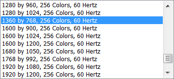
The standard list box is such a pervasive element of traditional client GUIs that it’s surprising how hard it is to find a good list box implementation on the web. A typical Windows example:

Your browser will probably render a standard HTML <select> tag as a dropdown list box, but as far as I know, there’s no standard way to get a in-line list box that supports single selection. (You will get a list box if you set the select tag’s “multiple” attribute, but then it will let the user select multiple items, which may not be what you want.) And all browser list elements can only render list items as plain text; as in the earlier discussion of combo boxes, none of the standard web list boxes support a rich presentation for a list item. Most sites create their own “list box” elements as divs with clickable inner elements. This usually means they end up without good keyboard support: e.g., you can’t move the selection up or down with the Up and Down arrow keys.
Key attributes
- In the most basic type of list box, zero items or one item can be selected at a time. It’s always possible to change which item is selected, but once a selection has been made, it’s often not possible to revert to the state where no item is selected. There are other types of list boxes that support multiple selection.
- When the list box has focus, pressing the Up key moves the selection to the previous item.
- Pressing Down moves the selection to the next item.
- Pressing Home (Fn+Up on the Mac) selects the first item.
- Pressing End (Fn+Down) selects the last item.
- Pressing Page Up (Option+Up) scrolls up a page. Or does it? See below.
- Pressing Page Down (Option+Down) scrolls down a page.
Pop quiz: Off the top of your head, do you think you can describe exactly how Page Up and Page Down should work?
You’d think they would just scroll the viewport by one page height in the indicated direction. That’s the basic idea. However, the actual behavior of these keys in a list box is more intricate. Consider Page Down. On Windows, if the currently-selected item is somewhere in the middle of the viewport, then hitting Page Down selects the control currently visible at the bottom of the viewport. That is, the first press of the Page Down key in a list generally doesn’t scroll the list at all! It’s only once the selection is already at the bottom of the viewport that the list scrolls by one page. Page Up works the same, only in the opposite direction. On the Mac, the standard behavior is different: Page Up and Page Down scroll the viewport by a full page, regardless of selection position, but these operations don’t move the selection. (I’m not sure why. To me, at least, the Windows behavior feels more useful.)
Another complexity of keyboard navigation is tracking whether the list actually did anything in response to a key press. If it did, the list box needs to stop propagation of the keyboard event. But if the list box didn’t do anything with the key (say, the user hit the Down key, but the selection was already sitting on the last item), then the event should bubble up and, for example, scroll the entire page instead of just scrolling the list box.
Finally, following any keyboard navigation, the list may need to adjust its scroll position to ensure that the currently-selected item is completely visible.
I think it’s safe to say that keyboard navigation is a good and desirable thing: it can make certain tasks easier and faster, and it makes a UI more accessible. I can’t see a significant downside to letting a user navigate a list with a keyboard, as the UI doesn’t get in the way of mouse or touch users. So how come more sites don’t have list boxes? It’s a bit of work to handle the keyboard, but not that much work. I think one problem is that it’s not free. If someone’s on deadline to produce a list of items for a web page, even supporting the selection and navigation described above is going to take them some time, and maybe they’re not going to get any immediate credit for going that extra mile. This is one reason I’m hoping a good UI framework will help make basic usability improvements in controls easier for any site to pick up.
ListBox
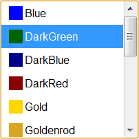
I’ve posted a basic, single-selection, in-line ListBox control to the QuickUI Catalog:

This ListBox control is also used as the dropdown portion of a ListComboBox.
Usage: Use an in-line ListBox in situations where picking a single item from a list is a significant part of the UI’s task. A list box will consume more real estate than a combo box, but also requires one less click to select an item. A list box also makes at least some of the choices visible to the user without forcing them to first interact with the control; this can make the task of selection more approachable. A standard list box doesn’t allow the user to add a choice of their own; for that, a combo box is the standard answer.
Implementation notes
As might have been expected from the above discussion, the trickiest aspect of this control was the keyboard navigation, especially the behavior of Page Up and Page Down. For now, at least, I’ve let Page Up and Page Down work the same on the Mac as on Windows. (If anyone can explain to me a common situation where the Mac’s standard viewport-scrolling behavior is better than the Windows behavior, please let me know!)
On the plus side, now that the QuickUI Catalog finally has a rudimentary ListBox control, I was able to drop a ListBox essentially unmodified into the ListComboBox control to give the latter basic keyboard support. ListComboBox originally used the more primitive List control, which simply renders a JavaScript array as a set of controls. ListBox builds on List, so it also has the ability to render array items as controls; to this it adds the concepts of single selection and keyboard navigation. A core promise of a control framework is code reuse. In this case, there was no need to reproduce single selection and keyboard navigation again in ListComboBox, since ListBox already provided it. It’s wonderful when that object-oriented promise can actually be realized.
One thing I left off this time around is making it easy to have a ListBox be an integral number of lines tall. If you look carefully at the bottom of the above ListBox shot, the bottom row is just a bit clipped. It would look better if the list box were just a bit taller, so that an integral number of lines could be completely visible. I also began experimenting with a multiple-selection list box, but that’s a fairly intricate bit of work all on its own.
Thanks to those of you who wrote expressing interest in using QuickUI with plain JavaScript (i.e., without markup). I’m continuing to work on that, and hope to have some basic documentation in place by year’s end. Stay tuned.