If your user got the result they wanted, what do you care if they didn’t do it the most efficient way?
May 6, 2011
Probably the most painful experience I have on a regular basis in my professional life is watching usability studies. Last year I became a big fan of UserTesting.com for conducting remote, unmoderated usability studies. In my experience, it’s been ridiculously fast, highly informative, and very inexpensive. Years ago I could only experience the agony of watching a floundering user by sitting behind a one-way mirror in a very expensive usability research lab. Now I can recapture that agony for only $39.
The most painful aspect of watching a usability study is seeing a well-intentioned UI — one you were sure would be a success — actually cause a user emotional distress. But the second most painful aspect of watching a usability study is seeing a user successfully accomplish a task in 10 steps which they could have accomplished in two. For example:
-
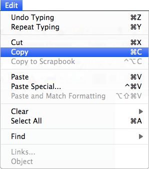
A user wants to copy and paste a word. They carefully mouse down at the
beginning of the word, slowly drag across the word, then let go. They move
their mouse waaaay up to the Edit menu, click, then slowly read down the
list of menu items until they come to “Copy”. They select Copy. Whew,
they’re halfway there. They reorient themselves, and then click where they
want to paste the word. They move their mouse waaaay back up to the Edit
menu, click, then slowly read down the list of menu items until they come to
“Paste”. Click. Voilà!
- A user wants to move a window. They drag the upper-left corner of the window to a new location. They then drag the lower-right corner of the window to a new location, taking care to make sure the window is now roughly the same size it was before.
- A user wants to browse to a URL. They click their browser’s Home button to return to a page that has a Google search box. They type the URL into the Google search box, then click Search. Google displays a long page of results (with ads!). The user finds a link to the desired URL at the top and clicks it.
It’s impossible to watch these events and not want to rush in and tell the user about how to use keyboard shortcuts, drag a window’s title bar, type in the address bar. Hey, user, you could be so much more efficient! This instinct, while natural, and somewhat altruistic, also has at its core some compulsive behavior. Software developers obsess a bit about Whitespace, The Silent Killer. Software designers obsess a bit about user inefficiency.
To be clear, being on the lookout for such inefficiencies is an absolutely critical design skill, as is being able to iterate towards a design that’s more likely to encourage efficient behavior. It’s worth asking, however: if the user got what they wanted, and is satisfied with the time and energy they spent, why should the fact that they ignored a more efficient route have to be troubling?
Changing a design—even for the better—has its own costs: the designer’s, the engineer’s, the tester’s, the support staff’s, not to mention the existing users’ time to learn something new. And sometimes a blunt attempt to force-train the user a more efficient path is worse than the original problem. (Remember all those “Tip of the day” dialogs that used to pop up on application startup to tell you all about a keyboard shortcut the app’s designers thought you really should know?)
Sometimes, however, it’s best to leave well enough alone. It can be enough to rely on the user’s ability to follow the information scent down a path that’s circuitous, long — and successful. If a feature’s design is generally letting users accomplish their goals, you probably have more urgent design priorities to address.
I’m always interested in hearing cases like this, where a user followed a circuitous but ultimately successful path. What’s the most extreme case of this you’ve seen?