UI Control of the Week: TabSet for traditional tabbed pages
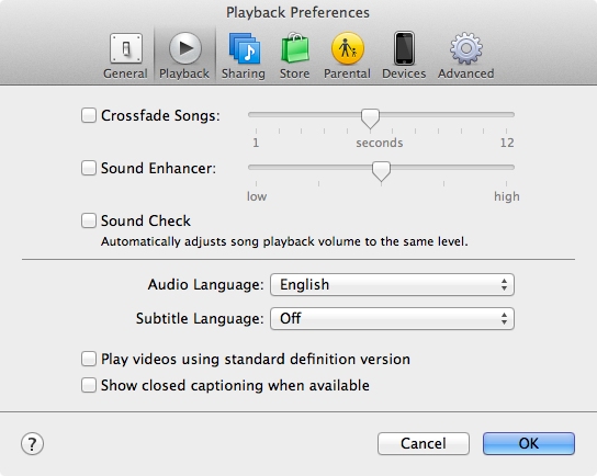
This week's control is the standard tabbed page UI found throughout client apps and web sites. Here's a typical example, from iTunes Preferences:
Key attributes
- The tabs typically represent different aspects of a single object, or different areas at the same navigational depth in a hierarchy.
- There's one button for each tab. Clicking a button selects the corresponding tab.
- The button for the active tab is always visually highlighted in some way. Often the active tab is shown on a surface contiguous with that of the active page. (iOS tabs don't do this.)
- The tab button are usually arranged horizontally across the top, but may also appear arranged along the left or, more rarely, the bottom.
- All tabs share the same width, and usually the same height as well. This consistent size probably was originally intended to reflect the consistent physical size of the atavistic tabbed paper folders that inspired this UI representation, but even now the consistent size is useful in helping the user recognize all the tabs as related aspects of some single thing. (Exception: On the Mac, a tabbed Preferences dialog like the one above, in which the window holds nothing but the tab set, will change size as the user changes tabs.)
- There's usually just one row of tabs. (Multiple rows are clunky: they prevent the active button from being adjacent to its corresponding tab, or else force tab rows to switch places.) This generally means the number of tabs is usually low, typically in the 3–9 range.
TabSet control
I've posted a TabSet control in the QuickUI Catalog that manages a set of tabs:
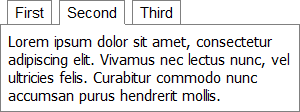
The pages within the TabSet can be any type of element or control, although for convenience a Tab control is provided to make it easy to set the page's descriptive label.
Usage: Use a TabSet when you need to fit a large number of controls into a comparatively small space, and the controls can be grouped into meaningful tabs with clear labels. The controls in each tab should generally only have local effects within that tab's UI; it would be extremely confusing if checking a box in one tab disabled some control on a different tab.
A scrolling page may often be a simpler alternative to a tabbed UI. One advantage tabs do have is that the labeled tab buttons provide a summary; they help give the user an overview of what object properties, navigational areas, etc., are available. To the extend the tab labels are meaningful and clearly reflect the tab's contained controls, this labeled structure may accelerate a user's search for a particular control.
Implementation notes
I've built TabSet top of a more primitive control called Switch. Switch acts as a container for other elements, and will only show one of those elements at a time. (The "Switch" name is inspired by the "switch" statement in programming languages like C and JavaScript.) There are actually plenty of cases where a UI will contain a mutually-exclusive set of elements, and not all of these cases happen to look like tabs, so upon reflection it's somewhat surprising to me that more UI toolkits don't offer something like a Switch control.
In this case, the TabSet wraps a Switch, adding a List of buttons and populating them with the description() property of the corresponding tabs.
The trickiest part of TabSet turned out to be handling the common case in which the TabSet itself should be as tall as its tallest tab (regardless of the individual tab heights). This allows for a consistent border or background, which helps the user interpret the disparate tabs as being closely related; it also avoids potential document reflow when the user switches tabs. The standard ad hoc solution in a case like this is to force all the elements to a known height (e.g., in pixels), but hard-coding element sizes seems like a cop-out if one's goal is to create a flexible control that handle a wide range of content. It seems like TabSet (or, actually, Switch) should be able to inspect the height of its contained elements and automatically resize itself to be as tall as the tallest contained element. This gets tricky because Switch normally hides all pages except the one which is active, and the height of an element hidden with display: none is reported as zero. To work around this, the underlying Switch class has been modified so that, in the auto-maximizing case like this, Switch hides the inactive pages with visibility: hidden instead (which lets the elements report their correct height), then uses absolute positioning to superimpose and top-align the pages.
A related complexity arose in the case shown in the TabSet demo: the height of a tab may change based on asynchronously loaded content (e.g., an image). So the update of any tab's content, even one which isn't currently visible, may potentially force the TabSet to resize. Unfortunately, there isn't a standard DOM resize event for elements other than elements the user can resize (such as the window). So QuickUI controls have to make do by raising a custom event when they resize, allowing controls like Switch to adjust their height accordingly.
It's boring details like resizing that forces most designers to throw up their hands and resort to hard-coded pixel dimensions, but UI controls that can flexibly handle dynamic content are ultimately far easier to use and work with as a design evolves.