The last time you had to arrange the furniture in your home — did you create a
design first? No. You had a design idea, and then immediately jumped
into implementing your idea by moving the sofa and table around until the
result felt good.
Hmm… let’s try putting this over here…
Consider these attributes of the typical process for arranging furniture:
You do it yourself. If you have enough money, you might tell movers where to
put the heavy things first, but you’re still directly involved, and you’ll
end up pushing things around yourself before it’s all over.
You work directly with the furniture and the space, without recourse to a
single design artifact. Think about it: in the time it would take to create
a scale model of a room and the furniture to sufficient accuracy that it
could actually inform your decisions, you can finish the task of moving the
real furniture into place.
You can never predict whether a layout will completely work until you’ve
actually gotten things in place. Once the pieces are in place, you
always discover something unexpected. You move your desk so it
faces the door, then sit in the desk chair and realize you can’t see the
view out the window. So you turn the desk around to face the window, then
get a creepy feeling that someone might sneak in the door and creep up
behind you without your knowledge. Each layout you try teaches you
something.
The process is inherently iterative. You start with an idea, and iterate
through various layouts until you converge on an acceptable result (or
you’re tired of moving stuff around).
You can design software user interfaces this way too.
I had a chance to speak about my own design process at a talk I gave last
month at the California College of the Arts in San Francisco, to an engaged
audience of interesting students in the school’s MBA in Design Strategy
program. There I discussed how my own design process has changed
substantially in the last five years to become something I might call
designing by making. In this process, the design of a software experience is
inseparable from the coding of that experience. In this regard, the process
has a lot in common with arranging furniture.
Many contemporary design process artifacts like field interviews, a wall of
post-it notes, and paper prototypes reflect an increasingly antiquated
premise: that building a real thing is much more expensive than producing a
design. Historically, it has been true that designing software with a complex
user interface was a minor cost compared to the labor of actually writing the
code. In my early days at Microsoft, one might have seen a ratio of one
designer to five to eight engineers (developers and testers), because even
primitive tasks like obtaining user input or positioning interface controls in
a window entailed such extensive, labor-intensive coding. It seemed sensible
to invest considerable thought and time in the design phase because it could
be many months before the designer would get to experience the actual product
for the first time. Unfortunately, that moment of enlightenment often didn’t
come until the fully-functional pre-beta builds arrived roughly two-thirds of
the way through the product cycle. At that point, when the designer inevitably
has new insights into the best design, any big design changes would often
needed to be deferred until the next version.
Much software is still designed this way, even though the economics of user
interface implementation have changed radically. The effort required to create
useful, functional, beautiful, reliable, and performant software application
user interfaces has been dropping for years, and this trend will continue for
the foreseeable future. About five years ago, the technology reached the point
where it became possible for me to create web applications directly. Rather
than working in Photoshop, Microsoft Word, or a prototyping tool as before,
and handing these designs off to an engineer, I can now directly create the
user interface design in code myself.
This is roughly as expensive as the old way of doing things, but with the
significant advance that I am now working with a functional artifact — a
working user interface — from the very beginning. This turns out to be a
transformative difference. Just as you can never predict all the ramifications
of a particular furniture layout, you can never fully predict the strengths
and weaknesses of a UI design.
Instead, I currently believe it’s best to design something by making
it. This means it’s generally not worth a great deal of time to consider
the hypothetical implications of a theoretical design. (“Will the user find
this clear?”, “Will this meet the user’s needs?”) It’s faster to just build
something that actually works, then immediately observe whether
it is good or not. Instead of viewing design as a predecessor to making, this
is designing by making. The process looks just like the process above:
Do both the design and coding yourself.
Work directly in code, without recourse to other design artifacts. If you’re
working with good tools, in the time it would take to create an accurate
static image of what you want, with all the specs that would go along with
that, you can instead create a functional design that actually does what you
want.
Know that you will be unable to predict whether a design will completely
work until you actually having a working interface.
Build your schedule around iteration. You start with an idea, and iterate
through various approaches until you converge on an acceptable result (or
you’re tired of moving stuff around).
This process isn’t for everyone. There are software domains that don’t entail
a user interface (Mars landers, say), where a traditional, process-heavy
design phase obviously holds true. And not all designers can code, nor can all
coders design. But I believe that designing by making does allows someone who
can do both well to iterate much faster from an idea to a usable interface
than a designer who is forced to rely on someone else to write the code.
I believe that in the near future, most software application design will look
like this. The trends simplifying the coding of user interfaces will continue
and accelerate, as better design/coding tools permit the construction of
better design/coding tools.
Component-oriented user interface frameworks
will allow people to spend less time designing and coding the details of
common patterns.
Furthermore, companies with experience in creating tools like Adobe are now
waking up to the realities of a post-Flash world, in which the open web is the
real application platform to focus on. (Microsoft is also slowly waking up to
the prospect of a post-Windows client world, although that change will take
much longer, and I’m not sure they’ll be able to change fast enough to stay
relevant.) Generally speaking, I have high hopes for innovation in the
realm of tools and frameworks, all of which should make it more and more
practical for someone like you to do both the design and coding yourself.
Today, it is already possible to have a design process built around coding
that is as efficient — or, often, more efficient — than a traditional,
artifact-heavy, pre-coding design process. What’s more, the tool chain will
ultimately improve to the point where designing a user interface will be
as fast as arranging furniture. In the time it takes you to
say, “Let’s try moving the bookcase over there”, and actually move the
bookcase, you’ll be able to say, “Let’s try a tabbed navigation approach”, and
actually switch a design to using tabbed navigation. Imagine what it will be
like to design software like that.
Just as geometry builds up complex results from simple axioms, and programming
languages build up complex constructs from simple primitives, it should be
possible to create complex user interface elements from simple elements. But
the lack of great building blocks for web user interface components causes
people to waste a colossal amount of time reproducing common behaviors or,
worse, forces them to settle for something quick but suboptimal.
Take something as basic as tabs. Every web UI package includes a widget or
component that produces a set of tabs, such as the typical example from
jQuery UI:
While a tab set may seem to be an irreducible unit of user interface
complexity, we can actually decompose its behavior into smaller, simpler
chunks:
Ensuring a single element within a set is “active” at any given
time. Here, only one of the tab buttons is in the active state. There are
many other manifestations of this behavior. Single-selection list boxes, for
example, also have a notion that a single item in the list is active.
Showing a single element a time. The main region of the tab
set shows a single page which corresponds to the active tab button. The
active page is the only one that’s shown; the non-active pages are hidden.
This behavior comes up in situations other than tabs. For example, photo
“carousel” controls let a user page through photos one at a time, generally
with previous/next buttons instead of a tab strip.
Showing a set of identical elements that correspond to items in a list. The strip of tab buttons across the top has an internal consistency: every
tab button is represented with the same type of button.
Positioning one collection of elements directly above another.
Here, the strip of tab buttons is stacked on top of the tabbed pages. This
kind of layout seems so simple as to not deserve consideration. However, in
current web browsers, this can be frustratingly difficult to achieve in the
common cases where the size of the tab set is flexible. Suppose you want the
tab set to fill the viewport, or a region of the viewport. The tab strip
should consume a given height (which for a variety of reasons should not be
fixed beforehand in, say, pixels), and the remainder of the space given over
to the tabbed pages. This type of layout can be achieved with a
CSS flexbox, but at least
for a little while longer, many app developers will need to support older
browsers (i.e., IE).
Giving UI elements a description which can shown elsewhere.
The pages shown within the tab set are rectangular regions, but the
name of the tab is shown outside. It’s fairly common to want to
give a UI element a user-friendly name like this.
Letting a user tap or click a button to achieve a result.
That is, the elements in the tab strip behave like buttons.
It should be possible to create UI classes that implement each of these more
fundamental behaviors or aspects. It should then be possible to exploit these
behaviors on their own, or recombine them with other behaviors to produce
other recognizable user interface controls. In effect, we should be able to
arrive at fundamental behaviors that behave like the axioms in a mathematical
domain or, alternatively, like atoms in a physical system of elements.
The domain of computer science has much to say on the topic of axiomatic
design. Programming languages are often predicated on the notion that you can
boil down everything you’d want to do in the language to a tiny set of
primitive functions. It’s only this small set of primitives which
must be written in a lower-level language (e.g., a machine language).
Everything else can be built up in the language itself. This not only keeps
things clean, it ensures the language’s popularity and survival by
facilitating the porting of the language to new platforms — only the
primitives must be rewritten, and all the remaining code built on top of the
primitives can be used as is. The original example of this axiomatic principle
in language design was Lisp, whose story Paul Graham recounts in his article
The Roots of Lisp.
(The full article is available on his site in the
original Postscript version, or in various
converted PDF versions.)
From his article:
In 1960, John McCarthy… showed how, given a handful of simple operators and
a notation for functions, you can build a whole programming language.
[McCarthy’s] ideas are still the semantic core of Lisp today. It’s not
something that McCarthy designed so much as something he discovered. It’s
not intrinsically a language for AI [artificial intelligence] or for rapid
prototyping, or for any other task at that level. It’s what you get (or one
thing you get) when you try to axiomatize computation. … By understanding
[Lisp] you’re understand what will probably the main model of computation
well into the future.
Can we determine a similar axiomatic deconstruction of user interface
elements? That’s a topic I’m acutely interested in, and I believe the answer
is yes. Even through graphical user interfaces span a range of devices,
platforms, and frameworks, the underlying collection of distinct user
interface behaviors is quite consistent: clicking one thing something makes
something else appear; items in lists are given consistent representations and
behavior; modes (for both better and worse) constrain the user’s attention and
powers; and so on. It should be possible to boil those consistent behaviors
into reusable code.
The result of this decomposition is a set of UI primitives which is
significantly bigger than the canonical tiny set of user interface controls: a
push button, a radio button, a check box, a text box. Of all the aspects
numbered above, only #6 (push buttons) are available as a native browser
control. Web developers are generally forced to recreate all the other aspects
through combinations of CSS and JavaScript. That's inefficient and
error-prone. As noted above, even something as seemingly straightforward as
stacking two regions on top of one another can prove unexpectedly complex.
The actual set of web UI primitives is probably an order of magnitude larger
than what browsers expose as interactive UI controls. At the same time, the
set of really general purpose contemporary UI (see this article for
a breakdown of UI elements by context-specificity) is not so large it can't be enumerated or understood. For today’s
typical mobile or web application, I believe a reasonably comprehensive
collection of UI primitives would number in the 100 – 200 range.
What would those primitives be? My work on the
QuickUI Catalog is an attempt this
question. It’s a work in progress, and is by no means complete. It currently
includes controls which shouldn’t be there (they’re really just sample uses of
an underlying component), and on the other hand doesn’t (yet) include enough
controls for common situations like mobile. Nor is the set of controls
completely stable yet. I occasionally realize two controls exhibit similar
behavior whose implementation should (or shouldn’t) be shared, which results
in both minor and major refactorings. Nevertheless, the Catalog already
represents a highly useful starting point for creating application UIs.
Let’s return to the tab set example above. The QuickUI Catalog includes a
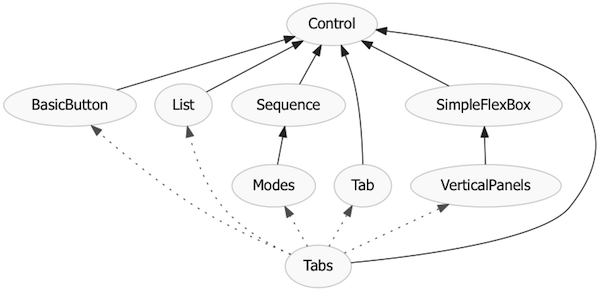
Tabs control for this purpose,
which can be used as is. But that Tabs control is simply a combination of
lower-level components corresponding to the attributes listed above:
A Sequence base class. A
Sequence control keeps track of which one (and only one) of its children is
currently active.
A Modes control. Extends the
Sequence class to hide everything but the active child.
A List control. Maps an array
of internal data items to an array of user-visible controls.
A
VerticalPanels
control. Stacks things vertically. This inherits from
SimpleFlexBox, a
user interface
polyfill which uses a
CSS flexbox for layout on modern browsers, and a manual engine for layout on
older browsers.
A Tab control. Associates a
description property with an arbitrary block of content. It's this
description the Tabs control displays in a List of buttons across the top.
A BasicButton control.
This wraps the browser’s native <button> as a component. Among other
things, this allows a BasicButton to be used to render items in the List
(above) to create the strip of tab buttons.
All these derive from a common
Control base class.
We can show the relationships between all these classes in a graph, where a
solid line represents an “is a” relationship (one class derives from another)
and a dotted line shows a “has a” relationship (one class makes use of
instances of another class):
This arrangement entails a lot more pieces than a typical web user interface
platform. The browser itself only provides a native button. Most
existing web user interface frameworks provide some button class wrapper (such
as BasicButton here) and a tab set class (Tabs). They may or may not expose a
general purpose UI component base class (here, Control). The tab set class is
typically fixed in a monolithic implementation, and can only be modified via
parameters the framework designers have anticipated beforehand.
Traditional client-side UI frameworks (e.g., Windows Presentation Foundation)
do have rich class hierarchies, although even their UI primitives tend to be
too course-grained. And contemporary web UI frameworks rarely have good
building blocks. (Some people claim the
Sencha framework does, but it's
unfortunately encumbered with developer licensing fees, and requires you to
build your app on top of a proprietary substrate. To me, that's moving in
the exact opposite direction of web development trends.)
The main obstacles to UI like this on the web may have multiple causes,
including the fact that the web's primary client-side programming language
JavaScript, still has no native support for traditional object-oriented
classes. Moreover, the browser doesn't yet expose a model for modular
component composition, which creates a lot of work for a UI framework's
creators.
In the above implementation of a tab set, all the lower-level pieces are
directly available to the user interface designer and developer. These can be
used on their own, or combined with other types of elements to create other
user interface elements. And, significantly, new elements constructed with
this approach are, by default, extensible and recombinable in their own
right. In a subsequent post, I plan to show some of the other sorts of
UI controls which can be created by combining some of the pieces above in
different ways.
As noted above, this Catalog implementation isn’t perfect. Among other things,
there are inherent limitations on what you can achieve with a classic single
inheritance hierarchy. But, overall, this feels like a promising direction,
and in practice is a highly efficient way to create web apps. Above all, this
axiomatic approach feels like the right paradigm for building UI.
McCarthy's big advance with Lisp wasn't to create programming language
primitives — all programming langauges have primitives. His insight was that
the primitives in programming languages of the time weren't primitive enough. Instead, you should break a language into irreducible axioms, and let
people combine those axioms to create any new language functions they need.
The functions you create with those Lisp primitives are just as powerful as
any pre-packaged functions created with those same primitives by the
language's designers. That is, there's nothing special the language
designer can do you which you cannot also do.
Similarly, a UI platform should give you a powerful set of axiomatic
appearances and behaviors and a means to combine them to create new elements
which are every bit as powerful as those elements that come bundled with the
platform. This is why attempts to build a tiny handful of new controls into
web browsers is almost completely uninteresting to me. A new date
picker in the browser, to take just one example, is just never going to solve your date picker needs. It's like the FORTRAN committee adding yet another hard-baked statement
to the language. What's infinitely more interesting is a UI platform that
gives you the building blocks you need to build a date picker of your own
that's as powerful as anything in the browser itself.
Version 0.9.2 is primarily a bug-fix release. Beyond a variety of minor fixes,
there are just a couple of notable changes:
Using $.control( element ) on an existing element to cast the element to the
correct subclass of Control now returns null (instead of undefined) if the
given element is not a control.
A bug has been fixed which prevented quickui.js from loading in IE8. Thanks
to QuickUI user Toussaint for reporting this bug and helping to test the
fix!
The release of 0.9.2 coincides with the release of version 0.9.2 of the
QuickUI Catalog, which includes the following:
Modes now derives from a new base class called Sequence, a general-purpose
class for any linear sequence of elements that can be navigated via a next()
and previous() method. Modes now focuses on showing just one element of a
Sequence at a time. As part of this change, Modes.activeChild() has been
renamed to Modes.activeElement().
SlidingPages has been renamed SlidingPanels (since its contained elements
aren’t necessarily pages). The class now also derives from Sequence.
Finally, SlidingPanels has been updated to take advantage of CSS transitions
on browsers that support them, falling back to a jQuery animation on older
browsers.
LateralNavigator has been refactored to handle two general cases: first,
navigating through a Sequence of elements, and second navigating through an
abstract axis like time. The former case is specifically addressed with a
new class called SequenceNavigator. The latter case is used in
CalendarMonthNavigator.
An issue that prevented CalendarMonthNavigator from correctly vertically
aligning its heading elements has been fixed. CalendarMonthNavigator now
also uses a new class, MonthAndYear, to show both the month and year instead
of just the month name.
A new VerticalAlign class handles the general problem of vertically aligning
child elements in older browsers.
A new Carousel class derives from SequenceNavigator, and uses a
SlidingPanels class to provide a sliding transition between elements in the
sequence.
The TabSet class has been renamed to Tabs.
This release is also notable as the first one in which Catalog controls have
been written (and, some cases, rewritten) in CoffeeScript.
At last week’s Google I/O 2012 conference, Chrome engineers Alex Komoroske and
Dimitri Glazkov gave a talk called, The Web Platform’s Cutting Edge, a good overview of Web Components and custom elements in particular. The demo code shown in that presentation does point to an
issue with the current Web Components spec that could seriously constrain the
ease with which components can be written and shared. I’ll lay out the case
here in hopes this problem can be fixed at an early stage.
But first: A word of appreciation
Authoring a spec for a new standard like Web Components is generally a
thankless task, as is the tireless work of promulgating the standard through
presentations like the one at Google I/O. So, before saying anything else: a
big
Thank You to Alex and Dimitri for their work on HTML
Templates, Custom Elements, and Shadow DOM. Everything which follows is meant
to support your work, not put it down.
Background of the problem
As I’ve blogged about before, I’m a passionate fan of web UI components and
believe they will transform UI development. The ability to define new elements for HTML is something designers and
developers have long wanted but, until now, could only dream about. In the
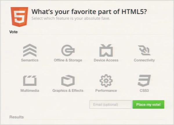
demo, Alex and Dimitri use Chrome’s early implementation of the proposed spec
to create custom elements. They elegantly combine these elements to produce a
custom UI component for a user poll:
This poll user interface is a large component comprised of sub-components for
accordions (or, later in the demo, tabs) and the big iconic choice buttons in
the poll for “Semantics”, “Offline & Storage”, etc. All these components
are defined with declarative markup.
I enthusiastically agree with the presenters that declarative HTML, including
the ability to define custom elements, results in UI code that can be easier
to read than a comparable imperative solution in JavaScript. And to its
credit, most of the demo code shown in the presentation is self-explanatory.
However, one aspect of the code really jumped out at me as a serious
limitation of the current spec: a component host can only pass a single DOM
content subtree to the component. As I’ll try to show, I believe that could
seriously limit the degree to which a component can expose a meaningful API.
Consider the markup behind those big “choice” buttons. Each choice component
includes an icon, a short text summary used as a label, and longer descriptive
text that appears in a tooltip on hover. You can think of that per-choice data
as, in effect, three public properties of the choice component:
The code above makes use of the proposed <content> element to select
specific portions of the DOM tree (using CSS selectors) and incorporate them
into the component’s shadow DOM. With that in place, the code for the overall
poll component (i.e., the choice host) can instantiate choice buttons with the
following markup:
<x-choice value=”semantics”>
    <h3>Semantics</h3>
    <p>Giving meaning to structure, semantics are front and…</p>
</x-choice>
<x-choice value=”offline-storage”>
    <h3>Offline & Storage</h3>
    <p>Web apps can start faster and work even if there is no…</p>
</x-choice>
…
So the first code fragment effectively defines a choice component with three
public properties (although these aren’t actually class properties). The
second code fragment shows the creation of two instances of that choice
component, filling in two of the three choice properties. It’s not shown where
the icon property is filled in, but it’s presumably done through styling.
All looks fine so far, but there are some serious issues lurking here.
Problems
The root issue here is that, as currently speced,
Web Components can only accept a single DOM-valued content property via
markup. This leads to a profusion of problems:
Asking developers to tease apart component content will mean work for
devs, and produce inconsistent results.
Why, exactly, is the choice component using the <h3> tag to specify
the text label for the button? Because this component has two textual
properties, and the current Web Components spec only lets the developer pass
one DOM content subtree to a component. So the component’s author
developer has to somehow let the component’s users pack more than one
property into the content, and then the dev has to crack that content to
extract those properties. The question of how to crack that single
content subtree into multiple properties is left entirely up to the
developer. The tool given to the developer for this purpose is CSS
selectors, which at first glance seems powerful. Unfortunately, it’s also a
recipe for inconsistency. Every developer will have the freedom—and chore—to
approach this problem their own way, guaranteeing the emergence of a handful
of different strategies, plus a number of truly bizarre solutions. It’s as
if you were programming in a system where functions could only accept a
single array. As it turns out, we already have a good, common example of a
such a system: command line applications. Every command-line application has
some main() function that’s handed a single array of command line options,
and the application has to decide what to do with them. Although conventions
eventually arose with respect to the order and meaning of arguments, there’s
still a wide variety of approaches. Some apps rely on argument position,
some rely on single-letter flags (“-a”), some rely on full-word named
parameters (“–verbose”), some have idiosyncratic microgrammars (e.g., chmod
permissions), and many applications support a rich combination of all these
approaches. Parsing arguments is tedious, boring work. In the early days, a
developer throwing an app together might do the absolute minimum work
necessary. The result was often inconsistent or incomplete argument support.
The dev might eventually be forced to hack on their app until they finally
had a roughly functional command line parser. These days, developers can
rely on language features, or libraries like Python’s argparse, to “crack”
the argument array into a meaningful structure which can be more easily
inspected. In particular, it’s invaluable to a developer to be able to
directly inspect specific arguments by name. The use of CSS
selectors does remove some of this tedium, but it still leaves devs without
a consistent way to refer to component properties by name, thereby leaving
the door wide open for inconsistency. A dev might decide to use DOM
structure, HTML tags, element classes, or a combination of all of these to
demarcate properties. This will make it much harder for devs to share
components, to swap out one component for another, and so on. It would be
better if we could learn from the command-line argument example now and head
off this inconsistency.
HTML semantics are nearly meaningless when used to identify parameters.
In the Google I/O demo, the developer of the choice component elected to use
HTML tags within the single content subtree to identify properties. In this
case, they decided that the first <h3> element in the content would
identify the summary text, and everything else would be used as the longer
text description. But why use <h3> for this purpose? The W3C spec
says a heading tag like <h3> should be used to, “briefly describe the
topic of the section it introduces”. These choices aren’t introducing
sections, so that can’t be the the case here. Neither is this <h3>
being used to reflect the rank of an element in a hierarchical document
structure. In all likelihood, the <h3> is used here, as it often is in
practice, to mean something like, “somewhat prominent, but not
too prominent”. Visually this usually translates to, “bold text, a
little bigger than the body text”. At least, that seems to be how <h3>
is being used in this component. There’s nothing really wrong with that, but
it’s clearly arbitrary. Other developers might easily make a different
decision. Later, in the very same demo, the code for the poll component
accepts the text label for a different Voting button through the use of a
<label> element. So in one place in this app, a button’s label is
specified with an <h3>, but elsewhere in the same app, a
button’s label is specified with a <label>. I don’t think this
reflects any particular negligence on the part of the demo’s developers. I
think it’s a latent issue in any scheme that relies on HTML elements for
something than the original purpose. Perhaps the code’ s developers did have
some reason in mind for using <label> in one place and <h3> in
another, but the point is that the reason is not obvious to another party
looking at the code. The same arbitrary nature of tag choice here applies to
use of the <aside> tag to identify the choice description. Try this:
show the poll screen shot above to 3 web developers, and ask them which HTML
tag they would use to specify the tooltip that should appear when the user
mouses over a choice button. I’d be surprised if even one of them
picked the <aside> tag. Is the tooltip content here really, as the
W3C description
says for the <aside> element, “tangentially related to the content
around the aside element, and which could be considered separate from that
content”? Well, not really. But, maybe; that’s a debatable point. The fact
it’s debatable is what’s at issue here. In contrast, here’s a tautological
statement which wouldn’t generate debate: the choice description in
the tooltip is the choice description in the tooltip. The
local semantics here aren’t in question. So it’s a shame the
property can’t be described in contextual terms like “description”, or
“tooltip”. The fact that the component is using HTML elements to identify
arguments appears sensible, but in practice will be nearly meaningless.
Every single time a dev needs to create a new component property, they’ll
pick from the 100-odd HTML elements. Their selection may depend on their
experience, their mood, the phase of the moon, and which handful of HTML
elements they haven’t already used for other properties on the same
component. It’s highly likely a different developer (or the same developer
on a different day) would make a different selection of HTML elements for
the same properties. Imagine an object-oriented programming language that
forced you to give class properties one of 100 sanctioned property names:
“index”, “count”, “name”, etc. Evereyone’s classes would
look consistent, but it would be an utterly false consistency.
That’s effectively what we’ll get if component authors are forced to choose
HTML tags to identify component properties.
Use of CSS selectors hinders a developer’s ability to add new properties.
Suppose the author of this component needs to add a new property to this
choice component. Maybe they want to add a “More about this choice” link to
each choice; this link should navigate to another page with more details on
that poll choice. Following the example of the <h3> for the choice
summary, they decide to define this link property by extracting the first
<a> tag in the content to be the link to the “More about this choice”
page. Perhaps, following their use of the “h3:first-of-type” selector above,
they decide to pick out this <a> tag with the similar CSS selector
“a:first-of-type”. If they do so, this component author will inadvertently
screw up any component user who happened to include an <a> tag
somewhere in the description. Suppose a user of this component has
already created some code for a choice like this:
The “a:first-of-type” selector for the “More about this choice” link will
accidentally pick up the existing link, thereby breaking this use of the
component. The component author could issue a “Breaking Change” notice,
warning everyone to include an <a> tag before the choice description.
But even that wouldn’t help someone who, for whatever reason, needed to
embed an <a> inside of the <h3>. The use of selectors here could
be made more robust by using the child selector “>”, as in “>
h3:first-of-type”. But this gets verbose, and again, isn’t likely to be a
universal convention, and inconsistent use of the child selector will only
add to the confusion. The fundamental problem is that using CSS selectors
for this purpose is inherently fragile.
Arbitrary parameter structure is brittle.
The fragility of using CSS selectors remains even if one tries to avoid the
use of arbitrary HTML elements. Suppose you decide to use element
position to identify components. You’ll still up a component which
is hard to update. Here, a relevant case study is the existing of positional
function parameters in most programming languages. To take just one example,
consider JavaScript functions. Suppose you’ve defined a function with three
parameters: “function foo(a, b, c) {…}”. If you now want to add a new
parameter “d”, you have to add it to the end of the argument list to avoid
breaking existing users of your function. This can easily produce a function
whose parameter order feels unnatural. And to use the new “d” parameter, a
function caller must supply the intermediate arguments a, b, and c,
even if those are irrelevant to the function call at hand. To avoid these
problems, programming languages tend to eventually evolve named function
parameters. Functions with named parameters are inherently more future-proof
and, importantly, allow callers to only specify the parameters they care
about. The lesson of positional function parameters applies to trying to
parse component properties out of the DOM content subtree. Having learned
this lesson in countless programming languages, it would be nice to just
jump straight to a reasonable solution which allowed for named component
properties. While CSS selectors represent a powerful parsing tool, much of
that power is completely unnecessary in this context — and some people will
inevitably put that extra power to poor use.
Subclasses will compete for parameters with their base classes.
The above situations quickly deteriorate further when one envisions
extending an existing component via subclassing. Subclassing is a crucial
means of efficiency in component development, in which the behavior of one
component can be specialized for new purposes. As just one case, over 33% of
the controls in the
QuickUI Catalog are subclasses of
other Catalog controls. For example, both
DateComboBox and
ListComboBox extend
ComboBox, which itself
extends PopupSource.
This separation of concerns is vital to keep the code clean, organized, and
maintainable. Such subclasses would likely become unworkable as Web
Components, because each level of the class hierarchy will be competing with
its ancestors and descendants as they all tried to extract properties from
the single DOM content subtree permitted by the Web Components spec. If the
choice class extracts an <h3> element from the content, then that
element is effectively invisible to the <content> selectors
of its subclasses. (Or, if you let subclasses have first shot at the
content, then the elements they pull out are effectively invisible to their
base classes.) This significantly complicates point #3 above (using CSS
selectors to pull out properties from the DOM content subtree makes it hard
to add new properties). Consider a subclass of the choice component above
called, say, special-choice. Perhaps the author of special-choice has
decided to use the HTML <h4> element to identify a particular
property. Now the author of the base choice component decides to add a new
property, and elects to use <h4> for this purpose themselves. This has
the effect of breaking the special-choice subclass. Obviously, such naming
conflicts can arise in regular OOP classes, but here the likelihood of
conflict is much greater because of the highly constrained vocabulary of
HTML elements. Using DOM structure to select properties (point #4, above) is
even more brittle when one considers subclasses. If a component
class decides to use DOM element position to select content for a given
property, and someone creates a subclass that likewise uses element
position, the original base class’ API is effectively frozen. Suppose the
base class defines a <content> element with selector “:nth-child(3)” ,
and the subclass goes ahead and uses a <content> with selector
“:nth-child(4)”. How is the base class supposed to add support for a new
property now? They can’t use position 4, because a subclass is already using
that. The situation could be worked around by requiring not just specific
tags, but also specific class names, but this has problems of its own (see
below). As currently drafted, the Web Components spec seems highly likely to
close off the possibility of rich component hierarchies. Most component
developers will probably elect to just copy-and-paste useful code from other
developers, rather than subclassing them, to preserve the ability to modify
their components in the future.
Class names could help identify properties, but will probably just
complicate everything.
One way to skirt the problems above is to use HTML element classes to
identify properties by class name, and reference these classes in the CSS
selectors. If you gave up on specific HTML tags, and just used a <div>
and a named element class for all properties, the second code fragment above
could look like this:
<x-choice value=”semantics”>
  <div class=”summary”>Semantics</div>
  <div class=”description”>Giving meaning to structure…</div>
</x-choice>
<x-choice value=”offline-storage”>
    <div class=”summary”>Offline & Storage</div>
    <div class=”description”>Web apps can start faster…</div>
</x-choice>
…
This could potentially work if everyone agreed to always using an
element class name to identify a property, and consistently applied those
classes to a single element type (likely <div>) which everyone agreed
upon would stand for “parameter”. Unfortunately, the more likely result is
that throwing element class names into the mix will just complicate
everything further. Some devs will write their components that way, but
others will insist the use of HTML elements as shown above. Some will
require the use of both specific HTML elements and specific class
names. E.g., the choice component’s summary property will be forced to be
identified with <h3.summary> to avoid possible conflicts with other
<h3> elements in the content. This would be verbose and, worse, as a
component user you’d have to remember and specify two things, when
one should be sufficient.
Invisible component APIs foreclose the possibility of inspection and
reflection.
The choice component in this example effectively presents its hosts with an
external API that allows the host to fill in two text properties.
Unfortunately, that API is implicit in the design of the
<content> elements and their selectors. That makes it hard to
programmatically understand what a component is doing. At design time,
there’s no easy way to statically analyze the code to inspect what those
<content> elements are actually being used for. You could potentially
parse the HTML to find the <content> elements, then parse their CSS
selectors, but that still wouldn’t give you any hints as to what those
<content> elements were being used for. At least a formal
property name gives you a real idea as to its purpose. And at runtime, there
would be no easy way to ask a choice component instance questions about
which properties it supports: “How many properties do you have?”, or “Do you
have a ‘description’ property?” Such run-time inspection of a component’s
API (also known as reflection) can be a powerful tool. In this very
presentation, Google’s developers point toward the benefits of programmatic
inspection when they observe that giving web developers the ability to
create new custom elements (via the <element> tag) will open new
possibilities in researching possible improvements to HTML itself. For
example, researchers could statically inspect Web Components actually used
by production web sites to determine, for example, the names of the most
common custom elements. That in turn could help guide the formal adoption of
new HTML elements in future versions of the language itself. That’s just one
example of what’s possible when APIs are explicit. Such explicitness should
be extended beyond component names to cover component property names as
well.
A proposal to fix this: Support multiple, named, DOM-valued component
properties
All the issues above could be eliminated or dramatically improved if the Web
Components spec were amended to let developers create components that accept
multiple, named, DOM-valued properties. (Presumably, this support would
actually be added to HTML Templates, used by both <element> and
<decorator> elements.)
Here are some possible syntax suggestions:
Proposal A: Use a consistent tag for component properties.
A convention of using <div> elements to hold properties (see point #6
above) is a bit odd, because the <div> tag is used simply as a
placeholder. The convention could be improved by formalizing a new element
specifically for this purpose. Perhaps the existing <param> tag,
currently limited to use within <object> elements, could be given new
life by being repurposed for use within components. Its definition would
need to be extended to support a closing </param> tag form that could
encapsulate a DOM subtree:
<x-choice value=”semantics”>
    <param name=”summary”>Semantics</param>
    <param name=”description”>Giving meaning to …</param>
</x-choice>
<x-choice value=”offline-storage”>
    <param name=”summary”>Offline & Storage</param>
    <param name=”description”>Web apps can start …</param>
</x-choice>
…
If <param> can’t be redefined this way, then a new tag like
<property> could be created. If HTML semantics zealots insist on
mapping component content to HTML elements, it’d be possible to let define a
component author identify a backing HTML semantic tag that should
be used to treat the property’s content for search and other purposes. E.g.,
syntax within the <element> definition would indicate that the
“summary” property should be backed by an <h3> element. This is
exactly the way that the <element> tag’s “extends” attribute is
already spec’ed to work. The author indicates that an <x-choice>
element is backed by a <div>. In the exact same way, the author could
indicate that a <param> (or <property>) of name=”summary” should
be backed by an <h3>. As noted above, the particular choice of backing
HTML element might be inconsistent or meaningless, but at least use of a
backing element confines the problem to a much smaller audience. That is,
the component users shouldn’t need to know that summary property
behaves like an <h3>, just like they don’t have to know that an
<x-choice> behaves like a <div>. Rather, that would be something
only the component author would need to concern themselves with.
Proposal B: Expand data- attributes to support data- elements
HTML developers can already attach arbitrary string data to HTML elements as
data- attributes (that is, element attributes prefixed with “data-”). Web
Components could build on this precedent to allow data-
elements that specify DOM subtrees nested within the component’s
content. For example:
<x-choice value=”semantics”>
    <data-summary>Semantics</data-summary>
    <data-description>Giving meaning to …</data-description>
</x-choice>
<x-choice value=”offline-storage”>
    <data-summary>Offline & Storage</data-summary>
    <data-description>Web apps can start …</data-description>
</x-choice>
…
In the case where the property values are pure text, a <data-foo>
element could be interchangeable with the corresponding data-foo attribute
within the component tag. So one could also write:
<x-choice value=”semantics” data-summary=”Semantics”>
    <data-description>Giving meaning to …</data-description>
</x-choice>
<x-choice value=”offline-storage” data-summary=”Offline & Storage”>
    <data-description>Web apps can start …</data-description>
</x-choice>
…
The data- element form would only need to be used when specifying a real DOM
subtree with subelements; otherwise, the data- attribute form could be used.
Proposal C (preferred): Let developers define custom property elements
The above approach could be tightened further by dropping HTML’s historic
obsession with restricting the set of tags. By dropping by the “x-“ in the
custom element tag, and the “data-“ in the custom property tag, we end up
with something much cleaner:
<choice value=”semantics”>
    <summary>Semantics</summary>
    <description>Giving meaning to structure, …</description>
</choice>
<choice value=”offline-storage”>
    <summary>Offline & Storage</summary>
    <description>Web apps can start faster …</description>
</choice>
…
As with the data- element approach above, this custom property element
approach could also support the use of a data- attribute on the element tag
itself when specifying a simple string property value. The cleanliness of
the code above comes at the cost of an ambiguity: if you can define your own
element tags and property tags, how does the parser know which is which? In
the code above, is <summary> a property of <choice>, or is it a
custom element in its own right? One resolution would be a precedence rule,
e.g., if <summary> is a child of a parent that has a summary property,
then treat it as a property, otherwise instantiate it as a custom element.
Another resolution would be to follow what Microsoft did with XAML’s property element syntax: allow (or require) the property to be written as <choice-summary>.
As noted above, if HTML powers that be insist on mapping component content
to a fixed set of HTML elements, that could be handled by letting a
component author indicate the HTML element which should be used to back each
property. Again, that would relegate the problem to something that only the
component author would have to worry about. The writer of the code above
that hosts the choice component wouldn’t have to obsess over the question of
why <aside> was picked instead of <label>; that detail would
only be visible by reading the code for the choice component. The host
author only has to deal with <summary>, which has local meaning. In
any event, the above code sample is clean, and should serve as a goal. Such
code would be a joy to write — and read. It moves HTML definitively towards
the creation of domain-specific languages, which is where it should go. It’s
somewhat absurd that we can only define markup terms according to global
consensus. That’s like waiting for a programming language committee to
approve the names of your classes. The web will move forward at a
much faster pace if we can let individual problem domains (online
stores, news sites, social networks, games, etc.) define their own tags,
with semantics they care about and can agree upon. As the aforementioned
uses of <aside> and <label> illustrate, forcing developers to
use HTML elements may give the appearance of consistent semantics, but that
consistency is merely a facade. In contrast, letting polling organizations
define the meaning of a <summary> property for a <choice>
component could produce meaningful consistency within that industry.
There’s still time to fix this
In their presentation, Alex and Dimitri indicated that their goal is not to
spec out a complete replacement for web UI frameworks. Rather, the goal of
their work is to lay a solid foundation on top of which great web UI
frameworks can be built by others. In this light, it is hoped that the Web
Components spec can be amended to support multiple, named, DOM-valued
properties — because that’s exactly the foundation a great web UI framework is
going to need.
The QuickUI framework, at least, is more expressive with regard to component
content than is possible within the current Web Components spec. That is to
say, the existing Catalog of QuickUI controls (and the many others controls
written in the service of specific QuickUI-based applications) could not be
ported to the current Web Components spec. Or, perhaps, those controls
could be ported — but then, for the reasons given above, the
collection would then become so brittle that its evolution would come to a
halt. That would be a shame.
To be sure, the Google team, and the others working on Web Components, are
smart folks, and it’s likely they’ve already given at least some thought to
the problems raised in this post. But more input, particularly when informed
by real application experience by potential users of a standard, is always
valuable in weighing decisions about what should go into the standard. And
it’s in that spirit that this post is written.
If you yourself have worked with component frameworks, and have experiences
that bear on this issue, please share them with the folks at Google. A good
forum for feedback might be the
Web Components page on Google+. (Be sure to thank everyone for their work!)
Web app designers and developers spend a staggering amount of time recreating
common effects and behavior that have already been done many times before on
other sites, or within their own organization, or in their own code on
previous projects, or — worse yet — in their own code on the
same project. You may spend days and days carefully reproducing
common UI behavior that can readily be found in other apps: menus, dialogs,
in-place editing, progress feedback, and on and on. The web wasn’t built to
solve those problems, so you have to solve them — over and over
again.
This situation is already at least partially avoidable with current web
frameworks that permit the creation of reusable UI components. As a case in
point, I recently created a
sample Contacts application
in the QuickUI framework. The app sports a
reasonably interesting user interface, but the bulk of its behavior is driven
by shared components from the
QuickUI Catalog that provide
layout, visual effects, editing behavior, list management, and keyboard
navigation.
Having built a handful of web apps in QuickUI now, there’s a pretty clear
pattern to the balance of UI components used in these apps: about
half of the UI code is comprised of components directly from the Catalog or
from previous projects. And, in every case, the project itself has generated
new, sharable UI components.
Look at your app’s UI elements — at every scale, from page, to region, to
widget, to tiny little visual element — and ask yourself: has anyone done this
before? Will someone do it again? If this were a component, could I be sharing
it with someone down the hall, or at another company? In asking these
questions, you’ll generally need to scrape away purely stylistic attributes
such as color and typography, and focus more closely on behavior.
As you consider these question of UI reusability, it becomes apparent that the
audience for a reusable UI element varies in size, depending on the
degree to which the UI is solving a problem that comes up in other contexts.
Some UI is completely specific to the context of a single feature, while some
UI patterns are extremely general and come up everywhere.
It’s possible to categorize your UI elements according to this aspect of
context-specificity. Having created a half dozen or so web apps of reasonable
complexity in the component-orient QuickUI framework, the proportional
breakdown across these categories has been very consistent. This leads me to
hypothesize that the general proportions of these categories are roughly
consistent across most web apps.
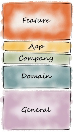
Categories of reusable user interface components across apps
Such a breakdown might look like this, ordered from most context-specific to
most general:
30% Feature-specific UI. These are elements you create to
define the UI for a specific feature: an Update Account Settings page in a
web app, or a custom popup that applies to just one list. You take more
basic controls (usually drawn from the categories below), compose them
together in a unique combination, and wire them up with context-specific
interactivity to achieve a specific task. By definition, this category of UI
code is not reusable. If you find an opportunity for reuse here,
you can factor that code out, but then you should group it one of the other
categories.
10% App-specific UI. Any app with more than one feature
will have UI elements which are consistent across those features, and those
consistencies can be implemented as reusable components. UI elements you
might use across multiple features within a given app might be: page
templates, templates or controls for table or list elements, a custom type
of touch menu used in multiple situations, and so on. You can think of this
set of UI as your app’s design language: a more focused expression of your
organization’s overall design language (below).If you work on a good team,
it should be straightforward to find and take advantage of such
opportunities.
10% Company-specific UI. Everything your company or
organization does has some (maybe not enough?) consistency in its
user interfaces. Perhaps you all follow a convention for app home pages, or
a standard way to handle user commenting, or maybe your company prefers
using multi-step wizards for complex tasks. These are the UI elements that
distinguish your company’s output from that of other companies working in
your industry. That is, this category defines your company’s design
language: the UI solutions that make your apps recognizable to your users.
(If your company makes only one app, then you can lump this category
together with the App-specific UI category above.) While in company leaders
may assume that everything in this category should be freely leveraged
across the company as a strategic advantage, in practice this category often
presents the most vexing practical challenges to reuse: office politics,
conflicting project schedules, and a lack of way to secure or account for
funding on shared work.
20% Domain-specific UI. Everyone working in your industry
works in the same problem domain. If you’re struggling to figure out the
best way to visually represent a complex data set, or to get a credit card
number from a customer, then others in your industry are too. You may be
lucky enough to work in a cooperative domain, but chances are, those other
people will be your competitors, and so for business reasons your company
may not be inclined to share implementations, and may in fact fight
tooth-and-nail to avoid their replication in competitive products. If you’re
in that boat, then this category of UI code can effectively be combined with
the Organization-specific UI category above. That is, your company will end
up with private implementations of solutions that could be shared in theory,
but in practice is company-specific. But occasionally even competitors may
recognize the value of sharing work. For example, a shared solution might
benefit your industry’s customers, and the result payoff for all
your companies may be great enough to overcome corporate resistance to
sharing.
30% General purpose UI. These are the common UI patterns
that everyone spends time coding up today: context menus, paginated
search results, docking toolbars, and so on. Very few companies
want to spend time on this stuff, because it’s just too far removed
from any company’s core competencies. Everyone wants to focus on the
categories above; no company believes they are going to beat their
competitors with their excellent implementation of tab buttons. So most
companies rush through the creation of these components, getting many of the
details wrong. This UI category contains everything that
should have been baked into the web, if only the web had been
designed for creating real applications instead of sharing scientific
research documents. As browsers evolve, the set of shared solutions here is
expanding, but only at a glacial pace. In the meantime, we all have this
chunk of UI problems to solve, and there is an enormous opportunity to share
UI code here. At the same time, the broad set of possible consumers of any
given UI component implies a significant challenge in establishing
consensus. The UI code in this category should be written once (or
maybe, because we could never get everyone to agree on anything, written a
tiny handful of times) and never written from scratch again.
The percentages I’ve given above are rough, but drawn from examining the UI
code in apps I’ve written over the last few years. Those apps were already
carefully componentized, and focused on code reuse, so I expect a more
thorough analysis of more web apps would confirm that the numbers above are
conservative. That is, the actual degree of unnecessary reimplementation
in a typical web application is probably far higher. Without a component
foundation, the most expedient way to replicate a given behavior is often to
cut-and-paste it from somewhere else in the app’s source, then hack on the
result to fit the new context. The app may not only be reinventing the UI
wheel, but doing so multiple times in the same codebase.
If the above breakdown is even roughly correct, then consider a new web
company entering an existing market who writes their app UI entirely from
scratch. Even if it were extremely well-factored, 50% of all the UI code they
write would be reinventing the wheel, solving domain-specific or general
purpose UI problems which have already been solved before. While that sounds
extreme, it’s probably not that far off the mark for most companies. While
most apps consume at least some third-party UI elements (to implement a
Facebook “Like” button, say), in many cases the typical company is just
nibbling at the edges of the problem. And, if we assume that office politics
and other factors prevent them from sharing code internally, the percentage of
unnecessary re-invention may be much higher.
No matter how you slice it, chances are that most app teams are writing way too much UI code. Because the web lacks a real component model, most companies write
reams and reams of non-modular, non-reusable UI code. If they were to build
their apps on a UI framework that let them use and extend components, they
could probably avoid writing much of the UI code they write today. To put this
in business terms: if they were to componentize their UI effectively, they
could get the same amount done in half the time or with half the resources.
Obviously adopting a component strategy and reusing components have costs of
their own, but I expect those are dwarfed by the mind-numbing scale of solving
the same problems again and again.
There already are component frameworks for developing web app user interfaces.
I’m obviously heavily invested in QuickUI, but you can find others out there
as well. Given the huge savings they can make possible, they’re worth a look.
Back in April, someone evaluating QuickUI made the completely reasonable
request to see a complete sample application created in QuickUI. More
specifically, they were interested in seeing a demonstration of how to use
QuickUI as the View in an MVC (Model-View-Controller) application, ideally
using the popular
Backbone.js library. QuickUI is well
suited to fill that role, and a sample application has now been created to
show off how to do exactly that.
The result is a
sample Contacts application
built in QuickUI. The sample takes advantage of QuickUI’s support for
CoffeeScript, which turns out to be an elegant language to express both
Backbone and QuickUI classes. Read the sample’s documentation for more details
of its construction.
First, it’s now even easier to create web user interface components in
CoffeeScript. When CoffeeScript support in QuickUI was
first announced
a month ago, you had to include a boilerplate constructor. This was required
to work around a limitation in CoffeeScript, in which CoffeeScript’s default
constructor for a class didn’t return a value. (See
a good summary of the issue here.) That issue has now been
fixed in
CoffeeScript 1.3.3. With a considerable degree of rework in the base Control
class, you can now create a new user interface control in a single line of
CoffeeScript:
Second, QuickUI 0.9.1 has a simplified model for generic styling. The QuickUI
Catalog controls define generic styles that allow them to function without you
needing to provide styling for them. You can easily turn off a base class’
generic style by setting the subclass’
generic()
property to false.
In order for the
recent release of QuickUI 0.9.1
to support concise creation of control classes in CoffeeScript, it was
necessary to go deep into the bowels of jQuery’s class constructor to
determine how it worked. Those findings are documented here in case others
have a similar need to subclass jQuery, or would like to address the same need
that drove jQuery to its current implementation.
The jQuery class constructor can be found in
core.js:
jQuery = function( selector, context ) {
    // The jQuery object is actually just the init constructor 'enhanced'
    return new jQuery.fn.init( selector, context, rootjQuery );
}
But the comment doesn’t do much to explain why init exists, or how it works.
All jQuery developers are familiar with the form $(“div”), which is a
shorthand for the longer jQuery(“div”). This, we are told, returns a new
jQuery object. Actually, from the above constructor, we can see that what it
really returns is an instance of the jQuery.fn.init class. (From here
on out, we’ll just refer to that class as “init”.) The init constructor is
defined like so:
Here, first note that jQuery.fn is just a synonym for jQuery.prototype. Given
that, we see that the init class constructor hangs off the jQuery prototype.
Stashing the init class on the jQuery class’ prototype allows the jQuery
library to avoid polluting the JavaScript global namespace with an extra
class. (Of course, init could easily have been defined inside the outer
jquery.js function closure, which would avoid namespace pollution and prevent
access to it from outside. The init class isn’t really referred to elsewhere
in the jQuery source, so it’s not immediately clear why that wasn’t done.
Perhaps the above approach makes for easier debugging.)
Further on, we see this init class defined as a subclass of the jQuery class:
// Give the init function the jQuery prototype for later instantiation
jQuery.fn.init.prototype = jQuery.fn;
Since jQuery.fn is just an abbreviation for jQuery.prototype, the above line
is really:
So all those times when you create an instance of jQuery you are actually working with an instance of a jQuery subclass.
Okay, but why bother? One reason is that jQuery wants to support a static
constructor form: one you can invoke with needing to specify “new”. Regardless
of whether you invoke the jQuery() constructor with “new” or not, it’s always
going to return an instance of the init class. And, because init is a subclass
of jQuery, you’ll end up with an instance of jQuery, which is what you wanted.
// The following lines are all equal.
var $e = new jQuery("div");
var $e = jQuery("div");
var $e = new $("div");
var $e = $("div");
So at least one reason init exists is that it serves as a helper class to let
you write shorter jQuery code. The thing is, supporting instantiation without
“new” doesn’t require defining a separate helper class.
The jQuery constructor above is relying upon an oddity in the JavaScript
language: a constructor can return an object that’s an instance of a class
other than the class defined by the constructor. The jQuery class could more
easily use the simpler factory constructor
pattern to check to see whether it’s been invoked without “new” (in which case
“this” will be the window) and, if so, just return a new instance of itself.
That is, in fact, how jQuery worked back in
jQuery 1.1:
var jQuery = function(a,c) {
    // If the context is global, return a new object
    if ( window == this )
        return new jQuery(a,c);
    ...
};
By jQuery 1.2, however, the jQuery constructor was using the technique shown
above. It’s hard to tell from the code exactly why the init helper class was
introduced. One possibility is that init has that extra rootjQuery parameter
which is for internal use only. Burying that parameter in a helper class
avoids having to expose the parameter in the jQuery API, where it might
confuse jQuery developers or, worse, encourage them to create code that
depends upon that parameter.
Subclassing jQuery
One cost of jQuery’s class scheme is that it makes it much harder for
you to subclass jQuery. One reason you might want to do this is to
provide scoping for your own jQuery plugins. If you want to add a lot of
plugins to jQuery’s prototype (which, as indicated above, is what you’re doing
when you add something to jQuery.fn), you could potentially pollute the jQuery
namespace and run into conflicts with other plugins. By subclassing jQuery,
and working strictly with instances of your subclass, you hide all your
plugins from anyone who’s directly instantiating the plain jQuery class.
Unfortunately, because of this init helper class, the normal JavaScript
prototype-based subclassing scheme won’t work with jQuery. To make your
subclass jQuery-like, you end up needing to replicate jQuery’s complex helper
class arrangement: create a subclass of jQuery and a companion init
helper class, derive your helper class from your actual jQuery subclass, and
ensure your subclass’s constructor actually returns an instance of your init
class.
The mind-breaking pain of all that is presumably what led to the creation of a
jQuery function called
$.sub(). That function does
exactly what’s described above: it defines a new subclass of jQuery and a
companion init helper class.
The $.sub() plugin doesn’t seem to be used much, perhaps because its benefits
and reason for existence aren’t well-documented. The announced plan is that
$.sub() will be removed from the core jQuery library in version 1.8, and
transition to become an official plugin. As a result, $.sub() is deprecated as
a native jQuery feature, but $.sub() and its technique will continue
to be useful, so it’s still worth understanding and considering it.
QuickUI relies upon the $.sub() technique to make its base Control a subclass
of jQuery. This is what lets you use any jQuery feature with QuickUI controls
directly: you can bind events to them with $.on(), you can style them with
$.css(), and so on. That’s because your control class derives from Control,
and so ultimately derives from jQuery.
You can
create a new QuickUI control class in JavaScript
by invoking Control.sub(). And, with QuickUI 0.9.1, you can now create
subclasses of Control (and, therefore, jQuery )
using CoffeeScript’s built-in class syntax, which is concise and highly legible. In either language, you can easily
create your own reusable web user interface components that have direct access
to all the power of jQuery.
For the past two months or so, I’ve left off from my weekly blogging habit
here to focus on some behind-the-scenes aspect of QuickUI. I post about those
updates on the separate QuickUI blog. That blog is more technically-oriented,
but I though it was worth sharing a roundup of those posts here:
I’ve made a number of improvements to the QuickUI runtime, including a
significant version update. One interesting new feature is support for creating UI in CoffeeScript
(in addition to plain JavaScript).
A developer asked for sample application code showing how to use QuickUI as
the “View” in an application with an MVC (Model-View-Controller)
architecture. That’s a great idea, and to date I haven’t had such a sample I
could offer. Cozi’s
Meal Planner is actually
a Model-View-Presenter that uses QuickUI for the View, but the source for
that application is proprietary. It’ll be useful to have an interesting
MVC/MVP sample application that shows off how to use QuickUI; I’ll post back
here when I have something worth looking at. Thanks for the suggestion,
Chris!
I continue to be interested in making sure the emerging Web Components spec
is well-suited to the scenarios routinely faced by UI designers and
developers, and have articulated a vision for
how QuickUI and Web Components could co-evolve. This has included some time
analyzing the QuickUI Catalog controls
in light of the Web Components spec. On that note, I’m looking forward to a
meeting with the spec’s author, Dimitri Glazkov, later this week.
A designer friend suggested creating a new QuickUI screencast. The few
QuickUI screencasts I’ve done in the past are now out-of-date, and my ideas
about how to explain the value of component-based UI development have
evolved, so it’s a good time for a new one.
I also continue to improve the
QuickUI Catalog controls, although
at a slower pace. The above work on the fundamentals and explaining them is
taking precedence for the time being.
Thanks to those who have shared suggestions with me — they’re very helpful. If
you take a look at any of the above and have feedback, please let me know.
This post shares some highlights of the experience porting a non-trivial
library from plain JavaScript to CoffeeScript in case other parties are
considering a similar transition.
Yesterday’s
announcement of QuickUI 0.9
mentioned that the framework source code has now been ported to CoffeeScript.
The QuickUI framework is intended for plain JavaScript development as well;
nothing in the change of source language changes that. But experimentation
with the CoffeeScript language suggested there were enough advantages to the
language that, going forward, it would be worth porting the runtime from plain
JavaScript to CoffeeScript.
Overall, the port from plain to JavaScript to CoffeeScript went rather
smoothly, and the bulk of it took about two days. The QuickUI runtime,
quickui.js, is a reasonably complex JavaScript library, which is to say that
it’s not a toy or trivial sample application. The last plain JavaScript
version of the QuickUI runtime, quickui-0.8.9.js, was about 7700 lines of
plain JavaScript (including comments), or about 60K, developed over the course
of four and a half years.
Automatic translation with js2Coffee
The handy js2coffee conversion tool was
used to kickstart the port. Kudos to Rico Sta. Cruz for this great tool.
The automatically translated CoffeeScript immediately passed 97% of the
QuickUI unit test suite. The remaining 4 broken tests were do to a single
issue related
to translation of the “instanceof” keyword, which was easy enough to work
around.
The one thing js2coffee doesn’t translate (yet) are comments, so these had
to be copied over by hand. Tedious, but straightforward.
Similarly, the js2coffee output sometimes produced long lines that needed to
be hand-broken for legibility. Again, a bit tedious but straightforward.
Once all unit tests passed, the unit tests themselves were ported to
CoffeeScript by the same process.
After about a morning of work, a CoffeeScript-based quickui.js was functional.
It passed all unit tests, and could actually be used to drive a non-trivial
QuickUI-based body of code like the
QuickUI Catalog.
Towards idiomatic CoffeeScript
After the mechanical port with js2coffee, various CoffeeScript idioms were
applied incrementally to replace the standard JavaScript idioms with their
more concise CoffeeScript versions. This took another day and half or so.
There was occasion to use pretty much all of CoffeeScript’s syntactic sugar.
References to Foo.prototype.bar() were replaced with the more concise
Foo::bar(). Closure variables to hold “this” for use in an event handler
were replaced with CoffeeScript’s “=>” syntax. Etc., etc.
Because CoffeeScript can wrap a body of code in a single function closure,
this no longer needed to be done by hand. A wrapping closure like that can
complicate the management of a pile of plain JavaScript files. The closure
will typically have to be created through a build process that includes a
JavaScript fragment (to start the closure) before the real JavaScript files,
and another fragment (to end the closure) afterwards. (The jQuery
Makefile
does this, for example.) CoffeeScript’s built-in support for a closure that
spans multiple files finally made it easy enough to break up the quickui.js
runtime from a single monolithic JavaScript file into a much saner and more
manageable collection of CoffeeScript files. That is, while the same degree
of manageability could have been achieved in plain JavaScript, CoffeeScript
made it simple enough that it actually got done.
The QuickUI runtime itself doesn’t create many classes, but in some cases
(e.g., the unit test suite), classes could be created via CoffeeScript’s
concise class syntax. This took advantages of QuickUI’s new support for creating web user interface controls using CoffeeScript class syntax.
JavaScript “for” loops were replaced with CoffeeScript list comprehensions.
Idiomatic CoffeeScript iteration over jQuery objects
Speaking of “for” loops, it turns out that a good deal of the QuickUI runtime
deals with looping over jQuery objects. QuickUI controls are a subclass of
jQuery object, and when looping over them in plain JavaScript, it’s often
convenient to use jQuery’s $.each() function. For example, this function
invokes foo(), a jQuery method or plugin, on each element in a jQuery object:
var $elements = $(".someClass");
$elements.each( function( index, element ) {
    $( element ).foo();
});
Note that $.each() gives the callback the plain DOM element, so you have to
wrap that element with $(element) to get a jQuery object you can then
manipulate. To simplify that, QuickUI’s runtime has long had a helper function
called eachControl() that gives the callback the element as a wrapped jQuery
object. (In QuickUI’s case, it also ensures the control’s particular subclass
of jQuery is used, so that you can directly manipulate the control with that
control’s own specific API.) E.g.:
To take best advantage of CoffeeScript’s supports for looping constructs, a
simple jQuery plugin was created to create an array that can directly be used
by CoffeeScript’s “for” loop and list comprehensions. This plugin, called
Control.segments(), converts a jQuery object that holds a number of elements
into an array of jQuery objects that each hold a single (wrapped) element. The
definition of segments() in CoffeeScript is trivial:
Control::segments = ->
  ( @constructor element for element in @ )
QuickUI defines segments() on the Control class so as not to pollute the
general jQuery plugin namespace, but the above definition could just as easily
be done as jQuery::segments to create a plugin that worked with any jQuery
object. In any event, the result of applying segments() to a jQuery object is
an array that can be directly iterated over, while at the same time preserving
type information.
$button.foo() for $button in Control(".BasicButton").segments()
Here, the looping variable $button ends up holding an instanceof BasicButton
(which is also an instanceof jQuery), so $button.foo() invokes
BasicButton.prototype.foo().
This “for” loop feels more direct and idiomatic in CoffeeScript than the
standard $.each() approach. (In fact, it’d be nice if $.each() were extended
so that, if invoked without arguments, it returned an array just like
segments() does here.) This segments() call can also be used in CoffeeScript
list comprehensions, thereby replacing many situations in which $.map() is
currently used. A
jsperf experiment
suggests the segments() approach performs roughly as well as the standard
$.each(). The generated JavaScript for segments() does build a temporary array
of results, but it avoids the need for the callback function and the
accompanying closure.
Impressions
The new, CoffeeScript-based QuickUI source code gets compiled to a plain
JavaScript file that’s essentially the same size as the handwritten JavaScript
(61K vs 60K). The new runtime appears to perform and function just as well as
the earlier plain JavaScript one, so QuickUI developers shouldn’t notice any
difference. At the same time, the new CoffeeScript source code
feels a lot tighter and easier to read and maintain.
This ability to write tighter code has already invited the successful
implementation of a number of long-planned improvements to the runtime. It’s
hard to say how many of those improvements were easier to tackle because of
advantages in the CoffeeScript language itself, and how many were tackled just
because CoffeeScript is a shiny, new tool. But as a general rule, it seems
that CoffeeScript permits a programmer to more directly express their
intention than one can do in JavaScript — and any language that can do that is
a step forward.
Best of all, using any language like CoffeeScript that compiles to plain
JavaScript enables a developer to finally break a hard dependence between
language choice and the user’s browser. Now that QuickUI itself is written in
CoffeeScript, it can take immediate advantage of improvements in CoffeeScript
the day they appear, instead of waiting years for incremental JavaScript
improvements to make their way through committee, into browsers, and into
users’ hands.
QuickUI now supports the use and creation of web user interface controls in
CoffeeScript, a
language that adds many useful features to the JavaScript language. Through
its compiler, CoffeeScript can be easily used as a replacement for JavaScript
in many web projects.
QuickUI turns out to be a natural fit for CoffeeScript. One of the nice
features in CoffeeScript is that you can create classes with the language’s
built-in “class” syntax. You can take advantage of that syntax to create new
QuickUI control classes, simply by extending the base Control class or any
other control class:
# A simple button class in CoffeeScript
class window.HelloButton extends BasicButton
  constructor: -> return Control.coffee()
  inherited:
    content: "Hello, world!"
  genericSupport: true
QuickUI control classes are subclasses of jQuery, so one of the key features
in QuickUI’s new support for CoffeeScript is actually being able to create
jQuery subclasses in CoffeeScript. CoffeeScript generates a prototype-based
class that is similar to the classes produced by jQuery’s
$.sub() feature (a core part
of jQuery that will be moved to a plugin in jQuery 1.8), but jQuery’s classes
require a rather Byzantine construction sequence. This is handled through the
boilerplate constructor shown above. When Control.coffee() is called, it fixes
up the CoffeeScript class so that it conforms to jQuery’s notion of how its
class constructors should work.
With this in place, it’s now possible to create QuickUI controls in
CoffeeScript with significantly less source code than the equivalent plain
JavaScript. This is an overall win for web UI developers. If your team hasn’t
already taken a look at CoffeeScript, now might be a good time.
Creating QuickUI controls in CoffeeScript currently requires a plugin, but the
plan is to fold CoffeeScript support directly into the quickui.js runtime.
Read the
documentation for QuickUI support of CoffeeScript
for more details.
As indicated in the earlier overview comparing
QuickUI and Web Components, one significant difference between the two frameworks is that QuickUI
allows code to run when a control’s content() property is set, while the Web
Components spec does not currently allow for this. This post will attempt to
begin making the case for the need for this feature, starting with an analysis
of how that feature is used in QuickUI controls today.
The largest public body of QuickUI controls is
QuickUI Catalog, which as of this
writing includes 76 open source controls that handle a variety of common user
interface tasks or serve as demonstrations of how to achieve common behaviors
in controls. Of the 76 published controls:
32 controls include code that runs when their content() property is set.
Since the base Control class already provides a default content() property,
these controls are overriding that base implementation. (In some cases, like
PopupSource, the
class’ content() property override is itself overridden by a subclass like
ComboBox.)
Of the above 32 controls, 23 use their content() property override to
delegate content to a sub-element. This is the standard approach in QuickUI
for a control to incorporate content from its host. (For a working example,
see this jsFiddle, in which
a UserTile control delegates its content to a span inside the control. This
topic is also covered in the second portion of the QuickUI JavaScript
tutorial.) This is roughly
analogous to what Web Components spec accomplishes with the proposed
<content> element.
12 controls (of the 76 in the catalog) are text box variations that delegate
their content() property to a text box: either an <input> element of
type “text” or a <textarea>. For example, the content() of a
ListComboBox will be
placed inside an <input>. Historically, HTML input fields have
insisted on handling the field’s value through a string “value” property,
whereas an element’s content is a DOM subtree. Despite the difference in
data type, in many cases the distinction between “value” and “content” feels
somewhat arbitrary. The convenience of a content property is just as
interesting to a control that wants to render that content in a text box.
For example, if a combo box is going to hold a list of animal names, it’s
nice to be able to set the default content of that combo box in markup
as:<ListComboBox>Dog</ListComboBox>. Naturally, this translation
is lossy: if one passes a DOM subtree into such a control’s content()
property, it’s to be expected that it will only preserve the subtree’s text.
Nevertheless, it is highly useful to be able to define controls that render
their primary content in text boxes.
20 of the controls override their content() property to perform work
whenever the content changes. The following table summarizes these 20 cases:
To summarize, these controls are doing the following types of work when their
content changes:
Adjust its dimensions or the dimensions of some subelements (e.g.,
AutoSizeTextBox, Menu).
Layout contents to achieve results not directly supported in HTML and CSS
(e.g., PackedColumns, PanelWithOverflow).
Transform or manipulate the content before rendering it (e.g., Repeater,
ColorSwatch).
Update its own subelements based on the content (e.g., TabSet,
SlidingPagesWithDots).
Validating content (e.g., ValidatingTextBox, and its subclasses like
DateTextBox).
Such controls represent a significant percentage of the QuickUI Catalog —
approximately 25% — and it’s very likely that similar results would be found
in other QuickUI-based projects. And in addition to the scenarios listed
above, other scenarios likely exist in which a control wants to perform work
when its content changes.
Overall, this pass through the QuickUI Catalog suggests that many interesting
user interface components have a need to perform work when their content is
set — to do something more than passively hold the content they’re passed. At
this point, it’s not exactly whether the aforementioned QuickUI controls could
be successfully ported to Web Components as the spec currently stands, which
would be unfortunate. (As stated in the previous post, a long-term vision for
the QuickUI framework is that controls created in QuickUI can be transitioned
to a Web Components foundation in the future.)
It’s possible that a component could use forthcoming support for DOM mutation
observers could be used to track changes to its own content, but whether this
would work, or work well, is not yet known. A control could also force its
host to invoke some method on the control whenever the host changes the
control’s content, but that would be unfortunate; it would place extra work on
the developer, and a host’s failure to properly notify the control that its
contents have changed could lead to subtle bugs.
This post is the first in a series looking at the relationship between QuickUI
and Web Components. This post will kick things off by laying out some basic
points of a vision for how these two technologies might co-evolve.
The Web Components effort spearheaded by Google is a vital effort towards
promoting component-based user interface design for web-based apps.
Componentized user interfaces may
radically transform the web industry. It will take some time for the spec to be finished and agreed upon, and
then still more time for the technology to make its way into users’ hands. It
is hoped that QuickUI can serve as a bridge to the world of Web Components,
act as a reference point for work on the emerging spec, and provide services
and component libraries that speed the creation of Web Component-based apps.
QuickUI and Web Components have the same goal
Both frameworks address the same fundamental objective: let web designers and
developers create better applications faster through the creation and use of
modular, reusable, and extensible user interface elements. QuickUI calls such
elements “controls” and the Web Components spec calls them “components”, but
in this context the terms are essentially interchangeable.
There are obviously differences in approach. QuickUI is built on JavaScript
and jQuery, while Web Components is native code and browser- and
library-agnostic. The Web Components framework, by virtue of being part of the
browser, can do many things which a JavaScript library like QuickUI cannot.
There are some obvious performance benefits to doing things in native code.
It’s also possible for the browser to enforce a high degree of component
isolation by preventing a Web Component’s host from knowing what’s going on
inside the component. Such isolation is crucial for a component platform,
because it leads to a proper
separation of concerns. A component author can make many modifications to the inner workings of a
component without fear that hosts of that component are inappropriately
depending on a particular implementation. QuickUI can only maintain such
separation of concerns by convention and by proffering services that make it
easier for developers to use controls in a modular way than not.
Despite their differences, fundamentally these two web user interface
frameworks are more compatible than not. This opens up the possibilities which
follow.
QuickUI and Web Components should be interoperable
Based on the current Web Components spec, in theory it should be
straightforward for a QuickUI control to host a Web Component, and vice versa.
That can provide a degree of future-proof resiliency to a team that wants to
build with QuickUI today. But it should be possible to do better than that…
QuickUI itself will someday be built on top of the Web Components foundation
Given the performance and modularity benefits of Web Components, and the
reasonably close alignment of goals, it appears that it should be possible to
eventually have QuickUI controls be Web Components.
Currently, the lowest levels of the quickui.js runtime provides services such
as creating control subclasses and instantiating controls. These low-level
services would be provided by a Web Components-enabled browser instead. The
QuickUI runtime could potentially detect whether the user’s browser supports
Web Components and, if so, create controls as Web Components wrapped by
jQuery. On legacy browsers (all today’s released browser versions, going back
to IE 8), the QuickUI runtime would continue to create controls as regular DOM
elements wrapped by jQuery.
QuickUI can provide useful features beyond those which have been standardized
Standards, by their nature, advance slowly. Even once QuickUI is built on top
of Web Components, QuickUI can continue to evolve at a faster pace to meet the
needs of web designers and developers. QuickUI can be the “running code” in
the maxim that Internet standards evolve from
Rough consensus, running code.
QuickUI is also designed explicitly for jQuery developers, whereas the Web
Components spec must be library-agnostic. In the same way that jQuery
developers currently find it much easier to write an interactive UI in jQuery
than by doing direct DOM manipulation, they will also find creating controls
(components) easier in QuickUI than using only the low-level services offered
by the browser. For example,
a QuickUI control is already a jQuery instance, so a developer can immediately and directly manipulate a control using all
the facilities in jQuery. As another example, QuickUI’s services for creating
properties generate jQuery-style getter/setter functions which are
automatically chainable, and can be applied to a collection of elements in a
single call.
QuickUI may serve as a reference for work on Web Components
As a 4+ year-old web user interface framework, there’s already a considerable
degree of hard-earned knowledge baked into the QuickUI framework. These
lessons can be considered as the various parties working on Web Components
flesh out the details of that spec. It’s in this role of QuickUI as a
reference point that some of the important lessons from QuickUI will be
covered in future posts on this blog.
QuickUI lets teams create componentized web user interfaces today
Many of the benefits of building a user interface with components can be
achieved by a team using QuickUI today. As summarized on the
QuickUI home page, those benefits include
the abilities to:
Better organize and maintain UI code.
Use custom controls to provide optimized user interactions or a particular
visual aesthetic.
To begin developing, in the course of one project, a library of reusable UI
that can accelerate a team’s future projects.
Share common UI solutions across teams and organizations so those solutions
don’t need to be created from scratch each time.
Investment in QuickUI apps today can be preserved when Web Components arrive
This is a vision, not a legal commitment. The Web Components spec is
still in flux and evolving entirely outside the control of anyone working on
QuickUI, so it’s impossible to promise how things will work in the future.
Still, it’s plausible that a team could begin creating a web user interface in
QuickUI today, and as Web Component-enabled browsers arrive and gain use, the
team could automatically (or, at least, easily) transition to that better
foundation to improve the performance and reliability of their apps.
The QuickUI Catalog will evolve into the web’s best open library of reusable
user interface components
To an extent, the QuickUI Catalog of
common, ready-to-use controls is somewhat independent of the underlying
QuickUI foundation. At the most abstract level, these are user interface
patterns that can be found in many applications on many platforms. Even if
obstacles prevent QuickUI controls from being built as Web Components, the
existing JavaScript code base for the Catalog would give one a huge headstart
in creating an equivalent library of Web Components. And if the vision
outlined here comes to pass, the Catalog’s collection of components — and user
interfaces built with them — should be able to transition smoothly to a Web
Components foundation.
Next steps: investigation of framework differences
While the above points lay out a vision for the coevolution of QuickUI and Web
Components, many details remain which must be investigated before such a
vision can come to pass. While the goals of the two frameworks are generally
aligned, the design principles underlying the two have significant
differences. For example, QuickUI’s
core design principles
seem to place greater emphasis on extensibility — creating a new control class
by extending an existing class — than does the current Web Components spec.
Such differences could lead to irreconcilable incompatibilities, which would
represent lost opportunity.
The hope is that any issues can be teased out of the Web Components spec early
enough and either worked around or submitted for consideration so that they
may hopefully be addressed. Some key issues warranting further investigation
are:
A significant fraction of QuickUI controls override their base class’
content() property setter function in order to perform work when a host sets
a control’s content. This is done for a variety of reasons: to partially
fill in a component’s DOM tree (a sort of user interface
currying); to transform
content before displaying it; to recalculate layout; or to perform other
operations dependent upon the content. This is not currently supported in
the Web Components spec. An analysis of the QuickUI Catalog controls on this
topic is underway to produce a set of common use cases.
A QuickUI subclass maintains an is-a relationship with its base class. The
<shadow> element in the Web Components spec may lead to subclasses
that effectively maintain more of a has-a relationship with their parent
class. It’s not immediately clear, for example, how one could define a base
class and a subclass that meet all these conditions: a) both use the same
root element (e.g., <button>), b) both are independently instantiable,
c) the subclass can host base class elements (e.g., via <shadow>), and
d) the subclass is a JavaScript instanceof (is-a) of the base class. These
conditions often arise when extending an existing control class, and QuickUI
control classes can meet all of them.
The Web Components proposal minimizes the impact on the HTML language
itself, but one repercussion of this appears to be that component classes
can’t define custom properties that can be set through markup. As currently
understood, the spec calls for hosts to pass values to components
exclusively through a single content tree. The component class must then
prise apart this content through a “select=” attribute so that it can
incorporate content subelements into different parts of the component.This
is roughly analogous to the way command-line apps must parse their text
arguments, with both the flexibility and the potential for great
inconsistency that go with that. In this context, such flexibility may
create significant complications for the creation and maintenance of
subclasses, as varying levels of the class hierarchy impose different
demands on the content. Overall, this doesn’t feel as specific or clean as
the compound property syntax in a language like XAML (or
QuickUI Markup), in which a
control class can define custom properties that may be set as string
attributes, through nested subelements, or through property setter
functions.
As these issues are investigated more deeply, the results of those
investigations will be posted here.
QuickUI 0.9 has been released. This is a major update which includes a number
of changes that make it easier than ever to create reusable, extensible web
user interface components.
The means by which classes are defined has been substantially simplified,
which means that QuickUI is doing a lot less work when a class is defined.
One result is that the previous Control.subclass() method has been replaced
with a simple jQuery.sub() call. An overload still permits one to pass in a
JavaScript object defining the class, but now everything in that object is
simply copied over to the new class’ prototype. A new “inherited:” key now
holds the Control JSON used to render the control; see the
docs for more
details.
The way you refer to an element within a control’s DOM has changed.
Previously, you set an ID on an element in Control JSON using an “id:” key.
Under the covers, this set an ID on the HTML element. As of QuickUI 0.9, to
refer to an element in code, the Control JSON should include a “ref:” key.
(See the
tutorial example.) Under the covers, this will set a CSS class on the element. As before,
this also implicitly creates an element reference function you can use to
get that element through code: e.g., setting ref: “foo” on an element lets
you get back to that element with the element reference function $foo().
A control’s initialize() method now implicitly invokes the initialize()
methods of its base classes. Previously, you had to remember to have
initialize() invoke this._super(), which was error prone. Failure to invoke
this._super() would often mean that a base class’ event handlers didn’t get
wired up, which could lead to bugs which were difficult to track down.
CoffeeScript support,
announced earlier, has been folded into the core quickui.js runtime.
While the above work was underway, the QuickUI source code was substantially
overhauled:
The aforementioned support for creating QuickUI controls in CoffeeScript has
gone so well that QuickUI’s own runtime has now itself been ported to
CoffeeScript. This does not mean that QuickUI developers need to
use CoffeeScript; QuickUI supports plain JavaScript development and
CoffeeScript development equally well. For people using QuickUI, this simply
means that a number of planned improvements to QuickUI (including those
listed above) could more easily be tackled.
The quickui.js runtime file itself is now built with Ben Alman’s handy
Grunt build tool.
The optional QuickUI markup compiler has been moved into a separate GitHub
repo, quickui-markup.
Imagine, for a moment, that you’re living way back in the early 1980s, maybe
1984. You have access to a computer, and on that computer, you use a
top-end DOS app like Lotus 1-2-3:
Then, one day, you see a marketing campaign for a new computer. Your eye
catches on this image:
Your mind is completely blown. The user interface for this
application, which you learn is called MacPaint, seems utterly unlike any
application you’ve ever seen. In fact, the entire premise of this image speaks
to a proposition that’s never before even occurred to you:
a computer can be used to create art.
• • •
Looking back, it’s hard to convey now how stunning both this image and that
proposition were at the time. When the original Macintosh was released, this
was probably the first vaguely art-like computer-rendered illustration most
people had ever seen. Before that moment, when (or if) the average person
thought about a computer, they considered it a tool for crunching numbers or
typing documents.
In retrospect, this Japanese woodcut was probably the most sophisticated
illustration most people ever saw on an original Macintosh. As groundbreaking
as the application was, it was simply impossible for the average user,
even a fairly artistic person, to create something of this quality with a
mouse. Drawing with a mouse in MacPaint was said to be, “like drawing with a
bar of soap”. If you tried to create something like the above yourself, the
results were laughable. You could indeed create interesting works in
MacPaint, but only by relying on text, lines, polygons, and those paint bucket
textures along the bottom. That is, you got the most interesting results with
tools that were well-suited to software implementation and which produced
effects you couldn’t easily achieve on paper.
With the Japanese lady, [Apple developer] Bill Atkinson was experimenting
with scanning, and Steve [Jobs] brought in an actual woodcut that he had
bought: it was big and colorful, and that was one of the first things that
we scanned. And I took the scan, which was kind of rough, and refined it to
make the final illustration. It looks so crude now — in terms of scanning
technology — but it seemed amazing at the time that you could get a “real”
image into your computer.
The fact that this image started from a scan was both a surprise and something
of a disappointment. Ah, no wonder we never saw illustrations like this —
fundamentally, this was marketing! Not to detract from the groundbreaking
impact of this work, but this image was clearly meant to suggest to users that
they could create art freehand, using only the tools in MacPaint.
Nevertheless, MacPaint represented a watershed in application user interfaces
that had broad impact far beyond its users or market. When such an event
occurs, it’s possible to look at the app and say something remarkable:
Someday allour apps will be this great.
The only reason the MacPaint woodblock image is no longer jaw-dropping to us
today is because, within a relatively short time, nearly every application
acquired a user interface that in many ways looked and worked as as well as
(or, eventually, better than) the interface in MacPaint. Apps simply had to
improve to stay competitive, and users everywhere reaped the benefits.
• • •
Such a moment has now happened again — or at any rate, it has now happened
again to me. The moment came when I saw a post on
Beautiful Pixels
about Paper, an app by a
company called FiftyThree:
Paper is beautiful, and I find it a joy to use. Like MacPaint before it,
I think Paper represents a new watershed in user interfaces.
Earlier I’d tried
Adobe Ideas, a vaguely similar sketch pad app. It’s a fairly typical touch-enabled iPad
application, and follows many (but not all) iPad conventions. Judging by app
store reviews of Adobe Ideas, some of its users love it, and find it very
useful. I myself was underwhelmed. Adobe Ideas feels utilitarian, like a dead
thing. Using it to create a sketch feels like work. After a few attempts, I
stopped using Adobe Ideas.
Paper, in contrast, feels like something tangible and alive. It’s delightfully
fun. Since I installed Paper, I look forward to using it every
day. Paper’s interface is beautiful at every level. Zooming out from a
drawing (above) shows a sketchbook (below left) containing multiple drawings,
and zooming out further shows your collection of sketchbooks (below right):
A stunning amount of detail has gone into every aspect of Paper’s design. Just
a sampling of the tiny details I’ve noticed:
The “paper” background of a sketch isn’t pure white; it’s very slightly
off-white. This lets the pure white ink and paint appear extra bright.
If you’re in the middle of drawing and drag your finger (or stylus) over the
tool palette, the palette automatically drops out of the way so you can
continue your line into the space the palette had just been occupying.
You can paint with white watercolor to lighten things. While Paper carefully
models the physics of real inks and paints, in various places it breaks with
those limitations to let you do things which useful but not possible in the
real world. This seems to be done judiciously; the drawing tools still feel
very much like their physical analogues.
The tools respond to the speed of your movement — but not always the same
way. The pen gets thinner the faster you go, which makes physical sense, but
the calligraphy pen gets thicker when you go fast. This
is another case in which the physical metaphor has been judiciously broken.
I’m not sure of the precise rationale behind these differences, but the
result feels right.
As you flip through a sketchbook, not only do the pages animate in 3D, their
shadows do as well. Paper is built on the OpenGL 3D library, but it
probably still was a lot of work to get these effects to look this
good and this smooth.
Surprisingly, Paper actually delivers on the original MacPaint premise:
you can create beautiful art. I’m no artist, but I was able to
quickly sketch the still life with fruit shown above, and the cat in the
smaller image. It turns out you can add watercolors to pretty much any pen or
pencil drawing in Paper and get something that looks pretty good. My children
think so too — yesterday evening I had to read the Kindle edition of
Angelmaker on my phone because I
couldn’t pry the iPad away from my four year-old.
(Aside: Paper is free, but you’ll have to pay to get the watercolors. You
should just bite the bullet and buy all the tools — you will in the end,
anyway. I think Paper’s pricing model is as clever as their interface design.)
As amazing as the artistic results are, I don’t think they represent Paper’s
greatest accomplishment. At the highest level, I think the best thing Paper
has really done is let you feel like an artist. I haven’t regularly
sketched anything since Drawing 101 in college, and now I find I’ve bought an
iPad stylus so I can do more with Paper.
FiftyThree carries this message throughout out the Paper app, as well as
through their site and brand. Everything about this product is designed to
lead you to believe, “I am the kind of cool latter-day renaissance person who
carries around a Moleskine notebook because my free aesthetic soul may
encounter a beautiful scene I want to render as art. I am
that awesome.” This is, in fact, the very image in the Paper
promotional video: a guy wandering around New York City sketching stuff. The
video is shot from first-person perspective. That guy is you.
I think the term “user experience design” is often overblown puffery —
when I get to observe someone working through an app design problem, they’re
usually focused on the feature set and interface. I rarely witness someone
actually thinking directly about the experience their user will have.
But with Paper, I think “experience design” is an apt term for what they’ve
done. Maybe even that term sells it short. It could be called something like
“self-conception design”.
But, wait! Here’s the best part.
Someday all our apps will be this great.
Think about that. In the not-too-distant future, every bit of software you
currently use (and maybe swear at) — an online store, the Settings area for
your latest device, a random tool from an IT department, the production app
you spend your workday in — all those things will someday be as beautiful to
look at and joyful to use as this Paper app.
And those apps will make you feel great. When send a message, you
will feel like a great communicator (or socialite). When you follow a treasure
map to an out-of-the-way restaurant in a new town, you will feel like a great
explorer. When you follow a recipe, you will feel like a great chef. And when
you create a bit of software, you will feel like a great designer.
The history of user interface design isn’t terribly long, but it’s long enough
that designers who ignore it do so at their users’ peril. In the transition
from clients apps to the web, a lot of UI history has been forgotten, ignored,
or reluctantly set aside because its lessons were too expensive (if not
impossible) to preserve in early browsers.
For example, it’s hard to find a web application with a menu bar as usable as
the standard system menu bars in OS/X and Windows. Consider the basic tasks of
opening and closing a menu in a menu bar. Last week’s
post on popups
listed a number of ways in which a user can cancel a menu: clicking outside of
it (while not accidentally triggering whatever one clicks on),
pressing Escape, resizing the window, scrolling, or moving the focus to a
different window. Web implementations often overlook these aspects of closing
a menu.
If we now turn our attention to the task of opening a menu, we find
most web apps give this basic act similarly blunt treatment. The choices
you’ll typically see in web menus are one of these:
Menus open when the user clicks on a menu title.This is straightforward for a single menu, but problematic in a
menu bar with multiple menus. Users need to scan a set of menus if they’re
exploring their options, or if they’re hunting for a particular command. In
these situations, having to click on each menu in turn feels clunky. And if
the menu developer has done the fundamentally right thing in absorbing mouse
clicks outside the menu (so the user doesn't accidentally trigger
something when canceling the menu), the user must click twice to
open up the next menu.
Menus open as soon as the user hovers over a menu title.
This feels responsive, and lets the user quickly scan a set of menus. On the
downside, it can be incredibly distracting to have menus pop open when
they’re unwanted. Consider a user who clicks in a text field, and then has
to move the cursor away from the text field because the cursor doesn’t
automatically disappear when they start typing.
(Another bit of UI history that’s been forgotten!) Knocking the
mouse out of the way, the user happens to end up parking the cursor over the
menu bar, and now a completely unwanted, giant
mega menu
pops up, covering up their work surface. (That menu article suggests using
careful timing to avoid irritating the user, but to me that seems like a
band-aid on what’s fundamentally the wrong solution.) Open-on-hover does
offer the ability to have a click on the menu title perform navigation, but
as discussed in
Why Hover Menus Do Users More Harm Than Good, users may not discover that they can click on the title like a link — if
hovering into the title popped it up, then the user can easily conclude that
the menu has already performed the only job it’s there for.
The odd thing is that a completely smooth way to finesse the problems of both
these methods is right in front of the designer and developer, in the very
same OS/X and Windows client applications they are likely using to design or
code one of these problematic approaches.
Key attributes of menu riffing behavior
For ages both OS/X and Windows have used the following menu behavior:
When no menu is open, hovering over a menu title can provide hover feedback
on the title (Windows does this), but does not pop up the menu.
Clicking a menu opens it. This required click prevents accidental menu
invocation.
Once a menu is open, hovering into the title of another menu closes the
previous menu and implicitly opens the new one. This lets the user quickly
riff through a menu bar’s menus to familiarize themselves with
their contents or to find a specific command.
[Update: A commenter correctly points out that client OSes actually open
menus immediately on mouse down, instead of waiting for mouse up.
This makes it possible to riff through menus with the mouse down. If I
recall, Mac OS menus originally only worked on mouse down; letting go of
the mouse while over a menu title closed the menu. Windows, in contrast,
would keep the menu open even after the user released the mouse button,
which was easier to use. The user didn't have to hold the mouse down
throughout the whole menu exploration and command selection operation.
This approach was eventually adopted by the Mac OS. But both Windows and
OS/X still support mouse down opening and riffing of menus.]
To me, this resolution seems about perfect, and I wish all web app menus
worked this way. In contrast, how often have you used one of the clunky
always-click-to-open or twitchy open-on-hover web menu implementations and
said to yourself, “I wish all my OS/X (or Windows) apps worked this way!”?
To be fair, simply knowing the UI history (or being very observant) isn’t
enough — there’s still the question of cost. One could argue that Apple and
Microsoft have greater control over the environment than a web site within the
constraints of the browser, which is true, but I think that explanation falls
short. The fundamental problem seems to be the economics of homegrown UI: for
most companies, it’s hard to justify the return on investment to get these
details right in order to make a really usable menu bar. (Which, if they get
it right, their users won’t even notice.) Apple and Microsoft can each build a
perfect menu bar once that many developers can benefit from, so it’s worth
their taking the time to get it right.
Google Docs is one web app that has taken the time to sweat the details. Their
document editing suite carefully follows the same menu riffing behavior
described above: you open the first menu with a click, and subsequent menus
with hover:
I’m not sure if Google acquired this finely-tuned menu through Writely or one
of the other predecessors to Google Docs, or if they’ve more recently decided
that a good way to displace with Microsoft Office is with great usability at a
much cheaper price. Either way, it’s details like this that make Google Docs
feels like such a reasonable replacement for a desktop application suite.
(Thought not perfect yet: Google Docs gets the menu open behavior right, but
gets points off for menu closing behavior because they don’t absorb
background mouse clicks. And, as referenced above, it doesn’t hide the mouse
when you start to type, the way most client text editors or word processors
do.)
MenuBar control
I’ve added a MenuBar control
to the QuickUI Catalog, along with the usual companions of
Menu,
MenuItem, and
MenuSeparator classes.
A Menu can be used on its own, or as part of a MenuBar. When placed inside a
MenuBar, the menus will exhibit the riffing behavior described above.
I like the way Google’s visual style puts both the menu title and an open menu
on the same seamless surface to visually connect the two regions, so I’ve used
that style for a Menu’s generic appearance (the one you get if you don’t want
to do any of your own styling).
Although the MenuItem and MenuSeparator classes assume a traditional
vertically-oriented list of commands, use of those classes isn’t required, and
the Menu class could just as easily be used to present commands in multiple
columns or any other arrangement.
Implementation notes
The tricky bit here was making the entire MenuBar and its menus accessible to
the mouse, while simultaneously absorbing any background mouse click outside
the menu bar or its menus. By default, an individual Menu control supplies its
own Overlay so that a Menu can be used on its own or in some other menu
bar-like UI construct. The problem is that an Overlay behind a single Menu
control will prevent the user from hovering into other menus in the menu bar.
So the MenuBar creates its own
Overlay control, and turns
off the Overlays of the individual Menu controls. The result is the entire
menu bar and its menus sit above a shared overlay. The user can hover from one
menu to the next, and any clicks on the background overlay are absorbed and
cancel the currently-opened menu.
As always, it’s my hope that delivering this behavior in an open, reusable
component can eventually change the economics of web usability so that anyone
can benefit from the UI design history baked into a component — whether they
realize that history is there or not.
Apps often need to pop up something over the main UI; common examples would be
menus and dialogs. Unfortunately, while apps need popups,
documents don’t, and until recently HTML was relentlessly
document-focused. It’s frustratingly difficult to do a popup well in a
contemporary web app, and so it’s not surprising to see so many apps do them
poorly or inconsistently.
As a case in point, consider the ways a user might want to dismiss a UI
element which has popped up over the main UI. Depending on the specific form
of popup, there are a surprisingly large number of methods the popup might
support for leaving it:
Click outside the popup. This is the most common means to
dismiss a lightweight popup like a menu. The user is saying, “I see you,
popup, but don’t want to interact with you; let me get back to the main UI.”
When the user clicks on the main UI in the background, a key question
arises: what happens with that click? This isn’t an easy question
to answer; see below.
Click inside it. Perhaps the user has hovered into an
element that’s popped up a tooltip, and maybe the tooltip’s under the mouse.
If the tooltip is nothing but static content, the user can generally click
anywhere within the popup to dismiss it.
Make a selection. This is a special case of the above
point. If the user’s dropped down a combo box and has clicked in an item in
the resulting list, they’re not only making a selection, they’re also
saying they’re done with the dropdown.
Click a button that explicitly indicates completion.
Another special case of point #3. A classic example would be an OK button in
a modal dialog, which is essentially a heavyweight form of popup.
Click a close box. A modeless dialog or persistent
palette window often relies on a small “×” icon in the
upper-right corner as the primary means to dismiss it.
Press Esc. Popups of many flavors can be dismissed by
pressing the Escape key.
Wait. A tooltip or
transient message
may go away all on its own after giving the user time to read its contents.
Hover into another control that produces a popup. The
classic example here is menu riffing in Windows or OS/X menu bar. The user
must click a menu to open it, but once that first menu is opened, the user
can open the next menu simply by hovering into it. (This aspect of menus is
worth a closer look in a subsequent blog post.)
Move the focus to another window. Most forms of pop ups are
temporary enough that the user doesn’t expect them to stick around. If the
user opens a right-click context menu in Google Docs, and then switches to
work in a different window, they don’t expect to come back to Google Docs
later and find the context menu still open.
Press the ALT key. On Windows, the ALT key or (considerably
more obscurely) Shift+F10 are used as the keyboard shortcuts to activate the
menu bar (or, in some cases, the selection’s context menu). If the user
already has a menu or other popup open, this generally dismisses the popup
before activating the menu bar.
Scroll the page with the mouse wheel. Some apps handle
this, some don’t. But if a tooltip or context menu was invoked from
something that’s being scrolled out of view, there’s probably no reason for
the popup to remain open.
[… Are there other ways? There are a wide range of other user actions
that could dismiss a popup, but the others I can think of close the popup
as a side effect of a click outside the popup or a loss of window
focus.]
Most web apps that create popups seem to consider only a small fraction of
these cases. For example, it’s common to have a web app’s menu stay open even
when the Escape key is pressed (point #6 above) or the tab or window has lost
focus (#9 above).
Some of the above cases have complexities that get overlooked. Point #1 above
— handling a click outside the popup — raises the question of what should
happen with that outside click. The choices are: a) absorb the click so that
it has no effect other than closing the popup, or b) let the click affect as
usual whatever element outside the popup the user clicked on. On the web, the
latter choice can be easier to handle, but this raises a significant usability
risk: if the user clicks outside a menu, and just so happens to do so by
clicking on a link, do they really intend to trigger the link’s normal
navigational response?
As an illustration, suppose a Facebook user has dropped down the menu on the
right side of their current toolbar, and then they decide to close the menu by
clicking outside it:
Careful!
That click outside the menu isn’t just going to dismiss the menu—the click is
also going to activate the partially obscured “app request” link. If the mouse
were just a few pixels lower, the user would end up launching the process to
create an ad.
Most OSes and client apps will absorb a click made outside a popup like a menu
so that the user doesn’t accidentally trigger an unintended action. Web apps
usually don’t absorb the click. It’s hard to know whether this is
intentional or not. I think it’s simply a reflection of the fact that
absorbing the outside click in a web app takes more effort. I personally think
that effort is worth the trouble to avoid usability issues that can arise if,
in the course of dismissing a popup, the user ends up accidentally triggering
a background UI element. I think that work is even more worthwhile if it can
be folded into a shareable component so that most designers and developers
don’t have to ever think about this issue.
Related to the concept of a popup is that of an overlay. To help the user see
a heavyweight popup like a modal dialog, many web apps display a “lightbox
effect” or other visual treatment. This layer sits visually behind the popup
but over the main UI in the background. This overlay is really a
distinct UI element, albeit one whose existence is probably seldom noticed.
The overlay may not even be visible — it may be entirely transparent! But a
transparent overlay is precisely the means one would typically use to absorb
clicks outside a popup: a click on the overlay prevents the click from
reaching a UI element in the background.
The Popup control and its related classes
Over the past week, I’ve overhauled the
Popup base class as part of
work towards a new Menu control. One of my goals was to create a base class
that handled more of the cases above automatically. For example, I wanted a
Popup to absorb outside clicks by default so that most designers won’t have to
even think about this, while still leaving the option of letting the outside
click go through if the designer really wants that behavior. Similarly, I
wanted the various Popup subclasses (like
Dialog) and related classes
to handle their respective situations better so that anyone using them has an
edge in producing UI with good usability.
The base Popup class now gives the designer and developer the ability to
smoothly handle many of the dismissal cases above: outside click, inside
click, loss of window focus, pressing Esc, etc. Special cases like menu bar
hover behavior can be addressed in subclasses (like the forthcoming Menu
control).
A Popup control will normally create a companion overlay control to absorb
outside clicks. This overlay is generally an instance of the Overlay class. By default, the first click on an overlay dismisses the popup
and removes the overlay. A subclass called
ModalOverlay can be
used for modal dialogs that want to absorb all outside clicks (not
just the first), so as to force the user to explicitly dismiss the dialog. The
generic appearance of the ModalOverlay class includes a basic lightbox effect.
A Popup can also be created with no overlay in situations where it’s important
to let outside clicks have their normal effect.
A related class called
PopupSource is available
for the common case where a persistent UI element (a button, say) invokes an
attached popup. PopupSource takes care of positioning the popup in relation to
the button which invokes the popup. If space allows, the popup is shown below
the button and left-aligned, but if this would cause the popup to extend
beyond the viewport, the popup may appear above the button or right-aligned as
necessary. PopupSource is used as the base class for
ComboBox, so a dropdown
produced by a combo box may actually drop up if there’s more room
above the combo box and not enough below. This is standard behavior on client
OSes, but rare in web sites that have created their own combo box-like
elements.
Implementation notes
In dealing with popups, one naturally has to dive into the details of how
browsers render one element on top of the other. In this study I was aided by
an excellent
summary of how DOM elements stack. Having read that, it now seems likely to me that any occurrence of the CSS
rule, “z-index: 1000”, can also be read as, “z-index: I don’t really know how
this works”.
Predictably, creating a general-purpose Popup class that works reasonably well
in a wide variety of configurations on all the mainstream browsers entailed a
substantial amount of testing and debugging. IE8 was particularly problematic
in this regard.
It’s really, really common in UI to place a panel on one or both sides of a
main content area, on the left and right or on the top and bottom:
As ubiquitous as these layouts are, until recently it wasn’t easy to create
them in HTML and CSS alone. You were either forced to hard-code the heights or
widths of the panels, which is gross and hard to maintain — measuring the
rendered dimension of a UI element is a task best left to the browser. You
could write JavaScript to calculate the dimensions at runtime, but that’s a
bunch of work many have avoided.
The
CSS Flexible Box Layout Module, a.k.a. “flexbox”, is intended to address layouts like the ones above. For a
general introduction to flexbox layout, see
CSS3 Flexible Box Layout Explained. This feature hasn’t gotten as much use as it could; as shown on
When can I use, it’s not
supported on the current (as of this writing) versions of Internet Explorer.
Moreover, the flexbox spec changed a while back; only Chrome supports the
final spec.
To address older browsers, it’s possible to use a
polyfill to support new
CSS features. In this case, I wanted to create QuickUI controls to serve as a
polyfill for flexbox layout. That is, these should take advantage of flexbox
on browsers that support it. On older browsers, they should fall back to
simpler flexbox-less CSS in cases where that is sufficient, and otherwise fall
back to JavaScript-based layout.
Key attributes
The flexbox layout module can handle many layouts and needs beyond the two
shown above, but the two above are common enough that they represent a good
starting point.
Each layout has a stretchable main content panel.
A horizontal layout can have a panel on the left, right, or both. Similarly,
a vertical layout can have a panel on the top, bottom, or both.
The control needs to be able to handle arbitrary content in the panels. If
the content changes, the layout should adjust in response.
Each layout comes in two forms: one with a constrained height (in which the
content is generally scrollable) and one with no height constraint (i.e.,
grows as tall as necessary). In practice, the unconstrained form comes up
much more often in the horizontal layout. (In the vertical case, the
unconstrained form is really just a stack of divs, so no special layout is
necessary. However, controls such as
TabSet come in both
height-constrained and unconstrained forms, and it’d be nice to be able to
position the tabs using a vertical layout in either case. So even the
unconstrained vertical layout comes up in some, albeit rare, situations.)
HorizontalPanels and VerticalPanels controls
I’ve posted
HorizontalPanels
and
VerticalPanels
controls that address the layouts described above. They can each handle up to
one panel on either side of the content area.
As browser implementations come up to snuff, the components can be updated to
take advantage of native CSS flexbox support (including, eventually, the new
syntax). You can build a UI using these layout components that will work today
(as far back as IE 8), knowing that your UI will capitalize on flexbox support
as it become more available.
Implementation notes
The HorizontalPanels and VerticalPanels controls derive from a base class
called SimpleFlexBox,
which sniffs out support for display: box and its variants. In testing, it
seemed only WebKit’s flexbox implementation is worth using today. As of this
writing, the Mozilla implementation seems too flaky overall to depend upon.
And even on WebKit, I hit what looks like a
bug
preventing the use of automatic scroll bars in a height-constrained flexbox
panel with horizontal orientation, which is a pretty common use case. This
means HorizontalPanels can’t always use flexbox layout, even on Chrome. And
while I’m interested in testing these controls on IE 10, Microsoft has tied
the IE 10 preview to the Windows 8 preview, and I’ve already wasted too much
of my life fiddling with Windows betas to care about trying Windows 8 before
it’s ready. (Weren’t all the tying-IE-to-Windows shenanigans supposed to end
with the DOJ consent decree?)
The height-unconstrained cases can be emulated on older browsers using other
CSS (i.e., without doing layout in JavaScript), so again there’s no price to
pay unless its necessary. If the only way to perform the layout is JavaScript,
the control binds to a newly-overhauled pair of events in the QuickUI
framework. There’s now a general-purpose layout event to which any control
class can bind if it wants to be notified when the control’s dimensions have
changed in response to a window resize. There’s a companion sizeChanged event
a control can listen to for changes in the dimensions of its children. This is
used by the SimpleFlexBox base class, for example, to listen for any changes
in the size of controls in its side panels so it can determine whether it
needs to adjust the size of the center content area. SimpleFlexBox only binds
to these events in the cases where it needs to manually lay things out, so
you’re only paying the price of those events when it’s necessary.
I did hit a weird cross-browser issue in IE9: when I view the VerticalPanels
demo in IE9 under Large Fonts, the border for the main content area
doesn't quite touch the border for the bottom panel. This can happen in
IE9 because elements that size to text content can end up with fractional
pixel heights. Since IE9 doesn't support flexbox, in the constrained
height scenario SimpleFlexBox needs to examine the height of the top and
bottom panels so it can adjust the metrics on the main content area.
SimpleFlexBox requires on jQuery's height() function to do this, which
turns out to always report integral pixel values. Under certain cases, then,
it's possible to end up with a sub-pixel gap between the main content area
and the panels — and the gap can become visible if the browser or
display is scaling things up (as with Large Fonts). IE9 can report fractional
heights via window.getComputedStyle(), but it doesn't seem worth this
trouble just to support IE9 under various display edge cases. IE8 reports
integral heights, and IE10 should support flexbox, leaving only IE9 with this
issue. A simple workaround would be to avoid setting interior borders on the
main content area if you're also setting them on the panels.
In any event, it’s nice to be able to wrap up a bunch of browser-dependent
styling or code into a reusable component that can handle the details so the
component user doesn’t have to. And, IMO, I’m not altogether sure that
universal flexbox support will actually eliminate all need for controls like
HorizontalPanels or VerticalPanels. Use of those controls in your code can
arguably make it easier to clearly state your intent. While the CSS
flexbox spec is very, um, flexible, the resulting CSS is not particularly easy
to read. I preferred the Dock=“Left” syntax of Microsoft’s
DockPanel
control to the flexbox syntax, and have tried to mirror the former in
designing the API for HorizontalPanels and VerticalPanels. Compare: to set the
content of the left panel of HorizontalPanels control, you can stuff that
content into a property called “left”. To achieve the same result in CSS3, you
omit the “box-flex:” property to ensure the panel
won’t stretch. I think the former is easier to read and maintain.
Even once everyone has a flexbox-capable browser, these controls might still
find use as more legible wrappers around the underlying CSS.
To facilitate controls that want to perform their own layout, controls can
bind to a new
layout
event. Catalog controls like HorizontalPanels, VerticalPanels,
PanelWithOverlfow, and PersistentPanel use this to recalculate the layout of
their contents in response to a change in window size.
A companion event called
sizeChanged
can be triggered by a control that wants to cooperatively let its parents
know about a change in the control’s size.
A helper Control method called
checkForSizeChange() can be called if a control has updated its contents and there’s the
possibility that its size has changed. The helper records the control’s last
known size and, if the size has indeed change, raises the aforementioned
sizeChanged event.
In just a few years, the ecosystem in which we create UI will change so
dramatically that it will be hard to remember how we did things way back in
2012.
For a sense of perspective, consider a similar change that transpired
over a much longer period of time in a different industry: home construction.
If you were building a house hundreds of years ago, you might have directly
built or overseen most of the elements that went into your house: the framing,
the hearth, the chimney, the roof, the windows, doors, you name it. You built
nearly everything yourself — there were hardly any
components. Depending on where you lived, the only pre-built
components you might have used would have been small and simple: glass from a
glazier, bricks from a brickmaker, hardware from a blacksmith, and pipes or
tiles from a ceramist. Even a glass window would have its surrounding parts —
the case or sash, the wooden frame, the sill — measured, cut, and assembled on
site and for a specific window. If you hired a craftsman like a carpenter or
mason, everything they built for you would have been created on site
specifically for your house.
Now build a house in a modern economy. The majority of your home’s
elements are components assembled elsewhere by specialists and shipped to your
construction site ready for final installation. When you design a house, you
now spend a lot of your time looking through catalogs of these
components. Most of those components come in standardized dimensions or
configurations. Many are quite complex. You can buy an intricate multi-part
casement window in a variety of window configurations as a single, complete
unit that includes wood, metal, multiple layers of glass, glass treatments,
hinges, locks, screens, and other hardware. You can find a similarly
dizzying selection of pre-built roof joists, plumbing fixtures, or light
sconces, or other components. If you want a component that someone doesn’t
already offer for sale, you are either visionary or insane.
A tiny handful of configurations for window components (source:
Window Express)
The componentization of the building industry means you can get a lot more
house for a lot less money, and the resulting home can be better suited to
your needs. Most of the factory-made components will be of better quality than
what any one individual could make themselves on site. (It’s the site-built
skylights that leak, not the factory-made ones.) And not only is the resulting
building different; the component ecosystem brings about myriad new roles and
industries.
Now consider software, where we’ve labored for years hand-crafting every
element of the user experience like a medieval builder. The browser or OS
gives us a tiny number of simple UI primitives; we must write nearly
everything else in the UI by hand. For simple designs that are essentially
fancy documents, one can use a visual editor of the Adobe DreamWeaver ilk, but
you still have to roll up your sleeves. And any UI that affords any
significant degree of interactively is created substantially in code on either
the back end or front end. To the extent that UI code is “shared”, most often
it’s actually copied and then hacked to fit, rather than implemented with a
truly shareable component. If you did static analysis of the UI code for the
100 most popular web apps, I’ll bet you’d find that only a tiny percentage of
that UI code is actually shared with another organization.
If only there were some standard for composing and extending web UI
components, we’d be able to unleash a UI ecosystem that would transform the UI
world as thoroughly as the physical building component ecosystem has changed
home construction.
The UI field may actually undergo a bigger transformation,
because the software world isn’t subject to the same constraints as the
physical world. It is possible to create responsive UI components that
change based on the device context, meta-controls that generate UI from more
basic controls, adaptable components that change based on the user’s abilities
and experience, and components that directly exploit third-party services.
With such tools in hand, it should be possible to create huge, complex
interfaces in a fraction of the time it currently takes, and for far less
money. You’ll be able to assemble the UI of a significant application very
quickly, and get something interesting that in many ways actually
works. It will be like snapping together building parts to create a
skyscraper.
This transformation is still in the future, but it’s coming. One important
step here is Google now taking the lead on a spec for web components that will
standardize how components are defined and interact. A good summary can be
found in
Web Components Explained. (Years ago, Microsoft tried to promulgate a standard for
HTML Components,
but it never caught on.) While closure on the web component spec is still off
in the future — and broad availability is, of course, even further
away — this new world is coming.
This can’t happen soon enough. It will finally free us from having to waste
such an ungodly amount of time attending to the design, coding, and testing of
common user interface patterns, and let us move our attention up the value
ladder to focus more on our own products’ domains.
This development will ultimately commoditize some large portion of the
industry’s UI output. As with the building industry, commoditization of UI
elements will catalyze the creation of new roles in the UX industry:
specialists who create components, component integrators, component testing
labs, standards groups, and many more people in more organiziations creating
better UI because they can start with solid, usable components addressing many
of their needs.
I’m excited by what this will mean for the QuickUI control framework. Google’s
web component spec will eventually let the browser natively address the
lowermost functions which QuickUI must currently perform in JavaScript. This
will enable much better performance, better isolation and modularity, and
faster adoption. It’s too early to say how QuickUI evolve in this regard, but
I want to direct its evolution such that it will transition smoothly to the
standard web component foundation when that becomes widely available. Among
other things, I’d looking at how to evolve the open
QuickUI Catalog of common UI
controls so that they can someday be delivered as web components on the
standard foundation. The goal is that someone using QuickUI controls today
will find their investment preserved and profitable when the component future
arrives.
If you’re interested in tracking Google’s work on the topic, they are posting
announcements on Google+ on the
Web Components
page.
Image-sharing site Pinterest is the current
darling of the social media world, and the core of its user experience is its
attractively-designed home page:
This page takes good advantage of available window real estate. As the user
makes the window wider, the page re-lays out the columns of image tiles (or
“pins”, in the parlance of the site) to take advantage of the extra width:
The page must accommodate a wide range of tile heights, as the photos have
different aspect ratios, and the number of comments per pin can vary. If the
page simply laid out the tiles in a strict grid, it would waste a great deal
of space. To use the space more efficiently, the page employs a “packed
columns” layout.
Key attributes
The packed columns layout algorithm is straightforward:
Divide available width by the standard item width to determine how many
columns can fit.
Make all columns initially empty.
For each item in turn, add the item to the column which is currently
shortest.
The simplicity of this algorithm is such that it’s been independently
recreated multiple times. The algorithm has some nice properties:
It’s fast.
As much horizontal space is used as possible (while still showing entire
items). If a user gives the site more width, they’re rewarded with more
information.
The arrangement is visually interesting.
The positions of the first few items are stable.
At any given page width, the overall heights of the columns will be roughly
equivalent. If the user scrolls to the bottom, they won’t find an unbalanced
amount of space under any particular column.
The relative vertical position of any two items is preserved across resize
operations. If item A appears above item B at one window size, then item A
will always be above (or on the same row) as item B at any other window
size. The user doesn’t need to understand this; it just means that if some
interesting item is “near the top” before a resize, then after the resize
the same interesting item will still be “near the top”.
The last point speaks to another benefit of the algorithm which doesn’t show
up in Pinterest, but does show up in other applications: the consistent
relative positions of items means you can offer users the ability to specify
an order or prioritization for the items that affects (but doesn’t completely
determine) where items end up. I used this years ago in the design for a home
page for Microsoft Money, a personal finance application whose home page
included a user-customizable set of home page modules. A Settings dialog let
the user specify the priority of those modules by dragging the modules within
a one-dimensional list. While the ultimate two-dimensional position of the
modules depended on the window width and the modules’ current heights, the
priority of any given module determined how close to the top of the page that
module would end up. This limited degree of customization was sufficient to
meet many users’ needs without having to create a full-blown customizable
layout UI.
PackedColumns
I’ve added a
PackedColumns control
to the QuickUI Catalog. There’s a link to a
demo that
simulates the general appearance of Pinterest’s home page. (I initially
centered the items in the demo the way Pinterest does, but turned centering
off to make it easier to observe the layout behavior.)
Usage: Use PackedColumns to arrange a collection of child elements whose
widths are fixed but whose heights vary substantially. If the heights are
relatively consistent, users will likely find a traditional grid presentation
easier to interpret and use.
Commentary
Given the simplicity of the algorithm, this wasn’t all that hard to code
up. I expect it’s not necessarily the actual cost of a layout like this
that deters sites from adopting it. Rather, it’s the current need to
independently discover or reverse-engineer behavior like this that most
inhibits its adoption. As design knowledge gets coded into controls, however,
such UI should become more pervasive.
In essence, an ability to easily create and adopt create web components will
lead to a commodification of user interface elements. Today Pinterest’s
insight and ability to create a packed columns layout may confer a slight
competitive edge, but someday commodification will quickly eliminate such
edges. This will be true not just for UI elements that can easily be
independently created, but for nearly anything. The day after a new site
launches with a cool new UI trick, that trick will be copied and packaged up
as an openly available and readily adoptable UI control anyone can use.
User interfaces invariably entail a certain degree of repetition; they’re
filled with vertical or horizontal sequences of UI elements that behave
identically are are styled identically. Sometimes the elements in such a
sequence vary only in their label, and sometimes even that doesn’t vary; the
controls really are all exactly the same. As an example, if we go back to the
first post in this series on UI controls, we find that Apple’s
sliding pages with dots
control contains a horizontal sequence of little dot buttons. The variant of
this control on Apple’s web Store uses blue dots:
Those little dots along the bottom don’t contain any data, and so their DOM
representation of each is essentially identical. (The blue selected state
comes from a style applied with a class.) Sequences of completely identical UI
elements like this are relatively rare in a production UI. During design and
development, however, it’s pretty common to want to throw a bunch of
placeholder controls into the UI. Early in the design process, a prototype’s
toolbar might have buttons labeled, “Button 1”, “Button 2”, “Button 3”, and so
on, until the team can work out exactly what commands they want to offer users
there.
But, despite the repetition, creating a collection of buttons like that is
generally a manual process: the designer or developer must manually create a
set of buttons, and carefully give them each a unique, placeholder name.
Alternatively, one writes a bit of throwaway script to generate a given number
of controls, although that can take a few minutes to work up.
The
recent post on placeholder controls
pointed out that it can be worthwhile to have a UI control even if it’s only
used during the design process; anything that saves time helps. Here, I think
it’s interesting to have a control specifically for the task of generating
repetitions in a UI. As with the
previously-discussedListBox, this is
effectively a higher-order meta-control: a control that creates or manipulates
other controls. This can be useful for mocking things up during design. And,
per the Apple example above, it might even be useful in production UI.
Repeater
The QuickUI Catalog contains a
Repeater
control. Given a control class and a number, it will create that many
instances of that class. If you create a Repeater and give it a dot button
class and a count of 5, you’ll get:
With that in hand, you can easily bump the count up or down to get whatever
number you need. If you want to see what things look like with 20 copies of
the dot control, instead of doing a cut-and-paste of your UI code, you can
just change the desired count to 20:
If you give the Repeater some content, each generated copy of the control will
end up with that content. Here a Repeater has been told to create 5 instances
of a simple button class and set their content to the text, “Button”:
For a bit of variety, you can also ask the Repeater to append an incrementing
integer to the content:
This is another one of those controls that, now that I have it, I end up using
quite a bit. When poking around with a layout idea, it’s great to be able to
fill up the UI quickly with a sequence of elements.
Implementation notes
It’s easy enough to create a one-off bit of JavaScript that creates an
arbitrary number of controls, but why rewrite that code every time you need
it? By investing just a bit of time in creating a reusable component, even
that simple bit of code has already been written for you.
The implementation of Repeater has become simpler over time as the QuickUI
framework has gotten better at supporting the creation of meta-controls. These
controls generally have one or more properties that accept a control class as
a value. Creating such a property is easily done in a single line using a
Control.property()
declaration. A recent update to the QuickUI runtime makes it also possible to
pass in arbitrary UI in
Control JSON format,
so you can use the Repeater control to generate n copies of some
brand-new UI fragment containing a mixture of other controls.
As suggested above, a Repeater is incorporated into the implementation of the
Catalog’s
SlidingPagesWithDots
and
RotatingPagesWithDots
(which adds automatic rotation) controls. Once the number of children (pages)
is known, the control can simply pass that number to the Repeater’s count()
property to generate the required number of dot buttons.
Here’s the current Sign In UI on a typical e-commerce web site (United
Airlines, one of the largest airlines in North America) with a minor but
common user interface bug:
The bug is this: the “Remember me” check box can only be checked by clicking
the tiny 13 by 13 pixel square; clicking the text label for the check
box has no effect. This minor but common bug appears on many web sites because
an HTML <input> check box on its own can’t define a label. The label can
only be defined by creating a separate <label> tag. I have no idea who
came up with this arrangement, and can only imagine that this was intended to
allow flexibility. It does allow, for example, a check box label to be placed
above, under, or to the left of, a check box. But this flexibility comes at a
cost: many web developers aren’t aware of the need for <label> tags, and
so they end up with check boxes with static, unclickable labels. HTML radio
buttons suffer from the same issue.
Of course, users have been long trained by client OSes that the text next to a
check box or radio button should be clickable. It makes sense, after
all, to give the user a large hit area (especially on a touch device). If the
site above were to correctly define a check box label, the hit target would be
600% times as large as using the box alone, at no additional cost in screen
real estate. Furthermore, the UI would be more accessible to a larger
population, including vision-impaired people using screen readers.
The situation is improving, and a quick survey of some highly-trafficked web
sites shows that many of them do correctly define labels for check boxes and
radio buttons. But even some popular sites do not, or don’t do so
consistently. Quantcast estimates the above United Airlines site gets about 1M
U.S. visitors a month, and it’s fair to guess that some significant portion of
those people are being driven through the faulty Sign In UI above.
The problem persists because here
it’s harder to create a correct UI than an incorrect one. For the
correct result here, the developer has to:
Hear about the need for the <label> tag and learn how it works.
Remember to use a <label>.
Set an ID on the <input> element.
Create the <label> element.
Type in the user-visible text.
Set the label’s “for” attribute to the input element’s ID.
In contrast, to create this check box the wrong way, the developer
just has to:
Type in the user-visible text.
A check box created the wrong way looks pretty much like one created the right
way, so it can be hard for the team creating the UI to spot the bug. And, of
course, when the problem exists in UI that’s generally shown only to new users
(like the UI above), team members will rarely be exposed to the bug
themselves.
Usability experts can exhort the correct use of <label> tags until
they’re blue in the face, but a real fix requires that it be easier to create
a correct UI than an incorrect UI. Client OSes have made this easy for years,
and I can probably count on one hand the number of times I’ve seen a check box
in a client app in which the text was not correctly clickable.
Oh, and one more thing. On the web, it turns out that
even if you do things the way you’re told to, your check box or radio
button UI may still have a tiny bug. By default WebKit and Mozilla put an
unclickable 3px margin around the input element. So even if you use a
<label> tag in the recommended fashion, you still end up with a 3 pixel
gap (highlighted below in red) between the input element and the label:
Clicks in this gap have no effect! This is a teeny tiny bug that nevertheless
happens to show up in WebKit and Mozilla on nearly every web site. (IE takes
care to leave no gap.) This probably means that on any given day thousands of
users happen to click in that gap, and are puzzled that nothing has happened
before they quickly click again. I noticed that one site, Gmail, carefully
works around this very issue by overriding the margins on the check box and
label to eliminate the gap. Once again, it seems the platform makes it harder
to create a correct UI than an incorrect one.
CheckBox and RadioButton
I’ve added CheckBox and
RadioButton controls to the
QuickUI Catalog that implicitly associate a label with an input element, and
close up the gap described above.
These aren’t particularly fancy or interesting components, but they’re
nevertheless simple to use and solve the problem defined above. I wish HTML
check boxes and radio buttons had always worked like this.
Implementation notes
Both CheckBox and RadioButton inherit from a
LabeledInput base class that
creates the automatic link between the label and the input element.
I originally implemented the LabeledInput base class as an inline div
containing an input and a label element, and had some JavaScript explicitly
link the two elements with a generated ID. But then I noticed something
interesting on Gmail’s sign in page: the input element is inside the
label element, right before the static text. I’ve never seen this approach
documented on pages that describe the use of <label>. Every site seems
to document the label appearing in the HTML immediately after the input. But
putting the input inside the label seems to work in all the mainstream
browsers. The advantage of this approach is that there’s no need to set the
“for” attribute on the label; the label automatically binds to the input
element it contains.
Taking another hint from Gmail, the LabeledInput class also sets margins so as
to leave no gap between the input element and the adjacent text.
Finally, as an extra bonus, the RadioButton control solves an annoyance
specific to HTML radio buttons. An HTML developer must manually designate an
internal radio button group name for each radio button in the group that
should work together (i.e., which should be mutually exclusive). This isn’t
hard to do, but it’s still an extra step, and more work than should really be
necessary. So, by default, if you don’t explicitly put a RadioButton into a
group, it will automatically group itself with any siblings (with the same DOM
parent) that are similarly ungrouped.
The documentation for the QuickUI Catalog, which now contains 60+ controls,
has been updated to include documentation of each class’ properties and
methods.
Previously, the only way to see how to use a control was to read the original
control source code on GitHub. Now the descriptions for a class’ members are
extracted from the source, and then used to populate the documentation page
for that class. For example, the
ListBox source
is parsed to create the
ListBox documentation page.
When you’re designing a new UI, you often need to experiment with a variety of
UI layouts in advance of having content that’s representative of what your UI
will eventually display. This is a good thing — you don’t want to be burdened
with the task of creating meaningful content when you’re focused on layout and
navigation flow. In the exploratory stages of design work, it’s also important
for you, or your design’s reviewers, to not get caught up too much in the
generation of sample content.
This is why designers have long used
Lorem Ipsum placeholder
text to fill up a design. It looks like real text (which would not be the case
if you simply mashed the keyboard), and you can
generate an infinite amount of it to fill
up any design you’re working on. Most designers also have a collection of
placeholder images or advertisements they can use to fill up a design mockup.
One service will dynamically serve up
placeholder photos of kittens, although
I’d imagine the conspicuous presence of zillions of kittens will be highly
distracting for most web site designs.
Although end users never see these sorts of placeholders, they’re nevertheless
an essential element in the software development process. I’ve yet to see
placeholder components included in a UI library, but it seems eminently
reasonable for these placeholders to be packaged up as reusable controls.
Anything that cuts down on design time is money in your company’s pocket.
With that in mind, the QuickUI library now has several placeholder controls:
LoremIpsum
The LoremIpsum control
generates an arbitrary number of paragraphs of Lorem Ipsum text. You can
control number the number of sentences per paragraph. By default, the first
sentence of the first LoremIpsum control starts with “Lorem ipsum dolor sit
amet…”, but you can control that as well.
FlickrInterestingPhoto
The
FlickrInterestingPhoto
control grabs a photo from Flickr’s
Interestingness
collection for the previous day. You can pick one of Flickr’s standard image
sizes, or you can use CSS to scale the photo to an arbitrary size.
I use Flickr for this control because it’s free, has a good API, has
high-quality images, and the images will change each day. It’d be pretty
straightforward to adapt the control to another photo service.
AdPlaceholder
Finally, the
AdPlaceholder control
creates a rectangle the size of any
IAB standard ad unit, or you can specify an
arbitrary size.
I’ve looked for a server that would serve up meaningful ad images, but haven’t
found one. Some sites will give you a small set of ad placeholders, but
they’re too boring to be convincing, and the small size of the sample set
means you get too much repetition. An ad placeholder service would be quite
useful. It would give advertisers free exposure, although the ad server would
need to be rigged to not count such impressions as meaningful. All
this means that it’s hard to provide a general-purpose ad placeholder control.
It would be quite easy, on the other hand, to create an ad placeholder control
that worked against a specific ad server and ad account.
Using placeholders like these let you quickly fill up a mockup. E.g., the
demo
for the
PersistentPanel
control uses all three types to block out a fairly interesting layout on the
fly:
In practice, I’ve discovered that these dynamic placeholder controls deliver a
substantial benefit over relying on static content: the random content forces
me to cope with layout situations I might not expect or encounter until far
later in the development process. Designers have a innate tendency towards
perfection, and invariably pick sample content to make a layout look as
appealing as possible. For example, a design for a window will typically show
a set of content that perfectly fills the window, but as I noted long ago,
such a design is
probably too good to be true. Your team will end up evaluating a design according to a degree of
theoretical perfection that will never be seen in production. By building
mockups around dynamic content, you force yourself to recognize and adapt to a
more meaningful range of text run lengths, picture aspect ratios, and so on.
This week's control is the standard tabbed page UI found throughout client
apps and web sites. Here's a typical example, from iTunes Preferences:
Key attributes
The tabs typically represent different aspects of a single object, or
different areas at the same navigational depth in a hierarchy.
There's one button for each tab. Clicking a button selects the
corresponding tab.
The button for the active tab is always visually highlighted in some way.
Often the active tab is shown on a surface contiguous with that of the
active page. (iOS tabs don't do this.)
The tab button are usually arranged horizontally across the top, but may
also appear arranged along the left or, more rarely, the bottom.
All tabs share the same width, and usually the same height as well. This
consistent size probably was originally intended to reflect the consistent
physical size of the atavistic tabbed paper folders that inspired
this UI representation, but even now the consistent size is useful in
helping the user recognize all the tabs as related aspects of some single
thing. (Exception: On the Mac, a tabbed Preferences dialog like the
one above, in which the window holds nothing but the tab set, will change
size as the user changes tabs.)
There's usually just one row of tabs. (Multiple rows are clunky: they
prevent the active button from being adjacent to its corresponding tab, or
else force tab rows to switch places.) This generally means the number of
tabs is usually low, typically in the 3–9 range.
TabSet control
I've posted a
TabSet control in the QuickUI
Catalog that manages a set of tabs:
The pages within the TabSet can be any type of element or control, although
for convenience a Tab
control is provided to make it easy to set the page's descriptive label.
Usage: Use a TabSet when you need to fit a large number of controls into a
comparatively small space, and the controls can be grouped into meaningful
tabs with clear labels. The controls in each tab should generally only have
local effects within that tab's UI; it would be extremely confusing if
checking a box in one tab disabled some control on a different tab.
A scrolling page may often be a simpler alternative to a tabbed UI. One
advantage tabs do have is that the labeled tab buttons provide a summary; they
help give the user an overview of what object properties, navigational areas,
etc., are available. To the extend the tab labels are meaningful and clearly
reflect the tab's contained controls, this labeled structure may
accelerate a user's search for a particular control.
Implementation notes
I've built TabSet top of a more primitive control called Switch. Switch acts as a container for other elements, and will only show one of
those elements at a time. (The "Switch" name is inspired by the
"switch" statement in programming languages like C and
JavaScript.) There are actually plenty of cases where a UI will contain a
mutually-exclusive set of elements, and not all of these cases happen to look
like tabs, so upon reflection it's somewhat surprising to me that more UI
toolkits don't offer something like a Switch control.
In this case, the TabSet wraps a Switch, adding a List
of buttons and populating them with the description() property of the
corresponding tabs.
The trickiest part of TabSet turned out to be handling the common case in
which the TabSet itself should be as tall as its tallest tab (regardless of
the individual tab heights). This allows for a consistent border or
background, which helps the user interpret the disparate tabs as being closely
related; it also avoids potential document reflow when the user switches tabs.
The standard ad hoc solution in a case like this is to force all the elements
to a known height (e.g., in pixels), but hard-coding element sizes seems like
a cop-out if one's goal is to create a flexible control that handle a wide
range of content. It seems like TabSet (or, actually, Switch) should be able
to inspect the height of its contained elements and automatically resize
itself to be as tall as the tallest contained element. This gets tricky
because Switch normally hides all pages except the one which is active, and
the height of an element hidden with display: none is reported as zero. To
work around this, the underlying Switch class has been modified so that, in
the auto-maximizing case like this, Switch hides the inactive pages with
visibility: hidden instead (which lets the elements report their correct
height), then uses absolute positioning to superimpose and top-align the
pages.
A related complexity arose in the case shown in the TabSet demo: the height of
a tab may change based on asynchronously loaded content (e.g., an image). So
the update of any tab's content, even one which isn't currently
visible, may potentially force the TabSet to resize. Unfortunately, there
isn't a standard DOM resize event for elements other than elements the
user can resize (such as the window). So QuickUI controls have to
make do by raising a custom event when they resize, allowing controls like
Switch to adjust their height accordingly.
It's boring details like resizing that forces most designers to throw up
their hands and resort to hard-coded pixel dimensions, but UI controls that
can flexibly handle dynamic content are ultimately far easier to use and work
with as a design evolves.
I’ve heard from people who are interested in using QuickUI (including the
controls I’ve been discussing here in Control of the Week posts), but who want
to do so in pure JavaScript. If this sounds like you, I have good news:
The framework has received a number of updates over the past two months such
that it is now practical to use QuickUI in pure JavaScript and CSS.
Until now, it’s been easiest to develop in QuickUI using a proprietary
HTML-like markup language which, though nice and compact, also necessitates
the need for a client-side compiler. Now that the markup requirement has been
removed, you should be able to use any of the QuickUI controls described here
in any web app.
By the way, the above link will take you to a new, separate QuickUI blog
that’s intended as a more technical resource for people already using the
framework. I intend to keep the flow|state blog here as a separate venue for
discussing UI design topics. Posts here may touch on QuickUI (given my current
work), but my goal is that those posts will still be interesting and relevant
to an audience of designers who don’t code or aren’t interested in coding.
I'd just like to offer thanks to the individuals who have provided me with
feedback on the evolving shape of QuickUI. Your thoughtful commentary has been
invaluable!
The new QuickUI Tutorial shows you
how to use QuickUI in plain JavaScript, without the need for a proprietary
markup language or client-side compiler.
The tutorial is divided into two sections: the first shows how you can use
QuickUI controls in your site (e.g., one mostly constructed via some other
tool), and the second shows how to create your own QuickUI controls. The
tutorial is built around small interactive coding exercises, each of which
demonstrates some aspect of the framework. Due to current limitations of the
code editor, the tutorial is not functional in IE8 and Safari. It works fine
in Chrome, Firefox, and IE9.
The existing markup tutorial has been moved to a new
Markup section that also now hosts
the Downloads page for the client-side compiler. This reorganization helps
emphasize the fact that the use of QuickUI markup is an optional, somewhat
advanced mode of use; markup is no longer required to use or create QuickUI
controls.
This tutorial represents the first of several forthcoming steps to make
QuickUI more appealing to a wider JavaScript audience.
I think the concept of a
pattern language
is a useful lens with which to consider interface design, but we don’t have to
settle for patterns as static, textual descriptions. The first pattern
language was grounded in the domain of physical architecture, and while the
concept was deeply insightful, many people have applied it to the domain of
software user interface design without, I believe, recognizing that the
constraints of building architecture don’t apply to software design. Given a
properly expressive UI framework, many UI techniques described as patterns can
be implemented in code.
I’ve been a fan of attempts to catalogue UI patterns since I first came across
Jenifer Tidwell’s
Common Ground.
Tidwell’s latest work is presented in her recent second edition of
Designing Interfaces. Many of the patterns
it describes contain some non-trivial element that can be given a functional
manifestation in code. To use an analogy from programming languages, UI
patterns are somewhat similar to abstract base classes. Such a class defines
some, but not all, of the behavior necessary to create a useful result. In my
mind, the more interesting a UI pattern is, the more likely it is that some
aspect of the textual description can be identified and coded in a reusable UI
control.
Take, for example, the List Inlay pattern, in which a list lets the user expand an item to see more
detail in place. Tidwell points to Amazon’s mobile review UI as one example:
Each list item shows a capsule review. Tapping a review expands the item in
place to show the full review text and some additional details:
Key attributes:
All list items are typically collapsed by default.
Clicking a list item expands it to reveal more information about that item,
possibly including interactive controls. Clicking an item which is already
expanded generally collapses it.
The list may either allow multiple items to be expanded simultaneously, or
may permit only a single item to be expanded at a time.
A List Inlay can also be used to implement the common “Accordion” user
interface pattern as well. As far as I can tell, there’s not much hard
difference between these two patterns. A List Inlay is essentially an
Accordion which shows live data, whereas the UI elements described as
Accordions tend to have static headings that have been hand-authored to
summarize their contents. Beyond that, to me these two patterns seem nearly
the same.
ListInlay control
Here, the above attributes of the List Inlay pattern are fairly
straightforward to code. With those requirements in mind, I’ve created a
ListInlay control for the
QuickUI Catalog:
Usage: Tidwell suggests using a List Inlay when…
Each item has interesting content associated with it, such as the text of
an email message, a long article, a full-size image, or details about a
file’s size or date. The item details don’t take up a large amount of
space, but they’re not so small that you can fit them all in the list
itself. You want the user to see the overall structure of the list and keep that
list in view all the time, but you also want her to browse through the
items easily and quickly.
In contrast, if the item details are complex, or offer substantial editing
capabilities, it may be more appropriate to navigate to the details in a
separate window or dialog, or show the details in a separate detail pane,
rather than expanding them inline.
The ListInlay class permits a single item to be expanded at a time, so
clicking a new item to expand it will collapse any previously-selected item.
I’ve also created a multiple-select variation called
MultiListInlay that
permits multiple items to be expanded at once.
Caution: Some applications use a variation of this UI for navigation, e.g., as
an accordion pane on the left side of an app window. It’s not uncommon for
such apps to dock the list items to the top or bottom of the navigation pane
(with the selected item filling the remaining space in the middle). I believe
such a UI is likely to exhibit usability problems: at large window sizes, a
user looking at the navigation items docked to the top of the pane could
easily overlook additional items docked to the bottom.
Implementation notes
This control was a pleasure to code up. A ListInlay is just a subclass of the
previously-discussed
ListBox
meta-control that, by default, uses a
Collapsible
to represent list items. Combining these two controls worked right away, and
from there it was simply a matter of customizing how ListInlay renders a list
item’s selected state. Instead of just adding a CSS “selected” class, the list
also needs to invoke the Collapsible’s collapsed() property. (I.e., when an
item is selected, it’s collapsed property should be set to false.)
The real treat was that basing this control off of ListBox means that, with no
additional work, ListInlay offers basic keyboard navigation. The control’s
generic appearance doesn’t show the selected state, but once the list has
focus, you can navigate the list with the Up and Down keys. It was a pleasant
surprise to see that the navigation UI played well with the expand/collapse
animation; score one for Separation of Concerns.
It’s hard to describe, but this sort of coding reminds me a lot of coding in
Lisp. In Lisp you can make use of higher-order functions like mapcar to
concisely express complex calculations. In the same vein, coding in QuickUI
often entails using a meta-control like ListBox to quickly create the
reasonably complex behavior of something like ListInlay.
Of course, the point of a control like ListInlay isn’t that it’s a polished,
production-ready result in its own right. As with an abstract base class, what
makes it useful is that it could form the basis of something
interesting. As I’m going through “Designing Interfaces”, it’s possible to
pick out those patterns whose interaction details are consistent or specific
enough that they could similarly be translated directly to code. I’m adding
the most interesting such patterns to the QuickUI road map for future work.
I'll be traveling this week to Dublin, Ireland, for the Interaction
2012 conference. If you'll be there, please drop me a line!
The “name” attribute on top-level <Control> tags has been changed to
“className”. Before:
<Control name=”MyControl”>
Now:
<Control className=”MyControl”>
This change allows some consistency with the run-time function className(),
and also reduces the chances for confusion if a Control class itself wants to
define a “name” property. This is a breaking change, so markup users will need
to download/build the latest qb tool, and force a rebuild of their project.
Sometimes an application has to deliver to the user a brief, non-vital
message. A number of sites, including Google’s app suite, show such messages
in a transient popup that presents a small bit of information for a second or
two, then disappears on its own. Here’s a typical “Loading…” message, which
appears over the standard Google toolbar:
An earlier generation of client applications might have shown such information
in a status bar. One disadvantage of a status bar is that it’s always there,
which not only takes up room, but can inure a user to its presence; they might
easily overlook a message that appears there briefly. In contrast, the very
appearance of Google’s “Loading…” message over the top of the toolbar helps
draw attention to the message.
The “Loading…” message above obviously disappears when the loading operation
has completed. In other cases, the message is used to confirm the successful
completion of an operation. For example, if you use
Cozi to send a shopping list to a family
member’s mobile phone, a transient message lets you know the list has been
sent successfully. In these cases, a message typically remains visible for
about two seconds before fading away, in order to give the user enough time to
read it. This sort of message UI may be preferable to a traditional modal
confirmation dialog in cases like these where because the information is not
vital. If the user happens to look away while the message is visible, they can
nevertheless assume the operation worked; the message is just providing
explicit confirmation. The fact that the message fades away on its own avoids
forcing the user to take a second to dismiss it manually.
Key attributes
The message goes away on its own, either when an operation completes or when
sufficient time has passed to let the user read the message.
It’s not absolutely essential that the user see the message. Hence, the app
doesn’t require that the user acknowledge the message.
The message content is fairly short, perhaps one medium-length sentence at
most. Since reading speeds vary, the longer the text is, the longer
variation you’ll have in how long users need to read it. Even if the message
is not essential, it would nevertheless be disconcerting to a user for the
message to disappear before they could finish reading it.
The message often visually appears docked to the top of the page (as shown
above) or centered vertically.
TransientMessage
I’ve posted a
TransientMessage
control to the QuickUI Catalog. As you’ll see on that page, I’m experimenting
with the impressive, embeddable
ACE code editor from Ajax.org to
let you experiment with controls directly within the Catalog documentation. If
this works out, I’ll look at rolling it out to the rest of the Catalog.
(Known issue: The page with the code editor doesn't work in IE8
yet.)
As usual, the generic styling of the message can be changed to suit an
application’s visual aesthetic.
Use a TransientMessage to deliver a short message, e.g., as a modeless
indicator of a short operation (the loading example above) or as a
confirmation of an operation that has just completed. If the message text is
more than a simple sentence, or if it’s critical that the user acknowledge the
message, consider a standard JavaScript alert or a
Dialog instead.
Implementation notes
This control is built on top of the general-purpose
Popup base class, making
implementation relatively straightforward. One side effect of this
implementation is that any click the user makes while the message is displayed
will dismiss the message. In future versions, it might be nice to let the user
continue to interact with the UI during the short period while the message is
visible.