UI Controls of the Week: Making HTML check boxes and radio buttons work the way they should have in the first place
Here’s the current Sign In UI on a typical e-commerce web site (United Airlines, one of the largest airlines in North America) with a minor but common user interface bug:
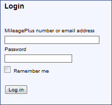
The bug is this: the “Remember me” check box can only be checked by clicking the tiny 13 by 13 pixel square; clicking the text label for the check box has no effect. This minor but common bug appears on many web sites because an HTML <input> check box on its own can’t define a label. The label can only be defined by creating a separate <label> tag. I have no idea who came up with this arrangement, and can only imagine that this was intended to allow flexibility. It does allow, for example, a check box label to be placed above, under, or to the left of, a check box. But this flexibility comes at a cost: many web developers aren’t aware of the need for <label> tags, and so they end up with check boxes with static, unclickable labels. HTML radio buttons suffer from the same issue.
Of course, users have been long trained by client OSes that the text next to a check box or radio button should be clickable. It makes sense, after all, to give the user a large hit area (especially on a touch device). If the site above were to correctly define a check box label, the hit target would be 600% times as large as using the box alone, at no additional cost in screen real estate. Furthermore, the UI would be more accessible to a larger population, including vision-impaired people using screen readers.
The situation is improving, and a quick survey of some highly-trafficked web sites shows that many of them do correctly define labels for check boxes and radio buttons. But even some popular sites do not, or don’t do so consistently. Quantcast estimates the above United Airlines site gets about 1M U.S. visitors a month, and it’s fair to guess that some significant portion of those people are being driven through the faulty Sign In UI above.
The problem persists because here it’s harder to create a correct UI than an incorrect one. For the correct result here, the developer has to:
- Hear about the need for the <label> tag and learn how it works.
- Remember to use a <label>.
- Set an ID on the <input> element.
- Create the <label> element.
- Type in the user-visible text.
- Set the label’s “for” attribute to the input element’s ID.
In contrast, to create this check box the wrong way, the developer just has to:
- Type in the user-visible text.
A check box created the wrong way looks pretty much like one created the right way, so it can be hard for the team creating the UI to spot the bug. And, of course, when the problem exists in UI that’s generally shown only to new users (like the UI above), team members will rarely be exposed to the bug themselves.
Usability experts can exhort the correct use of <label> tags until they’re blue in the face, but a real fix requires that it be easier to create a correct UI than an incorrect UI. Client OSes have made this easy for years, and I can probably count on one hand the number of times I’ve seen a check box in a client app in which the text was not correctly clickable.
Oh, and one more thing. On the web, it turns out that even if you do things the way you’re told to, your check box or radio button UI may still have a tiny bug. By default WebKit and Mozilla put an unclickable 3px margin around the input element. So even if you use a <label> tag in the recommended fashion, you still end up with a 3 pixel gap (highlighted below in red) between the input element and the label:

Clicks in this gap have no effect! This is a teeny tiny bug that nevertheless happens to show up in WebKit and Mozilla on nearly every web site. (IE takes care to leave no gap.) This probably means that on any given day thousands of users happen to click in that gap, and are puzzled that nothing has happened before they quickly click again. I noticed that one site, Gmail, carefully works around this very issue by overriding the margins on the check box and label to eliminate the gap. Once again, it seems the platform makes it harder to create a correct UI than an incorrect one.
CheckBox and RadioButton
I’ve added CheckBox and RadioButton controls to the QuickUI Catalog that implicitly associate a label with an input element, and close up the gap described above.
These aren’t particularly fancy or interesting components, but they’re nevertheless simple to use and solve the problem defined above. I wish HTML check boxes and radio buttons had always worked like this.
Implementation notes
Both CheckBox and RadioButton inherit from a LabeledInput base class that creates the automatic link between the label and the input element.
I originally implemented the LabeledInput base class as an inline div containing an input and a label element, and had some JavaScript explicitly link the two elements with a generated ID. But then I noticed something interesting on Gmail’s sign in page: the input element is inside the label element, right before the static text. I’ve never seen this approach documented on pages that describe the use of <label>. Every site seems to document the label appearing in the HTML immediately after the input. But putting the input inside the label seems to work in all the mainstream browsers. The advantage of this approach is that there’s no need to set the “for” attribute on the label; the label automatically binds to the input element it contains.
Taking another hint from Gmail, the LabeledInput class also sets margins so as to leave no gap between the input element and the adjacent text.
Finally, as an extra bonus, the RadioButton control solves an annoyance specific to HTML radio buttons. An HTML developer must manually designate an internal radio button group name for each radio button in the group that should work together (i.e., which should be mutually exclusive). This isn’t hard to do, but it’s still an extra step, and more work than should really be necessary. So, by default, if you don’t explicitly put a RadioButton into a group, it will automatically group itself with any siblings (with the same DOM parent) that are similarly ungrouped.